Gap - a bright future for padding in Flexbox (as in Grid)
One of my favorite parts of the CSS Grid specification is
grid-gap
. They make it easy to indent between elements within the grid.
Margins and the techniques we resort to in order to implement them in different situations have long been one of the main annoying points in CSS.
W3C recommended abandoning the
grid-gap
property in favor of a simple
gap
and its use in Flexbox and Multi-Column.
In this tutorial, we will see how margins were added to Flexbox before and how the
gap
property does this, allowing us to get indentation without additional tweaks.
Margins in a regular Flexbox grid
In this example, we'll take a group of blocks, use Flexbox to create a mesh style, and then separate the blocks from each other using margins.
Let's start with basic HTML. We have
flex-container
and
flex-item.
<div class="flex-container"> <div class="flex-item"></div> <div class="flex-item"></div> <div class="flex-item"></div> <div class="flex-item"></div> <div class="flex-item"></div> <div class="flex-item"></div> <div class="flex-item"></div> <div class="flex-item"></div> </div>
Thanks to the behavior of Flexbox, the content will be located next to each other. Based on the value of the width of the container, determine the size of the child elements and then let them be transferred using the
flex-wrap
property.
.flex-container { display: flex; flex-wrap: wrap; } .flex-item { width: calc(100% / 3); }
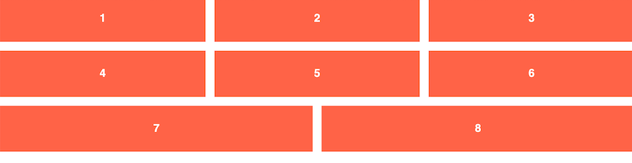
This gives us blocks of perfect size equal to 1/3 of the width of the container. Let's set margins to add vertical and horizontal space between each element.
.flex-item { width: calc(100% / 3); margin-right: 1rem; margin-bottom: 1rem; }

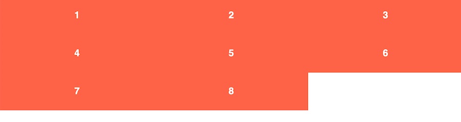
Oh! Our elements, which are 1/3 of the container, no longer fit the width of the parent element. Although the margins between the rows turned out to be quite correct and did not cause problems.
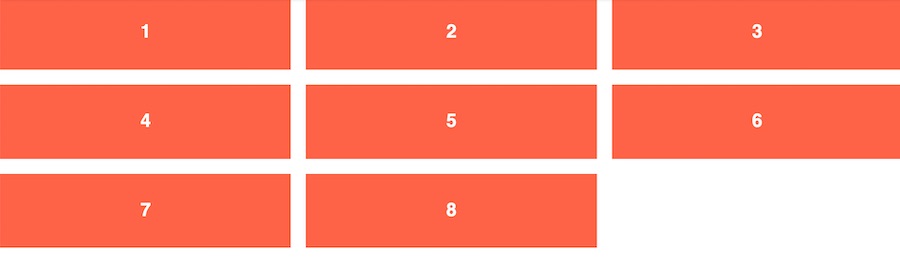
We will need to set the width of the child elements taking into account the additional space created by the margin. You also need to set the
margin-right
property to zero for every third element.
Now we have two margins left equal to
1rem
and we must subtract these
2rem
evenly from the width of all three elements.
flex-item { // width: calc(100% / 3); width: calc((100% / 3) - (2rem / 3)); // one-third - two margins divided equally among 3 items margin-right: 1rem; margin-bottom: 1rem; } .flex-item:nth-child(3n) { margin-right: 0; }
Looks too hard? For me, yes. There are simpler ways to do this, but they also do not give you the exact 1rem spacing between columns. This complex code also greatly complicates responsive design.
When the gap property becomes available for use in Flexbox in all browsers, the code becomes much cleaner. We can also move from setting widths for children to using the
flex-grow
,
flex-shrink
and
flex-basis
properties.
Indenting with Gap
Using the gap property, we get rid of the need to do most of the tricks with the width of the elements. It also allows us to revert to using flex-grow / flex-shrink values.
In the following example, we still use the
display: flex
and
flex-wrap: wrap
properties for our container, but now we also add the
gap
property. This is a shorthand property that combines
row-gap
and
column-gap
. Check out the MDN documentation for all the methods.
Now, instead of setting the width for each flex element, we set the values flex-grow, flex-shrink and flex-basis. The
flex-basis
property will determine how many columns browsers will install in the container. We will still use the
calc()
function for this, but the code will eventually get cleaner
.flex-container { display: flex; flex-wrap: wrap; gap: 1rem; } .flex-item { flex: 1 1 calc((100% / 3) - 2rem); }
An attentive reader will also notice that this now allows the last elements to grow in size to fill the space of the row in which the elements are missing. This is what CSS Grid and Flexbox based on element widths cannot do for us.
Bonus: Gap also facilitates responsiveness.
In our original example, if we wanted to change the number of container columns at certain control points, we had to recount the width AND change the
nth-child
selectors to get rid of margins.
In the
gap
example, all we need to do is adjust the flex-basis property, and you're done.
.flex-item { flex: 1 1 100%; // 1 across at mobile } @media (min-width: 640px) { .flex-item { flex-basis: calc((100% / 2) - 1rem); // 2 across at tabletish } } @media (min-width: 1024px) { .flex-item { flex-basis: calc((100% / 3) - 2rem); // 3 across at desktop } }
I won’t lie, I still prefer CSS Grid for such a design pattern, but I hope you see some examples of use for this incredible new feature.
Looking to the future
Now the gap property is only supported in Firefox. So, if this article interests you, I humbly apologize. You will have to wait for other browsers to catch up. I hope they notice the pain of developers related to margins and sooner or later give us new opportunities.
Addition from the translator
It seems that there is still a trick that allows you to get rid of the need now by using, for example,
nth-child(3n)
to remove the right margins of Flex-elements adjacent to the right edge of the container, and even correcting it every time the number of columns in Flex- changes container.
Of course, it is also not perfect and is as follows:
- In HTML markup, wrap the Flex container in an optional wrapper tag
- For children, for example, instead of
margin-right: 10px
, setmargin-left: 10px
- And in order to compensate for the increasing left indent, it is necessary to set a property for the Flex container with a negative
margin-left: -10px;
valuemargin-left: -10px;
The result can be viewed on CodePen
All Articles