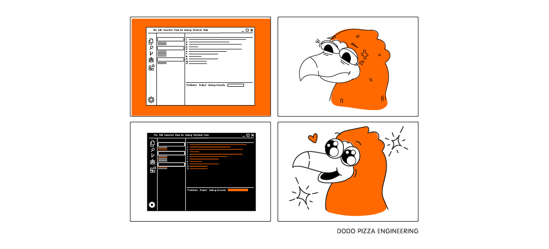
Why developers love the dark theme so much
- Tell me why the developers love the dark theme so much?
- And you try at night under the covers to get light!
Sometimes I want to drop everything, say that I am a bird, and all this is difficult for me. Then I remember that IT people are the best people I have ever met, and, overcoming pain and tears, I continue to explore them. In this article I try to understand the origins of attraction to a dark topic, as well as rock the boat and give a chance to light.
After that conversation about the pain in the eyes of a light topic under the covers, I still have some questions:
Of course, in response to these questions, I got a look full of sympathy and "oh, that's it." To emphasize the preferences of a light or dark theme among the developers of Dodo Pizza Engineering, I asked a very simple question: “So I see that you are using a dark theme. Why?"
In response, I wanted to get detailed thoughts with detailed analytics, links to research in proven sources, comparative analogies, but instead of all this I often received: “I just like it more.”
As a result, I got the impression that for many developers a dark topic is an axiom. A choice that does not require evidence. But! I take this opportunity, my ignorance and the desire to get to the truth, I decided to delve into this issue for real.
As you know, the whole world is divided into practitioners and theorists. While developers simply take and change predefined light themes to dark ones, scientists are fighting an unequal battle to whitewash a light theme and prove its advantages.
But what if the scientists who drown for “black and white” are mistaken? Here I have collected the reasons why dark themes are so dear to developers:
I want to leave the following three points for discussion in the comments. Write your opinion, experience, throw links to research.
While I was writing this article, I had a conversation with our designer who told me how he redid the internal interface of one of our services. Imagine my surprise when, by the end of the story, it turned out that the light themes of the interface had changed to dark. Then I could not stand it and, raising my hands to the sky, asked: “Yes why ??? Why is there a dark theme here? ”
To which the designer replied: “Yes, look! Can't you see that it’s better seen? These are the simple laws of contrast! And if you highlight the text in bold on a dark topic, it will be perceived as more readable! ”
At that moment, I was not ready to believe in this point of view, because mentally I was still on the bright side of the force. So I lived a couple of days, until somehow I got out of the subway car exactly in the middle of the platform. I looked to the left and saw it written in black and white ... More precisely, I did not see it.
And after a couple of minutes I got on the bus, and there they wrote to me red-haired in black! And then I believed.

The truth is somewhere nearby, and if we move away from the issues of the collective unconscious, taste and other objective-subjective, we can come to the following conclusions:
- And you try at night under the covers to get light!
Sometimes I want to drop everything, say that I am a bird, and all this is difficult for me. Then I remember that IT people are the best people I have ever met, and, overcoming pain and tears, I continue to explore them. In this article I try to understand the origins of attraction to a dark topic, as well as rock the boat and give a chance to light.
After that conversation about the pain in the eyes of a light topic under the covers, I still have some questions:
- Why code at night in the dark?
- Or maybe coding only during the day at work?
- Is night not created to give your head a rest?
Of course, in response to these questions, I got a look full of sympathy and "oh, that's it." To emphasize the preferences of a light or dark theme among the developers of Dodo Pizza Engineering, I asked a very simple question: “So I see that you are using a dark theme. Why?"
In response, I wanted to get detailed thoughts with detailed analytics, links to research in proven sources, comparative analogies, but instead of all this I often received: “I just like it more.”
As a result, I got the impression that for many developers a dark topic is an axiom. A choice that does not require evidence. But! I take this opportunity, my ignorance and the desire to get to the truth, I decided to delve into this issue for real.
Arguments for using a light theme
As you know, the whole world is divided into practitioners and theorists. While developers simply take and change predefined light themes to dark ones, scientists are fighting an unequal battle to whitewash a light theme and prove its advantages.
- I came across one study that claims that using a light theme improves productivity. The subjects had to perform two types of tasks:
- written in black and white;
- written in white on black.
As a result, it was found that the subjects performed tasks easier when the screens were in positive polarity mode. - In the next experiment, they checked whether something changes with age. It was expected that due to age-related changes in the vitreous body of the eye, the perception of positive polarity may change. But! The hypothesis was not confirmed, it turned out that it is easier for both young, mature and old people to read from screens in positive polarity mode.
- Now let's approach this issue in terms of the structure of the eye . White color reflects each wavelength in the color spectrum, which means our irises do not need to open wide and strain to absorb a sufficient amount of light. Since the lens is not deformed by the wider iris, we can see things more sharply, especially a high-contrast color, such as black, which actually absorbs wavelengths and does not reflect them. Black absorbs the wavelength, and our iris should open more (read, "strain and leave the comfort zone").
- Using a dark theme can encourage you to continue to work in the dark, and at night. A dark theme can make you look at the screen even longer, which is really bad for your eyes, since the screen with the code acts on the developer like a light on a moth.
- The real problem of those who drown for dark topics in the dark is that they look at devices at night. Enough. Give yourself a rest at night.
Arguments for using a dark theme
But what if the scientists who drown for “black and white” are mistaken? Here I have collected the reasons why dark themes are so dear to developers:
- Well, firstly, it's beautiful.
- Dark themes can indeed reduce perceived eye strain in low light conditions.
- Due to the use of a dark theme, the problems of flickering are leveled (if you are still working on such a monitor).
- Some developers are forced to work with dark topics not for aesthetic and religious beliefs, but for medical reasons (for example, photophobia or migraine).
- Yes, programming at night under the covers is bad. Nevertheless, the use of a dark theme has less effect on the disturbance of the body's sleep cycle when using the display in the evening.
- Focus on form versus focus on content. The human eye focuses on brighter areas, so a darker background draws attention to the content, while a light background draws attention to the window itself and the desktop.
Imagine you are watching a movie in 16: 9 format and the frame around is white. Some garbage, right? - Is more weighty argument in favor of a dark theme required if millions of developers simply vote for their choice?
- This is part of the subculture. Despite the fact that in most programs a light theme is preinstalled, real programmers change it to a dark one.
- For the same reason, poets like to look at the stars in the night sky. It gives divine focus and experience.
Disputed territories somewhere between dark and light
I want to leave the following three points for discussion in the comments. Write your opinion, experience, throw links to research.
- What can you say about applications and services that require syntax highlighting? Here I see the division into two camps. Some say: “Don’t you see that all the lights are visible on white, it’s obvious!” Others say the opposite. Is there truth here or is it still a matter of taste?

- Dark themes can become a big strain on the eyes in high light conditions. This question relates to daylight hours. The text is washed out, becomes less distinguishable.
- Applications that require reading long passages of text / code are generally harder to read in a dark topic.
And then I believed
While I was writing this article, I had a conversation with our designer who told me how he redid the internal interface of one of our services. Imagine my surprise when, by the end of the story, it turned out that the light themes of the interface had changed to dark. Then I could not stand it and, raising my hands to the sky, asked: “Yes why ??? Why is there a dark theme here? ”
To which the designer replied: “Yes, look! Can't you see that it’s better seen? These are the simple laws of contrast! And if you highlight the text in bold on a dark topic, it will be perceived as more readable! ”
At that moment, I was not ready to believe in this point of view, because mentally I was still on the bright side of the force. So I lived a couple of days, until somehow I got out of the subway car exactly in the middle of the platform. I looked to the left and saw it written in black and white ... More precisely, I did not see it.
And after a couple of minutes I got on the bus, and there they wrote to me red-haired in black! And then I believed.
The truth is somewhere near
The truth is somewhere nearby, and if we move away from the issues of the collective unconscious, taste and other objective-subjective, we can come to the following conclusions:
- If you do not like the dark theme, and you are a developer, do not use it. Make a revolution and fireplace out! Yes, it is fashionable, cool, generally accepted, but the choice is always yours. On bright days in bright rooms, a light theme can be more comfortable for your eyes and increase productivity.
- If you like a dark theme, use it! Even if the surroundings are dazzlingly bright, follow your preferences. There is more to life than the pursuit of small incremental improvements in theoretical productivity.
All Articles