React Native: Creating an Animated Input Field Using the Animated API
Hello! Today we are sharing with you cognitive material, a translation of which was prepared specifically for students of the course "ReactJS / React Native-developer" .
So, let's begin.
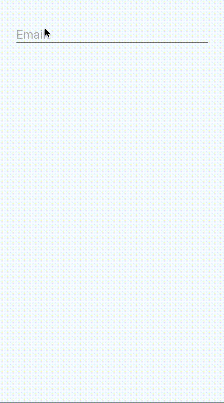
We all saw these input fields:
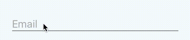
The caption is large and looks like a placeholder until you focus on the input. It will become smaller and rise up.
It looks great. Smooth. Impeccably.
It also seems that only an experienced developer can do this, doesn’t it?
Well, perhaps this was so before the advent of React Native, in those days when people lived in caves and created all kinds of game. But this is a thing of the past.
You can watch the video or continue reading. It all depends on what you prefer.
There are two options for what we are dealing with.
The first is when there is no focus on the input field.

An inscription appears inside the input field, and its size is equal to the size of the text field. The color is dull. This is very similar to the
property.
And the second option, when there is focus on the input field.

The inscription appears above the input field, its size is smaller, and the color is different from the color of the entered text.
Finally we can get to work. So far without any animations.
As it turns out, we have two UI states:
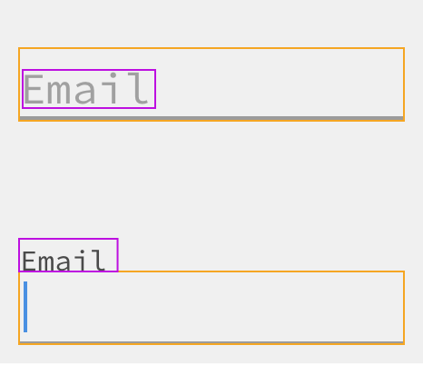
In fact, we could store the state of whether there is focus on the field or not. Then, depending on this state, we could choose where to place the inscription and what styles to apply to it.
Since the inscription should be in different places, and we do not want it to affect the placement of the components, we will absolutely position it. To make sure that there is enough space for it, you will have to add an indentation from the top to the wrapping view.
After the previous steps, we can achieve the following:
https://snack.expo.io/Sk006AbdW?session_id=snack-session-JRMksbYK3
And this is a good starting point. So far we have no animations, but we can already change the location of the inscription depending on where the focus is.
Actually the easiest part remained.
Since we have two states in which there may be an inscription, and we choose one, depending on the focus, and the animation of this transition between the states itself is quite trivial.
From this guide, we can highlight the following:
To implement all this is not difficult.
we will need to initialize in
.
Then, since the value of this number should be based on whether there is focus on the input field or not, and since we already have this bit of status information, we can add the
function, which will change this number depending on
:
Now, to reflect the style of the inscription in such terms, we need to make only two changes:
Change to
.
Instead of using conditions to define styles, define them as follows:
https://snack.expo.io/Hk8VCR-dZ?session_id=snack-session-AJ4vulSVw
If in the demo above you try to enter something, and then remove the focus from the input field, you will see something strange.
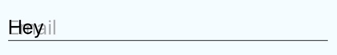
Fortunately, this is pretty easy to fix. We just need to change two lines in the code.
We want to check if the input field is empty and change the state to “unfocused” only if both of the following conditions are true:
Otherwise, we want the “focused” style to be applied and the replacement inscription to go up.
Now that we are tracking the status of the input field , we can easily access its value using
.
https://snack.expo.io/ByZBAC-dZ?session_id=snack-session-YNZSqhqOC
That's all. See you at the free webinar .
So, let's begin.
We all saw these input fields:
The caption is large and looks like a placeholder until you focus on the input. It will become smaller and rise up.
It looks great. Smooth. Impeccably.
It also seems that only an experienced developer can do this, doesn’t it?
Well, perhaps this was so before the advent of React Native, in those days when people lived in caves and created all kinds of game. But this is a thing of the past.
You can watch the video or continue reading. It all depends on what you prefer.
What are we trying to achieve?
There are two options for what we are dealing with.
The first is when there is no focus on the input field.
An inscription appears inside the input field, and its size is equal to the size of the text field. The color is dull. This is very similar to the
placeholder
property.
And the second option, when there is focus on the input field.
The inscription appears above the input field, its size is smaller, and the color is different from the color of the entered text.
Simplest implementation
Finally we can get to work. So far without any animations.
As it turns out, we have two UI states:
- There is no focus on the field and the inscription inside the field.
- There is focus on the field, an inscription above the input field.
In fact, we could store the state of whether there is focus on the field or not. Then, depending on this state, we could choose where to place the inscription and what styles to apply to it.
Since the inscription should be in different places, and we do not want it to affect the placement of the components, we will absolutely position it. To make sure that there is enough space for it, you will have to add an indentation from the top to the wrapping view.
class FloatingLabelInput extends Component { state = { isFocused: false, }; handleFocus = () => this.setState({ isFocused: true }); handleBlur = () => this.setState({ isFocused: false }); render() { const { label, ...props } = this.props; const { isFocused } = this.state; const labelStyle = { position: 'absolute', left: 0, top: !isFocused ? 18 : 0, fontSize: !isFocused ? 20 : 14, color: !isFocused ? '#aaa' : '#000', }; return ( <View style={{ paddingTop: 18 }}> <Text style={labelStyle}> {label} </Text> <TextInput {...props} style={{ height: 26, fontSize: 20, color: '#000', borderBottomWidth: 1, borderBottomColor: '#555' }} onFocus={this.handleFocus} onBlur={this.handleBlur} /> </View> ); } }
<FloatingLabelInput label="Email" value={this.state.value} onChange={this.handleTextChange} />
After the previous steps, we can achieve the following:
https://snack.expo.io/Sk006AbdW?session_id=snack-session-JRMksbYK3
And this is a good starting point. So far we have no animations, but we can already change the location of the inscription depending on where the focus is.
Why not use a
placeholder
?
Of course, using theTextInput
property of the placeholder seems tempting. However, this will not work, because we want to control how, when and where the inscription is displayed.
Instead, we want the label to be inside the text box when focus is on it. And we want it to move up when focus appears on the input field, and this can only be achieved if we work with the same element.
How about the animation?
Actually the easiest part remained.
Since we have two states in which there may be an inscription, and we choose one, depending on the focus, and the animation of this transition between the states itself is quite trivial.
From this guide, we can highlight the following:
-
Animated.Value
will mean whether there is focus on the field (1) or not (0); - We will gradually change the number to (1) when focusing and to (0) otherwise;
- In the form of this number, we will reflect the style of the inscription: in (0) and (1) we will define styles, and React Native will automatically calculate and apply intermediate styles. And even the colors.
To implement all this is not difficult.
Animated.Value
we will need to initialize in
componentWillMount
.
componentWillMount() { this._animatedIsFocused = new Animated.Value(0); }
Then, since the value of this number should be based on whether there is focus on the input field or not, and since we already have this bit of status information, we can add the
componentDidUpdate
function, which will change this number depending on
this.state
:
componentDidUpdate() { Animated.timing(this._animatedIsFocused, { toValue: this.state.isFocused ? 1 : 0, duration: 200, }).start(); }
Now, to reflect the style of the inscription in such terms, we need to make only two changes:
Change to
Animated.Text
.
Instead of using conditions to define styles, define them as follows:
const labelStyle = { position: 'absolute', left: 0, top: this._animatedIsFocused.interpolate({ inputRange: [0, 1], outputRange: [18, 0], }), fontSize: this._animatedIsFocused.interpolate({ inputRange: [0, 1], outputRange: [20, 14], }), color: this._animatedIsFocused.interpolate({ inputRange: [0, 1], outputRange: ['#aaa', '#000'], }), };
https://snack.expo.io/Hk8VCR-dZ?session_id=snack-session-AJ4vulSVw
Something else
If in the demo above you try to enter something, and then remove the focus from the input field, you will see something strange.
Fortunately, this is pretty easy to fix. We just need to change two lines in the code.
We want to check if the input field is empty and change the state to “unfocused” only if both of the following conditions are true:
- The input field is empty;
- There is no focus on the field.
Otherwise, we want the “focused” style to be applied and the replacement inscription to go up.
Now that we are tracking the status of the input field , we can easily access its value using
this.props
.
https://snack.expo.io/ByZBAC-dZ?session_id=snack-session-YNZSqhqOC
That's all. See you at the free webinar .
All Articles