How to keep the user on the site? Usability secrets
Imagine that you opened a bakery near a major university. You try, make the most delicious pastry in the world: sprinkle cinnamon rolls, put a lot of toppings. Crowds of hungry students come to you, but almost immediately run off to the nearest stall with shawarma. It's a shame, but what is the reason?
And we will answer this question and consider the most effective ways to keep the user on the site. Without ropes and handcuffs, with just one wholesome usability. So your online resource will not turn into a bakery without a single customer.
The user’s time spent on the site (dwell time) is one of the most important indicators of the quality of a resource, which affects the progress in search results. It’s definitely not worth it to bypass it.
You can create the highest quality content, use links and other tricks. But if the user has stayed on the page for just a couple of seconds, all your efforts will be in vain. That is, the longer a user lingers on a site, the better.
It is clear why PS rank sites by this indicator. After all, if a user lingers on a page while studying content, that means he most likely found what he was looking for. That is, the relevance of the site to a specific request is very high.
In addition to the standard Google Analytics and Yandex Metrics, there are a number of paid tools with similar functionality. For example, foreign Clicktale or Russian-speaking Labrika. But, despite the fact that paid services have much more rich functionality in terms of usability analysis, they are still seriously inferior to Google and Yandex in terms of overall web analytics.
Below we briefly discuss the basic concepts.
Click map is a useful tool for displaying the number of clicks on individual page elements. It helps to evaluate the usability of the site, identify the “hottest” (clickable) elements, and points to unsightly details for the user. Plus, so you can understand what elements of the site design seem like a button for visitors, but in fact they are not.
Where to look:
Yandex Metric: Click map;
Google Analytics: Click Map;
Plerdy: Heatmap
Depth of immersion (or depth of viewing, session) - this concept means the number of pages viewed in one session of visiting the site. One of the key behavioral factors has a significant impact on the position of the site in the SERP.
It is worth considering the fact that even if the user spends literally a few seconds on one specific page of the site, and then goes to another page of the same resource, as a result, good overall indicators can be achieved. The result is an increase in credibility in the eyes of the PS, and therefore the place in extradition.
Where to look:
Google Analytics: Audience / Overview (Pages / Session metric);
Yandex.Metrica: Reports / Standard reports / Visitors / Depth of viewing.
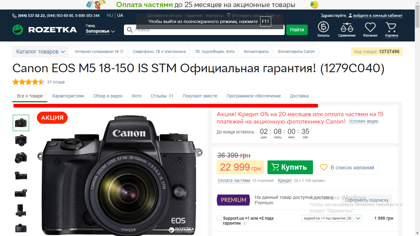
By “breadcrumbs” is meant a navigation chain designed to pave the way from the root directory of a site to a specific file, article, video or product that may interest the user.
In fact, this is part of the navigation system that makes the site more convenient, affects the viewing depth. A man went to read one article and immediately came across a friend with a similar theme.
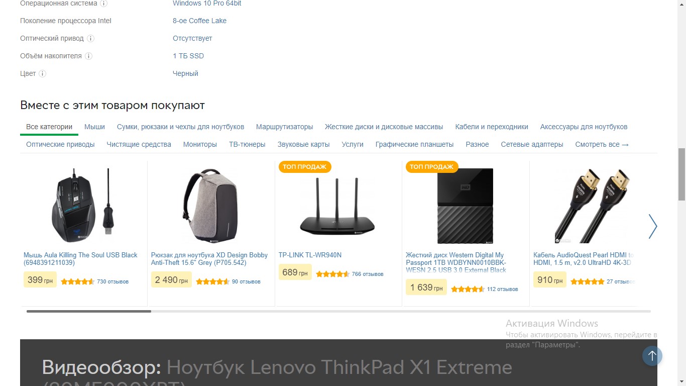
Be one step ahead of your buyer, think about what related products can be offered for the main purchase. For example, it can be attachments to an action camera, books of one genre or power bank for smartphones.

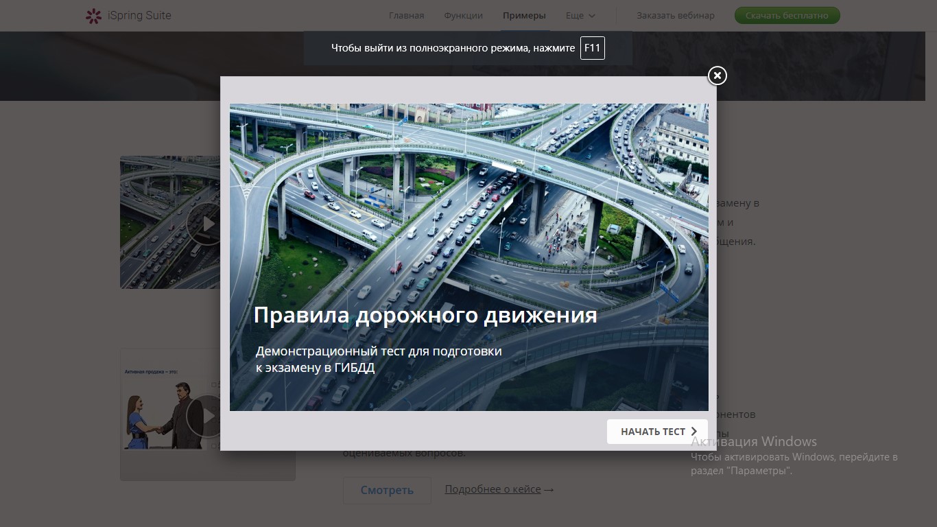
As we were taught from childhood that everything should be eaten with bread, so web designers suggest that pop-ups are a refined evil that only scares visitors.
And if in the first case we have matured and we ourselves decide what and with what we have. With respect to pop-up windows, we continue to sacredly believe in their harmfulness and futility. However, even in 2019, this is still a good way to convert traffic to subscribers or customers.
The main thing is to choose the right color and text for the window. It should simultaneously call for action and be pleasing to the eye.
Make sure that when the window appears, the visitor can easily close it and this does not interfere with the use of the site.
Surely you noticed that if the training takes place in a playful way, then the desired result can be achieved many times faster. By the way, game elements can be used not only in training, but also in network marketing. In this case, gamification involves the involvement of site visitors in the process of solving problems built on gaming thinking. Resources on which game elements are present are many times more attractive than their competitors. Such a site will definitely be remembered, recommended to friends.
Surveys and tests are a great way to not only attract attention, increase the database of current e-mail addresses and contacts, but also bring the user to a purchase. What can they be absolutely of any kind, because sometimes everyone wants to fool around and find out “What dinosaur are you today?”
Chatbots greatly simplify the user's path to purchasing goods. In fact, they perform the functions of a call center, translating communications with customers in a text format. This allows you to significantly reduce costs, eliminate the human factor, simplify navigation.
Beautiful design, thoughtful interface with breadcrumbs gamification (and other methods of increasing interest in the page), combined with high download speed and quick response to clicks, will help to keep your visitor and even transfer random guests to leads.
Following the above tips, you can make your site more attractive not only to the user, but also in the eyes of the search engine. And remember that good usability is not achieved in one night. Create, test seven times and lay it out once.
If you have already tried some type of usability improvement or we missed something, share your experience. We will be happy to listen to your stories and learn something new :)
And we will answer this question and consider the most effective ways to keep the user on the site. Without ropes and handcuffs, with just one wholesome usability. So your online resource will not turn into a bakery without a single customer.
How the time spent on the site affects the increase in positions in the issuance of PS
The user’s time spent on the site (dwell time) is one of the most important indicators of the quality of a resource, which affects the progress in search results. It’s definitely not worth it to bypass it.
You can create the highest quality content, use links and other tricks. But if the user has stayed on the page for just a couple of seconds, all your efforts will be in vain. That is, the longer a user lingers on a site, the better.
It is clear why PS rank sites by this indicator. After all, if a user lingers on a page while studying content, that means he most likely found what he was looking for. That is, the relevance of the site to a specific request is very high.
Tools for analyzing session time and depth
In addition to the standard Google Analytics and Yandex Metrics, there are a number of paid tools with similar functionality. For example, foreign Clicktale or Russian-speaking Labrika. But, despite the fact that paid services have much more rich functionality in terms of usability analysis, they are still seriously inferior to Google and Yandex in terms of overall web analytics.
Below we briefly discuss the basic concepts.
Click map
Click map is a useful tool for displaying the number of clicks on individual page elements. It helps to evaluate the usability of the site, identify the “hottest” (clickable) elements, and points to unsightly details for the user. Plus, so you can understand what elements of the site design seem like a button for visitors, but in fact they are not.
Where to look:
Yandex Metric: Click map;
Google Analytics: Click Map;
Plerdy: Heatmap
Immersion depth
Depth of immersion (or depth of viewing, session) - this concept means the number of pages viewed in one session of visiting the site. One of the key behavioral factors has a significant impact on the position of the site in the SERP.
It is worth considering the fact that even if the user spends literally a few seconds on one specific page of the site, and then goes to another page of the same resource, as a result, good overall indicators can be achieved. The result is an increase in credibility in the eyes of the PS, and therefore the place in extradition.
Where to look:
Google Analytics: Audience / Overview (Pages / Session metric);
Yandex.Metrica: Reports / Standard reports / Visitors / Depth of viewing.
Tricks of web developers to keep the user on the site
Bread crumbs
By “breadcrumbs” is meant a navigation chain designed to pave the way from the root directory of a site to a specific file, article, video or product that may interest the user.
In fact, this is part of the navigation system that makes the site more convenient, affects the viewing depth. A man went to read one article and immediately came across a friend with a similar theme.
Recommended
Be one step ahead of your buyer, think about what related products can be offered for the main purchase. For example, it can be attachments to an action camera, books of one genre or power bank for smartphones.
Pop-up windows
As we were taught from childhood that everything should be eaten with bread, so web designers suggest that pop-ups are a refined evil that only scares visitors.
And if in the first case we have matured and we ourselves decide what and with what we have. With respect to pop-up windows, we continue to sacredly believe in their harmfulness and futility. However, even in 2019, this is still a good way to convert traffic to subscribers or customers.
The main thing is to choose the right color and text for the window. It should simultaneously call for action and be pleasing to the eye.
Make sure that when the window appears, the visitor can easily close it and this does not interfere with the use of the site.
Gamification
Surely you noticed that if the training takes place in a playful way, then the desired result can be achieved many times faster. By the way, game elements can be used not only in training, but also in network marketing. In this case, gamification involves the involvement of site visitors in the process of solving problems built on gaming thinking. Resources on which game elements are present are many times more attractive than their competitors. Such a site will definitely be remembered, recommended to friends.
Tests / Surveys
Surveys and tests are a great way to not only attract attention, increase the database of current e-mail addresses and contacts, but also bring the user to a purchase. What can they be absolutely of any kind, because sometimes everyone wants to fool around and find out “What dinosaur are you today?”
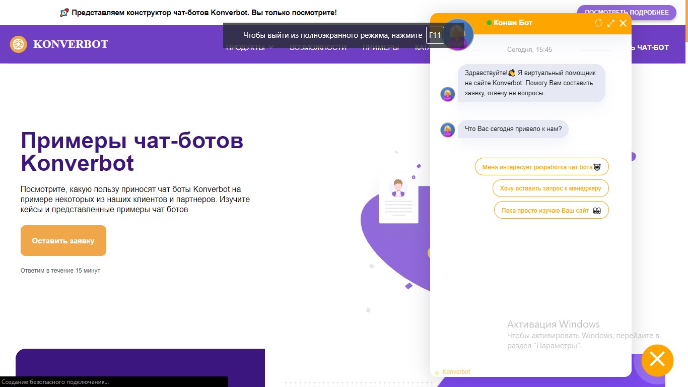
Chat Bot - 24/7 Support
Chatbots greatly simplify the user's path to purchasing goods. In fact, they perform the functions of a call center, translating communications with customers in a text format. This allows you to significantly reduce costs, eliminate the human factor, simplify navigation.
Conclusion
Beautiful design, thoughtful interface with breadcrumbs gamification (and other methods of increasing interest in the page), combined with high download speed and quick response to clicks, will help to keep your visitor and even transfer random guests to leads.
Following the above tips, you can make your site more attractive not only to the user, but also in the eyes of the search engine. And remember that good usability is not achieved in one night. Create, test seven times and lay it out once.
Good luck in optimization!
If you have already tried some type of usability improvement or we missed something, share your experience. We will be happy to listen to your stories and learn something new :)
All Articles