Interpreted machine learning model. Part 2
Hello. A few days remain until the start of the Machine Learning course. In anticipation of the start of classes, we have prepared a useful translation that will be of interest to both our students and all readers of the blog. And today we are sharing with you the final part of this translation.

Partial Dependence Plots (partial dependency plots or PDP, PD plots) show insignificant influence of one or two features on the predicted result of the machine learning model ( JH Friedman 2001 ). PDP can show the relationship between the target and the selected features using 1D or 2D graphs.
PDPs are also calculated after the model is trained. In the problem with football, which we discussed above, there were many signs, such as passes transferred, attempts to score into goals, goals scored, etc. Let's start by looking at one line. Let's say the line is a team that had the ball 50% of the time, which made 100 assists, 10 attempts to score and 1 goal.
We act by training our model and calculating the likelihood that the team has a player who received “Man of the Game”, which is our target variable. Then we select the variable and continuously change its value. For example, we will calculate the result, provided that the team scored 1 goal, 2 goals, 3 goals, etc. All these values are reflected in the graph, in the end we get a graph of the dependence of the predicted results on goals scored.
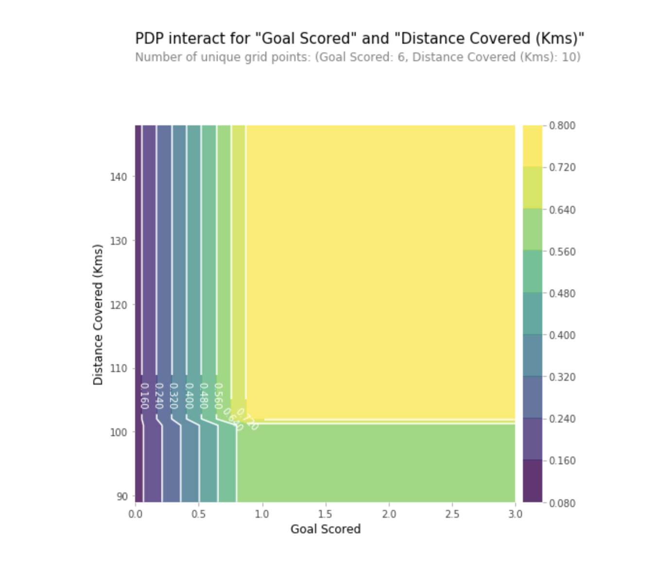
We can also visualize the partial dependence of two features simultaneously using 2D graphics.
Practice
SHAP stands for SHapley Additive explanation. This method helps to split the forecast into parts to reveal the significance of each characteristic. It is based on the Vector Shapley, a principle used in game theory to determine how each player contributes to its successful outcome in a joint game (https://medium.com/civis-analytics/demystifying-black-box-models-with-shap- value-analysis-3e20b536fc80). Finding a compromise between accuracy and interpretability can often be a difficult balance, but SHAP values can provide both.
And again, let's go back to the football example, where we wanted to predict the likelihood that a team has a player who won the “Man of the Game” award. SHAP - values interpret the influence of a certain value of a characteristic in comparison with the forecast that we would have made if this characteristic would have taken some basic value.
SHAP - values show how much this particular feature changed our prediction (compared to how we would make this prediction with some basic value of this trait). Suppose we wanted to know what the forecast would be if the team scored 3 goals, instead of a fixed base amount. If we can answer this question, we can follow the same steps for other signs as follows:
Therefore, the forecast can be presented in the form of the following graph:
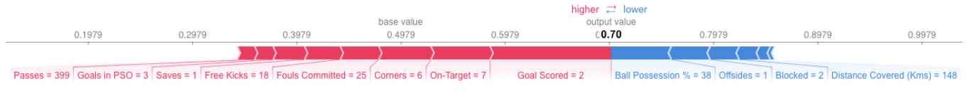
Here is the link to the big picture.
The example above shows the signs, each of which contributes to the movement of the model output at a base value (average statistical output of the model according to the training dataset that we passed to it earlier) to the final output of the model. Signs that advance the forecast above are shown in red, and those that lower its accuracy are shown below.
SHAP - values have a much deeper theoretical justification than what I mentioned here. For a better understanding of the issue, follow the link .
Aggregating multiple SHAP values will help form a more detailed view of the model.
To get an idea of which features are most important for the model, we can build SHAP - values for each feature and for each sample. The summary graph shows which features are most important, as well as their range of influence on the dataset.
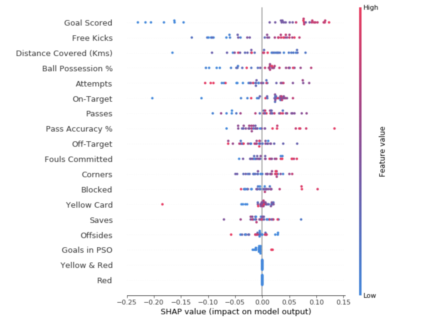
For each point:
The dot in the upper left corner means the team that scored several goals, but reduced the likelihood of a successful forecast by 0.25.
While the SHAP summary graph provides a general overview of each characteristic, the SHAP dependency graph shows how the model output depends on the characteristic value. The SHAP contribution dependency graph provides a similar PDP insight, but adds more detail.
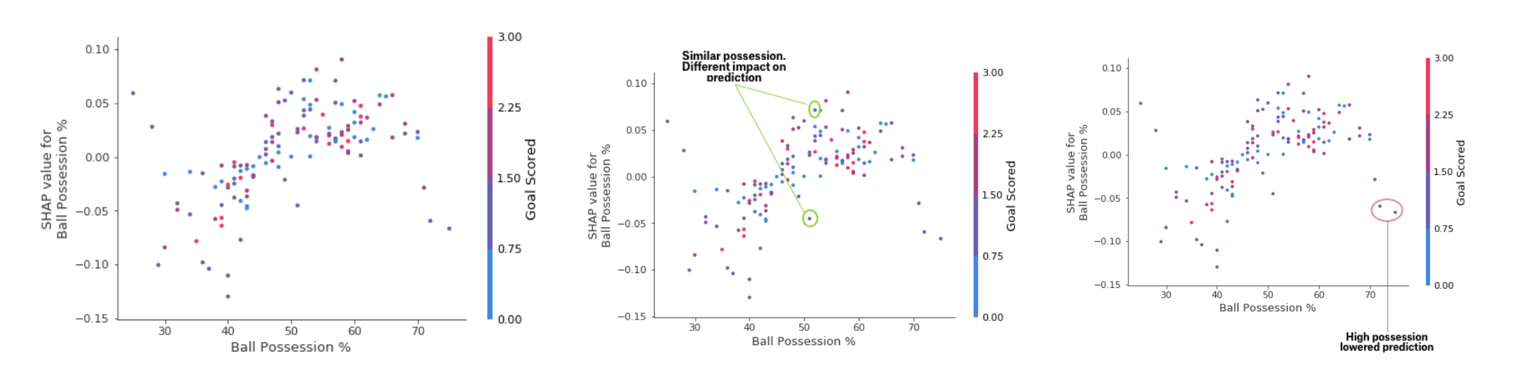
Deposit Dependency Chart
The graphs presented above indicate that the presence of a sword increases the chances of the team that it is their player who will receive a reward. But if a team scores only one goal, then this trend changes, because the judges can decide that the team players keep the ball for too long and score too few goals.
Practice
Machine learning should no longer be a black box. What is the use of a good model if we cannot explain the results of its work to others? Interpretability has become as important as the quality of the model. In order to achieve recognition, it is imperative that machine learning systems can provide clear explanations of their decisions. As Albert Einstein said: "If you can’t explain something in simple language, you don’t understand it."
Sources:
Read the first part
Partial Dependence Plots
Partial Dependence Plots (partial dependency plots or PDP, PD plots) show insignificant influence of one or two features on the predicted result of the machine learning model ( JH Friedman 2001 ). PDP can show the relationship between the target and the selected features using 1D or 2D graphs.
How it works?
PDPs are also calculated after the model is trained. In the problem with football, which we discussed above, there were many signs, such as passes transferred, attempts to score into goals, goals scored, etc. Let's start by looking at one line. Let's say the line is a team that had the ball 50% of the time, which made 100 assists, 10 attempts to score and 1 goal.
We act by training our model and calculating the likelihood that the team has a player who received “Man of the Game”, which is our target variable. Then we select the variable and continuously change its value. For example, we will calculate the result, provided that the team scored 1 goal, 2 goals, 3 goals, etc. All these values are reflected in the graph, in the end we get a graph of the dependence of the predicted results on goals scored.
The library used in Python to build PDP is called the python partial dependence plot toolbox or simply PDPbox .
from matplotlib import pyplot as plt from pdpbox import pdp, get_dataset, info_plots # Create the data that we will plot pdp_goals = pdp.pdp_isolate(model=my_model, dataset=val_X, model_features=feature_names, feature='Goal Scored') # plot it pdp.pdp_plot(pdp_goals, 'Goal Scored') plt.show()
Interpretation
- The Y axis reflects the change in forecast due to what was predicted in the original or in the leftmost value.
- The blue area indicates the confidence interval.
- For the Goal Scored graph, we see that a goal scored increases the likelihood of receiving a 'Man of the game' award, but after some time, saturation occurs.
We can also visualize the partial dependence of two features simultaneously using 2D graphics.
Practice
SHAP values
SHAP stands for SHapley Additive explanation. This method helps to split the forecast into parts to reveal the significance of each characteristic. It is based on the Vector Shapley, a principle used in game theory to determine how each player contributes to its successful outcome in a joint game (https://medium.com/civis-analytics/demystifying-black-box-models-with-shap- value-analysis-3e20b536fc80). Finding a compromise between accuracy and interpretability can often be a difficult balance, but SHAP values can provide both.
How it works?
And again, let's go back to the football example, where we wanted to predict the likelihood that a team has a player who won the “Man of the Game” award. SHAP - values interpret the influence of a certain value of a characteristic in comparison with the forecast that we would have made if this characteristic would have taken some basic value.
SHAP - values are calculated using the Shap library, which can be easily installed from PyPI or conda.
SHAP - values show how much this particular feature changed our prediction (compared to how we would make this prediction with some basic value of this trait). Suppose we wanted to know what the forecast would be if the team scored 3 goals, instead of a fixed base amount. If we can answer this question, we can follow the same steps for other signs as follows:
sum(SHAP values for all features) = pred_for_team - pred_for_baseline_values
Therefore, the forecast can be presented in the form of the following graph:
Here is the link to the big picture.
Interpretation
The example above shows the signs, each of which contributes to the movement of the model output at a base value (average statistical output of the model according to the training dataset that we passed to it earlier) to the final output of the model. Signs that advance the forecast above are shown in red, and those that lower its accuracy are shown below.
- The base value here is 0.4979, while the forecast is 0.7.
- With
Goal Scores
= 2, the sign shows the greatest influence on the improvement of the forecast, whereas - The
ball possession
attribute has the highest effect of lowering the final prognosis.
Practice
SHAP - values have a much deeper theoretical justification than what I mentioned here. For a better understanding of the issue, follow the link .
Advanced use of SHAP values
Aggregating multiple SHAP values will help form a more detailed view of the model.
- SHAP Summary Charts
To get an idea of which features are most important for the model, we can build SHAP - values for each feature and for each sample. The summary graph shows which features are most important, as well as their range of influence on the dataset.
For each point:
- The vertical arrangement shows what sign it reflects;
- The color indicates whether this object is strongly significant or weakly significant for this dataset string;
- The horizontal arrangement shows whether the influence of the value of this feature has led to a more accurate forecast or not.
The dot in the upper left corner means the team that scored several goals, but reduced the likelihood of a successful forecast by 0.25.
- SHAP Contribution Chart
While the SHAP summary graph provides a general overview of each characteristic, the SHAP dependency graph shows how the model output depends on the characteristic value. The SHAP contribution dependency graph provides a similar PDP insight, but adds more detail.
Deposit Dependency Chart
The graphs presented above indicate that the presence of a sword increases the chances of the team that it is their player who will receive a reward. But if a team scores only one goal, then this trend changes, because the judges can decide that the team players keep the ball for too long and score too few goals.
Practice
Conclusion
Machine learning should no longer be a black box. What is the use of a good model if we cannot explain the results of its work to others? Interpretability has become as important as the quality of the model. In order to achieve recognition, it is imperative that machine learning systems can provide clear explanations of their decisions. As Albert Einstein said: "If you can’t explain something in simple language, you don’t understand it."
Sources:
- “Interpretable Machine Learning: A Guide for Making Black Box Models Explainable.” Christoph Molnar
- Machine Learning Explainability Micro Course at Kaggle
Read the first part
All Articles