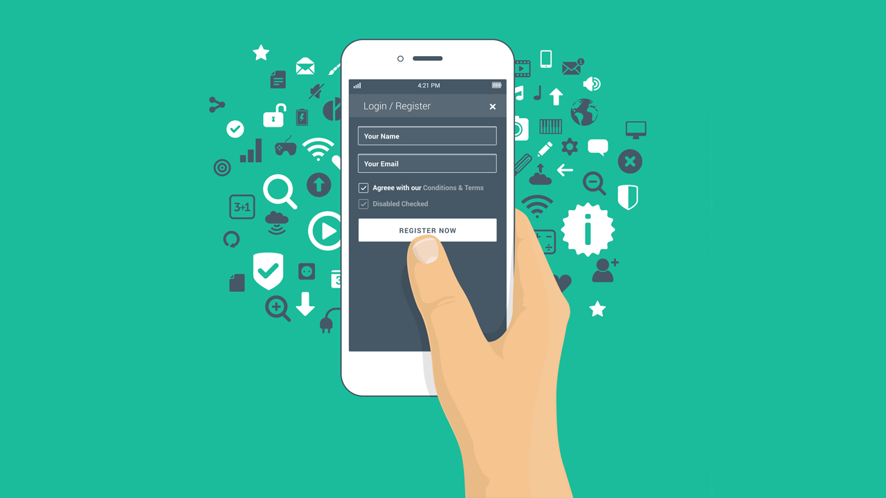
Features of testing Mobile Web applications
Hi, Habr.
Testing Mobile Web is somewhat similar to testing Desktop Web. On the one hand, these are the same HTML, CSS, JavaScript and other charms that we are used to seeing. The same problem areas and typical bugs. On the other hand, there are differences.
In this article, I put together a small checklist of those features that are important to test on a Mobile Web project. The list does not claim to be complete, so supplement it with your paragraphs in the comments. I will only be glad. The only rule is that the item should apply only to the mobile web, and not to the web at all.
I would like to start with the fact that we have at least two ways to test Mobile Web projects. The first is to emulate a mobile browser using Chrome DevTools (or other browsers in their developer tools, but this is a less popular way). The second is to test on a real device using a real mobile browser.
Most of the functionality is quite possible to check without a device, but still not all. Therefore, I broke the checks into two large parts - what we check on a PC, and what only with a mobile device in hand.
So, as mentioned above, mobile testing can be carried out on a PC without using a mobile device. Chrome browser can work in mobile mode.
In order to switch to mobile mode for viewing a web page, you need to open Chrome DevTools and click on this symbol:

A web application will open before us as if it were open from a mobile device:

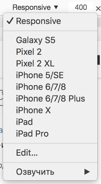
We can choose the type of device from the list, the work with which we emulate:
It is important to remember that some web applications, in addition to screen size, are also oriented to the User Agent . Such an application in mobile mode may visually differ from what we will see on a real device.
In order to do everything right, you need to additionally configure Network conditions in Chrome DevTools by setting the Mobile User Agent:

Then reload the page and get the desired result.
Using Chrome, you can test the application both on the slow Internet and completely offline. To do this, on the same Network Conditions tab, you can select the network throttling parameter:

This is important if users often use the application in poor Internet conditions, such as a navigator.
That's not all Chrome DevTools has. This is a great tool for working with the Desktop Web, and for the Mobile Web. There is excellent documentation from Google on it, in English of course .
We have a two-week online course on Chrome DevTools in Russian. All information on the profile page. Moving on. :)
Testing Mobile Web with Chrome DevTools has several advantages. It is simple, fast, does not require real devices and allows you to identify the most obvious application bugs. But, alas, not all.
The first reason why you should pick up a mobile device: the need to test the application on a weak device.
Modern web applications are overloaded with all kinds of animations, complex calculations on the client side, and so on. If on the desktop all this stuff can work smoothly and beautifully (although not always as well), there may be lags on some Samsung J-line (for example, J2).
The second reason is mobile browsers. It's about those browsers that are built into the system and are defaulted. Many people use them and don’t bother installing mobile Chrome.
One of the representatives of such a browser is Samsung Internet Browser. It is worth checking the operation of your web application. Especially if there are no statistics showing “what your users are sitting with”. If there are such statistics and it claims that no one visits the application from these browsers, then most likely it is not necessary to test it. Although ... what if they don’t enter because it’s just broken? :)
It’s worth thinking about.
Mobile Web application works in a mobile browser, which is logical. At the same time, mobile devices are arranged so that the application can be both in active mode and in the background. For example, if we switched to another application or we have an incoming call.
Now suppose that for some reason our user has moved the browser with the open application to the background. And then came back. Here are some examples of what might be wrong. For example, we have a chat application and the entire history of correspondence is lost. Now a page reload is required. Poorly? Of course! Or we have a notebook application. The user did not have time to add something when he was interrupted by an incoming call. Returning, he found that what he had written was erased. Now you have to write everything again. Or maybe it's better not to use such an application?
Be sure to check how the key functionality of the application works after the background.
Most often, Mobile Web users use an electronic keyboard to enter text. It happens that when it appears, the layout of the application breaks. Usually this problem is related to how the proportions of the screen are calculated and how they affect this layout.

It is worth paying special attention to those pages of the application where the user has to fill in a lot of data: the registration page, some questionnaires, and so on.
Mobile applications have two types of screen orientation: portrait and landscape. You can read about it here .
If we “put on our side” our device, most of the mobile applications will be “redrawn” to the new screen proportions. This also applies to mobile browsers. At this point, the layout of our web application can also break in the most unpredictable places.

Chrome DevTools can emulate both modes, but still the process of flipping and further redrawing the web application happens differently than on a real mobile browser.
The way our application will look after redrawing is definitely worth checking out. And, preferably, in both directions: from portrait to landscape and from landscape to portrait.
Another common case: when an application has both a Mobile Web version and a native application. In this case, it happens that some of the pages are not transferred to the native application, but simply display them as a WebView.
WebView is a component that allows you to embed web pages in an application. The built-in browser simply renders within the application what we would see on the Mobile Web. Quite often, this saves time when developing a native application.
In this case, it is worth checking the changes of Mobile Web not only in the browser, but also inside native applications, too. Of course, there is no way to do without a mobile device.
Unlike the Desktop Web, where there is only a mouse click, in a mobile application there are several ways to interact with the interface: touch, tap, flick, and so on. There are many places to read about this, for example here .
Chrome DevTools can emulate some of these actions. But, firstly, not all. And, secondly, the result is not always the same during emulation as when using a real device.
Even if your mobile web application is not tailored for special actions, it’s still worth checking the interface’s interaction with at least tap. Especially places like menus or some kind of switches. The bottom line is that tap does not fall into any specific coordinates. He falls into a whole area. If your controls are nearby, tap can affect several elements at once and cause inconvenience to the user.
I talked about the main features of testing Mobile Web projects. If you come from testing Desktop Web, this list is likely to come in handy. Of course, this is not all that could be recalled regarding this issue. If you want to supplement the list, be sure to write in the comments the checks that you do.
Thanks for attention.
Testing Mobile Web is somewhat similar to testing Desktop Web. On the one hand, these are the same HTML, CSS, JavaScript and other charms that we are used to seeing. The same problem areas and typical bugs. On the other hand, there are differences.
In this article, I put together a small checklist of those features that are important to test on a Mobile Web project. The list does not claim to be complete, so supplement it with your paragraphs in the comments. I will only be glad. The only rule is that the item should apply only to the mobile web, and not to the web at all.
I would like to start with the fact that we have at least two ways to test Mobile Web projects. The first is to emulate a mobile browser using Chrome DevTools (or other browsers in their developer tools, but this is a less popular way). The second is to test on a real device using a real mobile browser.
Most of the functionality is quite possible to check without a device, but still not all. Therefore, I broke the checks into two large parts - what we check on a PC, and what only with a mobile device in hand.
Chrome DevTools
So, as mentioned above, mobile testing can be carried out on a PC without using a mobile device. Chrome browser can work in mobile mode.
Mobile mode
In order to switch to mobile mode for viewing a web page, you need to open Chrome DevTools and click on this symbol:
A web application will open before us as if it were open from a mobile device:
We can choose the type of device from the list, the work with which we emulate:
User agent
It is important to remember that some web applications, in addition to screen size, are also oriented to the User Agent . Such an application in mobile mode may visually differ from what we will see on a real device.
In order to do everything right, you need to additionally configure Network conditions in Chrome DevTools by setting the Mobile User Agent:
Then reload the page and get the desired result.
Network throttling
Using Chrome, you can test the application both on the slow Internet and completely offline. To do this, on the same Network Conditions tab, you can select the network throttling parameter:
This is important if users often use the application in poor Internet conditions, such as a navigator.
That's not all Chrome DevTools has. This is a great tool for working with the Desktop Web, and for the Mobile Web. There is excellent documentation from Google on it, in English of course .
We have a two-week online course on Chrome DevTools in Russian. All information on the profile page. Moving on. :)
Testing Mobile Web with Chrome DevTools has several advantages. It is simple, fast, does not require real devices and allows you to identify the most obvious application bugs. But, alas, not all.
Performance
The first reason why you should pick up a mobile device: the need to test the application on a weak device.
Modern web applications are overloaded with all kinds of animations, complex calculations on the client side, and so on. If on the desktop all this stuff can work smoothly and beautifully (although not always as well), there may be lags on some Samsung J-line (for example, J2).
Mobile Browsers
The second reason is mobile browsers. It's about those browsers that are built into the system and are defaulted. Many people use them and don’t bother installing mobile Chrome.
One of the representatives of such a browser is Samsung Internet Browser. It is worth checking the operation of your web application. Especially if there are no statistics showing “what your users are sitting with”. If there are such statistics and it claims that no one visits the application from these browsers, then most likely it is not necessary to test it. Although ... what if they don’t enter because it’s just broken? :)
It’s worth thinking about.
Work in Background
Mobile Web application works in a mobile browser, which is logical. At the same time, mobile devices are arranged so that the application can be both in active mode and in the background. For example, if we switched to another application or we have an incoming call.
Now suppose that for some reason our user has moved the browser with the open application to the background. And then came back. Here are some examples of what might be wrong. For example, we have a chat application and the entire history of correspondence is lost. Now a page reload is required. Poorly? Of course! Or we have a notebook application. The user did not have time to add something when he was interrupted by an incoming call. Returning, he found that what he had written was erased. Now you have to write everything again. Or maybe it's better not to use such an application?
Be sure to check how the key functionality of the application works after the background.
Electronic keyboard
Most often, Mobile Web users use an electronic keyboard to enter text. It happens that when it appears, the layout of the application breaks. Usually this problem is related to how the proportions of the screen are calculated and how they affect this layout.
It is worth paying special attention to those pages of the application where the user has to fill in a lot of data: the registration page, some questionnaires, and so on.
Screen orientation
Mobile applications have two types of screen orientation: portrait and landscape. You can read about it here .
If we “put on our side” our device, most of the mobile applications will be “redrawn” to the new screen proportions. This also applies to mobile browsers. At this point, the layout of our web application can also break in the most unpredictable places.
Chrome DevTools can emulate both modes, but still the process of flipping and further redrawing the web application happens differently than on a real mobile browser.
The way our application will look after redrawing is definitely worth checking out. And, preferably, in both directions: from portrait to landscape and from landscape to portrait.
Web page in native application
Another common case: when an application has both a Mobile Web version and a native application. In this case, it happens that some of the pages are not transferred to the native application, but simply display them as a WebView.
WebView is a component that allows you to embed web pages in an application. The built-in browser simply renders within the application what we would see on the Mobile Web. Quite often, this saves time when developing a native application.
In this case, it is worth checking the changes of Mobile Web not only in the browser, but also inside native applications, too. Of course, there is no way to do without a mobile device.
Tap processing
Unlike the Desktop Web, where there is only a mouse click, in a mobile application there are several ways to interact with the interface: touch, tap, flick, and so on. There are many places to read about this, for example here .
Chrome DevTools can emulate some of these actions. But, firstly, not all. And, secondly, the result is not always the same during emulation as when using a real device.
Even if your mobile web application is not tailored for special actions, it’s still worth checking the interface’s interaction with at least tap. Especially places like menus or some kind of switches. The bottom line is that tap does not fall into any specific coordinates. He falls into a whole area. If your controls are nearby, tap can affect several elements at once and cause inconvenience to the user.
Total
I talked about the main features of testing Mobile Web projects. If you come from testing Desktop Web, this list is likely to come in handy. Of course, this is not all that could be recalled regarding this issue. If you want to supplement the list, be sure to write in the comments the checks that you do.
Thanks for attention.
All Articles