The second layer of development (mobile game), what, when and why
Recently, I try to download and watch a new mobile game once a week, and I noticed to myself that many projects are poorly implemented - responsiveness of the interface, microanimation, logical animation / sound inserts are missing. All that I have been calling myself for a long time is the second layer of development. This is not an industrial term, but in my opinion it well characterizes what is happening in game development.
I want to reveal the following points on concrete examples:
Consider an example including this project
Conditional development goes through several stages - pre-production (with luck), prototype, PoC (optional), alpha, beta, release.
At each stage, new mechanics are added, bugs are fixed, everything is done to please the core gameplay. UI is also made and tested, the store is imported as the core of the project, etc. etc. All sorts of things like interface animations, voice acting, localization and additional animations / animation and / or sound elements are left for later. When it comes later, they do it in a hurry and try to catch the maximum for release, but everything is done according to the residual principle and is often considered not important, well, there is no animation at the interface, well, nothing will be tolerated, the main game is ready and fire, and we’ll finish everything else. This is all that is left for later and what is essentially polishing / finishing, which I call the second development layer, since this is already development after development. Because initially, before the game was formed / settled down, it makes no sense to do it, and when the release is already there is no time to do it.
For me, the quality / presence of the second layer just indicates how much the developer as a whole is professional, since in small indie games the second layer is generally scored, medium-sized developers are not working well enough, and large ones are missed. And this is a very important point, the importance of which is greatly underestimated.
If you google the responsiveness of the interface, then the first question will be about the speed of the interface's response to user actions. For games and not only, I would expand this concept, and formulate it as follows - a responsive interface, this is such an interface in which the user understands what can be pressed, the emphasis on the interactive elements that he pressed at the moment and an understandable, quick reaction to user actions .
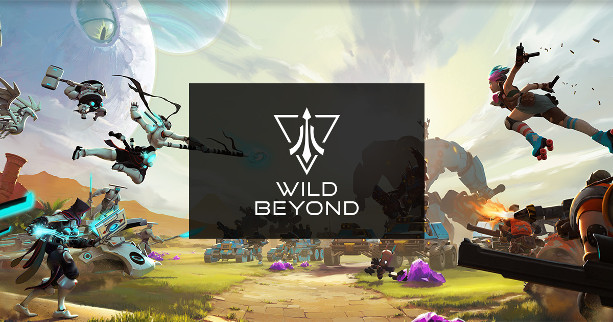
I want to give this game as an example of good work on the responsiveness of the interface, in general, transitions from element to element are clear and enjoyable, accents are placed, all pressings are accompanied by sounds and additional animation. Despite the fact that the project is similar to the indie project of a small team, it is very well designed, for secondary animations everything is also very good, but more on that later.
It would seem that everything is obvious, and it seems to be easily respected, but no, even very good games suffer from the fact that they do not have a responsive interface, a vivid example for me -
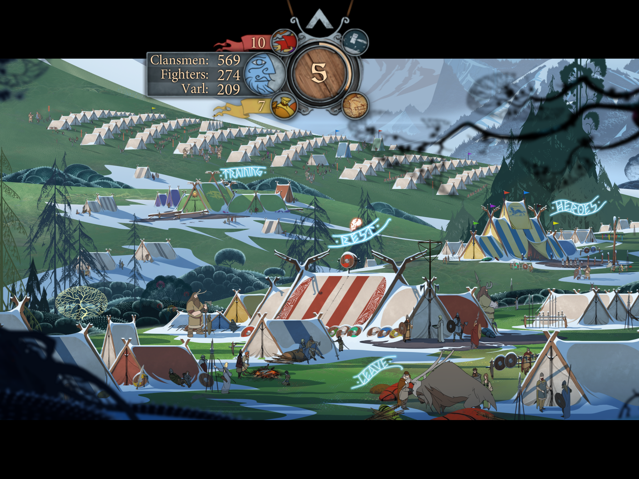
This is exactly the case when the second development layer for mobile phones was either absent or was done according to the residual principle. The banner of the saga is not at all obvious and it’s not clear where to click, which elements are interactive, which ones you’ve waited for, the reaction to pressing the minor is too fast. I clicked on one tent that something happened, on the second - nothing, where is the obvious difference for the user? If you look closely, you can notice the inscriptions above the objects, but they have no accent. I do not feel control, it is not responsive to me. And it’s clear that the problem is that this game is also for PC, and let's say you can mouse over an object on a PC and it will highlight, thus giving me the necessary hint, in this case even a minor visual reaction will give me that very responsiveness. But this does not work on mobile phones.

Here is a striking example of an overloaded interface, in which nevertheless there is a cascade of accents, and in addition to the obvious interactive elements, it is also clear here that the game wants us to click first.
Therefore, I derived a few rules:
Suppose you have a camp in the game as in a banner saga. It has several active objects and heroes. IMHO the best solution is to duplicate interactive objects with individual icons on the screen, or add mini icons + backlight to each interactive object. If you do not want to break the entourage, then as an option you can leave only interactive objects on the screen, the rest either remove or make them as background / secondary as possible. Thus, the user will not have questions about where to reap, he will understand that everything in this picture is interactive.
look from 9.30, unfortunately the timestamp for some reason does not work = (.
If you look closely, in addition to obvious things, there’s even a tap indicator (circles diverge from the place of the wheelbarrow), I'm not sure that it is directly necessary, but even in this oversaturated interface, for example, I don’t have any questions - where and how to click, and where I generally I click and clicked. From the advantages of the tapa indicator - you understand that if some element does not respond, but the tap was definitely there, then it is not interactive, or inaccessible.
I hope I have expanded this topic enough, I also want to add that a responsive interface is not only UI. This applies to all elements of the game, the user should understand that his action takes place in the right direction and produces the necessary effect, for example, flying blood from enemies when hit, accompanied by sound, heelsbar, etc., these are also elements of a responsive interface.
This term came from classical animation, in short, these are additional animations that are designed to emphasize the main animation. I want to say right away that secondary animations, for example, in the UI are very rare. Although in my opinion they give a very strong sense of responsiveness of the interface. Of the last good examples, this is just the game Match Land, whose video was higher. If you look closely, the change of interfaces and their elements occurs with the participation of secondary animations, the background is assembled from the elements and falls into place, the chests bounce, the panels and buttons spring. When I look at such a level of elaboration that even large studios don’t have, I understand that the animator did this with love and put his soul into it. I have no data on how secondary animation affects user perception. But I can say for sure that it definitely doesn’t cause rejection, and if we take a historical perspective, secondary animations were massively used by none other than Walt Disney, and we all know whether this led to success or not).
After that, I want to say that secondary animations improve the sensation not only from the UI, but also from the characters, etc. It is due to them that one character can watch at times more lively than another. But if in the case of characters an experienced animator tries to use them, then the UI is often past the checkout precisely because of the second layer.
This is perhaps the most difficult and controversial / subjective point. I will try to reveal it as accessible as possible, there are certain player expectations associated with the genre and visual style implemented in the game.
For example:
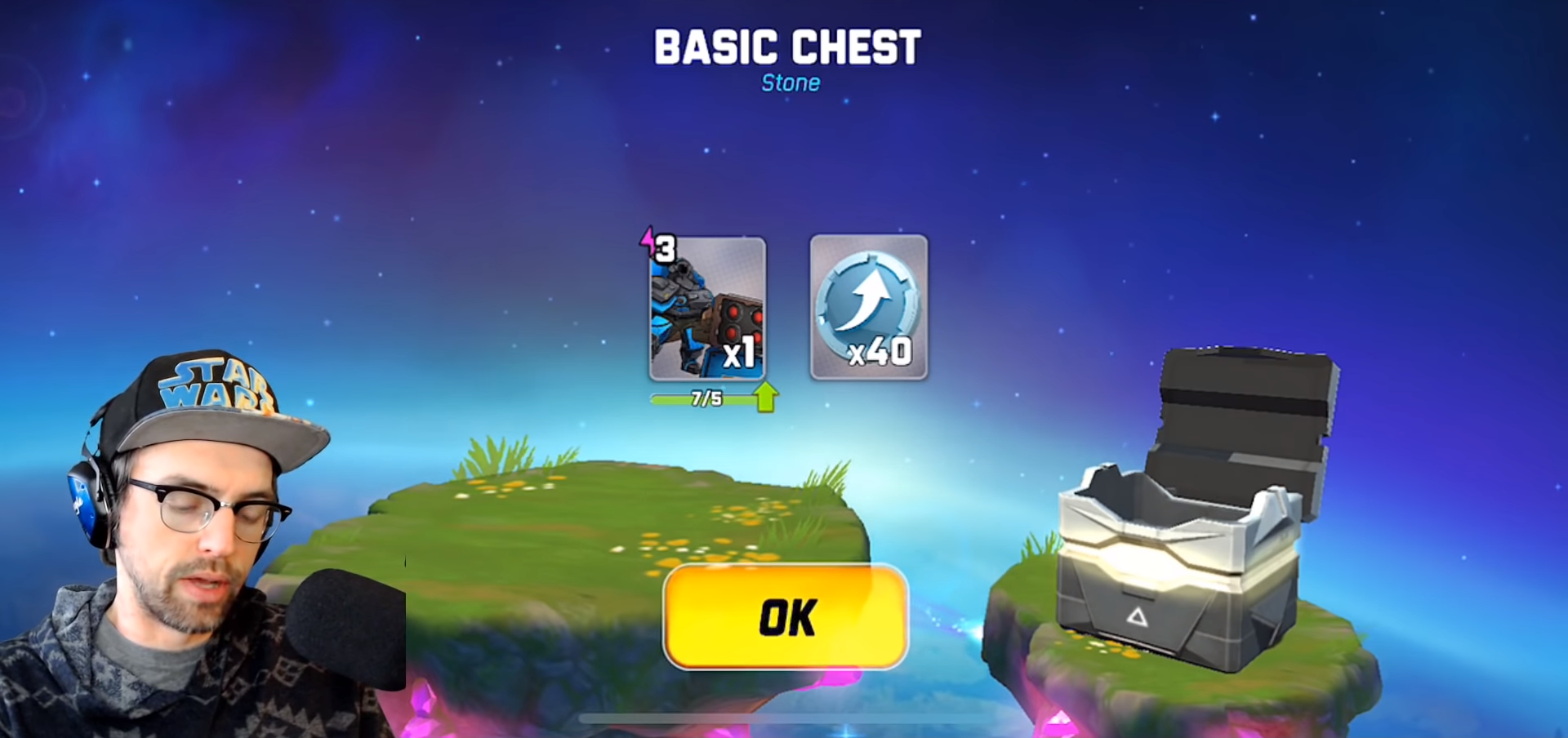
This is a screenshot from the video above, also after 9.30, and this is about opening the chest. Specifically, in this game, the opening of the chest really surprised me how well the project was done and how slurred this part was done, first of all because of some lags the chest often teleports to the right (sometimes jumps), then some yellow crap flies out of it (often because of it’s not visible), and suddenly the contents of the chest appear in the center of the screen. It looks very strange, and these are the moments I call a violation of visual logic when you expect it to open the chest and get some loot from there, and you get some kind of jerking and teleportation. Do not do it this way ). Violations of visual logic also include those episodes when we perform some action, but there are no signs that it happened, there is no audiovisual series of events accompanying. Again, this often happens in connection with the residual principle, and is fixed later.
The second layer of development is actually an objective reality, and it is necessary to lay on it initially. You can draw a very beautiful UI, think over the little things of ergonomics to make it convenient for the user, lay on the UX, and as a result, the interface will be dead, or the competitor's interface will be much more attractive than yours. If you are an indie developer, keep in mind that you need to breathe life, if you are an experienced developer, make a correction in the pipeline. I am for comfortable, beautiful and enjoyable games :)
What will be in this article?
I want to reveal the following points on concrete examples:
- Why a second development layer?
- Interface Responsiveness
- Microanimation
- Visual logic
Consider an example including this project
Why is the second layer of development?
Conditional development goes through several stages - pre-production (with luck), prototype, PoC (optional), alpha, beta, release.
At each stage, new mechanics are added, bugs are fixed, everything is done to please the core gameplay. UI is also made and tested, the store is imported as the core of the project, etc. etc. All sorts of things like interface animations, voice acting, localization and additional animations / animation and / or sound elements are left for later. When it comes later, they do it in a hurry and try to catch the maximum for release, but everything is done according to the residual principle and is often considered not important, well, there is no animation at the interface, well, nothing will be tolerated, the main game is ready and fire, and we’ll finish everything else. This is all that is left for later and what is essentially polishing / finishing, which I call the second development layer, since this is already development after development. Because initially, before the game was formed / settled down, it makes no sense to do it, and when the release is already there is no time to do it.
For me, the quality / presence of the second layer just indicates how much the developer as a whole is professional, since in small indie games the second layer is generally scored, medium-sized developers are not working well enough, and large ones are missed. And this is a very important point, the importance of which is greatly underestimated.
Interface Responsiveness
If you google the responsiveness of the interface, then the first question will be about the speed of the interface's response to user actions. For games and not only, I would expand this concept, and formulate it as follows - a responsive interface, this is such an interface in which the user understands what can be pressed, the emphasis on the interactive elements that he pressed at the moment and an understandable, quick reaction to user actions .
I want to give this game as an example of good work on the responsiveness of the interface, in general, transitions from element to element are clear and enjoyable, accents are placed, all pressings are accompanied by sounds and additional animation. Despite the fact that the project is similar to the indie project of a small team, it is very well designed, for secondary animations everything is also very good, but more on that later.
It would seem that everything is obvious, and it seems to be easily respected, but no, even very good games suffer from the fact that they do not have a responsive interface, a vivid example for me -
Saga banner
This is exactly the case when the second development layer for mobile phones was either absent or was done according to the residual principle. The banner of the saga is not at all obvious and it’s not clear where to click, which elements are interactive, which ones you’ve waited for, the reaction to pressing the minor is too fast. I clicked on one tent that something happened, on the second - nothing, where is the obvious difference for the user? If you look closely, you can notice the inscriptions above the objects, but they have no accent. I do not feel control, it is not responsive to me. And it’s clear that the problem is that this game is also for PC, and let's say you can mouse over an object on a PC and it will highlight, thus giving me the necessary hint, in this case even a minor visual reaction will give me that very responsiveness. But this does not work on mobile phones.
How it works on mobile phones
Here is a striking example of an overloaded interface, in which nevertheless there is a cascade of accents, and in addition to the obvious interactive elements, it is also clear here that the game wants us to click first.
Therefore, I derived a few rules:
- Interactive elements should be emphasized by color, effect, light, animation. Additional mini icons (exclamation mark, asterisk, etc.) are also possible.
- Emphasis can be placed by the intensity / presence of elements.
- Compression of the elements should be accompanied by sound, visual effect / highlighting, including a change in shape, it should be obvious that the element is pressed, as a result, some animated callbacks are needed, when the button action should occur after the animation.
Suppose you have a camp in the game as in a banner saga. It has several active objects and heroes. IMHO the best solution is to duplicate interactive objects with individual icons on the screen, or add mini icons + backlight to each interactive object. If you do not want to break the entourage, then as an option you can leave only interactive objects on the screen, the rest either remove or make them as background / secondary as possible. Thus, the user will not have questions about where to reap, he will understand that everything in this picture is interactive.
A good example of responsiveness of the interface
look from 9.30, unfortunately the timestamp for some reason does not work = (.
If you look closely, in addition to obvious things, there’s even a tap indicator (circles diverge from the place of the wheelbarrow), I'm not sure that it is directly necessary, but even in this oversaturated interface, for example, I don’t have any questions - where and how to click, and where I generally I click and clicked. From the advantages of the tapa indicator - you understand that if some element does not respond, but the tap was definitely there, then it is not interactive, or inaccessible.
I hope I have expanded this topic enough, I also want to add that a responsive interface is not only UI. This applies to all elements of the game, the user should understand that his action takes place in the right direction and produces the necessary effect, for example, flying blood from enemies when hit, accompanied by sound, heelsbar, etc., these are also elements of a responsive interface.
Secondary / Micro Animations
This term came from classical animation, in short, these are additional animations that are designed to emphasize the main animation. I want to say right away that secondary animations, for example, in the UI are very rare. Although in my opinion they give a very strong sense of responsiveness of the interface. Of the last good examples, this is just the game Match Land, whose video was higher. If you look closely, the change of interfaces and their elements occurs with the participation of secondary animations, the background is assembled from the elements and falls into place, the chests bounce, the panels and buttons spring. When I look at such a level of elaboration that even large studios don’t have, I understand that the animator did this with love and put his soul into it. I have no data on how secondary animation affects user perception. But I can say for sure that it definitely doesn’t cause rejection, and if we take a historical perspective, secondary animations were massively used by none other than Walt Disney, and we all know whether this led to success or not).
After that, I want to say that secondary animations improve the sensation not only from the UI, but also from the characters, etc. It is due to them that one character can watch at times more lively than another. But if in the case of characters an experienced animator tries to use them, then the UI is often past the checkout precisely because of the second layer.
Visual logic
This is perhaps the most difficult and controversial / subjective point. I will try to reveal it as accessible as possible, there are certain player expectations associated with the genre and visual style implemented in the game.
For example:
This is a screenshot from the video above, also after 9.30, and this is about opening the chest. Specifically, in this game, the opening of the chest really surprised me how well the project was done and how slurred this part was done, first of all because of some lags the chest often teleports to the right (sometimes jumps), then some yellow crap flies out of it (often because of it’s not visible), and suddenly the contents of the chest appear in the center of the screen. It looks very strange, and these are the moments I call a violation of visual logic when you expect it to open the chest and get some loot from there, and you get some kind of jerking and teleportation. Do not do it this way ). Violations of visual logic also include those episodes when we perform some action, but there are no signs that it happened, there is no audiovisual series of events accompanying. Again, this often happens in connection with the residual principle, and is fixed later.
Summary and meaning
The second layer of development is actually an objective reality, and it is necessary to lay on it initially. You can draw a very beautiful UI, think over the little things of ergonomics to make it convenient for the user, lay on the UX, and as a result, the interface will be dead, or the competitor's interface will be much more attractive than yours. If you are an indie developer, keep in mind that you need to breathe life, if you are an experienced developer, make a correction in the pipeline. I am for comfortable, beautiful and enjoyable games :)
All Articles