Audit and testing of letters: what you should pay attention to while layout
Hello, Habr!
The code does not tolerate negligence, whether it be complex data processing algorithms or layout of email newsletters.
Having received a letter from one of the major retailers, our head of the layout department noticed that some elements are uneven. The professional instinct did not allow us to simply pass by, and, since the store is not among our customers, he decided to check it out according to our layout quality control process. Ilya Kasterin ikasterin , head of the layout department at Retail Rocket, tells about the results and how to see problems in the display at the development stage of the newsletter.
The display of letters is important for online stores, as many of them communicate with customers primarily through email. The less attractive the newsletter, the more unsubscribes and fewer orders.
You may argue: “If a store sells quality products at an affordable price, then mailings are not that important.” Yes it's true. However, the prices for the most popular positions are the same everywhere, plus or minus, and the goods themselves are often purchased from one manufacturer. This is especially true for online hypermarkets and partly an assortment of marketplaces. So it turns out that decides the quality of service, excellent work in email communications and marketing in general. And if someone doesn’t care that the text may be crooked or the line spacing is not the same, another buyer will think that such shortcomings can be in the store’s service or the quality of the product, and change the opinion of the store for the worse.
Retail Rocket is a personalization platform for online stores that helps retailers build personal communications with each customer on the site and in the email channel. The personalized email marketing platform includes mailings of any kind and complexity: from trigger emails to the formation of smart automated campaigns with dynamic content.
Many retailers choose our platform because of the high level of service and support that we provide through a clearly calibrated work process. At the moment, the layout department has reached (and is not going to stop) the following indicators:
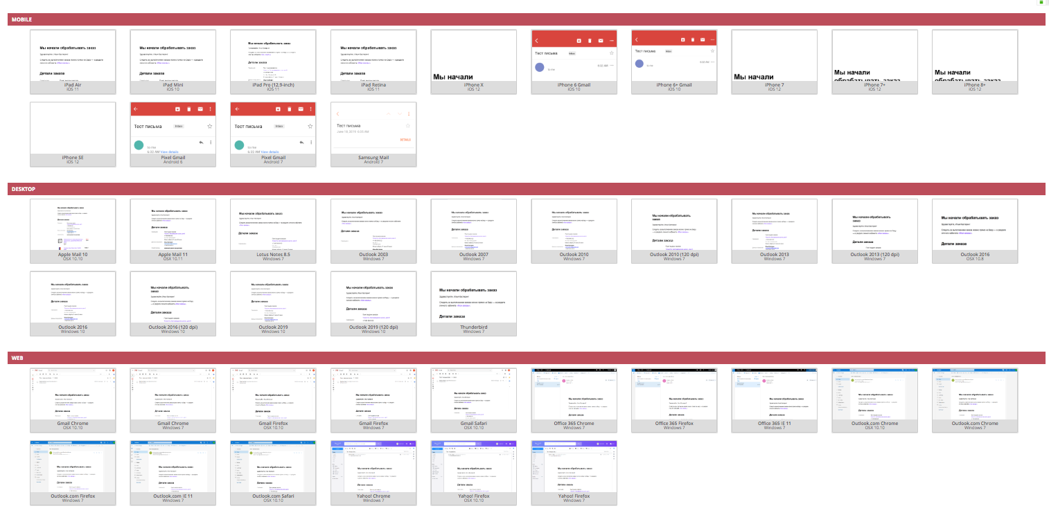
This result was obtained not least with the help of a streamlined work process, for which Retail Rocket uses kanban boards in Trello:

One of the boards of the layout department
With the help of kanban boards, the whole team controls the task and sees the difficulties if they appear. The whole layout process is as follows:
Before showing what problems may arise during layout, I want to emphasize that no concrete solutions will be indicated, except for one thing: to remake the letter from scratch. If you have several stages with a review, then finding and fixing errors will be simple. Here are some more tips to help you improve your work:
Let's get back to the audit. We tested the received letter on several email clients after placing an order for a large retailer according to Retail Rocket standards.
Let's start by looking at the display of letters on the desktop. Try to find the layout errors in it yourself:

At first glance, the letter is pretty well laid out, but this is because the main errors are visible when you open the letter on mobile devices. Although here you can see several flaws.
Many retailers are limited to checking on the desktop and are satisfied with the results. But more than half of the letters open on mobile. That is why the testing process on the largest possible number of different devices and email clients is so important.
Consider the errors and drawbacks of the layout in more detail.
Absolutely in all email clients text blocks are displayed incorrectly with the price, quantity and properties of the product, such as incorrect hyphenation or a disproportionate font in relation to the picture, but most often there are problems with indentation.
This can be clearly seen in the example below: in one product card, the display is correct, and in the one below, the text is at different levels:
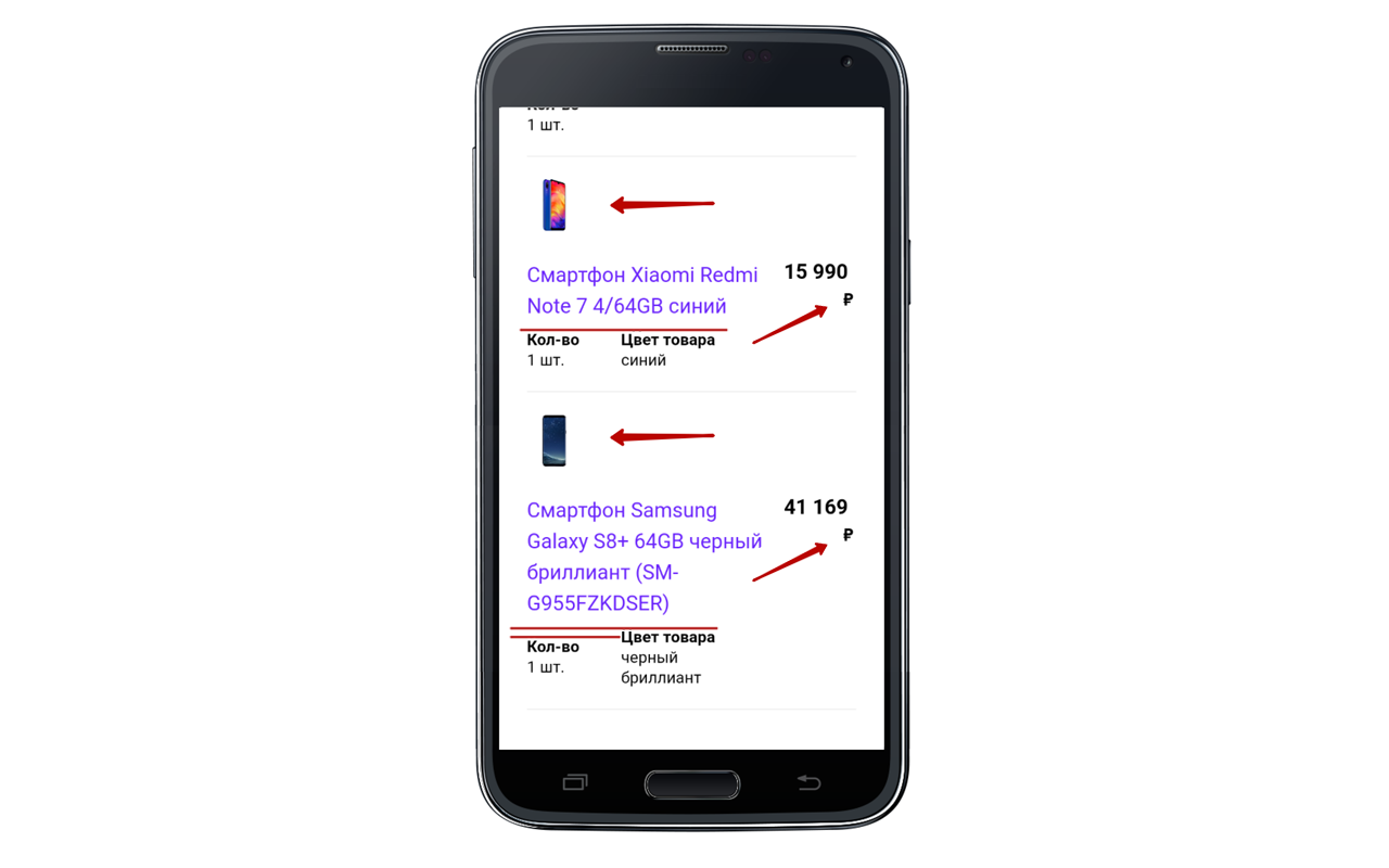
The product image is too small relative to the text and against this background, the font seems huge. The ruble symbol is also transferred, which does not look very beautiful.
It is worth noting: the price and name of the product are at different levels, the same problem with the parameters of the product under the name.
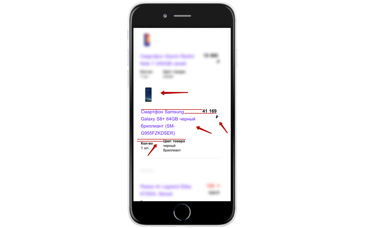
There are no problems with displaying the price, but, like in the previous example, the product image and text look too small and large, respectively. The price and name also vary in height, the same applies to the parameters.
These problems recur in Gmail on the iPhone 7 iPhone 7+ and iPhone SE.
The letter does not adapt to the screen size, without approximation it will be difficult to consider the details of the order.
Yes, some buyers still use these mailers and therefore they cannot be ignored. In our case, both in Lotus Notes 8.5 and in Outlook 2003, the letter fell apart due to the gigantic size of the pictures.
All images in the letter must be the maximum size. In this particular case, it is 90px high and wide.

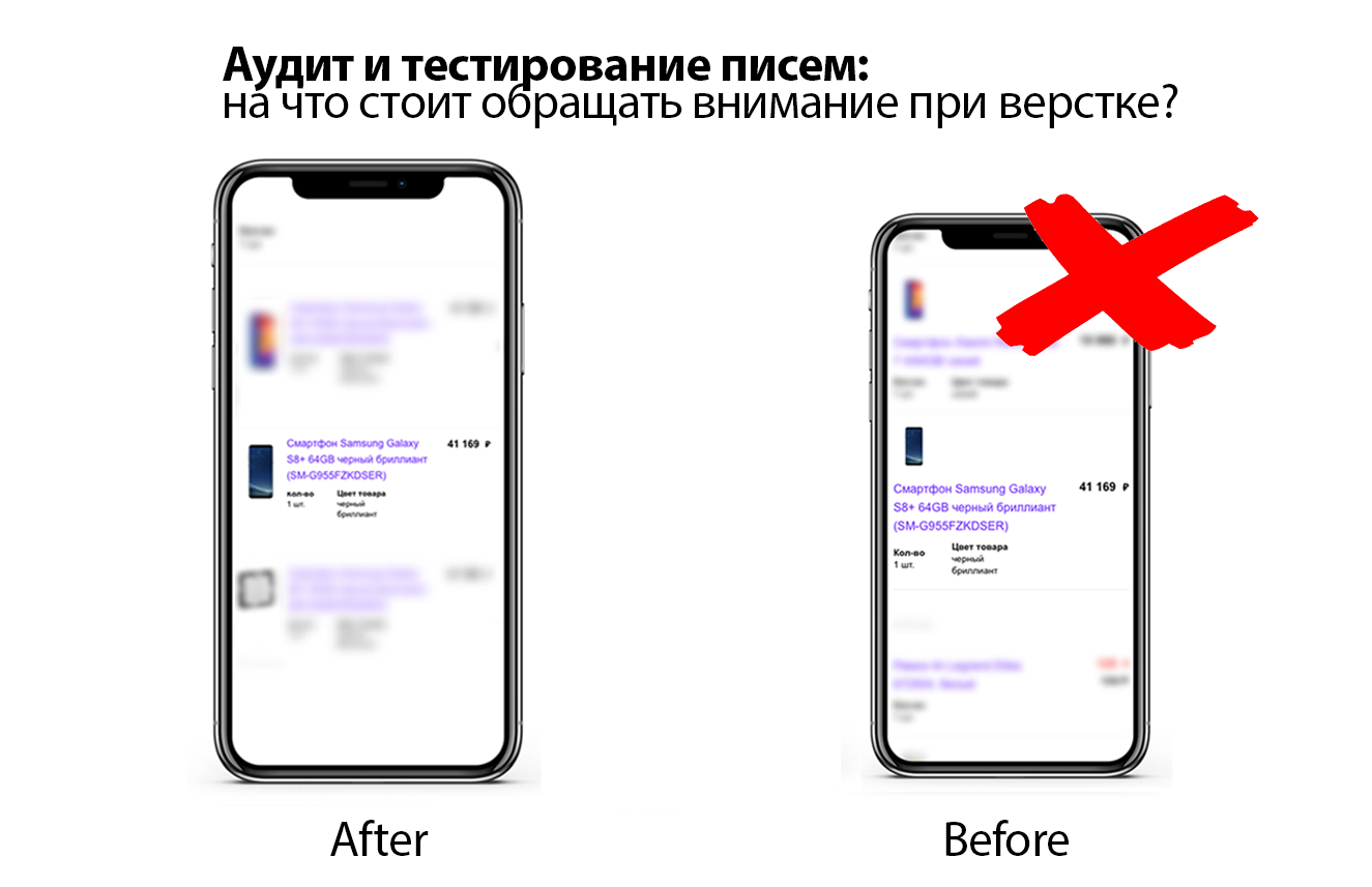
Buyers are not always aware that there are problems with spacing or font ratio in the newsletter, but this definitely affects how the message is perceived as a whole. Unfortunately, not all retailers take this into account. The letter would look something like this if it went through our layout process:
Our mission is to increase sales of online stores, so we openly share our methods of work and show how to avoid mistakes. Thorough testing could identify all display problems and fix them in time.
Perhaps the letter after completing the order is not the most remarkable, but if there are so many drawbacks in such a simple structure, then what is the likelihood that mass mailings with various design elements will be perfectly made up?
What do you think about this? We are waiting for your answers and will gladly discuss the topic.
The code does not tolerate negligence, whether it be complex data processing algorithms or layout of email newsletters.
Having received a letter from one of the major retailers, our head of the layout department noticed that some elements are uneven. The professional instinct did not allow us to simply pass by, and, since the store is not among our customers, he decided to check it out according to our layout quality control process. Ilya Kasterin ikasterin , head of the layout department at Retail Rocket, tells about the results and how to see problems in the display at the development stage of the newsletter.
For whom and why it is important
The display of letters is important for online stores, as many of them communicate with customers primarily through email. The less attractive the newsletter, the more unsubscribes and fewer orders.
You may argue: “If a store sells quality products at an affordable price, then mailings are not that important.” Yes it's true. However, the prices for the most popular positions are the same everywhere, plus or minus, and the goods themselves are often purchased from one manufacturer. This is especially true for online hypermarkets and partly an assortment of marketplaces. So it turns out that decides the quality of service, excellent work in email communications and marketing in general. And if someone doesn’t care that the text may be crooked or the line spacing is not the same, another buyer will think that such shortcomings can be in the store’s service or the quality of the product, and change the opinion of the store for the worse.
How to organize the work process to minimize errors?
Retail Rocket is a personalization platform for online stores that helps retailers build personal communications with each customer on the site and in the email channel. The personalized email marketing platform includes mailings of any kind and complexity: from trigger emails to the formation of smart automated campaigns with dynamic content.
Many retailers choose our platform because of the high level of service and support that we provide through a clearly calibrated work process. At the moment, the layout department has reached (and is not going to stop) the following indicators:
- In one working day, specialists perform an average of 18.1 tasks. This includes both refinement of existing mailings, and imposition from scratch of a couple of dozen trigger campaigns or blocks with complex logic and many scripts for displaying to different user segments;
- The average time for completing a task is less than two business days (in most cases, everything will be ready on the day the task is set);
- The probability of incorrect display of letters from our customers is practically zero.
This result was obtained not least with the help of a streamlined work process, for which Retail Rocket uses kanban boards in Trello:
One of the boards of the layout department
With the help of kanban boards, the whole team controls the task and sees the difficulties if they appear. The whole layout process is as follows:
- Collection of information: layouts, texts, links, banners and other information from the store. It is necessary to get all the necessary introductory as much as possible so that some edits do not appear at the stages of layout and testing, because there something will change more resource-intensively.
- Layout The basis is a universal basic template, which includes all the achievements and "chips" of the company, which can be used in the design of letters (about them, alas, not today);
- Testing. Using specialized tools, letters are checked on almost all email clients, sometimes we even check some points on real devices with Android and iOS;
- Testing again. Additional verification of the display and code of all letters personally by the head of the layout department and the project manager of all letters;
- Mission accomplished. Ready letters are sent to the task manager.
Audit letter
Before showing what problems may arise during layout, I want to emphasize that no concrete solutions will be indicated, except for one thing: to remake the letter from scratch. If you have several stages with a review, then finding and fixing errors will be simple. Here are some more tips to help you improve your work:
- Planning a process for quality control of layout. Brainstorm with colleagues and based on your experience, draw up a testing and layout methodology that will be supplemented. This will greatly facilitate work in the future, especially with new employees;
- In the process of testing each letter. Try to break the task down into blocks, where at each stage there will be quality control;
- Please note: in order for the letter to be pleasing to the eye, it is necessary to monitor the ratio of the size of fonts, images, as well as intervals and hyphenation. It sounds simple, but below you will see that incorrect display is not always obvious;
- Support innovation. Try to introduce new chips into the work. Until recently, my colleagues and I laughed at requests to insert a slider in a letter, but AMP appeared and soon such tricks will become a must have.
Let's get back to the audit. We tested the received letter on several email clients after placing an order for a large retailer according to Retail Rocket standards.
Let's start by looking at the display of letters on the desktop. Try to find the layout errors in it yourself:
At first glance, the letter is pretty well laid out, but this is because the main errors are visible when you open the letter on mobile devices. Although here you can see several flaws.
Many retailers are limited to checking on the desktop and are satisfied with the results. But more than half of the letters open on mobile. That is why the testing process on the largest possible number of different devices and email clients is so important.
Consider the errors and drawbacks of the layout in more detail.
A common flaw in all letters
Absolutely in all email clients text blocks are displayed incorrectly with the price, quantity and properties of the product, such as incorrect hyphenation or a disproportionate font in relation to the picture, but most often there are problems with indentation.
This can be clearly seen in the example below: in one product card, the display is correct, and in the one below, the text is at different levels:
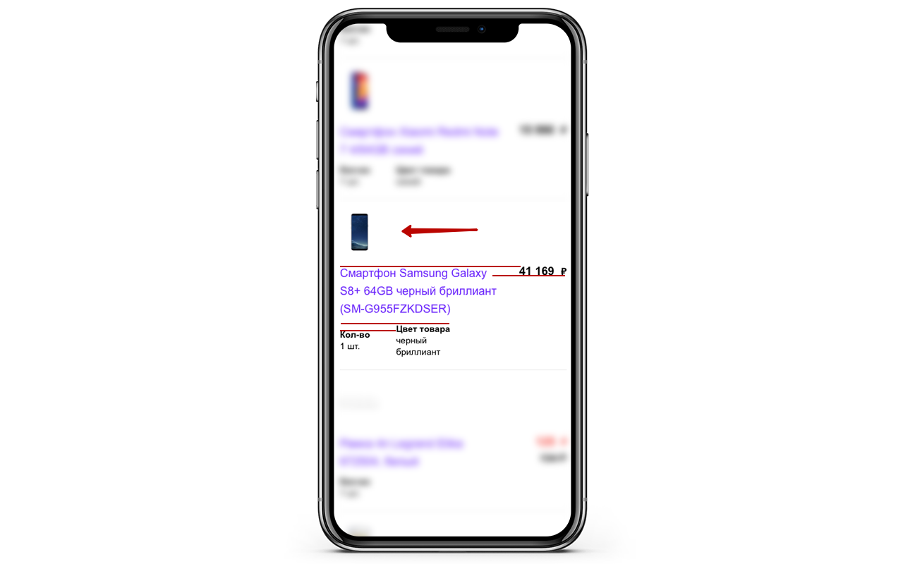
Display on iPhone 6 and iPhone 6+
The product image is too small relative to the text and against this background, the font seems huge. The ruble symbol is also transferred, which does not look very beautiful.
It is worth noting: the price and name of the product are at different levels, the same problem with the parameters of the product under the name.
Display on iPhone X and Pixel
There are no problems with displaying the price, but, like in the previous example, the product image and text look too small and large, respectively. The price and name also vary in height, the same applies to the parameters.
These problems recur in Gmail on the iPhone 7 iPhone 7+ and iPhone SE.
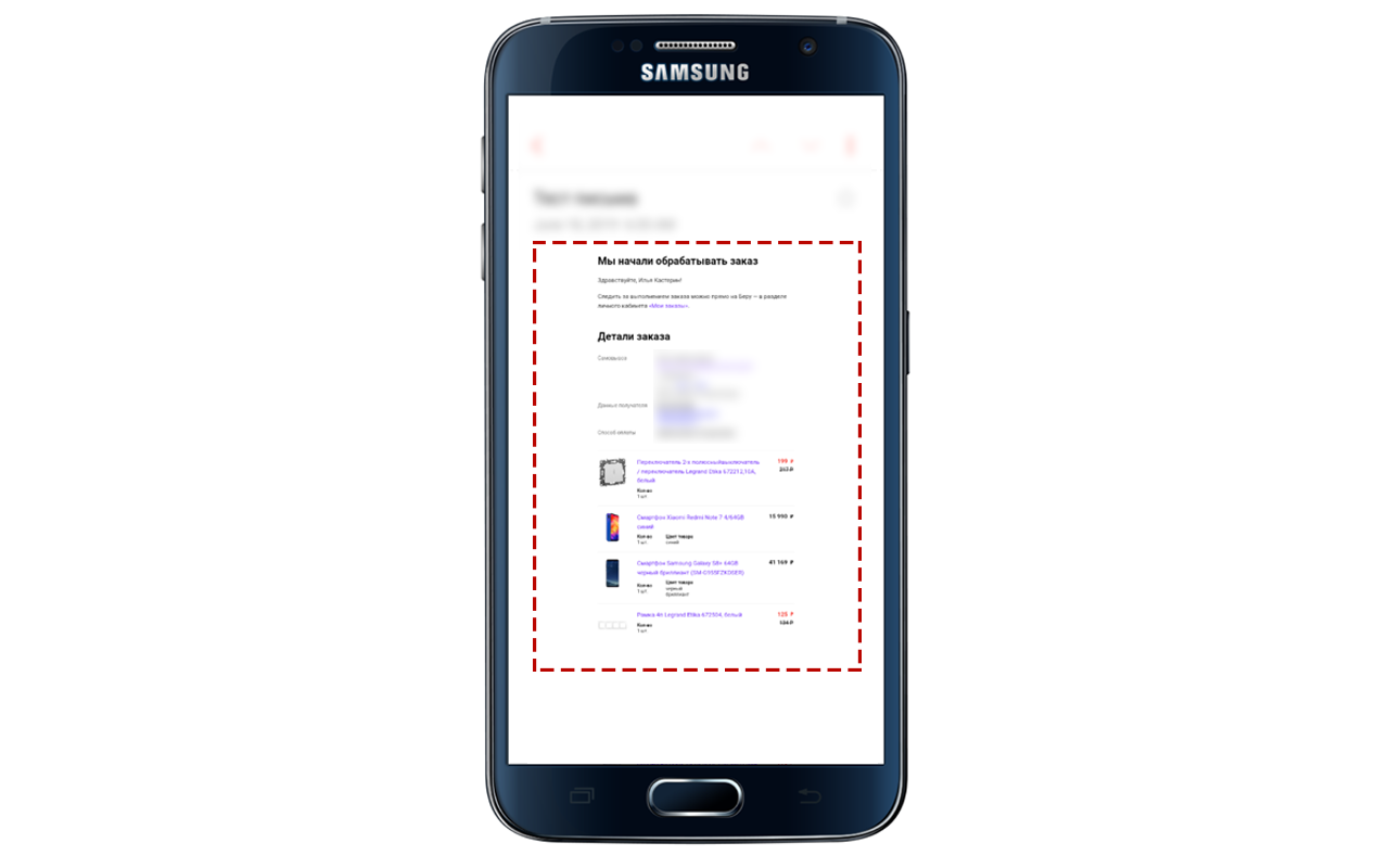
Display on Samsung Mail
The letter does not adapt to the screen size, without approximation it will be difficult to consider the details of the order.
Mapping on Lotus Notes 8.5 and Outlook 2003
Yes, some buyers still use these mailers and therefore they cannot be ignored. In our case, both in Lotus Notes 8.5 and in Outlook 2003, the letter fell apart due to the gigantic size of the pictures.
All images in the letter must be the maximum size. In this particular case, it is 90px high and wide.
Summary
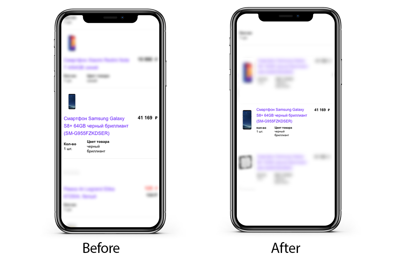
Buyers are not always aware that there are problems with spacing or font ratio in the newsletter, but this definitely affects how the message is perceived as a whole. Unfortunately, not all retailers take this into account. The letter would look something like this if it went through our layout process:
Our mission is to increase sales of online stores, so we openly share our methods of work and show how to avoid mistakes. Thorough testing could identify all display problems and fix them in time.
Perhaps the letter after completing the order is not the most remarkable, but if there are so many drawbacks in such a simple structure, then what is the likelihood that mass mailings with various design elements will be perfectly made up?
What do you think about this? We are waiting for your answers and will gladly discuss the topic.
All Articles