Development of a game interface for various proportions of screens
It is no secret that the developer of mobile applications must take into account the variety of displays that are used in smartphones and tablets. There are different approaches to solving this problem for the correct display of mobile application interfaces on screens of different resolutions and proportions.
I want to bring to your attention my trip, which I use when developing game applications in landscape orientation.
If you look at the trend of recent years, manufacturers of smartphones choose screens for their models, then it is easy to notice the desire to increase the height of displays. This has its own rational kernel. It becomes much more comfortable for users to work with many applications in portrait orientation, it’s more convenient to browse sites. Thanks to the elongated screen, much more information is placed on it and the need for frequent scrolling of content up or down is reduced.
But there is a fairly large category of applications requiring landscape orientation of the screen, for example, many gaming applications. In this case, additional efforts should be made so that the game looks correctly on screens with different proportions.
Currently, probably the most common display format is 16: 9, but it is not the only one. There are many models on the market that use screens with an aspect ratio of 18: 9, Apple's new products are equipped with 19.5: 9 displays. But this is not the limit, at the beginning of the year, Sony introduced a smartphone with a 21: 9 screen. And just recently, the Chinese company Xaiomi announced a new product with a 22.5: 9 screen. At the same time, one cannot discount the presence of a large number of tablet models with 4: 3 screens. If the latter format is presented as 12: 9, then it is easy to notice an interesting feature: in landscape orientation, the height of the screens of different proportions is a multiple of 9, and their horizontal ratio can differ almost by half.

In search of an optimal solution to this problem, I came across a proposal to place the main game elements in the area corresponding to the screen of the smallest relative width in landscape orientation. It is clear that with this approach, you should focus on the 4: 3 format. When starting the game on smartphones with other display formats, it was proposed to fill in additional space with a background image.
This approach is quite reasonable, but only with a small difference in the proportions of the screens. For example, if the game was created for a 16: 9 screen, then for the 18: 9 display this will work. But already in the cases of, say, 22.5: 9 and 4: 3 hardly.
I also met with a proposal to use a “rubber” layout, in which the sizes of game elements are adapted to the sizes of displays. But this is also not an option, in many cases the shape of such elements will become distorted.
After a series of experiments, I found for myself an approach that works great in practice. It is possible I invented the “bicycle”, but I could not find it.
I repeat, the solution I propose was developed for specific tasks and not the fact that it is universal.
The game Leaping Dodgem , which I did using the LibGDX framework , uses the orthogonal projection of the camera to the center of the screen. Therefore, it was decided to use this point as a single reference point when placing all the game elements. But this is not a dogma, some elements were tied to the borders of the screens, so it turned out to be more convenient and gave better visual results.
During the development, the widely used 16: 9 format with a resolution of 1920 × 1080 was chosen as the base size of the game screen. Most game elements are positioned relative to the center of the screen in relative indentation with plus and minus signs.
The figure schematically depicts the principle of such placement by the example of two buttons for controlling the game process and a label with a fixed position.
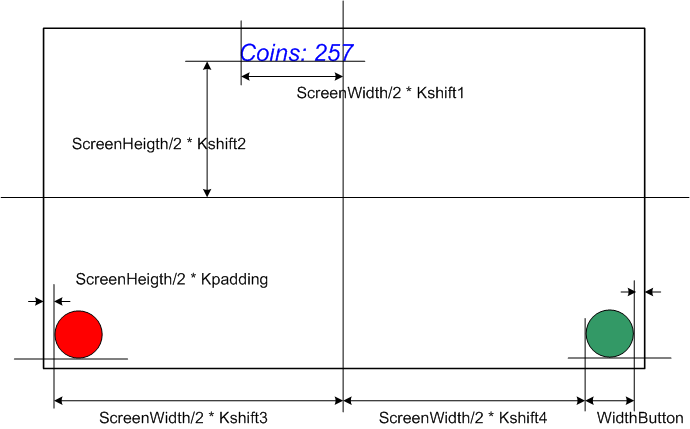
But the proposed method is only a principle; in practice, such an approach is not always justified. Alternatively, you can unify the selection of coefficients of relative indentation by setting predefined constants. Let's say we want the edges of the buttons to not reach the borders of the screen at a distance of 5% of the width and height. If the formula remains unchanged for the left half of the screen, then the size of the button itself will need to be taken into account for the right.
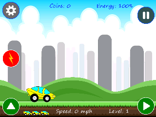
This approach made it possible to correctly place game elements on screens with different proportions. For example, screenshots of my game on different displays. For clarity, a 4: 3 screenshot was taken from an emulator of an ancient model with a 320x240 display.
In the first screenshot 4: 3, the artifact on the right side of the screen is specially left. The upper and lower right buttons were placed based on the coefficients of relative displacement from the center of the screen. As you can see, the top button "failed". This is due to the recalculation of the size of the original button image, taking into account the screen resolution. If you do not enter this coefficient, then the right edge of the buttons in this part of the screen will crawl out of it. But since the size of the button decreased, and the origin of its output remained unchanged, so it was visually “failed”.

In this screenshot, the problem is solved by using the coefficients of relative indentation from the borders of the screen.
Now a few screenshots for screens of different proportions

16: 9 ratio, 1920x1080 screen

18: 9 ratio, screen 28801440
19.5: 9 ratio 2688x1242 screen
The offset of the beginning of the output point of most game elements in the presented screenshots was carried out as described above, through relative indents from the center of the screen. But for the five control buttons had to do a little differently, so that they were always in their positions. A relative padding of Kpadding along the X and Y axes from the borders of the screen was set for them. Since the game was created for a basic resolution of 1920x1080, for the correct display on displays with a different resolution, a special scaling factor was calculated based on the actual screen size and basic resolution. This coefficient was taken into account when calculating the absolute displacements of game elements and their displayed sizes.
I hope this article helps beginner game developers and saves them a lot of time.
I want to bring to your attention my trip, which I use when developing game applications in landscape orientation.
If you look at the trend of recent years, manufacturers of smartphones choose screens for their models, then it is easy to notice the desire to increase the height of displays. This has its own rational kernel. It becomes much more comfortable for users to work with many applications in portrait orientation, it’s more convenient to browse sites. Thanks to the elongated screen, much more information is placed on it and the need for frequent scrolling of content up or down is reduced.
But there is a fairly large category of applications requiring landscape orientation of the screen, for example, many gaming applications. In this case, additional efforts should be made so that the game looks correctly on screens with different proportions.
Currently, probably the most common display format is 16: 9, but it is not the only one. There are many models on the market that use screens with an aspect ratio of 18: 9, Apple's new products are equipped with 19.5: 9 displays. But this is not the limit, at the beginning of the year, Sony introduced a smartphone with a 21: 9 screen. And just recently, the Chinese company Xaiomi announced a new product with a 22.5: 9 screen. At the same time, one cannot discount the presence of a large number of tablet models with 4: 3 screens. If the latter format is presented as 12: 9, then it is easy to notice an interesting feature: in landscape orientation, the height of the screens of different proportions is a multiple of 9, and their horizontal ratio can differ almost by half.
In search of an optimal solution to this problem, I came across a proposal to place the main game elements in the area corresponding to the screen of the smallest relative width in landscape orientation. It is clear that with this approach, you should focus on the 4: 3 format. When starting the game on smartphones with other display formats, it was proposed to fill in additional space with a background image.
This approach is quite reasonable, but only with a small difference in the proportions of the screens. For example, if the game was created for a 16: 9 screen, then for the 18: 9 display this will work. But already in the cases of, say, 22.5: 9 and 4: 3 hardly.
I also met with a proposal to use a “rubber” layout, in which the sizes of game elements are adapted to the sizes of displays. But this is also not an option, in many cases the shape of such elements will become distorted.
My approach to layout
After a series of experiments, I found for myself an approach that works great in practice. It is possible I invented the “bicycle”, but I could not find it.
I repeat, the solution I propose was developed for specific tasks and not the fact that it is universal.
The game Leaping Dodgem , which I did using the LibGDX framework , uses the orthogonal projection of the camera to the center of the screen. Therefore, it was decided to use this point as a single reference point when placing all the game elements. But this is not a dogma, some elements were tied to the borders of the screens, so it turned out to be more convenient and gave better visual results.
During the development, the widely used 16: 9 format with a resolution of 1920 × 1080 was chosen as the base size of the game screen. Most game elements are positioned relative to the center of the screen in relative indentation with plus and minus signs.
The figure schematically depicts the principle of such placement by the example of two buttons for controlling the game process and a label with a fixed position.
But the proposed method is only a principle; in practice, such an approach is not always justified. Alternatively, you can unify the selection of coefficients of relative indentation by setting predefined constants. Let's say we want the edges of the buttons to not reach the borders of the screen at a distance of 5% of the width and height. If the formula remains unchanged for the left half of the screen, then the size of the button itself will need to be taken into account for the right.
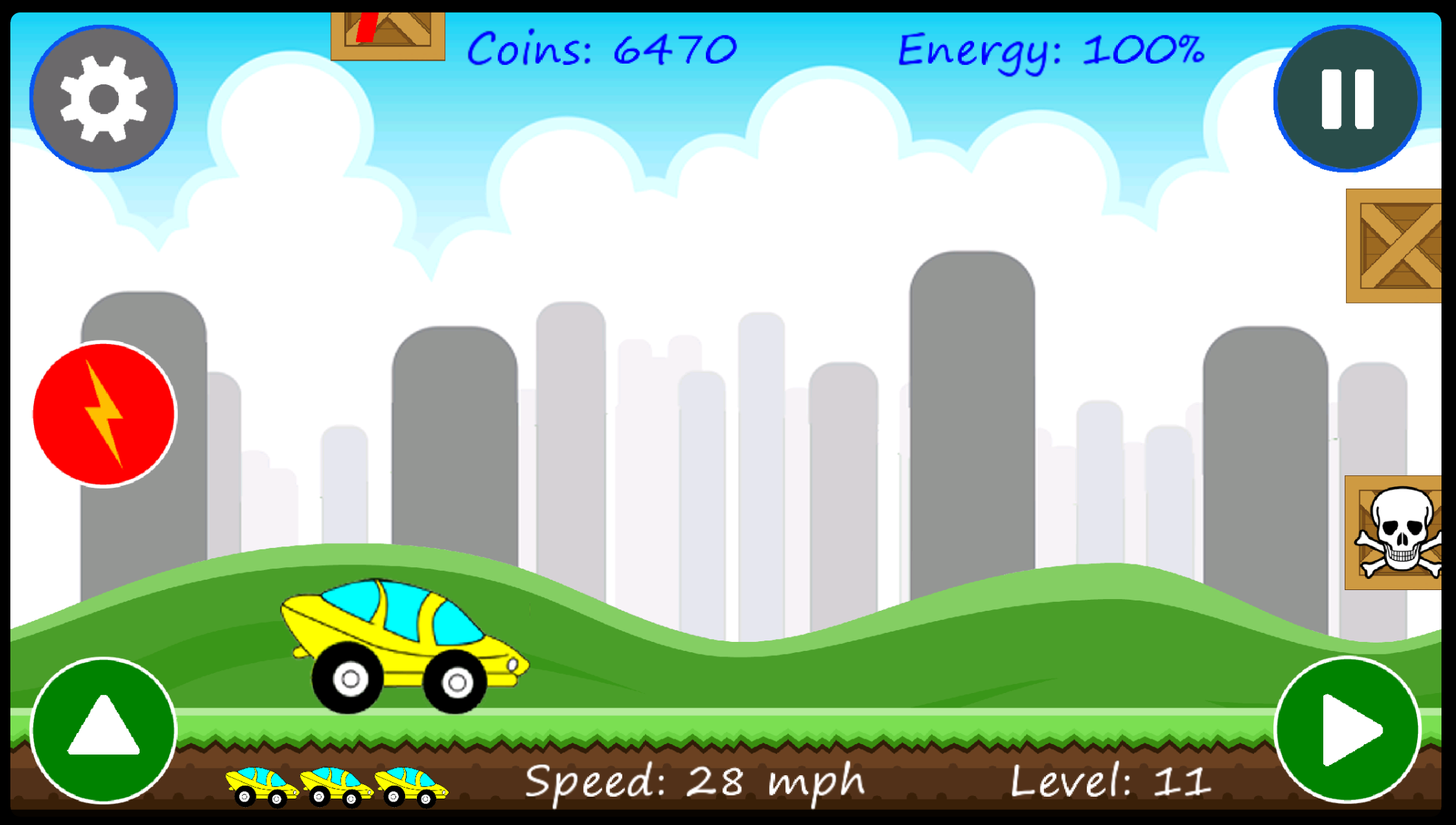
This approach made it possible to correctly place game elements on screens with different proportions. For example, screenshots of my game on different displays. For clarity, a 4: 3 screenshot was taken from an emulator of an ancient model with a 320x240 display.
In the first screenshot 4: 3, the artifact on the right side of the screen is specially left. The upper and lower right buttons were placed based on the coefficients of relative displacement from the center of the screen. As you can see, the top button "failed". This is due to the recalculation of the size of the original button image, taking into account the screen resolution. If you do not enter this coefficient, then the right edge of the buttons in this part of the screen will crawl out of it. But since the size of the button decreased, and the origin of its output remained unchanged, so it was visually “failed”.
In this screenshot, the problem is solved by using the coefficients of relative indentation from the borders of the screen.
Now a few screenshots for screens of different proportions
16: 9 ratio, 1920x1080 screen
18: 9 ratio, screen 28801440
19.5: 9 ratio 2688x1242 screen
The offset of the beginning of the output point of most game elements in the presented screenshots was carried out as described above, through relative indents from the center of the screen. But for the five control buttons had to do a little differently, so that they were always in their positions. A relative padding of Kpadding along the X and Y axes from the borders of the screen was set for them. Since the game was created for a basic resolution of 1920x1080, for the correct display on displays with a different resolution, a special scaling factor was calculated based on the actual screen size and basic resolution. This coefficient was taken into account when calculating the absolute displacements of game elements and their displayed sizes.
I hope this article helps beginner game developers and saves them a lot of time.
All Articles