
前のパートで既存のコントロールを拡張および変更する手段に慣れてきたので、このシリーズの記事で最も興味深いトピックである新しいコントロールの作成に取り組みます。
パート3.新しいコントロールの作成
添付プロパティとビヘイビアにより、既存のコントロールをその内部構造に干渉することなく拡張できます。 テンプレートのレイアウトを使用して、外観と視覚状態の作業( VisualState )を変更することもできます 。 ただし、既存のコントロールのロジックを変更または拡張する場合、または新しいコントロールを作成する場合でも、コードレベル( ControlName.cs )に移動する必要があります。
既存のコントロールに基づいて新しいコントロールを作成する
この項目は、 前のパートで詳しく説明したコントロールテンプレートの変更のテーマから、独自のコントロールの作成のトピックへのスムーズな移行です。 その一環として、前述の資料を活用し、既存のコントロールのロジックを拡張します。
ロジックの拡張は、既存のコントロールに基づいて新しいコントロールを作成することにより実現されます。 これにより、依存関係のすべてのプロパティを操作する既に実装されているロジックを完全に採用できるため、このコントロール要素で利用可能な機能を再作成する必要がなくなります。
入力検証機能を備えた登録入力フィールドを開発する必要があるとします。 この問題を解決するには、 TextBoxコントロールが基礎として最適です。
次のように拡張します。
- 指定された正規表現テンプレートに従った検証機能
- 検証のステータスを報告する視覚的なインジケータ
- 入力フィールドが必要かどうかを知らせる視覚的なインジケータ
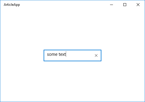
その結果、次のコントロールを取得します
ExtendedTextBoxコントロール
それでは始めましょう。 新しいコントロールを作成します。 便宜上、 「... / Controls / ControlName / ControlName.cs」というパスに沿ってプロジェクトに配置することをお勧めします。

プロジェクトに新しいコントロールを配置する
新しいプロジェクト要素をTemplated Controlとして追加します。 このテンプレートは新しい空のクラスとそれほど違いはありませんが、主なことは、新しいコントロールのGeneri。Xamlファイルにマークアップテンプレートの空のスタブを自動的に作成することです。 そして、このファイルがない場合は作成します。 デフォルトでは、ユーザーコントロールのレイアウトテンプレートが検索されるのはこのファイルです。

テンプレートコントロールテンプレートを使用して新しいプロジェクト要素を作成する
<ResourceDictionary xmlns="http://schemas.microsoft.com/winfx/2006/xaml/presentation" xmlns:x="http://schemas.microsoft.com/winfx/2006/xaml"> <Style xmlns:local2="using:ArticleApp.Controls.ExtendedTextBox" TargetType="local2:ExtendedTextBox"> <Setter Property="Template"> <Setter.Value> <ControlTemplate TargetType="local2:ExtendedTextBox"> <Border Background="{TemplateBinding Background}" BorderBrush="{TemplateBinding BorderBrush}" BorderThickness="{TemplateBinding BorderThickness}"> </Border> </ControlTemplate> </Setter.Value> </Setter> </Style> </ResourceDictionary>
デフォルトのコントロールレイアウトレイアウト
同時に、XAMLからの操作を簡素化するために、すべての新しいコントロールに共通の名前空間を指定することをお勧めします。 また、基本クラスを、基礎として使用するクラスに変更します。 この場合、 TextBox 。
次に、デフォルトのマークアップテンプレートにいくつかの変更を加えます。

名前空間と基本クラスを変更する
<ResourceDictionary xmlns="http://schemas.microsoft.com/winfx/2006/xaml/presentation" xmlns:x="http://schemas.microsoft.com/winfx/2006/xaml" xmlns:controls="using:ArticleApp.Controls"> <Style TargetType="controls:ExtendedTextBox"> <Setter Property="Template"> <Setter.Value> <ControlTemplate TargetType="controls:ExtendedTextBox"> <Border Background="{TemplateBinding Background}" BorderBrush="{TemplateBinding BorderBrush}" BorderThickness="{TemplateBinding BorderThickness}"> </Border> </ControlTemplate> </Setter.Value> </Setter> </Style> </ResourceDictionary>
修正されたコントロールレイアウトテンプレート
その後、新しいコントロールを使用できます。 現時点では、 TextBoxコントロールの機能を完全にコピーし、 Border要素で構成されるマークアップを持っています 。
<Page x:Class="ArticleApp.MainPage" xmlns="http://schemas.microsoft.com/winfx/2006/xaml/presentation" xmlns:x="http://schemas.microsoft.com/winfx/2006/xaml" xmlns:controls="using:ArticleApp.Controls"> <Grid Background="{ThemeResource ApplicationPageBackgroundThemeBrush}"> <controls:ExtendedTextBox HorizontalAlignment="Center" VerticalAlignment="Center" Width="200" Height="40" BorderBrush="Red" BorderThickness="2"/> </Grid> </Page>
新しいコントロールを使用する

新しいコントロールの外観
次のステップは、 TextBoxコントロールのレイアウトテンプレートを再利用することです(これについては前のパートで詳しく説明しました)。
それを受け取ったら、新しいExtendedTextBoxコントロールのテンプレートに置き換えます。 TargetType属性の値を適切な場所でTextBoxからExtendedTextBoxに変更することを忘れないでください。

新しいコントロールのマークアップを修正
現在、 ExtendedTextBoxコントロールはTeBoxコントロールの正確なコピーであり、外観と機能の両方を繰り返しています。
新しいコントロールがTextBoxの外観を繰り返します
機能の拡張に進みます。
1.入力フィールドが必要かどうかを示す視覚的なインジケータを追加します。
マークアップテンプレートでヘッダーを担当する部分を見つけ、次のように変更します。
<StackPanel Grid.Row="0" Grid.ColumnSpan="2" Orientation="Horizontal" Margin="0,0,0,8"> <ContentPresenter x:Name="HeaderContentPresenter" x:DeferLoadStrategy="Lazy" Visibility="Collapsed" Foreground="{ThemeResource SystemControlForegroundBaseHighBrush}" Content="{TemplateBinding Header}" ContentTemplate="{TemplateBinding HeaderTemplate}" FontWeight="Normal" /> <TextBlock x:Name="NecessityIndicatorTextBlock" Text="*" FontSize="{TemplateBinding FontSize}" Foreground="Red" Visibility="{TemplateBinding IsNecessarily}"/> </StackPanel>
マークアップでの「*」インジケータの実装
これと並行して、ExtendedTextBox.csファイルで次の変更を行います。
public sealed class ExtendedTextBox : TextBox { private TextBlock _necessityIndicatorTextBlock; public ExtendedTextBox() { this.DefaultStyleKey = typeof(ExtendedTextBox); } protected override void OnApplyTemplate() { base.OnApplyTemplate(); _necessityIndicatorTextBlock = GetTemplateChild("NecessityIndicatorTextBlock") as TextBlock; UpdateControl(); } public bool IsNecessarily { get => (bool)GetValue(IsNecessarilyProperty); set => SetValue(IsNecessarilyProperty, value); } public static readonly DependencyProperty IsNecessarilyProperty = DependencyProperty.Register("IsNecessarily", typeof(bool), typeof(ExtendedTextBox), new PropertyMetadata(false, IsNecessarilyPropertyChanged)); private static void IsNecessarilyPropertyChanged(DependencyObject d, DependencyPropertyChangedEventArgs e) { var textbox = d as ExtendedTextBox; if (textbox == null || !(e.NewValue is bool)) { return; } textbox.UpdateNecessityIndicator(); } private void UpdateControl() { UpdateNecessityIndicator(); } private void UpdateNecessityIndicator() { if (_necessityIndicatorTextBlock != null) { _necessityIndicatorTextBlock.Visibility = IsNecessarily ? Visibility.Visible : Visibility.Collapsed; } } }
クラス状態ExtendedTextBox
ここでは、次のことに注意します。
- OnApplyTemplate()メソッドを再定義し、 指定されたx:Nameでマークアップ要素へのリンクを見つけます。
- この入力フィールドが必須かどうかを決定するIsNecessarily依存関係プロパティと 、このインジケーターの可視性を更新する本文のPropertyChangedCallback IsNecessarilyPropertyChangedを定義します。
重要です。 PropertyChangedCallbackコントロールが初期化されると、 OnApplyTemplate()メソッドが呼び出される前に関数を実行できることに注意してください。 そのため、これらの関数の実行時に要素ツリーがまだロードされておらず、ターゲットオブジェクトが見つからなかったという状況が発生します。 このため、 OnApplyTemplate()メソッドの最後で、コントロールの状態を正しい状態にする必要があります。 ここでは、 UpdateControl()メソッドを実行します。
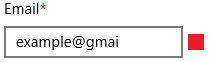
IsNecessarilyプロパティの値をtrueに設定すると、次の結果が得られます。

ExtendedTextBox必須インジケータ
2.与えられた正規表現テンプレートに従って入力されたデータを検証するロジックを扱いましょう。
以下を定義します。
- RegexPattern依存関係プロパティとそのCallBack- RegexPatternPropertyChanged 関数
- プライベートset-accessorを持つIsValid依存プロパティ。
- RegexPatternまたはTextプロパティが変更されたときに呼び出されるValidateTextBox()メソッド 。
そして、クラスコードにさらにいくつかの変更を加えると、次のようになります。
public sealed class ExtendedTextBox : TextBox { private TextBlock _necessityIndicatorTextBlock; public ExtendedTextBox() ... protected override void OnApplyTemplate() { base.OnApplyTemplate(); this.TextChanged -= ExtendedTextBoxTextChanged; _necessityIndicatorTextBlock = GetTemplateChild("NecessityIndicatorTextBlock") as TextBlock; this.TextChanged += ExtendedTextBoxTextChanged; UpdateControl(); } private void ExtendedTextBoxTextChanged(object sender, TextChangedEventArgs e) { ValidateTextBox(); } //public bool IsNecessarily ... //public static readonly DependencyProperty IsNecessarilyProperty = ... //private static void IsNecessarilyPropertyChanged(DependencyObject d, DependencyPropertyChangedEventArgs e) ... public string RegexPattern { get { return (string)GetValue(RegexPatternProperty); } set { SetValue(RegexPatternProperty, value); } } public static readonly DependencyProperty RegexPatternProperty = DependencyProperty.Register("RegexPattern", typeof(string), typeof(ExtendedTextBox), new PropertyMetadata(string.Empty, RegexPatternPropertyChanged)); private static void RegexPatternPropertyChanged(DependencyObject d, DependencyPropertyChangedEventArgs e) { var textbox = d as ExtendedTextBox; if (textbox == null || !(e.NewValue is string)) { return; } textbox.ValidateTextBox(); } private void ValidateTextBox() { IsValid = Regex.IsMatch(Text, RegexPattern); if (this.Text.Length == 0 || !this.IsValid.HasValue) { VisualStateManager.GoToState(this, "Indeterminate", true); return; } VisualStateManager.GoToState(this, this.IsValid.Value ? "Valid" : "Invalid", true); } public bool? IsValid { get { return (bool?)GetValue(IsValidProperty); } private set { SetValue(IsValidProperty, value); } } public static readonly DependencyProperty IsValidProperty = DependencyProperty.Register("IsValid", typeof(bool?), typeof(ExtendedTextBox), new PropertyMetadata(default(bool?))); private void UpdateControl() { UpdateNecessityIndicator(); ValidateTextBox(); } //private void UpdateNecessityIndicator() ... }
検証ロジックを追加した後のExtendedTextBoxクラスの状態
重要です。 実行時にコントロールのテンプレートを変更できるという事実のため、 OnApplyTemplate()メソッドでイベントをサブスクライブするときは注意が必要です。 したがって、テンプレートを変更するときにプロパティの変更を不必要にリッスンすることを排除するためのプラクティスの1つは、このメソッドの本文でイベントを再サブスクライブしてイベントのサブスクライブを解除することです。
また、 ValidateTextBox()メソッドの本体にも注意を払います。ValidateTextBox()メソッドは、有効状態に応じて、参照する3つの状態のいずれかにコントロールの視覚状態を転送するVisualStateManagerクラスメソッドを呼び出しますが、テンプレートのレイアウトではまだ定義されていません
まず、コントロールのレイアウトを拡張します
<Grid> <Grid.ColumnDefinitions> <ColumnDefinition Width="*" /> <ColumnDefinition Width="Auto" /> <ColumnDefinition Width="5" /> <ColumnDefinition Width="16" /> </Grid.ColumnDefinitions> <Grid.RowDefinitions> <RowDefinition Height="Auto" /> <RowDefinition Height="*" /> </Grid.RowDefinitions> <Border x:Name="BackgroundElement"/> <Border x:Name="BorderElement"/> <StackPanel Grid.Row="0" Grid.ColumnSpan="2" Orientation="Horizontal" Margin="0,0,0,8"> <ContentPresenter x:Name="HeaderContentPresenter"/> <TextBlock x:Name="NecessityIndicatorTextBlock"/> </StackPanel> <ScrollViewer x:Name="ContentElement"/> <ContentControl x:Name="PlaceholderTextContentPresenter"/> <Button x:Name="DeleteButton"/> <Image x:Name="ValidationStatusImage" Grid.Row="1" Grid.Column="3"/> </Grid>
グリッド拡張と有効性インジケーター画像の追加
そして、必要な視覚状態とその論理の説明を追加します。
<VisualStateGroup x:Name="ValidStates"> <VisualState x:Name="Indeterminate"/> <VisualState x:Name="Valid"> <Storyboard> <ObjectAnimationUsingKeyFrames Storyboard.TargetName="ValidationStatusImage" Storyboard.TargetProperty="Source"> <DiscreteObjectKeyFrame KeyTime="0" Value="Assets/Icons/validState.png" /> </ObjectAnimationUsingKeyFrames> </Storyboard> </VisualState> <VisualState x:Name="Invalid"> <Storyboard> <ObjectAnimationUsingKeyFrames Storyboard.TargetName="ValidationStatusImage" Storyboard.TargetProperty="Source"> <DiscreteObjectKeyFrame KeyTime="0" Value="Assets/Icons/invalidState.png" /> </ObjectAnimationUsingKeyFrames> </Storyboard> </VisualState> </VisualStateGroup>
新しいビジュアルグループValidStates
これで、次のデータ入力ページを作成できます。

データ入力ページ
この例をまとめると、 ExtendedTextBox.csファイルのコードの量は、それほど大きくはありませんが、将来、制御ロジックをさらに拡張した場合に、ファイルの向きに多少の不便を引き起こす可能性があることに注意してください。
このような不便さを最小限に抑えるために、部分的なクラスを使用して、独自の裁量でクラス構造宣言を持つ追加のファイルを作成することをお勧めします。
たとえば、次のように:
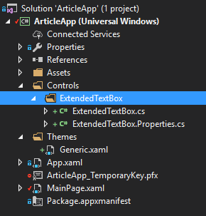
制御宣言を部分に分割するときのプロジェクト構造
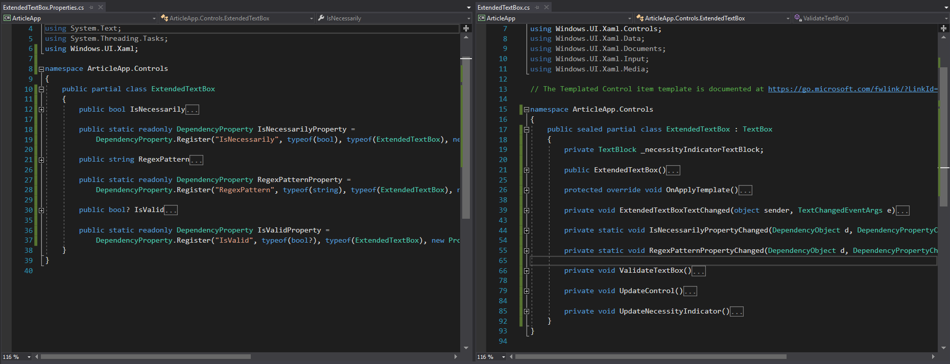
部分制御宣言を含むファイルのタイプ
これで、このコントロールでの作業が完了しました。 同様に、ロジック、外観を拡張し、より良いパラメーター化のために追加の依存関係プロパティを追加できます(たとえば、 ValidImageSource プロパティとInvalidImageSourceプロパティ )
新しいコントロールを作成する
このセクションでは、新しいコントロールをゼロから作成するプロセスを見ていきます。 基本的に、このプロセスは前の段落で行ったものと変わりません。
例として、 Expander UWPコントロールは含まれていますが、有用ではありません。
public partial class Expander { public static readonly DependencyProperty HeaderProperty = DependencyProperty.Register(nameof(Header), typeof(string), typeof(Expander), new PropertyMetadata(null)); public static readonly DependencyProperty IsExpandedProperty = DependencyProperty.Register(nameof(IsExpanded), typeof(bool), typeof(Expander), new PropertyMetadata(false, OnIsExpandedPropertyChanged)); public string Header { get { return (string)GetValue(HeaderProperty); } set { SetValue(HeaderProperty, value); } } public bool IsExpanded { get { return (bool)GetValue(IsExpandedProperty); } set { SetValue(IsExpandedProperty, value); } } }
エキスパンダーコントロールの依存関係プロパティ
public sealed partial class Expander : ContentControl { public Expander() { this.DefaultStyleKey = typeof(Expander); } protected override void OnApplyTemplate() { base.OnApplyTemplate(); if (IsExpanded) { VisualStateManager.GoToState(this, "Expanded", true); } } private void ExpandControl() { VisualStateManager.GoToState(this, "Expanded", true); } private void CollapseControl() { VisualStateManager.GoToState(this, "Collapsed", true); } private static void OnIsExpandedPropertyChanged(DependencyObject d, DependencyPropertyChangedEventArgs e) { var expander = d as Expander; bool isExpanded = (bool)e.NewValue; if (isExpanded) { expander.ExpandControl(); } else { expander.CollapseControl(); } } }
エキスパンダーコントロールボディ
ここでは、 Expanderが何でもあり得るコンテンツの存在を想定しているという事実に注意を払います。 これを考慮すると、Controlクラスからではなく、 Contentプロパティを操作する機能をすぐに取得できるようにContentControlクラスから継承するのが理にかなっています。
<Style TargetType="controls:Expander"> <Setter Property="Template"> <Setter.Value> <ControlTemplate TargetType="controls:Expander"> <Grid> <VisualStateManager.VisualStateGroups> <VisualStateGroup x:Name="ExpandedStates"> <VisualState x:Name="Expanded"> <VisualState.Setters> <Setter Target="MainContent.Visibility" Value="Visible" /> </VisualState.Setters> </VisualState> <VisualState x:Name="Collapsed" /> </VisualStateGroup> </VisualStateManager.VisualStateGroups> <Grid> <Grid.RowDefinitions> <RowDefinition Height="Auto" /> <RowDefinition Height="Auto" /> </Grid.RowDefinitions> <ToggleButton x:Name="ExpanderToggleButton" Height="40" HorizontalContentAlignment="Left" HorizontalAlignment="Stretch" Foreground="{TemplateBinding Foreground}" Content="{TemplateBinding Header}" IsChecked="{Binding IsExpanded, Mode=TwoWay, RelativeSource={RelativeSource TemplatedParent}}" /> <ContentPresenter Grid.Row="1" x:Name="MainContent" Background="{TemplateBinding Background}" HorizontalAlignment="{TemplateBinding HorizontalContentAlignment}" HorizontalContentAlignment="Stretch" VerticalAlignment="{TemplateBinding VerticalContentAlignment}" Visibility="Collapsed" /> </Grid> </Grid> </ControlTemplate> </Setter.Value> </Setter> </Style>
エキスパンダーコントロールレイアウトテンプレート
このマークアップの興味深い場所は、 ToggleButtonコントロールのIsCheckedプロパティです。つまり、親要素のIsExpandedプロパティにバインドする方法です。 このバインディングメソッドは、 TemplateBindingが、 TwoWayに設定されたときにExpanderの状態に影響するModeプロパティを提供しないという事実によるものです。
これらの記事では、UWPプラットフォームでコントロールを展開 、 変更、作成するためのツールを詳細に検討しました。 この資料が興味深く有用であることを願っています。
次の記事では、UWPでの開発プロセスの最適化に関する質問を検討します。
あなたの意見で何かが十分に詳細にカバーされていない場合、私たちはコメントのすべての質問に答えさせていただきます!
Ian Moroz、シニア.NET開発者