最初に、将来の笑顔が配置されるコンテナを作成します。
<div class="demo-smile"></div>
.demo-smile{ width: 100%; height: 100vh; background-color: #32bfd3; }
輪を作ることで笑顔の実装を始めます。 これを行うには、.demo要素内にsad-smileクラスを持つ要素を追加します。
<div class="demo-smile"> <div class="sad-smile"></div> </div>
次に、幅と高さのプロパティに同じ値を設定し、境界線の半径に50%を使用して角を丸める必要があります。
.sad-smile{ width: 250px; height: 250px; border-radius: 50%; }
ここで線形グラデーションを使用して、円を塗りつぶす必要があります。また、よりリアルに内部シャドウを追加する必要があります。
.sad-smile{ width: 250px; height: 250px; border-radius: 50%; background-image: linear-gradient(to bottom, #efee5f, #ecc837); box-shadow: inset 0 -14px 14px rgba(0, 0, 0, .3), 0 2px 20px rgba(0, 0, 0, .6); }
絵文字はページの中央に配置する必要があります。 これは、フレックスボックスを使用して実行できます。
.demo-smile{ width: 100%; height: 100vh; background-color: #32bfd3; display: flex; } .sad-smile{ width: 250px; height: 250px; border-radius: 50%; background-image: linear-gradient(to bottom, #efee5f, #ecc837); box-shadow: inset 0 -14px 14px rgba(0, 0, 0, .3), 0 2px 20px rgba(0, 0, 0, .6); margin: auto; }
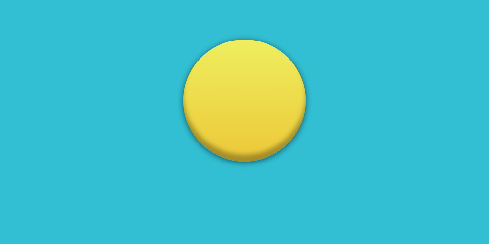
頭の準備ができました!
次に目を追加します。 これを行うには、sad-smile__eyeクラスで2つのdivタグを作成します。 次に、左目用にsad-smile__eye_leftクラスを追加し、右目用にsad-smile__eye_rightクラスを追加します。
<div class="demo-smile"> <div class="sad-smile"> <div class="sad-smile__eye sad-smile__eye_left"></div> <div class="sad-smile__eye sad-smile__eye_right"></div> </div> </div>
アイスタイリングは、要素のサイズから始める必要があります。
.sad-smile__eye{ width: 50px; height: 50px; }
次に、白い背景で塗りつぶし、黒いストロークを作成して、上部の角を丸めます。
.sad-smile__eye{ width: 50px; height: 50px; border: 8px solid #000; background-color: #fff; border-radius: 50% 50% 0 0; }
目の位置は、.sad-smileに対して相対的に配置された要素に対して計算されます。
.sad-smile{ position: relative; width: 250px; height: 250px; border-radius: 50%; background-image: linear-gradient(to bottom, #efee5f, #ecc837); box-shadow: inset 0 -14px 14px rgba(0, 0, 0, .3), 0 2px 20px rgba(0, 0, 0, .6); margin: auto; } .sad-smile__eye{ width: 50px; height: 50px; border: 8px solid #000; background-color: #fff; border-radius: 50% 50% 0 0; position: absolute; top: 33px; } .sad-smile__eye_left{ left: 50px; } .sad-smile__eye_right{ right: 50px; }

次に、疑似要素の後に::を使用して、円の形で生徒を追加します。
.sad-smile__eye::after{ content: ""; width: 20px; height: 20px; border-radius: 50%; background-color: #000; position: absolute; left: 0; bottom: 0; }
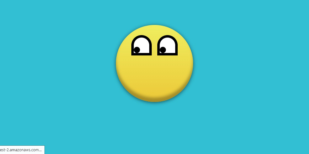
目を作った!
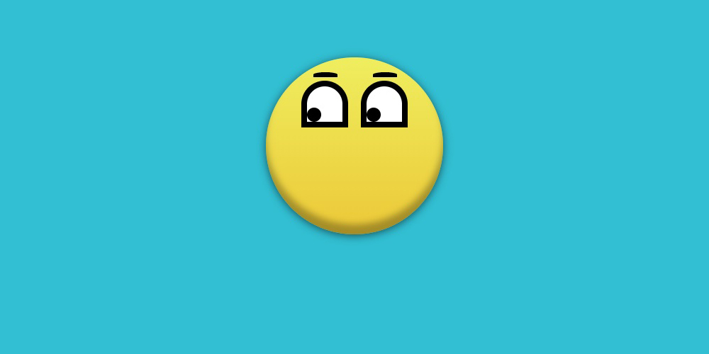
次に、眉毛を追加する必要があります。 それらを実装するには、疑似要素の前に::を使用する必要があります。
.sad-smile__eye::before{ content: ""; width: 34px; height: 7px; background-color: #000; border-radius: 50% 50% 0 0; }
幅、高さ、背景色の助けを借りて、眉の基礎となる黒い長方形が作成されます。 また、border-radiusプロパティは、要素が眉のように見えるように、上隅を丸めます。
眉の位置は、.sad-smile__eye要素から計算されます。
.sad-smile__eye::before{ content: ""; width: 34px; height: 7px; background-color: #000; border-radius: 50% 50% 0 0; position: absolute; top: -20px; right: 7px; }
口を追加するだけでした。 その実装では、sad-smile__mouthクラスを持つdivを使用します。
<div class="demo-smile"> <div class="sad-smile"> <div class="sad-smile__eye sad-smile__eye_left"></div> <div class="sad-smile__eye sad-smile__eye_right"></div> <div class="sad-smile__mouth"></div> </div> </div>
口自体は弧のように見えます。 口の付け根を作成するには、フレーム付きの長方形を使用します。
.sad-smile__mouth{ width: 165px; height: 75px; border: 7px solid #222; }
結果の長方形を正しい位置に設定する必要があります。
.sad-smile__mouth{ width: 165px; height: 75px; border: 7px solid #222; position: absolute; bottom: 12px; left: 125px; transform: translateX(-50%); }
アークを実装するために、私はすべての側面にフレームを必要としません。 border-bottom、border-right、border-leftを使用するだけで十分です。
.sad-smile__mouth{ width: 165px; height: 75px; border-right: 7px solid #222; border-left: 7px solid #222; border-bottom: 7px solid #222; position: absolute; bottom: 12px; left: 125px; transform: translateX(-50%); }
次に、border-leftプロパティとborder-rightプロパティの透明な値を設定する必要があります。
.sad-smile__mouth{ width: 165px; height: 75px; border-right: 7px solid transparent; border-left: 7px solid transparent; border-bottom: 7px solid #222; position: absolute; bottom: 12px; left: 125px; transform: translateX(-50%); }
border-radiusを使用して角を丸くすることは残ります。
.sad-smile__mouth{ width: 165px; height: 75px; border-right: 7px solid transparent; border-left: 7px solid transparent; border-bottom: 7px solid #222; border-radius: 50%; position: absolute; bottom: 12px; left: 125px; transform: translateX(-50%); }
そして最後のステップ。 rotateXプロパティを使用して要素を180度反転させるだけで、悲しい顔文字を悲しくします。
.sad-smile__mouth{ width: 165px; height: 75px; border-right: 7px solid transparent; border-left: 7px solid transparent; border-bottom: 7px solid #222; border-radius: 50%; position: absolute; bottom: 12px; left: 125px; transform: rotateX(180deg) translateX(-50%); }

絵文字の準備ができました!
次に、涙を追加する必要があります。 それらを実装するには、sad-smile__tearクラスで2つの要素を追加する必要があります。
<div class="demo-smile"> <div class="sad-smile"> <div class="sad-smile__eye sad-smile__eye_left"> <div class="sad-smile__tear"></div> </div> <div class="sad-smile__eye sad-smile__eye_right"> <div class="sad-smile__tear"></div> </div> <div class="sad-smile__mouth"></div> </div> </div>
涙の形は三角形であるため、CSS三角形を使用して涙を実装できます。
.sad-smile__tear{ width: 0; height: 0; border-right: 8px solid transparent; border-left: 8px solid transparent; border-bottom: 24px solid #1ca5e2; }
border-radiusプロパティは、結果の三角形を丸めて裂け目を作成します。
.sad-smile__tear{ width: 0; height: 0; border-right: 8px solid transparent; border-left: 8px solid transparent; border-bottom: 24px solid #1ca5e2; border-radius: 50%; }
涙は、親要素.sad-smile__eyeに対して相対的に配置されます。
.sad-smile__tear{ width: 0; height: 0; border-right: 8px solid transparent; border-left: 8px solid transparent; border-bottom: 24px solid #1ca5e2; border-radius: 50%; position: absolute; top: 50%; left: 0; z-index: 2; }

涙のアニメーション用のスクリプトを書くことは残っています。
@keyframes tear{ 0% { opacity: 0; transform: translate3d(0, 0, 0) scale(0); } 5%{ opacity: 1; transform: translate3d(0, 0, 0) scale(0); } 10%{ transform: translate3d(0, 25px, 0) scale(1); } 100%{ transform: translate3d(0, 175px, 0) scale(1); } }
そして、それを要素に追加します。
.sad-smile__tear{ width: 0; height: 0; border-right: 8px solid transparent; border-left: 8px solid transparent; border-bottom: 24px solid #1ca5e2; border-radius: 50%; position: absolute; top: 50%; left: 0; z-index: 2; animation: tear 2.5s cubic-bezier(.63, .49, 1, -.15) .2s infinite both; }
しかし、今では涙が互いに平行になっているので、左の場合は少し遅れます。
.sad-smile__eye_left .sad-smile__tear{ animation-delay: 1s; }

最終的なデモはCodepenで見ることができます