今日は、CSS3のみを使用してアニメーション化されたフラスコを作成した方法について説明します。 結果はここで見ることができます 。 さて、何が面白いですか? それでは始めましょう!
問題を研究します
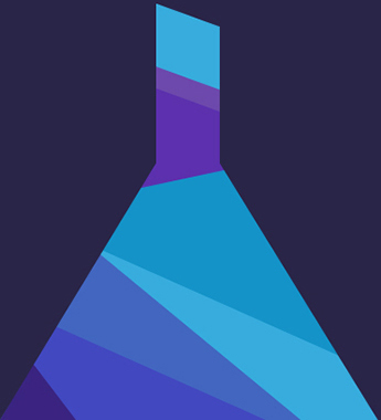
電球は多くの用途の広い形状で構成されていますが、CSSには制限があり、これらの種類の要素を作成することはできません。 どうする? 三角形と長方形を使用して実装します。
- 擬似要素:前と後:
- 位置、上、右、下、左、z-index
- ボーダー、幅、高さ
フラスコのベースの実装
ベースは三角形であるため、三角形を使用して作成します。 これを行うには、次のマークアップを作成します。
<div class="flask"> <div class="flask__bottom"> <div class="flask__triangle"></div> </div> </div>
フラスコクラスでメイン要素を使用します。これは、フラスコ__bottomクラスでベースを格納します。 その中に、将来の三角形のために空白を追加しました。 次に、マークアップを定型化します。
body { background-color: #292548; } .flask { height: 405px; width: 368px; position: absolute; bottom: 0; } .flask__bottom { position: absolute; bottom: 0; } .flask__triangle { width: 368px; height: 250px; overflow: hidden; position: relative; background-color: #fff; }
プロパティの位置:absoluteおよびbottom:0を使用して、電球の底にベースを固定しました。次に、368ピクセルの幅と250ピクセルの高さに設定しました。 その結果、長方形ができました。

今から楽しみが始まります! 三角形の作り方 このために、前と後の擬似要素を使用します。 それらを使用して、長方形の三角形を作成し、それぞれ左端と右端から白い長方形の上に配置します。 したがって、その領域の一部を非表示にします。

しかし、最初に、直角三角形を作成する必要があります。 これを行うには、次のCSSコードを追加します。
.flask__triangle::before, .flask__triangle::after { content: ""; width: 0; height: 0; border-top: 250px solid #292548; position: absolute; top: 0; z-index: 100; } .flask__triangle::before { border-right: 152px solid transparent; left: 0; } .flask__triangle::after { border-left: 152px solid transparent; right: 0; }
CSS三角形を作成する基本的な方法は、borderプロパティを使用することです。 ただし、三角形のサイズを正しく計算するには、まず要素の幅と高さを0に設定する必要があります。
さらに、境界線のプロパティを250ピクセルに設定し、色#292548(背景色)に設定します。 次に、左の三角形について、152ピクセルの値でborder-leftプロパティを指定します。 右の三角形についても同じことをしますが、border-leftの代わりにborder-rightと書きます。
次に、leftプロパティとrightプロパティを使用して、四角形のエッジに配置します。 そして、三角形ができました!

基本要素を作成する
次に、基礎要素の実装に進みます。 これを行うには、次のマークアップを追加します。
<div class="flask"> <div class="flask_bottom"> <div class="flask__triangle"> <div class="flask__bottom-one"></div> <div class="flask__bottom-two"></div> <div class="flask__bottom-five"></div> <div class="flask__bottom-six"></div> <div class="flask__bottom-seven"></div> <div class="flask__bottom-eight"></div> </div> </div> </div>
そして、次のコードでスタイルを設定します。
.flask__bottom-one { width: 0; height: 0; border-bottom: 55px solid #3a2481; border-left: 32px solid transparent; border-right: 42px solid transparent; position: absolute; bottom: 0; z-index: 4; } .flask__bottom-two { width: 0; height: 0; border-bottom: 165px solid #4266c0; border-left: 93px solid transparent; border-right: 200px solid transparent; position: absolute; bottom: 0; left: 0; z-index: 2; } .flask__bottom-five { width: 100%; height: 75px; background-color: #4248c0; position: absolute; bottom: 18px; left: 50px; z-index: 3; transform: rotate(24deg); transform-origin: left top; } .flask__bottom-six { width: 100%; height: 170px; background-color: #37acdd; position: absolute; right: 0; bottom: 0; z-index: 1; } .flask__bottom-seven { width: 100%; height: 218px; background-color: #1493c8; position: absolute; right: -95px; bottom: 24px; z-index: 3; transform: rotate(24deg); transform-origin: right top; } .flask__bottom-eight { width: 100%; height: 50px; background-color: #5c30ae; position: absolute; right: -95px; bottom: 218px; z-index: 3; transform: rotate(-12deg); transform-origin: left top; }
要素を作成する重要な手順は、ベースの三角形の形状を保持することです。 パーツを配置すると、三角形を超えるため、親に対して非表示の値を持つオーバーフロープロパティを追加しました。
次に、6つの要素を作成し、変換プロパティ(rotate値を使用)およびtransform-originを使用して、必要に応じて配置します。 この場合、要素を回転させるには変換が必要で、transform-origin-要素を回転させる中心点を示す必要があります。 また、絶対配置を使用して、要素をその場所に配置します。 その結果、以下が得られます。

首とその要素を作成する
ネックを作成するには、62ピクセルx 152ピクセルのサイズの長方形を作成し、4つの要素すべてを内部に配置する必要があります。 これを行うには、次のマークアップを追加します。
<div class="flask"> <div class="flask__throat"> <div class="flask__throat-one"></div> <div class="flask__throat-two"></div> <div class="flask__throat-three"></div> <div class="flask__throat-four"></div> </div> <div class="flask_bottom"> <div class="flask__triangle"> <div class="flask__bottom-one"></div> <div class="flask__bottom-two"></div> <div class="flask__bottom-five"></div> <div class="flask__bottom-six"></div> <div class="flask__bottom-seven"></div> <div class="flask__bottom-eight"></div> </div> </div> </div>
そしてCSS:
.flask__throat { width: 64px; height: 155px; overflow: hidden; position: absolute; top: 0; left: 152px; } .flask__throat-one { width: 150px; height: 50px; background-color: #5c30ae; position: absolute; top: 110px; right: -26px; z-index: 3; transform: rotate(24deg); transform-origin: right top; } .flask__throat-two { width: 150px; height: 60px; background-color: #37acdd; position: absolute; top: 35px; right: -35px; z-index: 3; transform: rotate(20deg); transform-origin: right top; } .flask__throat-three { width: 100%; height: 50px; background-color: #5c30ae; position: absolute; bottom: 0; right: 0; z-index: 3; } .flask__throat-four { width: 150px; height: 20px; background-color: #6c49ac; position: absolute; top: 100px; right: -45px; z-index: 3; transform: rotate(20deg); transform-origin: right top; }
要素の配置の原理は、基本要素のそれとまったく同じです。 そのため、このタスクで問題が発生することはありません! 結果は完成したフラスコです!
バブルアニメーション
フラスコをロードし、しばらくするとそこから泡が現れます。 それらは異なるサイズと色になります。 発生頻度は異なります。
バブルを実装するには、最新のCSS機能、つまりborder-radiusプロパティを使用します。 このプロパティを使用して、要素の角を丸めることができます。 次に、同じサイズの3つのマルチカラーのバブルを作成します。1つは少し大きく、もう1つは大きいサイズです。 これを行うには、次のマークアップを追加する必要があります。
<div class="flask"> <div class="circle circle_small"></div> <div class="circle circle_middle"></div> <div class="circle circle_little circle_little-white"></div> <div class="circle circle_little circle_little-purpure"></div> <div class="circle circle_little circle_little-blue"></div> <div class="flask__throat"> <div class="flask__throat-one"></div> <div class="flask__throat-two"></div> <div class="flask__throat-three"></div> <div class="flask__throat-four"></div> </div> <div class="flask_bottom"> <div class="flask__triangle"> <div class="flask__bottom-one"></div> <div class="flask__bottom-two"></div> <div class="flask__bottom-five"></div> <div class="flask__bottom-six"></div> <div class="flask__bottom-seven"></div> <div class="flask__bottom-eight"></div> </div> </div> </div>
cssを追加します。
.circle { border-radius: 50%; border: 1px solid #fff; position: absolute; top: 30px; left: 48%; } .circle_small { width: 20px; height: 20px; } .circle_middle { width: 45px; height: 45px; margin-left: 2px; left: 42%; } .circle_little { width: 5px; height: 5px; margin-left: 4px; } .circle_little-white { background-color: #fff; } .little_circle_purpure { background-color: #6c49ac; border: 1px solid #6c49ac; } .circle_little-blue { background-color: #117fba; border: 1px solid #117fba; }
次のステップは、@ keyframesプロパティを使用してアニメーションスクリプトを作成することです。 スクリプト自体は次のようになります。 ページが読み込まれると、バブルの初期座標はY軸に沿って20ピクセルになり、アニメーションが開始されると、バブルはY軸に沿って初期座標から-200pxに移動し始めます。 Y軸に沿った動きと平行して、気泡は徐々に使用から遠ざかります。 これを行うには、transformプロパティを使用します。 また、バブルが移動すると、opacityプロパティを使用してスムーズに消えます。
スクリプトが作成されました。次に、サークルクラスで指定する必要があります。 これを行うには、animation-nameプロパティを使用して、スクリプト名-circleを指定します。 次に、バブルごとに、アニメーション遅延を使用して遅延を設定します。これにより、異なる時間に表示されます。 最後の手順は、animation-iteration-countパラメーターを設定して、アニメーションスクリプトを際限なく繰り返すことです。
.circle { animation-name: circle; animation-duration: 5s; animation-iteration-count: infinite; animation-delay: 0s; } .circle_little-white { animation-duration: 4200ms; } .circle_little-purpure { animation-duration: 4200ms; animation-delay: 200ms; } .circle_little-blue { animation-duration: 4200ms; animation-delay: 600ms; } @keyframes circle { 0% { transform: translateZ(0px) translateY(20px) scale(1); opacity: 1; } 85% { opacity: 0; } 100% { transform: translateZ(0px) translateY(-200px) scale(0); opacity: 0; } }
フラスコアニメーション
電球をアニメーション化するために、各要素に対して独自のスクリプトを作成しました。
@keyframes animation_bg_element1 { 0% { border-bottom-color: #3a2481; } 25% { border-bottom-color: #242781; } 50% { border-bottom-color: #244081; } 75% { border-bottom-color: #242781; } } @keyframes animation_bg_element2 { 0% { border-bottom-color: #4266c0; } 25% { border-bottom-color: #4287c0; } 50% { border-bottom-color: #42a8c0; } 75% { border-bottom-color: #4287c0; } } @keyframes animation_bg_element3 { 0% { background-color: #4248c0; } 25% { background-color: #4269c0; } 50% { background-color: #428ac0; } 75% { background-color: #4269c0; } } @keyframes animation_bg_element4 { 0% { background-color: #37acdd; } 25% { background-color: #37d8dd; } 50% { background-color: #37ddb5; } 75% { background-color: #37d8dd; } } @keyframes animation_bg_element5 { 0% { background-color: #1493c8; } 25% { background-color: #14c2c8; } 50% { background-color: #14c89d; } 75% { background-color: #14c2c8; } } @keyframes animation_bg_element6 { 0% { background-color: #5c30ae; } 25% { background-color: #3a30ae; } 50% { background-color: #3048ae; } 75% { background-color: #3a30ae; } } @keyframes animation_bg_element7 { 0% { background-color: #6c49ac; } 25% { background-color: #5249ac; } 50% { background-color: #495aac; } 75% { background-color: #5249ac; } }
次に、各クラスにアニメーションコールを追加します。
.flask__throat-one, .flask__throat-two, .flask__throat-three, .flask__throat-four { animation-duration: 5s; animation-iteration-count: infinite; animation-delay: 0s; } .flask__throat-one, .flask__throat-three { animation-name: animation_bg_element6; } .flask__throat-two { animation-name: animation_bg_element5; } .flask__throat-four { animation-name: animation_bg_element7; } .flask__bottom-one, .flask__bottom-two, .flask__bottom-five, .flask__bottom-six, .flask__bottom-seven, .flask__bottom-eight { animation-duration: 5s; animation-iteration-count: infinite; animation-delay: 0s; } .flask__bottom-one { animation-name: animation_bg_element1; } .flask__bottom-two { animation-name: animation_bg_element2; } .flask__bottom-five { animation-name: animation_bg_element3; } flask__bottom-six { animation-name: animation_bg_element4; } .flask__bottom-seven { animation-name: animation_bg_element5; } .flask__bottom-eight { animation-name: animation_bg_element6; }
おわりに
この記事では、CSSの最新の機能を紹介しました。 あなたがこれに興味を持ち、素晴らしい作品を作成できることを願っています。 ありがとうございます!