最初の投稿はすぐに感情について書かれました。 ニコール法は、ある場所では無力で面倒なように思えましたが、多くの点で私の成果よりも優れていることを認める価値があり、今後はその方法を採用することに満足しています。 しかし、ニコールは私が修正した小さな欠陥を作りました。 また、余分なゴミを取り除き、典型的な組版作業の普遍的な解決策を試します。
私たちは何に来ますか:
-外部スタイルの使用と、その後のインライン化によるコードの実行。 コードが複雑なため、これは便利です。
-クラスの命名とセマンティクスの改善によるセマンティクスの改善
-バットの部分的なサポート! ニコールは彼に得点したが。
-すべてのモバイルメールクライアントを完全にサポート
-以前は危険な構造物の使用。 厳しいテストのおかげで、問題は解決されました。
ラッパー
新しいレターラッパー( Github )の概要を説明します。
非表示のテキスト
<meta charset="utf-8"> <style> body { margin:0; } /* */ .content { background-color:#ffffff; padding:30px; } .newsletter { margin: 0 auto; max-width: 600px; } .wrapper { width: 100%; background-color:#f4f4f4; table-layout: fixed; -webkit-text-size-adjust: 100%; -ms-text-size-adjust: 100%; } @media only screen and (max-width: 400px) { /* */ } @media screen and (min-width: 401px) and (max-width: 600px) { /* */ } @media screen and (min-width: 600px) { .newsletter { width:600px !important; } } </style> <!--[if (gte mso 9)|(IE)]> <style> /* */ </style> <![endif]--> <div align="center" class="wrapper"> <!--[if (gte mso 9)|(IE)]> <table align="center" width="600" cellpadding="0" cellspacing="0" style="border-collapse:collapse;"><tr><td> <![endif]--> <table class="newsletter" align="center" width="100%" cellpadding="30" cellspacing="0"> <tr> <td class="content" style="width:600px !important;"> </td> </tr> </table> <!--[if (gte mso 9)|(IE)]></td></tr></table><![endif]--> </div>
そして今、私はそれが何であり、どのようにあなたに教えます:
-まず第一に、Doctype、head、bodyは必要ないことに注意する価値があります。 Doctypeがなければ、文字の動作はどこでも似ており、驚きをもたらしません。 頭は役に立たない。 さて、ほとんどのメールWebマスターはまだ本文をカットしています。 この理由から、本文を通して手紙の一般的な背景を設定しません。
-.wrapperブロックは、背景色を示す一般的なラッパーです。したがって、予測できない動作を避けるために、背景といくつかのcssプロパティを設定します。
-.newsletterテーブルは、直接中央に配置された文字です。 彼の.wrapper親に対して、テーブルがyahooメールの中央にくるように、align属性の中央値を設定します。 将来、テーブルを整列させるには、指定された整列のdivでテーブルをラップする必要があることを理解しておく必要があります。 この場合、テーブル自体の配置を指定することを忘れないでください。 .newsletterの場合、忠実性のためにインラインで100%の幅を指定し、応答性を得るためにmax-width:600pxを指定しました。 ただし、このプロパティはOutlookおよびコウモリでは機能しません。 Outlookの問題を解決するために、.newsletterの親である追加のテーブルを作成しました。
-.contentセルはすでにレターの一部です。 彼女のために、cssでbackground-color:#ffffffを指定して、背景の灰色の背景ではなく、文字の白い背景を設定しました。 幅を明示的に指定しました:600px!重要; max-widthをサポートしていないbat!問題を解決するには、バーツで文字の幅を600ピクセルにします。
結果は上のスクリーンショットにあります。 同時に、ブラウザーの端を簡単に引き出して、レイアウトの適応性をテストできます。
内容
次に、メールにコンテンツを追加しましょう( Github )
非表示のテキスト
<meta charset="utf-8"> <style> body { margin:0; } a { color:#0077cc !important; } a img { border:0; } a span { color:#0077cc; } table { border-collapse:collapse; } p { margin:1em 0; font-family: arial; font-size:14px; color:#666666; line-height:1.4em; text-align: left; } .paragraph { font-family:arial; font-size:14px; color:#666666; line-height:1.4em; text-align: left; } .button { display:inline-block; vertical-align:top; width:150px; } .button table { border-collapse: separate !important; border:#ffffff 5px solid; } .button div { font-family:arial; font-size:14px; } .button a, .button span { color:#ffffff !important; text-decoration:none; } .content { background-color:#ffffff; padding:30px; } .h1 { font-family: arial; font-size: 24px; color:#666666; line-height:1.2em; } .newsletter { margin: 0 auto; max-width: 600px; } .wrapper { width: 100%; background-color:#f4f4f4; table-layout: fixed; -webkit-text-size-adjust: 100%; -ms-text-size-adjust: 100%; } @media only screen and (max-width: 400px) { /* */ } @media screen and (min-width: 401px) and (max-width: 600px) { /* */ } @media screen and (min-width: 600px) { .newsletter { width:600px !important; } } </style> <!--[if (gte mso 9)|(IE)]> <style> /* */ </style> <![endif]--> <div align="center" class="wrapper"> <!--[if (gte mso 9)|(IE)]> <table align="center" width="600" cellpadding="0" cellspacing="0" style="border-collapse:collapse;"><tr><td> <![endif]--> <table class="newsletter" align="center" width="100%" cellpadding="30" cellspacing="0"> <tr> <td class="content" style="width:600px !important;"> <div class="h1">Paragraph Heading</div> <p><a href="#" target="_blank"><span>Lorem ipsum dolor</span></a> sit amet, consectetur adipiscing elit, sed do eiusmod tempor incididunt ut labore et dolore magna aliqua. Ut enim ad minim veniam, quis nostrud exercitation ullamco laboris nisi ut aliquip ex ea commodo consequat. Duis aute irure dolor in reprehenderit in voluptate velit esse cillum dolore eu fugiat nulla pariatur. Excepteur sint occaecat cupidatat non proident, sunt in culpa qui officia deserunt mollit anim id est laborum.</p> <div align="center"> <div class="button"> <table cellpadding="10" cellspacing="0"> <tr> <td bgcolor="#666666" style="padding:10px 20px; border-radius:50px;"> <div><b><a href="#" target="_blank"><span>Button Example</span></a></b></div> </td> </tr> </table> </div> <div class="button"> <table cellpadding="10" cellspacing="0"> <tr> <td bgcolor="#666666" style="padding:10px 20px;"> <div><b><a href="#" target="_blank"><span>Button Example</span></a></b></div> </td> </tr> </table> </div> <div class="button"> <table cellpadding="10" cellspacing="0"> <tr> <td bgcolor="#666666" style="padding:10px 20px; border-radius:50px;"> <div><b><a href="#" target="_blank"><span>Button Example</span></a></b></div> </td> </tr> </table> </div> </div> <br> <div class="h1">Markered List</div> <p>– Lorem ipsum dolor sit amet, consectetur adipiscing elit</p> <p>– Lorem ipsum dolor sit amet, consectetur adipiscing elit</p> <p>– Lorem ipsum dolor sit amet, consectetur adipiscing elit</p> <p>– Lorem ipsum dolor sit amet, consectetur adipiscing elit</p> </td> </tr> </table> <!--[if (gte mso 9)|(IE)]></td></tr></table><![endif]--> </div>
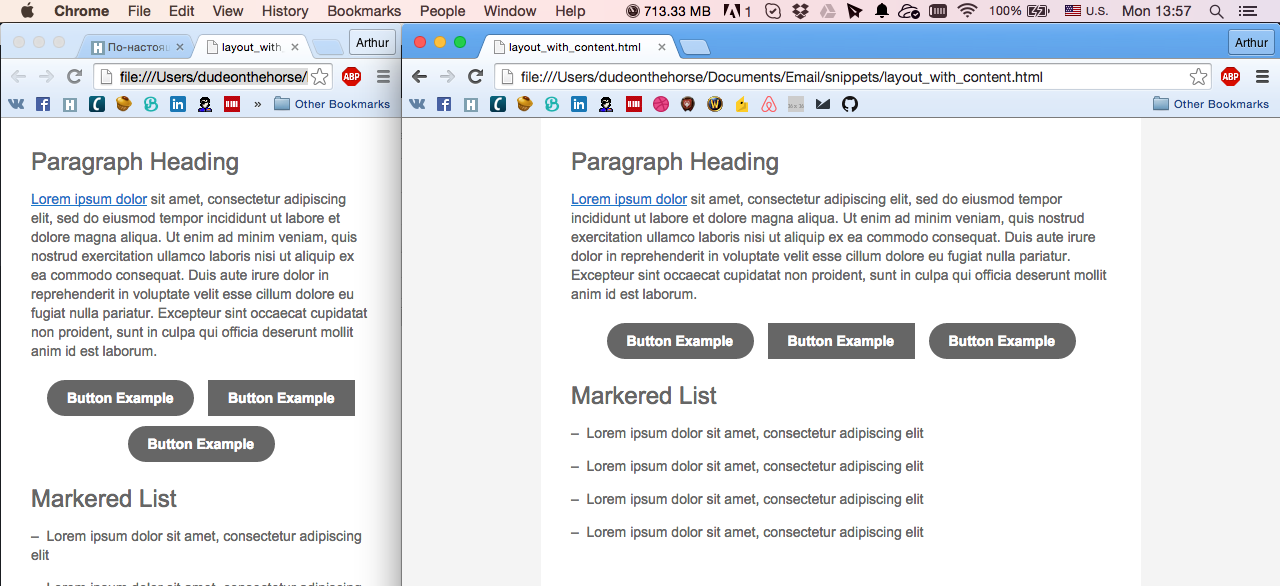
順番に見てみましょう。
見出し
.h1 { font-family: arial; font-size: 24px; color:#666666; line-height:1.2em; } <div class="h1">Paragraph Heading</div>
余白を設定せずに使用されるdivは、上部のパディングを持つブロックの不必要なインデントの出現を回避します。
段落
p { margin:1em 0; font-family: arial; font-size:14px; color:#666666; line-height:1.4em; text-align: left; } .paragraph { font-family:arial; font-size:14px; color:#666666; line-height:1.4em; text-align: left; } <p>Lorem ipsum dolor sit amet, consectetur adipiscing elit, sed do eiusmod tempor incididunt ut labore et dolore magna aliqua. Ut enim ad minim veniam, quis nostrud exercitation ullamco laboris nisi ut aliquip ex ea commodo consequat. Duis aute irure dolor in reprehenderit in voluptate velit esse cillum dolore eu fugiat nulla pariatur. Excepteur sint occaecat cupidatat non proident, sunt in culpa qui officia deserunt mollit anim id est laborum.</p> <div class="paragraph">Lorem ipsum dolor sit amet, consectetur adipiscing elit, sed do eiusmod tempor incididunt ut labore et dolore magna aliqua. Ut enim ad minim veniam, quis nostrud exercitation ullamco laboris nisi ut aliquip ex ea commodo consequat. Duis aute irure dolor in reprehenderit in voluptate velit esse cillum dolore eu fugiat nulla pariatur. Excepteur sint occaecat cupidatat non proident, sunt in culpa qui officia deserunt mollit anim id est laborum.</div>
段落タグのマージンを明示的に指定していることに注意してください。 これは、outlook.comでインデントを再計算するために必要です。 そこでは、デフォルトのものとは根本的に異なります。 段落タグは、前の見出しオプションで使用するのに理想的です。
divを使用して実行される段落の2番目のバージョンはあまり使用されませんが、それでも必要な場合があります。 これは同じ段落で、単純に垂直方向のインデントがありません。
リンク
a { color:#0077cc !important; text-decoration:underline; } a img { border:0; } a span { color:#0077cc; } <a href="#" target="_blank"><span>Lorem ipsum dolor</span></a>
リンクがテキストの場合、リンク設計は常にスパン内に含まれている必要があります。 これはOutlookの松葉杖です。 リンクの色と内部スパンに同じ色を設定します。 モバイルGmailでは、リンクから下線を削除するために、色を明示的に装飾する仕事が必要です。 リンク画像の場合、すぐに境界線をゼロに設定します。
ボタン
.button { display:inline-block; vertical-align:top; width:150px; } .button table { border-collapse: separate !important; border:#ffffff 5px solid; } .button div { font-family:arial; font-size:14px; } .button a, .button span { color:#ffffff !important; text-decoration:none; } <div class="button"> <table cellpadding="10" cellspacing="0"> <tr> <td bgcolor="#666666" style="padding:10px 20px; border-radius:50px;"> <div><b><a href="#" target="_blank"><span>Button Example</span></a></b></div> </td> </tr> </table> </div>
ボタンのデザインは少し面倒ですが、それでも鉄筋コンクリートです。 まず、ボタンはブロック要素ではなくインラインであるため、いくつかのボタンを隣り合わせに配置できます。 ボタンに適切な境界半径を使用できるようにするには、ボタン内のテーブルを分離する必要があります。 残りはリンクの例に従っています。 少し給餌するとボタンの準備ができました。 重要なお知らせ。 ボタンの名前が2つの単語で構成されている場合、ボタンは2行で折りたたむことができます。そのため、この問題を処理するために複雑なスペースを使用します。 または、固定のテーブルセル幅を使用できます。 ボタンを整列するには、明示的な整列で親divを使用します。
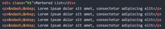
最後に、リスト
すでに前のトピックでそれについて書いたので、詳細は繰り返さない。 最適な方法でデザインする方法を紹介します。 余分なCSSはありません。 すべてが非常に簡単です。
HabraparserはUnicode文字を食べているため、スクリーンショット付きのサンプルコードを挿入します。
このメモでは、「最初の部分」を終了し、次では、文字の他の部分を作成する方法と、複数列の例を示します。 「一体何?」と言う人のために 確かに、前の記事でそれは同じでした!」私は違いが大きいと答えます。 このアプローチにたどり着くには、1週間の複数のテスト、試行錯誤が必要でした。
ステディタンド。
UPD:もちろん、GitHubでより完全なレイアウトファイルを見つけることができますが、ニュアンスの多くがすぐに明確にならない可能性があるため、ここでは特にリンクを示しませんでした。 これはまだ最終手法の実験版です。 彼らが言うように、興味があれば、自分で喫煙してください。
UPD2:モバイルyahooクライアントでバグが表面化しました。 このトピックの更新または以下の部分で、ソリューションについて説明します。
UPD3: Yahooのバグは解決しました。 yahooモバイルアプリケーションはテーブルのセルパディングプロパティを理解しないため、スタイルを使用してセルのインデントを指定する必要があります。 また、yahooのインラインボタンは一緒に詰め込まれていました。 万能薬として、ボタンの固定幅が使用されます。 私たちが望むほどクールではありませんが、何をすべきか。
今日の資料の一部として、次のCSSを追加する必要があります。
.content { padding:30px; } .button { width:150px; }