Webサイトの背景にある大きなビデオは、 Webデザインでかなり人気のある傾向です。 ビデオを上手に適用すると、Webサイトがより劇的でユーザーにアピールできます。
さらに、動画の背景は、ユーザーがアニメーションの結果を見る前に特定のコードと画像をダウンロードする必要があるJavaScriptを使用して作成された背景とは異なり、「ブレーキ」なしでスムーズに再生できます。
PowerhouseやAdidasなど、ビデオをサイトの背景として使用して、製品やサービスに関する特定のメッセージやストーリーをユーザーに伝える企業があります。
ビデオ背景を作成する最も一般的な方法は、HTML5 ビデオタグといくつかのCSSオプションを使用することですが、YouTubeなどの代替ビデオソースにも注意を払う必要があります。 この場合、リクエストはYouTubeに直接送信されるため、サーバーの応答が遅いことを心配する必要はありません。
この記事では、YouTubeビデオを背景として使用するクールなWebサイトを構築する方法を紹介します。 jQuery.mb.YTPlayer.jsを使用して、ビデオの外観を編集および制御します。 それでは始めましょう!
ソースをダウンロード
デモ
次のものが必要です。
- Google Font( Railway and Lato )
- 素晴らしいフォント
- JQueryライブラリ
- mb.YTPlayer
カスタマイズ
サイト自体の作成を開始する前に、ユーザーに表示する内容を決定する必要があります。 作業を開始する前に、次の点を考慮する必要があります。
- ビデオの長さは15〜30秒である必要があります。
- 自動再生に設定する必要があります。
- ボリュームはゼロでなければなりません。
- タイトルやその他のテキストがビデオの背景で読めることを確認してください。
- ビデオが伝えるメッセージは明確で明瞭でなければなりません。
HTML
テンプレートは3つのセクションで構成されます。
- ビッグバックグラウンド-バックグラウンドビデオ
- セクションについて-「私たちについて」
- 小さい背景セクション-「共有」
<section class="big-background"> //Big Background Content here </section> <div class="wrapper"> <section class="about-section"> //About Section Content here </section> <section class="small-background-section"> //Small Background Section Content here </section> </div>
次に、各セクションにコンテンツを入力する必要があります。 大きな背景セクションと小さな背景セクションのセクションで、 パターンクラスを配置して、ビデオに明るいテクスチャを作成します。 また、h1、h2、段落、ボタンを追加する必要があります。
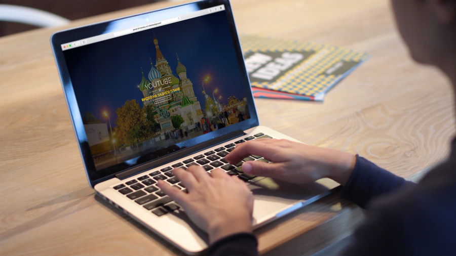
<section class="big-background"> <a id="bgndVideo" class="player" data-property="{videoURL:'http://www.youtube.com/watch?v=PKGjG_ZhF-A',containment:'body',autoPlay:true, mute:true, startAt:0, opacity:1}"></a> <div class="pattern"></div> <div class="big-background-container"> <h1 class="big-background-title">YOUTUBE</h1> <div class="divider"></div> <h1 id="colorize"> </h1> <a href="http://designmodo.com/video-background-website/" class="big-background-btn"> </a> </div> </section> <div class="wrapper"> <section class="about-section"> <div class="about-section-container"> <h2 class="about-section-title"> YouTube </h2> <p> , ? <br/> ! jQuery MB.YTPlayer, jQuery, YouTube .<br/> HTML . !</p> <a href="https://github.com/pupunzi/jquery.mb.YTPlayer" target="_blank" class="about-section-btn"> </a> </div> </section> <section class="small-background-section"> <div class="pattern"></div> <div class="small-background-container"> <h2 class="small-background-title"><span> </span></h2> <ul class="socials"> <li><a href="https://www.facebook.com/designmodo" target="_blank"><i class="fa fa-facebook-square fa-3x"></i></a></li> <li><a href="https://twitter.com/Designmodo" target="_blank"><i class="fa fa-twitter-square fa-3x"></i></a></li> <li><a href="https://plus.google.com/+Designmodo" target="_blank"><i class="fa fa-google-plus-square fa-3x"></i></a></li> </ul> </div> </section>
ソーシャルアイコンにはFont Awesomeフォントを使用しました。これは、 small-background-sectionセクションにあります。 次に、 jQuery.mb.YTPlayerプラグインを使用してビデオのテンプレートを追加します。 次のコードを<section class = "big-background">の直後に配置します。
<a id="bgndVideo" class="player" data-property="{videoURL:'https://www.youtube.com/watch?v=0WhoCe_2jpc', containment:'body',autoPlay:true, mute:true, startAt:0, opacity:1}"></a>
ビデオの構成に使用したものは次のとおりです。
- クラスプレーヤー -このクラスはmb.YTPlayerプラグインによって使用されます
- videoURL-ビデオへのリンク
- 封じ込め -ビデオを再生するCSSセレクター
- autoPlay-ビデオの自動再生
- ミュート -音の存在
- startAt-ビデオの再生を開始する時間
- opacity-ビデオの透明度
CSS
サイトにスタイルを追加します。 まず、html、body、段落タグ、および箇条書きリストの外観を定義しましょう。
html { height:100% } body { font:15px/23px 'Raleway',sans-serif; margin:0; padding:0; height:100%; width:100%; -webkit-font-smoothing:antialiased; -webkit-text-size-adjust:100% } p { font-size:20px; line-height:140%; text-align:center } ul li { display:inline-block; list-style:none; padding-right: 10px; }
次に、 wrapper 、 pattern、 divider 、 colorizeにスタイルを追加します 。
.wrapper { z-index:600; position:relative } .pattern { background-image:url(../images/pattern.png); background-repeat: repeat; background-attachment:scroll; width:100%; height:100%; position:absolute; top:0; left:0 } .divider { background-image:url(../images/divider.png); display:block; width:300px; height:35px; margin:10px auto } #colorize { color:#f1c40f; font-family:'Lato',sans-serif; font-size:40px }
大きな背景セクションのスタイルの時が来ました。 z-indexを550に、 overflowパラメーターをhiddenに設定します。 これは、YouTubeコンテンツ(字幕、注釈)がサイトに表示されないようにするために必要です。 残りのスタイルは、見出し、ボタン、およびデフォルト画像に必要です(詳細は後ほど)。
.big-background { z-index:550; text-align:center; height:100%; min-height:100%; position:relative; overflow:hidden } .big-background .big-background-container { width:830px; max-width:100%; display:inline-block; position:absolute; top:50%; left:50%; -webkit-transform:translate(-50%,-50%); -moz-transform:translate(-50%,-50%); -ms-transform:translate(-50%,-50%); -o-transform:translate(-50%,-50%); transform:translate(-50%,-50%) } .big-background-title { font-family:'Raleway',sans-serif; font-size:78px; color:#fff; font-weight:300; text-transform:uppercase; text-align:center; margin-bottom:22px; padding-top:20px; display:inline-block; background-attachment:scroll; background-repeat:repeat-x; background-position:top center } a.big-background-btn { font-family:'Lato',sans-serif; font-size:13px; text-transform:uppercase; text-decoration:none; color:#fff; background:transparent; border:2px solid #fff; padding:10px 14px; cursor:pointer; letter-spacing:2px; text-align:center; display:inline-block; -webkit-transition:.4s background ease; -moz-transition:.4s background ease; -o-transition:.4s background ease; transition:.4s background ease; } .big-background-btn:hover { color:#fff; background:rgba(255,255,255,0.20) } .big-background-default-image { background:url(../images/sunset.jpg); background-repeat:no-repeat; background-position:center center; background-size:cover; width:100%; height:100%; z-index:0; backface-visibility:hidden }
それでは、 about-sectionに進みましょう。 background-colorパラメータを白に、 パディングを上下60px、左右20pxに設定します。
.about-section { font-family:'Lato',sans-serif; color:#7f8c8d; background:#fff; padding:60px 20px } .about-section-container { text-align:center; padding-bottom:50px } .about-section-title { font-family:'Raleway',sans-serif; font-size:40px; background:#fff; color:#3d566e; padding:0 35px; margin-bottom:22px; background-attachment:scroll; background-repeat:repeat-x; background-position:center center; text-transform:uppercase } a.about-section-btn { font-family:'Lato',sans-serif; font-size:13px; text-transform:uppercase; text-decoration:none; color:#34495e; background:transparent; border:2px solid #34495e; padding:10px 14px; cursor:pointer; letter-spacing:2px; text-align:center; display:inline-block; -webkit-transition:.4s background ease; -moz-transition:.4s background ease; -o-transition:.4s background ease; transition:.4s background ease; } .about-section-btn:hover { color:#fff; background: #34495e; }
フッターとしても機能する小さな背景セクションのセクションでは、幅を100%に設定し、 オーバーフローパラメーターをhiddenに設定します。 また、ビデオを見ることができるように、上下に小さなパディングを追加します 。 最後に、ソーシャルメディアボタンのスタイルを追加します。
.small-background-section { font-family:'Raleway',sans-serif; padding:100px 0; position:relative; width:100%; overflow:hidden } .small-background-container { position:relative; text-align:center } .small-background-title { font-size:40px; color:#f1c40f; font-weight:300; z-index:10; display:inline-block; text-transform:uppercase; margin-bottom:20px; margin-top: 20px; position:relative; background-attachment:scroll; background-repeat:repeat-x; background-position:top center } .socials a { color:#fff } .socials a:hover { color:#bdc3c7 }
メディアクエリ
サイトをレスポンシブにするために、メディアクエリを追加します。
@media screen and (max-width: 768px) { .about-section-title { line-height:1 } } @media screen and (max-width: 480px) { .big-background-title { font-size:58px } .small-background-title { line-height:1 } /*.player{ display: none;} -> If you want to remove the video bg on a specific viewport w/o plugin*/ } @media screen and (max-width: 360px) { .big-background-title,#colorize { line-height:1 } } @media screen and (max-width: 320px) { .small-background-title { font-size:30px } }
jQuery
次に、YouTubeビデオをオンにします。 jQueryコード内でプレーヤークラスを呼び出します。 次のコードを、終了bodyタグの前と<script> </ script>タグ内に配置します 。
$(function(){ $(".player").mb_YTPlayer(); });
スペアオプション
YouTubeのバックグラウンドビデオは、YouTubeのポリシーでは許可されていないため、携帯端末やタブレットでは再生できません。
ただし、ユーザーがモバイルデバイスからサイトにログインしたとブラウザーが判断した場合、jQueryを使用してデフォルトの背景画像を追加できます。
手動ソリューション
ユーザーがモバイルデバイスまたはタブレットからログインしたことを確認するために、特定の画面サイズでアイテムを非表示にすることができます。 たとえば、480pxのワイドスクリーンでビデオの背景を削除したいとします。 プレーヤー要素にdisplay:noneを追加するだけです:
@media screen and (max-width: 480px) { .player{ display: none; } }
jQueryの場合、 is_mobile変数にfalseパラメーターを設定します。 次に、 プレーヤークラスにdisplay:noneオプションがあることを確認します。 その場合、 big-background-default-imageクラスをbig-background セクションとsmall-background-sectionセクションに追加して、デフォルトの背景画像を使用します。 そうでなければ、何も変わりません。
(function($) { $(document).ready(function() { var is_mobile = false; if( $('.player').css('display')=='none') { is_mobile = true; } if (is_mobile == true) { //Conditional script here $('.big-background, .small-background-section').addClass('big-background-default-image'); }else{ $(".player").mb_YTPlayer(); } }); })(jQuery);
jQueryプラグインを使用したソリューション
デフォルトのイメージを設定する別の方法は、jQueryプラグインdevice.js ( http://matthewhudson.me/projects/device.js/ )を使用することです。 これにより、モバイルデバイスのさまざまな画面サイズの条件を記述するプロセスが簡素化されます。 このプラグインを使用して、次のコードを簡単に記述できます。
(function($) { $(document).ready(function() { //Device.js will check if it is Tablet or Mobile - http://matthewhudson.me/projects/device.js/ if (!device.tablet() && !device.mobile()) { $(".player").mb_YTPlayer(); } else { //jQuery will add the default background to the preferred class $('.big-background, .small-background-section').addClass( 'big-background-default-image'); } }); })(jQuery);
ここでは、 device.mobile()およびdevice.tablet()メソッドを使用して、ユーザーがログインしたデバイスをテストしました。 条件が満たされると、 big-background-default-imageクラスがbig-background セクションとsmall-background-sectionセクションに追加されます 。 それ以外の場合、 プレーヤークラスは変更されずに残り、ビデオが再生されます。
片付ける
ビデオは視聴者にメッセージを伝える優れた方法です。 適切な使用を考慮すると、サイトの強力なツールになる可能性があります。
Webデザインの開発と改善により、Webサイトデザインでビデオを使用するための創造的なアイデアがますます増えると確信しています。 このチュートリアルで何かを学んだことを願っています。 コメントにあなたの考えやコメントを書いてください。
翻訳者から。 翻訳に関するすべての要望とコメントを添えて、午後に私に連絡してください。 よろしくお願いします!