:target
疑似クラスの使用が含まれています。
:target
を使用する際の問題は、メニュー内のブロックを閉じることができないことです。アコーディオンの「開く」だけが機能します。
例1:ドロップダウンリスト(チェックボックス)
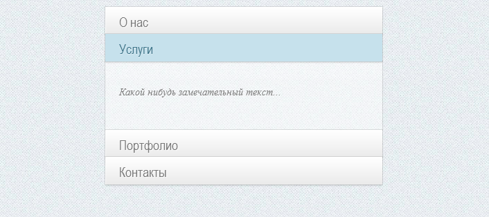
例2:折りたたみ可能なリスト(ラジオ)
したがって、擬似クラス
:checked
を使用して、純粋なCSSでアコーディオンメニューを実装する例を示します。 この方法を使用すると、ブロックの開閉を制御できます。 メニューには2つのタイプがあります。完全に開いたものと、他のブロックが折りたたまれたときの1つのブロックの表示です。 ウィル
checkbox
と
radio
それぞれ使用し
checkbox
。
HTMLマークアップ
メニュー自体は
ac-container
. checkbox
, input
ID.
<section class="ac-container"> <div> <input id="ac-1" name="accordion-1" type="checkbox" checked /> <label for="ac-1"> </label> <article> <p> ... </p> </article> </div> <div> <input id="ac-2" name="accordion-1" type="checkbox" /> <label for="ac-2"></label> <article> <p> ...</p> </article> </div> <div> <input id="ac-3" name="accordion-1" type="checkbox" /> <label for="ac-3"></label> <article> <p> ...</p> </article> </div> <div> <input id="ac-4" name="accordion-1" type="checkbox" /> <label for="ac-4"></label> <article> <p> ...</p> </article> </div> </section>
CSS
.ac-container{ width: 400px; margin: 10px auto 30px auto; }
. C input. z-index. :
.ac-container label{ font-family: 'BebasNeueRegular', 'Arial Narrow', Arial, sans-serif; padding: 5px 20px; position: relative; z-index: 20; display: block; height: 30px; cursor: pointer; color: #777; text-shadow: 1px 1px 1px rgba(255,255,255,0.8); line-height: 33px; font-size: 19px; background: -moz-linear-gradient(top, #ffffff 1%, #eaeaea 100%); background: -webkit-gradient(linear, left top, left bottom, color-stop(1%,#ffffff), color-stop(100%,#eaeaea)); background: -webkit-linear-gradient(top, #ffffff 1%,#eaeaea 100%); background: -o-linear-gradient(top, #ffffff 1%,#eaeaea 100%); background: -ms-linear-gradient(top, #ffffff 1%,#eaeaea 100%); background: linear-gradient(top, #ffffff 1%,#eaeaea 100%); filter: progid:DXImageTransform.Microsoft.gradient( startColorstr='#ffffff', endColorstr='#eaeaea',GradientType=0 ); box-shadow: 0px 0px 0px 1px rgba(155,155,155,0.3), 1px 0px 0px 0px rgba(255,255,255,0.9) inset, 0px 2px 2px rgba(0,0,0,0.1); } } .ac-container label:hover{ background: #fff; }
input :
.ac-container input:checked + label, .ac-container input:checked + label:hover{ background: #c6e1ec; color: #3d7489; text-shadow: 0px 1px 1px rgba(255,255,255, 0.6); box-shadow: 0px 0px 0px 1px rgba(155,155,155,0.3), 0px 2px 2px rgba(0,0,0,0.1); }
- :after
label
.ac-container label:hover:after, .ac-container input:checked + label:hover:after{ content: ''; position: absolute; width: 24px; height: 24px; right: 13px; top: 7px; background: transparent url(http://netcribe.com/example/arrow_down.png) no-repeat center center; } .ac-container input:checked + label:hover:after { background-image: url(http://netcribe.com/example/arrow_up.png); }
input article:
.ac-container input{ display: none; } .ac-container article{ background: rgba(255, 255, 255, 0.5); margin-top: -1px; overflow: hidden; height: 0px; position: relative; z-index: 10; -webkit-transition: height 0.3s ease-in-out, box-shadow 0.6s linear; -moz-transition: height 0.3s ease-in-out, box-shadow 0.6s linear; -o-transition: height 0.3s ease-in-out, box-shadow 0.6s linear; -ms-transition: height 0.3s ease-in-out, box-shadow 0.6s linear; transition: height 0.3s ease-in-out, box-shadow 0.6s linear; } .ac-container input:checked ~ article{ -webkit-transition: height 0.3s ease-in-out, box-shadow 0.6s linear; -moz-transition: height 0.3s ease-in-out, box-shadow 0.6s linear; -o-transition: height 0.3s ease-in-out, box-shadow 0.6s linear; -ms-transition: height 0.3s ease-in-out, box-shadow 0.6s linear; transition: height 0.3s ease-in-out, box-shadow 0.6s linear; box-shadow: 0px 0px 0px 1px rgba(155,155,155,0.3); height 100px; } .ac-container article p{ font-style: italic; color: #777; line-height: 23px; font-size: 14px; padding: 20px; text-shadow: 1px 1px 1px rgba(255,255,255,0.8); }
, article
. height
auto .
.