Jsfiddleの例
HTML
<html> <head></head> <body id="body"><body> </html>
CSS
背景色(pattern.png-この例ではテクスチャ)とブラウザウィンドウの高さに等しいページの高さを設定します。
html{ height: 100%; min-height: 100%; } body{ background:url('http://www.netcribe.com/images/pattern.png') repeat fixed left center #0296BA; overflow:hidden; }
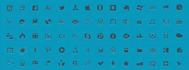
背景のアニメーション部分はアイコンで、その画像は.iconsクラスを持つ要素の背景になります。 幅は背景画像の幅に等しくなります。
leadicons.png(4898px * 32px)
.icons{ background-image:url('http://www.netcribe.com/images/leadicons.png'); background-repeat:repeat-x; height:60px; width:4898px; clear:both; /*animation-duration*/ -webkit-animation-duration:200s; -moz-animation-duration:200s; -ms-animation-duration:200s; -o-animation-duration:200s; animation-duration:200s; /*animation-iteration-count*/ -webkit-animation-iteration-count:infinite; -moz-animation-iteration-count:infinite; -ms-animation-iteration-count:infinite; -o-animation-iteration-count:infinite; animation-iteration-count:infinite; }
CSSでは、2つのクラスが指定されており、左に移動するアニメーションが割り当てられ、左に移動するアニメーションが割り当てられ、右に移動するアニメーションが割り当てられています。
.move-left{ /*animation-name*/ -webkit-animation-name:movement-left; -moz-animation-name:movement-left; -ms-animation-name:movement-left; -o-animation-name:movement-left; animation-name:movement-left; } .move-right{ /*animation-name*/ -webkit-animation-name:movement-right; -moz-animation-name:movement-right; -ms-animation-name:movement-right; -o-animation-name:movement-right; animation-name:movement-right; }
Javascript
.iconsクラスを使用した要素の移動は異なる位置から開始することが重要であるため、すべての要素は異なる背景位置プロパティを持ち、アニメーション関数自体でマージンプロパティを変更する必要があります。
アニメーションの方向を使用するCSSスタイル:
.icons{ background-image:url('http://www.netcribe.com/images/leadicons.png'); background-repeat:repeat-x; height:60px; width:4898px; clear:both; /*animation-duration*/ -webkit-animation-duration:200s; -moz-animation-duration:200s; -ms-animation-duration:200s; -o-animation-duration:200s; animation-duration:200s; /*animation-iteration-count*/ -webkit-animation-iteration-count:infinite; -moz-animation-iteration-count:infinite; -ms-animation-iteration-count:infinite; -o-animation-iteration-count:infinite; animation-iteration-count:infinite; /*animation-name*/ -webkit-animation-name:movement; -moz-animation-name:movement; -ms-animation-name:movement; -o-animation-name:movement; animation-name:movement; } .move-left{ /*animation-direction*/ -webkit-animation-direction:alternate; -moz-animation-direction:alternate; -ms-animation-direction:alternate; -o-animation-direction:alternate; animation-direction:alternate; } .move-right{ /*animation-direction*/ -webkit-animation-direction:alternate-reverse; -moz-animation-direction:alternate-reverse; -ms-animation-direction:alternate-reverse; -o-animation-direction:alternate-reverse; animation-direction:aalternate-reverse; } javascipt
<script src="http://yandex.st/jquery/1.8.2/jquery.min.js"></script>
$(document).ready(function(){ var clientWidth, clientHeight, x, y, z; clientWidth = $("html").width(); clientHeight = $("html").height(); margin = 4898 - parseInt(clientWidth); x=Math.ceil(clientHeight/60); // .icons y=0; // background-position z=Math.ceil(4898/(2*x)); // background-position $("#body").css({'width':clientWidth,'height':clientHeight});
アニメーション関数を生成します:
$("#body").append('<style>@keyframes movement-left {from {} to {margin-left: '+ -margin +'px;}} @keyframes movement-right {from {} to {margin-left: 0px;} @-moz-keyframes movement-left {from {} to {margin-left: '+-margin+'px;}} @-moz-keyframes movement-right {from {} to {margin-left:0px;} @-ms-keyframes movement-left {from {} to {margin-left: '+ -margin +'px;}} @-ms-keyframes movement-right {from {} to {margin-left: 0px;}} @-o-keyframes movement-left {from {} to {margin-left: '+ -margin +'px;}} @-o-keyframes movement-right {from {} to {margin-left: 0px;}} @-webkit-keyframes movement-left {from {} to {margin-left: '+ -margin +'px;}} @-webkit-keyframes movement-right {from {} to {margin-left: 0px;}} </style>');
.iconsクラスを使用して要素を作成します。
for(var i=0;i<x;i++){ if(i%2==0){ $("#body").append('<div style="background-position:'+y+'px 0;" class="icons move-left">'); } else{ $("#body").append('<div style="background-position:'+y+'px 0; margin-left: '+ -margin +'px" class="icons move-right">');}y+=z;} });
background-positionのみを変更できるのにマージンを変更する理由:
この場合、background-positionで示される最終位置までの距離は、すべての要素と移動速度で異なります。 アニメーションがひどく見える理由
セミの原理
background-positionのみが変更される1つのアニメーションを使用して、この例を実装することができます。 この場合、素晴らしいicの原理を使用する必要があります(これについては、 こちらで説明します )。 次に、アニメーションの逆の動きを指定します。
ご清聴ありがとうございました。