最終的に何をすべきか
始めましょう、プロジェクトを作成し、このコードをアクティビティに追加します
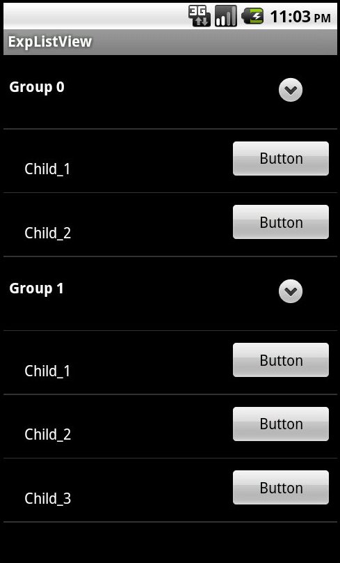
public class ExpActivity extends Activity { @Override public void onCreate(Bundle savedInstanceState) { super.onCreate(savedInstanceState); setContentView(R.layout.main); // list ExpandableListView listView = (ExpandableListView)findViewById(R.id.exListView); // ArrayList<ArrayList<String>> groups = new ArrayList<ArrayList<String>>(); ArrayList<String> children1 = new ArrayList<String>(); ArrayList<String> children2 = new ArrayList<String>(); children1.add("Child_1"); children1.add("Child_2"); groups.add(children1); children2.add("Child_1"); children2.add("Child_2"); children2.add("Child_3"); groups.add(children2); // context ExpListAdapter adapter = new ExpListAdapter(getApplicationContext(), groups); listView.setAdapter(adapter); } }
main.xml ExpandableListViewに追加する
<?xml version="1.0" encoding="utf-8"?> <LinearLayout xmlns:android="http://schemas.android.com/apk/res/android" android:orientation="vertical" android:layout_width="fill_parent" android:layout_height="fill_parent" > <ExpandableListView android:id="@+id/exListView" android:layout_width="match_parent" android:layout_height="match_parent" android:indicatorLeft="250dp" android:indicatorRight="300dp" /> </LinearLayout>
アダプタークラスを作成します
public class ExpListAdapter extends BaseExpandableListAdapter { private ArrayList<ArrayList<String>> mGroups; private Context mContext; public ExpListAdapter (Context context,ArrayList<ArrayList<String>> groups){ mContext = context; mGroups = groups; } @Override public int getGroupCount() { return mGroups.size(); } @Override public int getChildrenCount(int groupPosition) { return mGroups.get(groupPosition).size(); } @Override public Object getGroup(int groupPosition) { return mGroups.get(groupPosition); } @Override public Object getChild(int groupPosition, int childPosition) { return mGroups.get(groupPosition).get(childPosition); } @Override public long getGroupId(int groupPosition) { return groupPosition; } @Override public long getChildId(int groupPosition, int childPosition) { return childPosition; } @Override public boolean hasStableIds() { return true; } @Override public View getGroupView(int groupPosition, boolean isExpanded, View convertView, ViewGroup parent) { if (convertView == null) { LayoutInflater inflater = (LayoutInflater) mContext.getSystemService(Context.LAYOUT_INFLATER_SERVICE); convertView = inflater.inflate(R.layout.group_view, null); } if (isExpanded){ // -, Group } else{ // -, Group } TextView textGroup = (TextView) convertView.findViewById(R.id.textGroup); textGroup.setText("Group " + Integer.toString(groupPosition)); return convertView; } @Override public View getChildView(int groupPosition, int childPosition, boolean isLastChild, View convertView, ViewGroup parent) { if (convertView == null) { LayoutInflater inflater = (LayoutInflater) mContext.getSystemService(Context.LAYOUT_INFLATER_SERVICE); convertView = inflater.inflate(R.layout.child_view, null); } TextView textChild = (TextView) convertView.findViewById(R.id.textChild); textChild.setText(mGroups.get(groupPosition).get(childPosition)); Button button = (Button)convertView.findViewById(R.id.buttonChild); button.setOnClickListener(new View.OnClickListener() { @Override public void onClick(View view) { Toast.makeText(mContext,"button is pressed",5000).show(); } }); return convertView; } @Override public boolean isChildSelectable(int groupPosition, int childPosition) { return true; } }
メソッドとパラメーターの名前は非常に有益です。 getGroupViewメソッドとgetChildViewメソッドは、それぞれ「親」と「子」のビューを返します。 getGroupViewメソッドでisExpandedパラメーターを使用すると、たとえば、さまざまな条件下でグループの背景を変更できます。 LayoutInflaterを使用して、リストにカスタムレイアウトを使用します。
group_view.xml
<?xml version="1.0" encoding="utf-8"?> <LinearLayout xmlns:android="http://schemas.android.com/apk/res/android" android:layout_width="match_parent" android:layout_height="match_parent"> <TextView android:id="@+id/textGroup" android:layout_width="wrap_content" android:layout_height="50dp" android:layout_marginLeft="5dp" android:layout_marginTop="20dp" android:textColor="@android:color/white" android:textStyle="bold" /> </LinearLayout>
child_view.xml
<?xml version="1.0" encoding="utf-8"?> <LinearLayout xmlns:android="http://schemas.android.com/apk/res/android" android:layout_width="match_parent" android:layout_height="match_parent"> <TextView android:id="@+id/textChild" android:layout_width="wrap_content" android:layout_height="40dp" android:layout_marginLeft="20dp" android:layout_marginTop="20dp" android:textColor="@android:color/white" /> <Button android:id="@+id/buttonChild" android:layout_width="100dp" android:layout_height="40dp" android:layout_marginLeft="150dp" android:layout_marginTop="10dp" android:text="Button" android:focusable="false" /> </LinearLayout>
ボタンがchild_view.xmlに追加され、 getChildViewメソッドのアダプターでクリックされました。 同様に、ボタンやその他の要素をgroup_view.xmlに追加できます。
リストは、リスナーが「ハング」させることもできます。
- OnChildClickListener-要素をクリックします
- OnGroupCollapseListener-グループを最小化
- OnGroupExpandListener-グループ展開
- OnGroupClickListener-グループをクリックします
次に、 groupIndicator-グループステータスインジケータについて考えます。 その位置は、 main.xmlで indicatorLeftおよびindicatorRightパラメータをそれぞれ左および右の境界で設定します。 デフォルトでは、インジケータは左側にありますが、あまり馴染みがありません。 画像を置き換えることもできます。そのためには、このコードを使用してdrawableフォルダーにindicator.xmlを作成する必要があります
<?xml version="1.0" encoding="utf-8"?> <selector xmlns:android="http://schemas.android.com/apk/res/android"> <item android:state_expanded="true" android:drawable="@drawable/imageOpen"> </item> <item android:state_empty="true" android:drawable="@drawable/imageClose"> </item> </selector>
ここで、 imageOpen-グループが開いているときに表示され、 imageClose-が閉じられます。 次に、 main.xmlで、 AndroidリストのパラメーターにgroupIndicator = "@ drawable / indicator"という行を追加する必要があります。 画像を準備するとき、group_viewレイアウトの高さ全体に沿って画像が引き伸ばされることを考慮する必要があります。 そのため、カスタムインジケーターアイコンが必要な場合は、いくつかの画像を使用し、getViewメソッドで外観を制御することをお勧めします。 この記事では、アダプターをうまく使用することのニュアンスについて説明します。また、ViewHolderクラスの使用にも注意を向けたいと思います。
それだけです。この投稿が初心者デベロッパーの助けになることを願っています。