UIPopoverController
またはポップアップウィンドウ(以降、単に「ポップオーバー」)要素は決して新しいものではあり
UIPopoverController
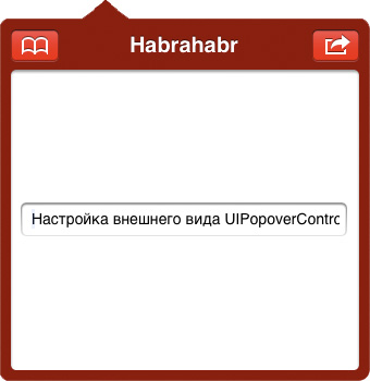
。 Habréには、このテーマに関する入門記事が1つと、他のトピックのいくつかのリファレンスがあります。 ほとんどの場合、ポップオーバーは「そのまま」使用され、変更を必要としませんが、一部のプロジェクトでは、この要素の外観を変更する必要があります。 この記事では、これを行う方法について説明します。
記事は、Appleのドキュメントを翻訳したり改作したりするだけではありません。 私は実際のプロジェクトで問題に遭遇し、(言葉の意味で)自分自身に資料を渡し、徹底的にかみ砕いた説明を準備し、最後に具体的な実装でこれを味付けしました。これはあなたに役立つかもしれません。
なぜこれが必要なのですか?
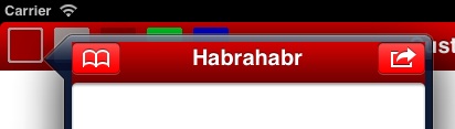
上で書いたように、特定のプロジェクトの例に対するそのようなニーズに直面しました。 最初は、アプリケーションはiPhone用に作成され、赤で「完了」しました。つまり、
UINavigationBar
クラスの
appearance
メソッドが使用されました。
[[UINavigationBar appearance] setTintColor: [UIColor colorWithRed:0.481 green:0.065 blue:0.081 alpha:1.000]]; [[UINavigationBar appearance] setBackgroundImage:[UIImage imageNamed:@"navbar"] forBarMetrics:UIBarMetricsDefault];
結果は次のようになりました。
既存のアプリケーションに基づいてiPadバージョンの作成を開始したとき、ポップオーバー内に
UINavigationController
を配置する必要がありました。
もちろん、デフォルトの外観をポップオーバー内に表示する場合、
UINavigationBar
クラスに戻すことができます
[[UINavigationBar appearanceWhenContainedIn:[UIPopoverController class], nil] setBackgroundImage:nil forBarMetrics:UIBarMetricsDefault]; [[UINavigationBar appearanceWhenContainedIn:[UIPopoverController class], nil] setTintColor:[UIColor clearColor]];
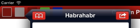
原則として、それは致命的ではありませんが、たとえば、顧客(そして彼は常に正しい)は、それはそのようにはならず、「ポップオーバーを思い出す!」 これは、
popoverBackgroundViewClass
クラスの
popoverBackgroundViewClass
プロパティが
UIPopoverController
です。 私たちのタスクは、ドキュメントに従って、
UIPopoverBackgroundView
クラスを継承することです。
UIPopoverBackgroundView
継承
もちろん、ドキュメントには、何をどのように行うのか、どのメソッドをオーバーライドするのか、そしてその理由を詳しく説明しています。 さらに、実用的な推奨事項が示されています-背景と矢印を描くには画像と
UIImageView
クラスを使用することをお勧めします。 これはすべて「言葉で」、私はイラストがそれに添付されている場合、私はテキストをより簡単に知覚するので、この「ギャップ」を埋めようとします。 並行して、
UIPopoverBackgroundView
特定のサブクラスの実装の記述を開始します。 最初に行うことは、単に実装を継承せずに、今のところそのままにしておきます。
#import <UIKit/UIPopoverBackgroundView.h> @interface MBPopoverBackgroundView : UIPopoverBackgroundView @end
UIPopoverController
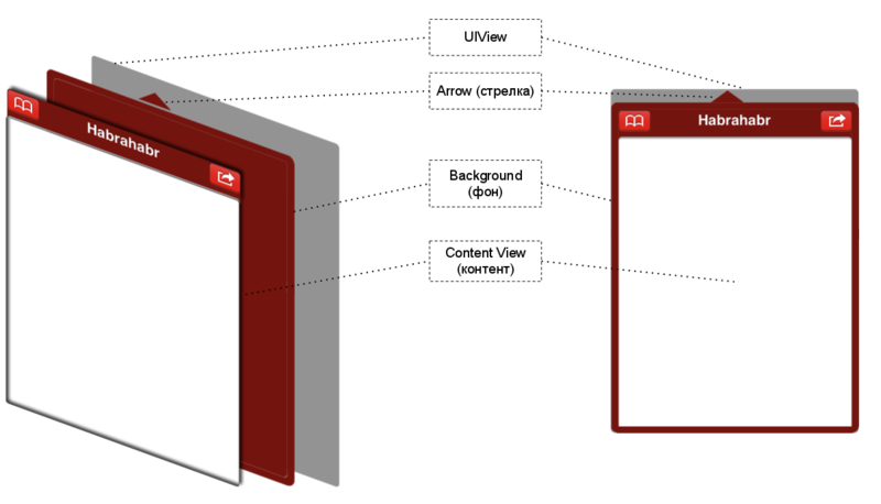
UIPopoverController
は、矢印(矢印)、背景(背景)、コンテンツまたはコンテンツ(コンテンツビュー)、およびこれらすべてが含まれ、レンダリングされるUIViewで構成されます。
矢印
 実際、この文脈での「矢印」は純粋に比fig的な用語です。 私たちは自分の想像力と常識によってのみ制限され、矢印の外観を選択します。 破線、曲線、任意の画像を使用できます。 オーバーライドされた
draw
メソッドで
UIView
のみを使用し、
gl***
関数で描画できます。アニメーション
UIImageView
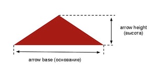
などを使用できます。 覚えておくべき唯一のことは、矢印の付け根の幅(
arrowBase
)とその高さ(
arrowHeight
)がクラスのすべてのインスタンスで変更されないことです。 この制限はある程度回避できますが、それについては後で詳しく説明します。
UIImageView
、Appleのアドバイスに従って、矢印を表す
UIImageView
を選択し
UIImageView
。 また、クラス
+(CGFloat)arrowBase
および
+(CGFloat)arrowHeight
のメソッドにも注意して
+(CGFloat)arrowHeight
。 デフォルトでは、両方とも例外をスローするため、サブクラスでそれらを再定義する必要があります。
表示を簡単にするために、矢印の画像があり、それが「popover-arrow.png」ファイルに保存されていることに同意します。 これですべてを安全にコーディングできます
@interface MBPopoverBackgroundView () // image view @property (nonatomic, strong) UIImageView *arrowImageView; @end @implementation MBPopoverBackgroundView @synthesize arrowImageView = _arrowImageView; // (arrow base) + (CGFloat)arrowBase { // return [UIImage imageNamed:@"popover-arrow.png"].size.width; } // (arrow height) + (CGFloat)arrowHeight { // return [UIImage imageNamed:@"popover-arrow.png"].size.height; } // - (id)initWithFrame:(CGRect)frame { self = [super initWithFrame:frame]; if (!self) return nil; // image view self.arrowImageView = [[UIImageView alloc] initWithImage:@"popover-arrow.png"]; [self addSubview:_arrowImageView]; return self; } @end
しかし、これは矢印だけではありません。 私たちの責任には、2つのプロパティのオーバーライドも含まれます。
@property (nonatomic, readwrite) UIPopoverArrowDirection arrowDirection; @property (nonatomic, readwrite) CGFloat arrowOffset;
そうでない場合、それらのいずれかに対してセッターまたはゲッターを呼び出そうとしたときに同じ例外をキャッチします。
矢印の方向(
arrowDirection
)は、矢印が指す場所(上、下、左、右)と実際の位置を示します。 矢印オフセット(
arrowOffset
)は、ビューの中心から矢印の中心を通る線までの距離です。一般に、図を見ると、すべてが明確に示されており、オフセットは青でマークされています。 上下のオフセットは負の値を持ちます。

ドキュメントでは、これらのプロパティにセッターとゲッターを実装することを推奨しています。 しかし実際には、これらのプロパティを宣言し、必要なメソッドを合成できることがわかりました
@interface MBPopoverBackgroundView () // @property (nonatomic, readwrite) UIPopoverArrowDirection arrowDirection; @property (nonatomic, readwrite) CGFloat arrowOffset; @end @implementation MBPopoverBackgroundView @synthesize arrowDirection = _arrowDirection; @synthesize arrowOffset = _arrowOffset; @end
これらのプロパティのいずれかを変更することは、矢印と背景のサイズと位置を変更する必要があることを示す信号です。 これらの目的には、Key-Value Observingメカニズムを使用します。 プロパティが変更されたらすぐに、
MBPopoverBackgroundView
をクリーンアップして、子(サブビュー)をその場所に配置する時間である、つまり、
setNeedsLayout
呼び出し
setNeedsLayout
。 これにより、次の適切な瞬間(OSが正確に決定するタイミング)に
layoutSubviews
れます。
layoutSubviews
の実装については、
layoutSubviews
詳しく説明します。
- (id)initWithFrame:(CGRect)frame { // *** *** [self addObserver:self forKeyPath:@"arrowDirection" options:0 context:nil]; [self addObserver:self forKeyPath:@"arrowOffset" options:0 context:nil]; return self; } - (void)observeValueForKeyPath:(NSString *)keyPath ofObject:(id)object change:(NSDictionary *)change context:(void *)context { // // setNeedsLayout [self setNeedsLayout]; } - (void)dealloc { [self removeObserver:self forKeyPath:@"arrowDirection"]; [self removeObserver:self forKeyPath:@"arrowOffset"]; // *** "" *** [super dealloc]; }
背景
矢印について言われていることのほとんどは背景に当てはまります。 また、特定の実装のために
UIImageView
を選択します。 ただし、矢印のサイズは変わりませんが、背景の動作はまったく異なります。 アプリケーションでは、さまざまな目的でポップオーバーを使用し、さまざまなサイズのコンテンツを内部に詰め込みます。 背景は、小さなツールチップでも、画面の床にある想像もできないポップオーバーでも同じように見えるはずです。 Appleは、伸縮可能な画像の使用を推奨しています;
UIImageView
クラスは、これらの目的のために
resizableImageWithCapInsets:(UIEdgeInsets)capInsets
メソッドを提供します。 たとえば、単純な背景、角が丸く、グラデーション、影、その他の効果のない1色で塗りつぶされた128x128の長方形を作成しました。 ファイルに「popover-background.png」という名前を付けましょう。
@property (nonatomic, strong) UIImageView *backgroundImageView; // *** @synthesize backgroundImageView = _backgroundImageView; - (id)initWithFrame:(CGRect)frame { // *** UIEdgeInsets bgCapInsets = UIEdgeInsetsMake(12, 12, 12, 12); UIImage *bgImage = [[UIImage imageNamed:@"popover-backgroung.png"] resizableImageWithCapInsets:bgCapInsets]; self.backgroundImageView = [[UIImageView alloc] initWithImage:bgImage]; [self addSubview:_backgroundImageView]; // *** }
UIEdgeInsets
オプションは、インデント(
UIEdgeInsets
)を使用して設定されます。 特定の値は、選択した画像によって異なります。 たとえば、私の場合、角の丸みの半径は10なので、理論上、すべての境界からインデントを10に等しくすることができますが、これは必須ではありません。

内容
コンテンツまたはコンテンツは、ポップオーバー内に表示されるものです。
UIPopoverBackgroundView
のコンテキストでは、コンテンツとそのサイズに影響を与えません。逆に、ポップオーバーのサイズ、したがって
UIPopoverBackgroundView
のサイズを決定するのはコンテンツのサイズです。
方法は次のとおりです。
UIPopoverController
ポップオーバーを描画する準備
UIPopoverController
できたら、コンテンツのサイズとポップオーバーを描画する位置を正確に把握し、矢印と背景に合わせて端に追加する量を把握する、つまり
MBPopoverBackgroundView
frame
プロパティを計算する
MBPopoverBackgroundView
です。
これらの目的のために、
+(CGFloat)arrowHeight
および
+(UIEdgeInsets)contentViewInsets
ます。 1つ目は矢印の高さを示し、2つ目は背景に含まれるコンテンツの量を示し、コンテンツの端から背景の端にインデントを返します。 このすべての情報を使用して、
UIPopoverController
は矢印の方向を選択し、
UIPopoverBackgroundView
クラス(より正確には特定のサブクラス)のオブジェクトを初期化し、特定のサイズを与えます。その後、必要に
UIPopoverBackgroundView
て矢印と背景を配置する必要があります。
contentViewInsets
再定義し
contentViewInsets
。 例として、すべてのエッジで10にインデントします。 負のインデントを設定することもできます。何か良い結果が得られるとは思いませんが、...
+ (UIEdgeInsets)contentViewInsets { // return UIEdgeInsetsMake(10, 10, 10, 10); }
コンテンツの周囲には、背景から10ピクセルの厚さのフレームがあります。

レイアウト
最後に、最後のステップは、矢印の方向、オフセット、および
UIPopoverBackgroundView
特定の寸法を
UIPopoverBackgroundView
、矢印と背景を正しく配置すること
UIPopoverBackgroundView
。
これを行うには、
layoutSubviews
メソッドを実装します。
#pragma mark - Subviews Layout // , setNeedsLayout - (void)layoutSubviews { // // CGRect bgRect = self.bounds; // , "" // , / , BOOL cutWidth = (_arrowDirection == UIPopoverArrowDirectionLeft || _arrowDirection == UIPopoverArrowDirectionRight); // , bgRect.size.width -= cutWidth * [self.class arrowHeight]; BOOL cutHeight = (_arrowDirection == UIPopoverArrowDirectionUp || _arrowDirection == UIPopoverArrowDirectionDown); // , bgRect.size.height -= cutHeight * [self.class arrowHeight]; // , origin point ( ) // ( ) ( ) if (_arrowDirection == UIPopoverArrowDirectionUp) { bgRect.origin.y += [self.class arrowHeight]; } else if (_arrowDirection == UIPopoverArrowDirectionLeft) { bgRect.origin.x += [self.class arrowHeight]; } // _backgroundImageView.frame = bgRect; // - (arrowDirection) (arrowOffset) // , image view // ( transformations), // : CGRect arrowRect = CGRectZero; UIEdgeInsets bgCapInsets = UIEdgeInsetsMake(12, 12, 12, 12); // switch (_arrowDirection) { case UIPopoverArrowDirectionUp: _arrowImageView.transform = CGAffineTransformMakeScale(1, 1); // - // : frame, bounds, bounds arrowRect = _arrowImageView.frame; // origin arrowRect.origin.x = self.bounds.size.width / 2 + _arrowOffset - arrowRect.size.width / 2; arrowRect.origin.y = 0; break; case UIPopoverArrowDirectionDown: _arrowImageView.transform = CGAffineTransformMakeScale(1, -1); // () arrowRect = _arrowImageView.frame; // origin arrowRect.origin.x = self.bounds.size.width / 2 + _arrowOffset - arrowRect.size.width / 2; arrowRect.origin.y = self.bounds.size.height - arrowRect.size.height; break; case UIPopoverArrowDirectionLeft: _arrowImageView.transform = CGAffineTransformMakeRotation(-M_PI_2); // 90 arrowRect = _arrowImageView.frame; // origin arrowRect.origin.x = 0; arrowRect.origin.y = self.bounds.size.height / 2 + _arrowOffset - arrowRect.size.height / 2; // - // , // , bgCapInsets.bottom, // arrowRect.origin.y = fminf(self.bounds.size.height - arrowRect.size.height - bgCapInsets.bottom, arrowRect.origin.y); // arrowRect.origin.y = fmaxf(bgCapInsets.top, arrowRect.origin.y); break; case UIPopoverArrowDirectionRight: _arrowImageView.transform = CGAffineTransformMakeRotation(M_PI_2); // 90 arrowRect = _arrowImageView.frame; arrowRect.origin.x = self.bounds.size.width - arrowRect.size.width; arrowRect.origin.y = self.bounds.size.height / 2 + _arrowOffset - arrowRect.size.height / 2; // UIPopoverArrowDirectionLeft arrowRect.origin.y = fminf(self.bounds.size.height - arrowRect.size.height - bgCapInsets.bottom, arrowRect.origin.y); arrowRect.origin.y = fmaxf(bgCapInsets.top, arrowRect.origin.y); break; default: break; } // _arrowImageView.frame = arrowRect; }
最後の仕上げ
上記のすべてのコードはタスクに対応しています。つまり、ポップオーバーの代替外観を作成できます。 それにもかかわらず、このコードには多くのマイナスがあります。たとえば、矢印と背景のファイル名はコードにしっかりと記述されています。 赤いポップオーバーではなく緑のポップオーバーを使用するには、別のサブクラスを作成し、特定のファイル名に応じてメソッドを再定義する必要があります。 背景を引き伸ばしてコンテンツの端からインデントするために使用されるオプションについても同じことが言えます。
もっと柔軟にしたいのですが、それを試みました。
名前を話す名前のクラスメソッドをいくつか追加しました
@interface MBPopoverBackgroundView : UIPopoverBackgroundView // + (void)initialize; // ( ) + (void)cleanup; // ( ) + (void)setArrowImageName:(NSString *)imageName; // + (void)setBackgroundImageName:(NSString *)imageName; // + (void)setBackgroundImageCapInsets:(UIEdgeInsets)capInsets; // + (void)setContentViewInsets:(UIEdgeInsets)insets; // @end
もちろん、このクラスのすべてのオブジェクトは同じ矢印と背景を描画しますが、別のプロジェクトで同じコードを変更せずに使用する機会があります。 1つのアプリケーション内で異なる色と色合いのポップオーバーが必要な場合は、
MBPopoverBackgroundView
継承する
MBPopoverBackgroundView
、外観ごとに1つの継承者を継承する
MBPopoverBackgroundView
、毎回
MBPopoverBackgroundView
set***
を呼び出してから、以前とは異なるポップオーバーを作成します。 要するに、柔軟性...
// @interface MBPopoverBackgroundViewBlue : MBPopoverBackgroundView @end // - (BOOL)application:(UIApplication *)application didFinishLaunchingWithOptions:(NSDictionary *)launchOptions { // [MBPopoverBackgroundView initialize]; // [MBPopoverBackgroundView setArrowImageName:@"popover-arrow-red.png"]; [MBPopoverBackgroundView setBackgroundImageName:@"popover-background-red.png"]; [MBPopoverBackgroundView setBackgroundImageCapInsets:UIEdgeInsetsMake(12, 12, 12, 12)]; [MBPopoverBackgroundView setContentViewInsets:UIEdgeInsetsMake(10, 10, 10, 10)]; // "" [MBPopoverBackgroundViewBlue setArrowImageName:@"popover-callout-dotted-blue.png"]; [MBPopoverBackgroundViewBlue setBackgroundImageName:@"popover-background-blue.png"]; [MBPopoverBackgroundViewBlue setBackgroundImageCapInsets:UIEdgeInsetsMake(15, 15, 15, 15)]; [MBPopoverBackgroundViewBlue setContentViewInsets:UIEdgeInsetsMake(20, 20, 20, 20)]; // *** } // { UIPopoverController *popoverCtl = ...; popoverCtl.popoverBackgroundViewClass = [MBPopoverBackgroundView class]; // popoverCtl.popoverBackgroundViewClass = [MBPopoverBackgroundViewBlue class]; // // *** }
明確な結果
MBPopoverBackgroundView
ソースと使用例はgithubにあります。
実装は ARCを使用しないため、ARCが有効になっているプロジェクトで使用する場合は
-fno-objc-arc
にフラグを
dealloc
か、コード内のいくつかの
autorelease
、
retain
、
release
および
dealloc
呼び出しを削除することを忘れないでください。 後者の場合、
s_customValuesDic
が明示的に
s_customValuesDic
ないため、静的辞書
s_customValuesDic
がどのくらいの期間存続するか
s_customValuesDic
ませんが、ARCのロジックによると、アプリケーションが終了するまで静的オブジェクトに触れません。 そして、この方法で値を保存することが最良の解決策であるとはまったく思いませんが、安定して確実に機能します。