
 少し前に、 Qtに関する最高の記事のコンテストの一環として、 TimePickerコンポーネントを開発し 、それに関する記事を書きました。 それだけでなく、コメントで、次のコンポーネントであるDatePickerについて話しました。 数日前に完成しました。
前の記事を読んでいない人のために、 NokiaがHarmattanアプリケーションで使用するすべてのコンポーネントが無料であるわけではなく、一部はMetGoの Qt Componentsに含まれていない、一部は代理で置き換えられている、左の写真はオリジナル、右の写真は開発者に提供されるDatePickerコンポーネントの代理。
必要条件
最初に必要なことは、コンポーネントの要件を決定することです。既存のコンポーネントの類似物を私に実装しようとしていたので、それは簡単です。
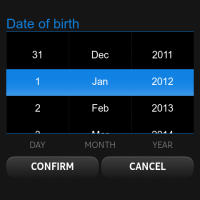
したがって、 DatePickerは指定された月のカレンダーのように見え、前月と翌月の最後の日をキャプチャする必要があります。 月間のナビゲーションは、矢印をクリックして、シフトジェスチャで、前月/翌月の日付をタップして実行されます。 現在選択されている日は枠で囲まれ、タップで切り替える必要があります。 今日も特別なフレームとして目立つはずです。
2番目の要件は、 Qt Quickをサポートするプラットフォームへの移植性を保証するMeeGo Qt Componentsとは別にコンポーネントを実装する必要があると判断したことです。
成分
叙情的な余談
最初に、コンポーネントの外観に柔軟な設定をセットアップする必要があります。 そして、それは非常に複雑なので、比較的多くの設定があります。 元のQt Componentsの作者と同じように、つまり、デフォルト設定のプロパティで満たされたシンプルなスタイルコンポーネントを作成しました。
QtObject { id: style property string orientationString: "portrait" property string backgroundImage: "image://theme/meegotouch-calendar-monthgrid-background-" + orientationString property string currentDayImage: "image://theme/meegotouch-monthgrid-daycell-current-day-" + orientationString property string selectedDayImage: "image://theme/meegotouch-monthgrid-daycell-selected-day-" + orientationString property string currentSelectedDayImage: "image://theme/meegotouch-monthgrid-daycell-selected-day-current-" + orientationString property string leftArrowImage: "image://theme/meegotouch-calendar-monthgrid-previousbutton" property string leftArrowPressedImage: "image://theme/meegotouch-calendar-monthgrid-previousbutton-pressed" property string rightArrowImage: "image://theme/meegotouch-calendar-monthgrid-nextbutton" property string rightArrowPressedImage: "image://theme/meegotouch-calendar-monthgrid-nextbutton-pressed" property string eventImage: "image://theme/meegotouch-monthgrid-daycell-regular-day-eventindicator" property string weekEndEventImage: "image://theme/meegotouch-monthgrid-daycell-regular-weekend-day-eventindicator" property string currentDayEventImage: "image://theme/meegotouch-monthgrid-daycell-current-day-eventindicator" property string selectedDayEventImage: "image://theme/meegotouch-monthgrid-daycell-selected-day-eventindicator" property string otherMonthEventImage: "image://theme/meegotouch-monthgrid-daycell-othermonth-day-eventindicator" property color weekEndColor: "#EF5500" property color weekDayColor: "#8C8C8C" property color otherMonthDayColor: "#8C8C8C" property color dayColor: "#000000" property color monthColor: "#000000" property color currentDayColor: "#EF5500" property color selectedDayColor: "#FFFFFF" property int monthFontSize: 32 property int dayNameFontSize: 18 property int dayFontSize: 26 }
将来、 DatePickerユーザーは設定を変更して、自分のスタイルをデフォルトからの継承者として定義できます。 ご覧のとおり、デフォルトはHarmattanプラットフォームで設定されており、優れたプラットフォームで使用する場合は再定義する必要があります。
メインについて
まず、コンポーネントの構造を決定する必要があります;一般的に、それは3つの要素で構成されています:
- 月と矢印の名前の帽子
- 曜日を含む文字列
- 月の日付の格子
それらを個別に検討しましょう。
月と矢印の名前の帽子
Item { id: header anchors { left: parent.left right: parent.right top: parent.top } height: 65 Item { id: leftArrow anchors { left: parent.left top: parent.top bottom: parent.bottom } width: 100 height: 65 Image { id: leftArrowImage anchors { left: parent.left leftMargin: (header.width / 7) / 2 - (width / 2) verticalCenter: parent.verticalCenter } width: height source: root.platformStyle.leftArrowImage } MouseArea { anchors.fill: parent onPressed: { leftArrowImage.source = root.platformStyle.leftArrowPressedImage } onReleased: { leftArrowImage.source = root.platformStyle.leftArrowImage previousMonthAnimation.start() dateModel.showPrevious() } } } Text { id: monthLabel anchors.centerIn: parent font.pixelSize: root.platformStyle.monthFontSize font.weight: Font.Light color: root.platformStyle.monthColor } Item { id: rightArrow anchors { right: parent.right top: parent.top bottom: parent.bottom } width: 100 height: 70 Image { id: rightArrowImage anchors { right: parent.right rightMargin: (header.width / 7) / 2 - (width / 2) verticalCenter: parent.verticalCenter } width: height source: root.platformStyle.rightArrowImage } MouseArea { anchors.fill: parent onPressed: { rightArrowImage.source = root.platformStyle.rightArrowPressedImage } onReleased: { rightArrowImage.source = root.platformStyle.rightArrowImage nextMonthAnimation.start() dateModel.showNext() } } } }
ここのすべては一見すると非常にシンプルで明確です:中央にはテキストフィールドがあり、端には矢印が付いた2つの写真があり、押すと月の変更手順とアニメーションが開始されます。
曜日を含む文字列
Row { id: weekDaysGrid anchors { left: parent.left right: parent.right top: header.bottom bottomMargin: 10 } width: parent.width WeekCell { text: qsTr("Mon") platformStyle: datePicker.platformStyle } WeekCell { text: qsTr("Tue") platformStyle: datePicker.platformStyle } WeekCell { text: qsTr("Wed") platformStyle: datePicker.platformStyle } WeekCell { text: qsTr("Thu") platformStyle: datePicker.platformStyle } WeekCell { text: qsTr("Fri") platformStyle: datePicker.platformStyle } WeekCell { isWeekEnd: true text: qsTr("Sat") platformStyle: datePicker.platformStyle } WeekCell { isWeekEnd: true text: qsTr("Sun") platformStyle: datePicker.platformStyle } }
Rowコンポーネントは、宣言されている順序で子を1行に配置します。
コードからわかるように、子は独自のコンポーネントを使用しますが、これは非常に単純です。
Item { id: weekCell property alias text: label.text property QtObject platformStyle: DatePickerStyle {} property bool isWeekEnd: false height: label.height width: parent.width / 7 Text { id: label anchors.centerIn: parent font.pixelSize: weekCell.platformStyle.dayNameFontSize color: weekCell.isWeekEnd ? weekCell.platformStyle.weekEndColor : weekCell.platformStyle.weekDayColor font.bold: true } }
DatePickerからこれらのコンポーネントへのスタイルオブジェクトの転送には特に注意を払う必要があります。したがって、ユーザーを追加の心配から省くことができます。実際、 WeekCellコンポーネントの存在をまったく知る必要はありません。
月の日付の格子
数値グリッドには、GridViewを使用しました。
GridView { id: daysGrid anchors { top: weekDaysGrid.bottom left: parent.left right: parent.right bottom: parent.bottom } cellWidth: width / 7 - 1 cellHeight: height / 6 interactive: false delegate: DayCell { platformStyle: datePicker.platformStyle width: daysGrid.cellWidth; height: daysGrid.cellHeight isCurrentDay: model.isCurrentDay isOtherMonthDay: model.isOtherMonthDay hasEventDay: model.hasEventDay dateOfDay: model.dateOfDay } model: DateModel { id: dateModel currentDate: new Date() onMonthChanged: { monthLabel.text = getMonthYearString() daysGrid.currentIndex = dateModel.firstDayOffset + selectedDate.getDate() - 1 } onSelectedDateChanged: { root.selectedDateChanged(selectedDate) } } MouseArea { anchors.fill: parent property int pressedPosition: 0 onPressed: { pressedPosition = mouseX } onReleased: { var delta = mouseX - pressedPosition; if (Math.abs(delta) > 100) { if (delta < 0) { nextMonthAnimation.start() dateModel.showNext() } else { previousMonthAnimation.start() dateModel.showPrevious() } } pressedPosition = 0 if (Math.abs(delta) < 20) { var index = daysGrid.indexAt(mouseX, mouseY) daysGrid.currentIndex = index dateModel.selectedDate = daysGrid.currentItem.dateOfDay if (daysGrid.currentItem.isOtherMonthDay) { if (daysGrid.currentItem.dateOfDay.getMonth() < dateModel.selectedDate.getMonth()) previousMonthAnimation.start() else nextMonthAnimation.start() dateModel.changeModel(daysGrid.currentItem.dateOfDay) } } } } }
ここでは、 表示モードが無効になり、唯一のMouseAreaが完全に閉じるという事実に特に注意する必要があります。 これにより、シフトジェスチャの問題が解決されます。指で移動したパスの長さを処理し、指定された数を超える場合は、新しい月に切り替えます。 パスがまったく良くない場合、ユーザーは特定の日にクリックしただけです。 注目すべきindexAtメソッドを使用すると、ピクセル座標でセルのインデックスを返す必要なセルの位置を決定できます。
セルデリゲート自体は非常に単純です。
Item { id: dayCell property QtObject platformStyle: DatePickerStyle {} property bool isOtherMonthDay: false property bool isCurrentDay: false property bool isSelectedDay: false property bool hasEventDay: false property date dateOfDay function color() { if (GridView.isCurrentItem) return platformStyle.selectedDayColor else if (isCurrentDay) return platformStyle.currentDayColor else if (isOtherMonthDay) return platformStyle.otherMonthDayColor return platformStyle.dayColor } function background() { if (GridView.isCurrentItem) { if (isCurrentDay) return platformStyle.currentSelectedDayImage return platformStyle.selectedDayImage } else if (isCurrentDay) return platformStyle.currentDayImage return "" } function eventImage() { if (GridView.isCurrentItem) return platformStyle.selectedDayEventImage else if (dateOfDay.getDay() === 0 || dateOfDay.getDay() === 6) return platformStyle.weekEndEventImage else if (isCurrentDay) return platformStyle.currentDayEventImage else if (isOtherMonthDay) return platformStyle.otherMonthEventImage return platformStyle.eventImage } Image { id: background anchors.centerIn: parent source: dayCell.background() Text { id: label anchors.centerIn: parent font.pixelSize: dayCell.platformStyle.dayFontSize color: dayCell.color() font.weight: (dayCell.isCurrentDay || dayCell.GridView.isCurrentItem) ? Font.Bold : Font.Light text: dayCell.dateOfDay.getDate() } Image { anchors { top: label.bottom topMargin: -5 horizontalCenter: parent.horizontalCenter } visible: hasEventDay source: dayCell.eventImage() } } }
これはほんの数枚の写真とテキストで、メインの写真は現在の要素と今日の要素を強調する役割を果たします。イベントが今日予定されている場合は、追加の要素が表示されます。 ヘルパー関数は、フラグの状態に応じて要素の外観を決定する際に関与します。
モデル
コンポーネントの最も複雑で退屈で物議を醸す部分。 実際には、モデルをQml / ECMAScriptのみで作成したかったのですが、 C ++ソリューションはより美しくシンプルになりますが、ユーザーがC ++で qmlプラグインをドラッグする必要があるため、実装にさらに困難が生じますコード。
そのため、 ECMAScriptで日付を操作するための嫌な組み込みクラスはひどく、ほとんど何もできません。たとえば、うるう年が現在かどうか、現在の月が何日かはわかりません。 または、たとえば、現在の月の最初の日が何曜日であるかなどです。 これらはすべて自分で作成する必要がありました。
モデルの補助部品
私はECMAScript / Javascriptの第一人者でもファンでもないので、これらのメソッドが可能な限り最適に作られているかどうかは絶対にわかりません。 それらは機能を果たしますが、私の意見ではinいです。
ここでは実装を示しません。名前のみを示します。
function isLeapYear(year); function getValidDayByMonthAndDay(month, day, leapYear);
最初が年がうるう年の場合はtrueを返し、2番目は年の予想数、月、および「うるう年」に応じて月の正しい数を返します。つまり、月を切り替えるときに境界値を調整します。
インターフェイスモデルメソッド
//public: function setEvent(eventDate, enable) { if (eventDate.getMonth() !== selectedDate.getMonth() && eventDate.getFullYear() !== selectedDate.getFullYear()) return setProperty(eventDate.getDate() + firstDayOffset, "hasEventDay", enable) } function getMonthYearString() { return Qt.formatDate(selectedDate, "MMMM yyyy") } function showNext() { showOtherMonth(selectedDate.getMonth() + 1) } function showPrevious() { showOtherMonth(selectedDate.getMonth() - 1) } function changeModel(_selectedDate) { clear() selectedDate = _selectedDate fillModel() monthChanged() }
setEventメソッドは、コードからわかるように、イベントフラグを特定の日付に設定またはリセットし、現在の月のイベントのみが処理されるようになりました。これにより、ユーザーはイベントを使用して日付の変更を監視し、変更ごとにイベントを再度設定することができます。 将来的には、モデル内にイベントの配列を作成して、この問題を解決する予定です。
getMonthYearStringメソッドは、単に「month year」という形式で期日を返します。ご想像のとおり 、これはDatePickerヘッダーに必要です。
showNextメソッドとshowPreviousメソッドは 、それぞれモデルを翌月または前月に切り替えるだけです。
さて、 changeModelメソッドを使用すると、現在選択されている日付を任意の日付に変更できます。
プライベートモデルメソッド
残念ながら、 Qmlはメソッドをプライベートにする方法をまだ知りませんが、プライベートでなければならないメソッドを以下に示します 。
function showOtherMonth(month) { var newDate = selectedDate var currentDay = selectedDate.getDate() currentDay = getValidDayByMonthAndDay(month, currentDay, isLeapYear(selectedDate.getFullYear())); newDate.setMonth(month, currentDay) changeModel(newDate) } function fillModel() { var tmpDate = selectedDate tmpDate.setDate(selectedDate.getDate() - (selectedDate.getDate() - 1)) var firstDayWeekDay = tmpDate.getDay() if (firstDayWeekDay === 0) firstDayWeekDay = 6 else firstDayWeekDay-- firstDayOffset = firstDayWeekDay for(var i = 0; i < 6 * 7; ++i) { var objectDate = selectedDate; objectDate.setDate(selectedDate.getDate() - (selectedDate.getDate() - 1 + firstDayOffset - i)) appendDayObject(objectDate) } } function appendDayObject(dateOfDay) { append({ "dateOfDay" : dateOfDay, "isCurrentDay" : dateOfDay.getDate() === currentDate.getDate() && dateOfDay.getMonth() === currentDate.getMonth() && dateOfDay.getFullYear() === currentDate.getFullYear(), "isOtherMonthDay" : dateOfDay.getMonth() !== selectedDate.getMonth(), "hasEventDay" : false }) }
showOtherMonthメソッドは、モデルを別の月に移動し、数値を変更せずに残します(もちろん境界調整を考慮に入れます)。
fillModelメソッドは、モデルに月の番号を入力します。これにより、彼は最初に月が始まる曜日を見つけます。
appendDayObjectメソッドは、指定されたテンプレートに従ってモデルに新しいレコードを追加するだけです。
おわりに
以上です。 コメント、要望、提案、バグ報告、パッチ-どういたしまして。
コンポーネントコードはGitoriusで入手できます 。 TimePickerのように、BSDライセンスの下で配布されています。 クイック使用ガイドは私のブログにあります。