Based on this line system, techniques work that make it possible to name lines and even grid areas. Using these techniques allows you to place items by name and not by number. In this article, I will take a detailed look at the various ways of naming lines and areas in CSS Grid layouts , as well as some interesting features that they create.
From the translator:
An article two years ago (2017), but it touches on the important mechanics of the CSS Grid functional, and therefore seems useful and relevant today.
Line naming
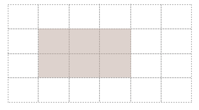
Let's start by naming the grid lines. In the example below, there is a Grid with six explicit column tracks and one explicit line track. Elements are placed on the grid using line numbers.
.grid { display: grid; grid-gap: 20px; grid-template-rows: 20vh ; grid-template-columns: 1fr 2fr 1fr 2fr 1fr 2fr; } .header { grid-row: 1; grid-column: 1 / -1; } .sidebar { grid-row: 2; grid-column: 1 / 3; } .content { grid-row: 2; grid-column: 3 / -1; }
If necessary, line names can be specified inside square brackets in the track list. It is important to remember here that you name the line, not the track that follows it. Having named the lines, you can use their names instead of numbers when positioning elements on the grid.
.grid { display: grid; grid-gap: 20px; grid-template-rows: [header-start] 20vh [header-end] ; grid-template-columns: [sidebar-start] 1fr 2fr [sidebar-end] 1fr 2fr 1fr 2fr; } .header { grid-row: header-start; grid-column: 1 / -1; } .sidebar { grid-row: 2; grid-column: sidebar-start / sidebar-end; }
The name can be anything other than the
span
keyword. For reasons that you'll learn later in this article, naming with the suffix
-start
for start lines (no matter if it's a line or column line) and
-end
for end is a good practice. The result should be
main-start
and
main-end
or
sidebar-start
and
sidebar-end
.
Quite often, the end line of one part of the grid and the start line of the other part are the same, but this is not a problem, since lines can have several names. You can specify lines of several names by adding them through a space inside square brackets.
.grid { display: grid; grid-gap: 20px; grid-template-rows: [header-start] 20vh [header-end] ; grid-template-columns: [full-start sidebar-start] 1fr 2fr [sidebar-end main-start] 1fr 2fr 1fr 2fr [main-end full-end]; } .header { grid-row: header-start; grid-column: full-start / full-end; } .sidebar { grid-row: 2; grid-column: sidebar-start / sidebar-end; } .content { grid-row: 2; grid-column: main-start / main-end; }
This example demonstrates that you do not have to name each individual grid line, and that line numbers that can be used in addition to names are always available.
Codepen 1. Line Naming
Lines with the same name.
We saw how lines can have several names, but there are also situations where several lines have the same name. This happens if you use the
repeat()
function and include named lines in the track list. The following example creates six named lines, alternately named
col-a-start
and
col-b-start
.
.grid { display: grid; grid-gap: 20px; grid-template-columns: repeat(3, [col-a-start] 1fr [col-b-start] 2fr); }
If you specify
col-a-start
when positioning an element, it will be placed on the first line encountered with the name
col-a-start
(which in the example considered would be the first grid line). According to the same principle, if you specify
col-b-start
when positioning an element, it will be placed on the second grid line.
If you need to position on subsequent lines, add a number after the name to indicate on which line of the line with the same name the item should be placed
.box3 { grid-row: 2; grid-column: col-a-start 2 / col-b-start 3; }
Codepen 2. Lines with the same name.
The specification describes this behavior as "creating a named set of grid lines."
Saving line names when rebuilding an adaptive grid
Use the line numbers or their names, you decide. As a rule, lines can be useful in situations when you want to change the grid structure as part of a media query. Instead of tracking on which line you place the elements at different control points, you can operate on sequentially named lines.
In the following simple example, I define grid columns for a narrow screen, and then redefine them with a width of 550px.
.grid { display: grid; grid-gap: 20px; grid-template-rows: [header-start] 20vh [header-end]; grid-template-columns: [full-start ] 10px [sidebar-start main-start] 1fr [main-end sidebar-end] 10px [full-end]; } @media (min-width: 550px) { .grid { grid-template-columns: [full-start sidebar-start] 1fr 2fr [sidebar-end main-start] 1fr 2fr 1fr 2fr [main-end full-end]; } }
Codepen 3. Naming things: redefining the position of named lines
Named Regions
Before that, we considered only named lines, but there is another way. We can name grid areas.
A grid region is a rectangular region consisting of one or more grid cells. The area is defined by four grid lines indicating the start and end lines for columns and rows.
We name the grid areas using the
grid-template-areas
property. This property describes the layout in the form of an ASCII table and is a set of lines, each of which describes a separate line track of the grid.
.grid { display: grid; grid-template-columns: repeat(3, 1fr 2fr) ; grid-template-areas: "head head head head head head" "side side main main main main" "foot foot foot foot foot foot"; }
The names that we use in the rows of the
grid-template-areas
property are assigned to the direct children of the grid using the
grid-area
property. The value of this property, when used for naming, is the so-called user identifier , so it does not need to be quoted
.header { grid-area: head; } .sidebar { grid-area: side; } .content { grid-area: main; } .footer { grid-area: foot; }
In order to make the area cover more than one cell when describing the grid structure using the
grid-template-areas
property, you need to re-record its identifier several times along a row or column. The created area must be a rectangle, L and T-shaped areas are not allowed. You can also create only one rectangular area for each name - disconnected areas are not allowed. The specification notes that:
“Non-rectangular or disconnected areas may be allowed in future versions of this module”
- Property grid-template-areas
When describing a grid, you need to take care of its full presentation, otherwise the entire ad will be discarded as invalid. This means that each grid cell must be filled.
grid-template-areas: "head head head head head head" "side side main main main main" "foot foot foot foot foot foot"; }
Since you may want to leave some cells in the markup empty, the specification defines a dot symbol
.
or a sequence of dots without spaces between them
....
as a marker of an empty cell
grid-template-areas: "head head head head head head" "side side main main main main" "....... ....... foot foot foot foot"; }
Codepen 4. Named Regions
If you haven’t already downloaded Firefox to take advantage of all the latest Firefox DevTools Grid Inspector features, I recommend doing this when working with named areas

Demonstration of named areas in the "Grid Inspector" of the Firefox browser ( Open original )
Named lines form areas
Now we come to the interesting part of this whole holiday of naming. You may remember that when we looked at named lines, I suggested using a line ending agreement that sets the start of the area using
-start
, the end of the area using
-end
. The reason for this is that if you name the lines this way, you end up with a grid area with that name, and you can put an element into it by setting this name through the
grid-area
property.
In the following example, for both rows and columns, I name the lines
panel-start
and
panel-end
. This will give me a named area called panel. If I set it as the value of the
grid-area
property for an element on the page, this will place the element in the area defined by these lines
.grid { display: grid; grid-gap: 20px; grid-template-columns: 1fr [panel-start] 2fr 1fr 2fr 1fr [panel-end] 2fr; grid-template-rows: 10vh [panel-start] minmax(200px, auto) 10vh [panel-end]; grid-template-areas: "head head head head head head" "side side main main main main" ".... .... foot foot foot foot"; } .panel { grid-area: panel; }
Codepen 5. Areas formed from named lines
Lines are formed from named areas
We can also do the opposite of what is shown above using lines created from named areas. Each area creates four named lines using the same
-start
and
-end
suffix
-end
. If there is a named area called
main
, its start and end line and column lines will be called
main-start
and
main-end
. These named lines can be used to position an element.
In the following example, I position the panel using the names of these automatically generated lines:
.grid { display: grid; grid-gap: 20px; grid-template-columns: 1fr [panel-start] 2fr 1fr 2fr 1fr [panel-end] 2fr; grid-template-rows: 10vh [panel-start] minmax(200px, auto) 10vh [panel-end]; grid-template-areas: "head head head head head head" "side side main main main main" ".... .... foot foot foot foot"; } .panel { grid-area: panel; }
Codepen 6. Lines form from named areas
Line names equivalent to region name
In addition to lines with the
-start
and
-end
, lines are created for the faces of any grid region with the name of this region. Thus, if there is a
main
area, you can use the
main
identifier as a value for the
grid-row-start
or
grid-column-start
properties, and the content will be located from the beginning of this area. If you used this value for the
grid-row-end
or
grid-column-end
property, then the end line of this area is selected. In the example below, I stretch the
.panel
element from start of
main
to end of
main
for columns, and from start of
main
to end of
foot
for lines
.panel { grid-column: main; grid-row: main / foot ; }
Codepen 7. Line names equivalent to region name
Grid-area property explanation
It is useful to know something about the
grid-area
property. Essentially, what we do when using
grid-area
with an identifier such as
main
is how we describe all four lines of the area. Valid values for the
grid-area
property are also line numbers.
.main { grid-area: 2 / 1 / 4 / 3; }
This has the same effect as the entry:
.main { grid-row-start: 2; grid-column-start: 1; grid-row-end: 4; grid-column-end: 3; }
When you ask
.main { grid-area: main; }
This actually means:
.main { grid-area: main / main / main / main ; }
The
grid-area
property behaves a little differently when a user identifier is used, rather than a line number. When using line numbers for initial values in the
grid-area
property, any end line number that you do not specify will be automatically set to
auto
, therefore, automatic positioning will be used to determine where to place the element.
However, if you use a user ID and skip some lines, they are set as follows
Three line names defined
.main { grid-area: main / main / main ; }
If you specify three line names, then essentially you are missing
grid-column-end
. If
grid-column-start
is a user identifier, then the same identifier is also set for
grid-column-end
. As we have already seen, the
-end
property will use the end face of the
main
, so if
grid-column-start
and
grid-column-end
given the same name, the content is stretched to all the columns of this area.
Two line names specified
.main { grid-area: main / main ; }
When only two names are specified, the starting lines of the rows and columns are set. If
grid-column-start
and / or
grid-row-start
is a user identifier, then
grid-column-end
and
grid-row-end
are set to the same value, respectively.
One line name specified
.main { grid-area: main ; }
Setting one line name is exactly what you do when you set the grid-area to the main name of the area. In this case, all four lines are set to this value.
Note : This works for both
grid-column
and
grid-row
.
This method actually means that you can designate a set of columns or rows in a grid to place an element. As the
-end
values for the
grid-area
property are set to the same values as the initial ones (when omitted), the final values for the
grid-column
and
grid-row
properties also behave. This means that you can place the element between the start and end column lines of the
main
area using:
.main { grid-column: main ; }
In the Breaking Out with CSS Grid explained, I showed how this feature is used to create useful design patterns for full-sized areas that go beyond a limited content area.
A grid can have many named lines.
All of the above means that the grid as a result can contain a huge number of named lines. In most cases, you should not worry about this. Work with the lines you need and ignore the existence of others.
Naming and abbreviated grid and grid-template properties
CSS Grid has two abbreviations that allow you to set many grid properties in one compact syntax. Personally, it seems difficult enough for me to perceive. When I discuss this with other developers, opinions are divided: some like them, others prefer to use separate properties. As in the case of other abbreviations, it should be remembered that the values of properties that you do not use in it will be reset to the original
Grid-template abbreviation: creating an explicit grid
You can use the
grid-template
shortcut to set all the properties of an explicit grid in one place at once
grid-template-columns grid-template-rows grid-template-areas
This means that you can define named lines and named areas at the same time. When using a property that combines named areas and lines, I would first determine the value of the
grid-template-areas
property, as described in the section above.
Then you might want to add line names. They are placed at the beginning and at the end of each line of values - remember that each line of values represents a line track. The name or names of the lines must be inside the square brackets, just as when naming the lines in the
grid-template-rows
property, and must be outside the quotation marks surrounding the line of values that defines the line track.
In the example below, I named two line lines:
panel-start
goes after the header line (second line grid line) and
panel-end
goes after the last footer line (fourth grid line with three line tracks). I also determined the size of the line track for the named and unnamed lines, adding a parameter at the end of the value line describing this line track
.grid { display: grid; grid-gap: 20px; grid-template: " head head head head head head" 10vh [panel-start] "side side main main main main" minmax(200px, auto) ".... .... foot foot foot foot" 10vh [panel-end]; }
If it is also necessary to name the columns, we cannot do this inside the line, so we need to add the separator
/
, and then define a list of column tracks. Lines are named just as if this list were the value of the
grid-template-columns
property.
.grid { display: grid; grid-gap: 20px; grid-template: " head head head head head head" 10vh [panel-start] "side side main main main main" minmax(200px, auto) ".... .... foot foot foot foot" 10vh [panel-end] / [full-start ] 1fr [panel-start] 2fr 1fr 2fr 1fr [panel-end] 2fr [full-end]; }
In this example, which you can see in the codepen below, I create an additional set of lines for rows and columns, these lines define an area called
panel
, since I used the syntax
panel-start
and
panel-end
. This way I can place the element by setting the
panel
value of the
grid-area
property.
At first glance, this looks rather incomprehensible. So, here we create a list of columns that line up in accordance with our ASCII table defined above. Optionally, you can add spaces between the values to align the definition of
template-areas
and
template-columns
.
Codepen 8. Grid -template abbreviation
Grid abbreviation: explicit and implicit mesh
The specification assumes that if you need to define an implicit grid separately, you should use the shorthand
grid
property instead of
grid-template
. The abbreviation
grid
resets all implicit values that you have not set. Thus, it allows you to set and reset the following properties
grid-template-columns grid-template-rows grid-template-areas grid-auto-columns grid-auto-rows grid-auto-flow
For our purposes, using the
grid
abbreviation will be identical to using the
grid-template
, since we specify an implicit grid definition. The only difference will be in resetting the
grid-auto–*
properties. The
grid
abbreviation can be used either to set the explicit grid and reset the implicit properties, or to set the implicit grid and reset the explicit properties. Doing both at the same time does not make much sense
.grid { display: grid; grid-gap: 20px; grid: " head head head head head head" 10vh [panel-start] "side side main main main main" minmax(200px, auto) ".... .... foot foot foot foot" 10vh [panel-end] / [full-start ] 1fr [panel-start] 2fr 1fr 2fr 1fr [panel-end] 2fr [full-end]; }
Note : In the original recommended version of the CSS Grid specification, this reduction also resets the gap properties between
grid-column-gap
and
grid-row-gap
cells. However, this behavior was eventually changed. Browsers update this behavior, but at the time of writing (October 2017), you could still encounter a situation where the value of the
gap
properties is reset to zero when the reduction is used, so you may need to redefine them later
Which approach to use?
You may ask which of all these methods is best used for a specific task? There are no strict rules. Personally, I like to use
grid-template-areas
for components when I work in my template library. It’s convenient to have the structure of the component right in front of your eyes right in CSS and
grid-template-areas
makes it easy to try out different layout options when testing it. I found that because of such a simple movement of the mesh cells, it is important to ensure that the visual and logical order of the component cells is not disturbed. Visitors who interact with your site using the keyboard, switching between the elements with the Tab button, will select the elements in the order in which they are defined in the markup. Be sure to remember to reorder the layout as soon as you decide on the most appropriate way to display your content. To learn more about this issue, I suggest reading the CSS Grid Layout and Accessibility article.
Basic naming conventions
To summarize the article, I will reiterate a few basic rules to keep in mind when naming lines or areas of CSS Grid:
Line naming:
- You can use almost any name (except for the span keyword), but you can use the area created from these lines if their names end with
-start
and-end
- Lines can have multiple names defined inside square brackets and separated by a space
- Multiple lines may have the same name; if you need a specific one, just add the number of the necessary line after the name in order
Naming Areas:
- When defining an area using
grid-template-areas
, the shape of the area should be rectangular - When using the
grid-template-areas
property, each line track of the grid is represented as a string of values and is displayed in quotation marks - Each cell must be filled. If by design you want to leave some cells empty, use a dot for this
.
or ellipsis...
no spaces - Named regions create lines with the same name as the region, but with the
-start
and-end
. They can be used to position elements.