Hello!
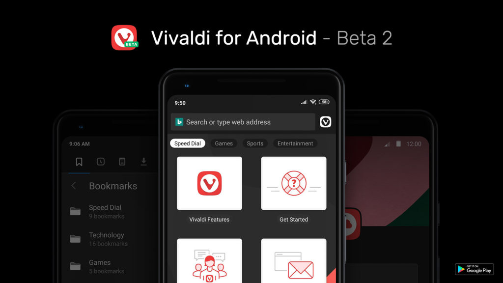
The development of modern software resembles a snowball: added one function - received two requests for its improvement, implemented these requests - has already received four offers to expand the capabilities of the browser. The beauty! No time to drink tea. But today, all the same, let's be patient, pour some tea or, there, coffee — whoever loves, and see what’s new in the next, already second beta version of Vivaldi browser for Android. We will move from larger and more noticeable changes to smaller ones, albeit no less significant.
Almost Angry Tabs
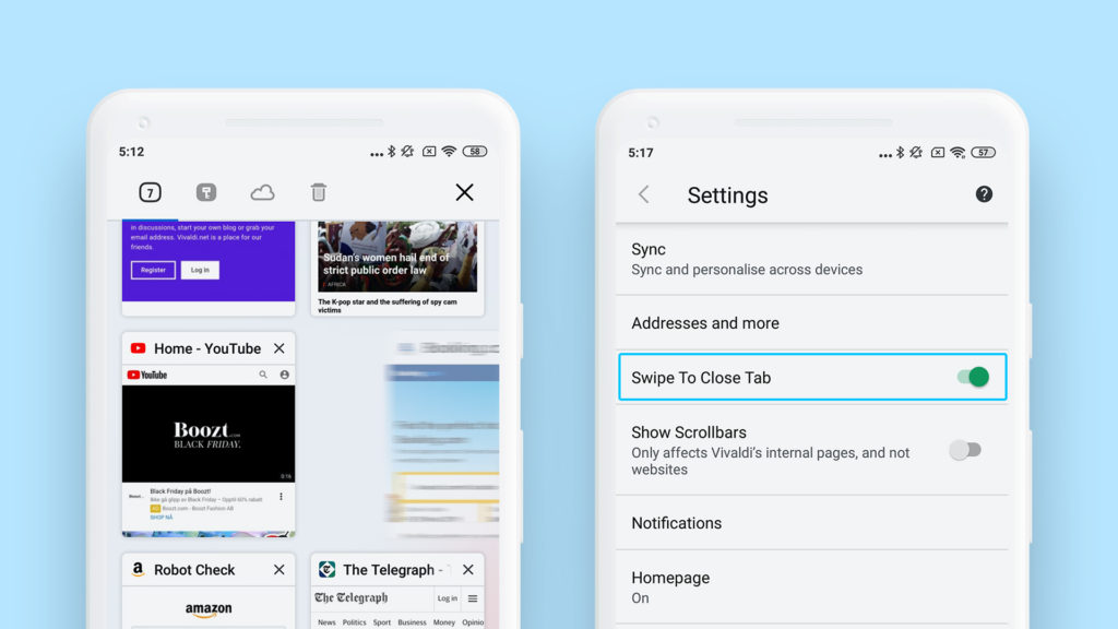
By the numerous requests of users, a new option appeared in the browser settings called “Close tabs by shift”. Actually, the name is quite telling, although not aloud. When you turn on this useful function, the user gets the opportunity to close unnecessary tabs not by poking a cross, but with a flick of the finger to the left. Or right. Put your finger on the tab, count to three and then with a slight shift in one of the sides we throw the tab out of the screen. You can even arrange something like a competition for speed - only first you need to open a dozen three or four tabs. Well, this is at the discretion of users. Yes, and just a little life hack: the tabs will close much faster if you count not up to three, but up to two.
End visibility
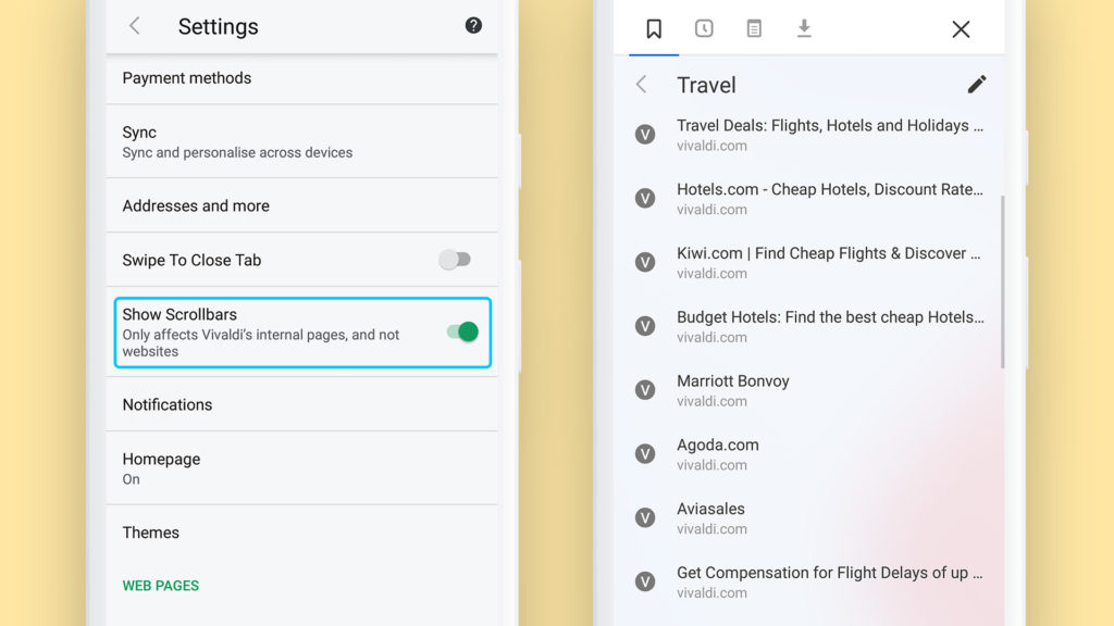
In the same settings and, which is typical of the same browser, today you can find another new option - the inclusion of scroll bars for internal pages. At first glance - some sort of nonsense, a trifle. Who needs it? To be honest, some people need it. For almost everyone who is used to visualizing how much more this Express-panel will have to wind up to get to the very end. At the same time, the option performs another pedagogical function. Thanks to it, the user can think - is it necessary to add so many bookmarks to this Express panel and is it not better to create another folder?
Panel work
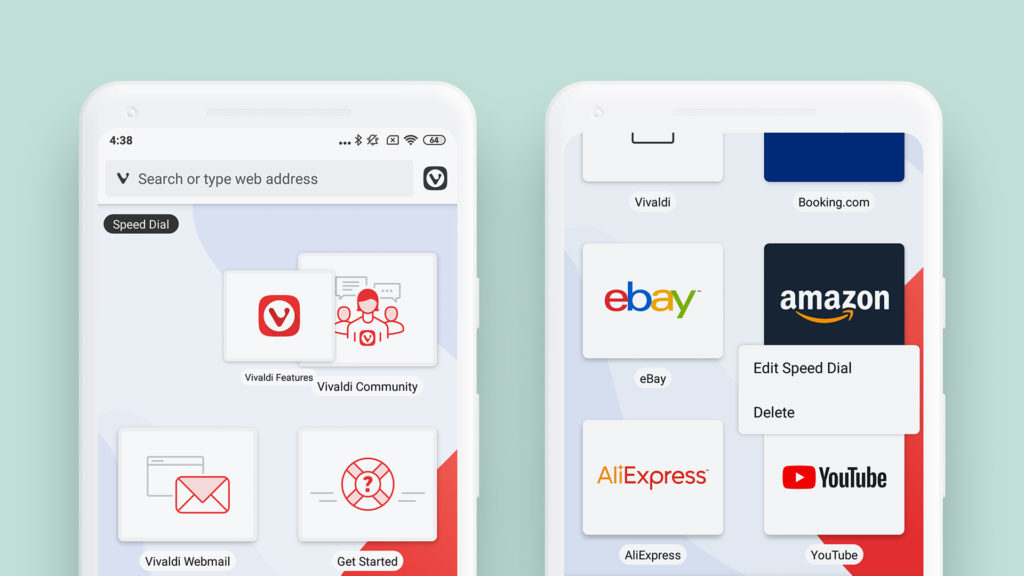
But we knew that the user will think about it. And everything was foreseen in advance. After all, how was it before? A person pokes a finger on the cross on the Express panel - immediately and the screen for creating a new bookmark opens. Now everything is different, in a modern way. Artificial intelligence and quantum computers. If the user simply pokes a finger on the cross, he will see the bookmark creation screen, and if he pokes and thinks, but the finger does not remove the cross, here the browser will speak not in his own voice, but in plain text: they say, what will we do - create a new cell or immediately a new folder?
An inquisitive reader may ask: what happens if a person pokes a finger and thinks not in a cross, but in an existing Express-panel cell? After all, he might have such an unusual desire. And here we have provided for everything - it's a quantum computer, and not just like that. With this turn of events, the browser again speaks contextual and asks whether to edit the bookmark first or immediately throw it into the basket?
Fingertip clean
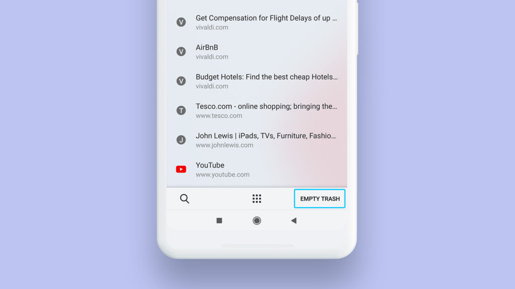
It is clear that the solution with the basket is not ideal. She, too, is not eternal - how much can you shove everything into it? So after all, you can cram up to the point that the scroll bar appears when the corresponding option is enabled. And this will mean that we threw away a lot of unnecessary. But not to the end - it all lies in the basket and is somehow somehow slowly settling in there for a long time. And then they will be asked to recover - is this the case? So we open the basket, find a good button on the panel from the bottom right and poke it with your finger - it will immediately clear the basket to shine.
Everything is like dad
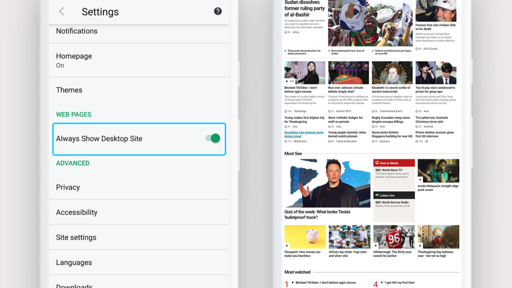
Another problem that scientists are working on is unclear. It is often not clear what is in the hands of the user - a small computer or a large phone? So the browser is also unclear - which version of the website to request, mobile, or full, large. But now, thanks to quantum computers, users can use the appropriate option in the settings to help the browser determine and always load the full version of the pages, as the dad of the mobile version does - the Vivaldi desktop browser.
Other joys
We also worked on the icons of the browser panels, and also improved the stability and speed of the interface. In addition, there is news for owners of devices running Chrome OS - this beta version experimentally supports installation on such devices. Feel free to experiment.
And, of course, corrections, improvements and polishing. Everything is as before. By the way, remember how some did not like that, first of all, the browser suggests saving selected text to notes, and only then - copying? We screwed up a bit with a screwdriver in a quantum computer - now the order of options has changed: first we copy, and only then send it to notes. Life is getting better.
That's all for today. Email us, feel free to suggest new improvements and report breakdowns. The address is the same, in the same place there is a form for sending a bug report .
You can download the second beta version of Vivaldi for Android from Google Play .