Imagine that you are developing a system for researching data. Or an energy management app. Or a dashboard for corn sellers. Maybe you are developing something similar right now. In all the cases mentioned, people will expect tables. Not those trendy of inspiring sites, but Excel-looking monsters with hundreds of cells and complex interactions.
In this case, the designer is faced with many problems. For example, matching a design with existing front-end frameworks or fighting “inconvenient” data that destroys the layout. We will overcome these problems with the following steps: systematize needs, become atomic, and define interaction.

This article was translated with the support of EDISON Software, a company that develops applications and sites , and also deals with user interfaces .
1. Systematization of needs
So, you interviewed the target audience. Now it's time to put together their needs and desires and turn them into something useful for design. For example, one user said: “I need to see how my data affects other parts of the application.” Or, after seeing how another person works with old software, you notice that he uses keyboard shortcuts and does not touch the mouse at all. What does it mean? The first user requirements relate to input validation and prompts. You will need to add warnings and background information to the table. Or develop a system of significant colors. It depends on the subject area and mental model. Watching the work of the second user, you begin to understand that you need to develop all the actions available from the keyboard. And you probably need to think of more specialized hotkeys than just “Cmd + C” and “Cmd + V”.
As a result, you will have a list of the needs and desires of people. Open-ended questions are useful for identifying real needs and filtering whims. For example: “What helps you work faster? How does it increase the efficiency of your work? What will change if you cannot make X? "
Now it's time to build a logical framework for your table. The scheme of what it contains and is capable of doing. If you go directly to creating a wireframe or creating a prototype, you will embark on the difficult path of endless redrawing. Below is an example of where you could start. This is a tree of features.
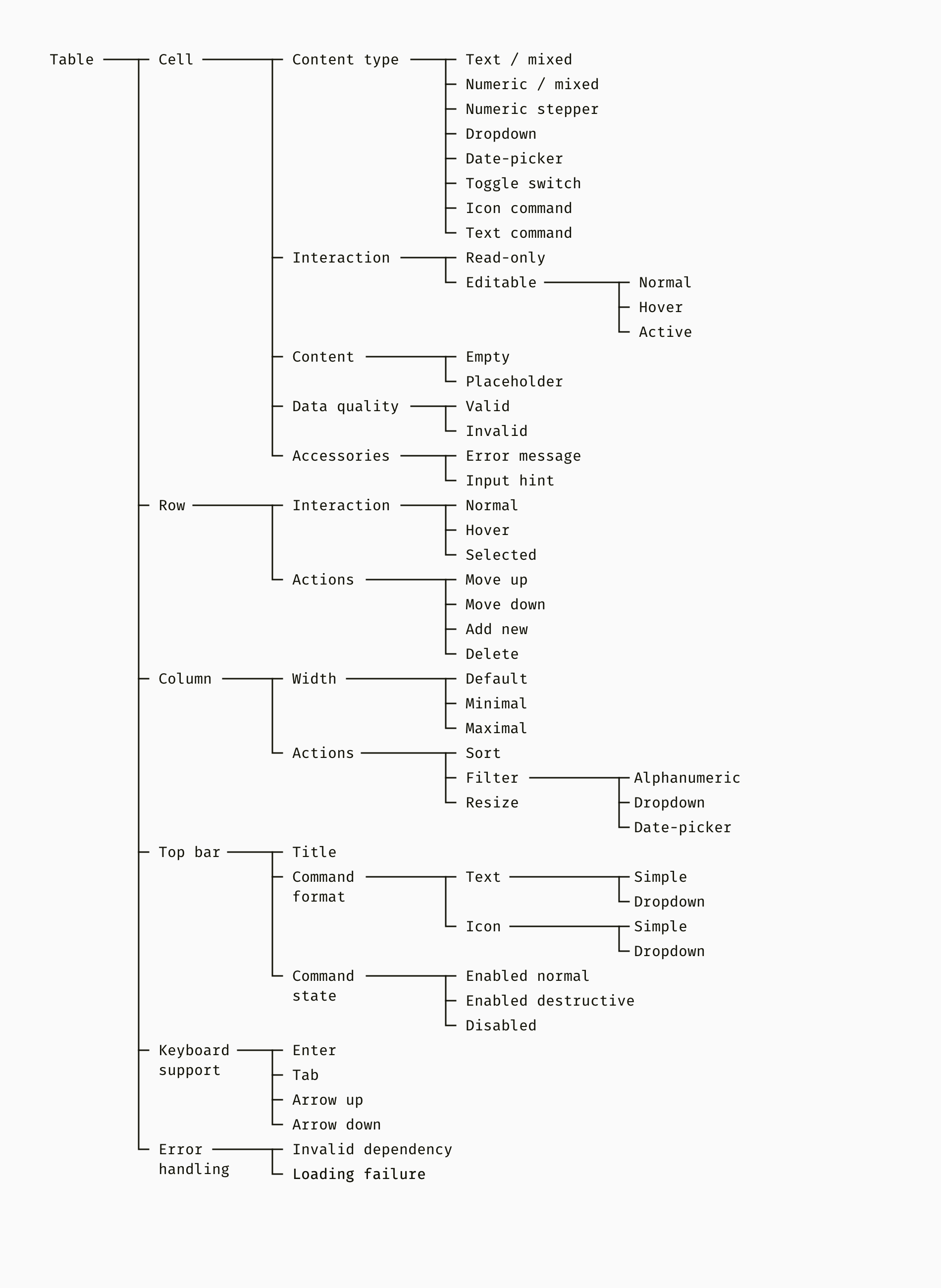
The smallest building block of any table is a cell. Cells are combined into rows and columns, which may have specific features different from other cells. And finally, we move on to such important additions to the table as the top panel, keyboard commands, error handling, etc.
A well-organized function tree is also useful for the development team. They can map features to front-end capabilities and find the best way to turn a project into code. In one of my projects, we used the Angular Material framework. Unfortunately, Angular's tables were very simple. We found the Ag-Grid library that supported our functionality but had one limitation. She did not have the opportunity to expand the line and put something inside. We identified this problem and adjusted the design in advance.
Subtotal
- Start building a complex table by collecting and prioritizing user needs.
- Draw a tree diagram that organizes all the necessary functions. Use this as a plan for producing visual effects.
2. Introduce atomicity
So, functionality is defined, and you know the limitations of development. It's time to mock up your table. In essence, the atomic approach is to first develop small user interface components, and then assemble larger ones. We will gradually move from elementary parts such as fonts and colors to such large modules as a heading or column. I deliberately chose a strict brutal style for layouts, so that we can focus on functionality rather than appearance.
Fonts, colors and icons
These parts can already be defined in your design system or in the UI framework. If you are creating a table for an existing product, check to see if its color palette, fonts, and icons match the requirements of the table.

Cells and Accessories
When the atoms in the table are ready, we can move on to the molecules — different types of cells. First of all, it is important to think in advance about the normal, induced and active states of each element. Later, the designer also adds pressed, disabled, and other states.
In one of my projects, we had eight types of cells with their own interaction. The simplest are text and number cells. In our case, it was allowed to fill in the numerical cells with non-numerical contents, such as “N / A” (not applicable) and “N / C” (without control). This was a feature of the field of activity. Drop-down lists and date pickers are more complex and have children. Finally, we had the table cells, which are buttons.
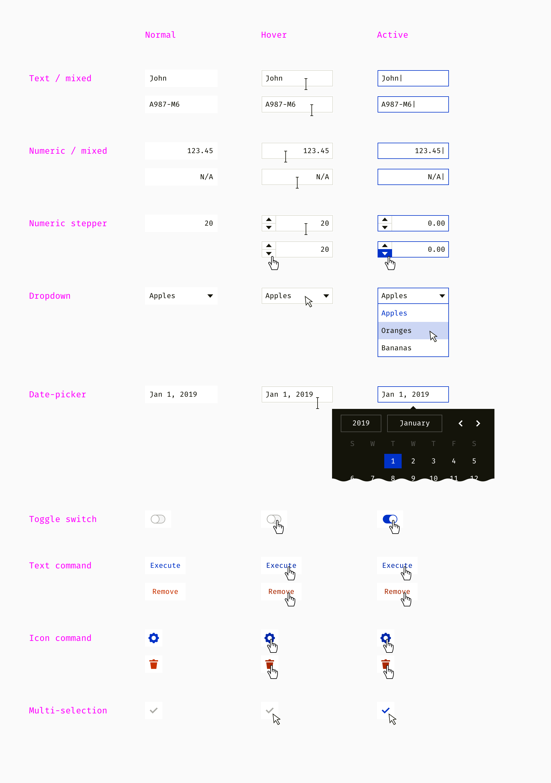
Cells can have accessories such as tooltips, input tips, error messages, placeholders, etc. At this point, they are static, but later the developer must specify the logic for displaying them.

Lines and Headers
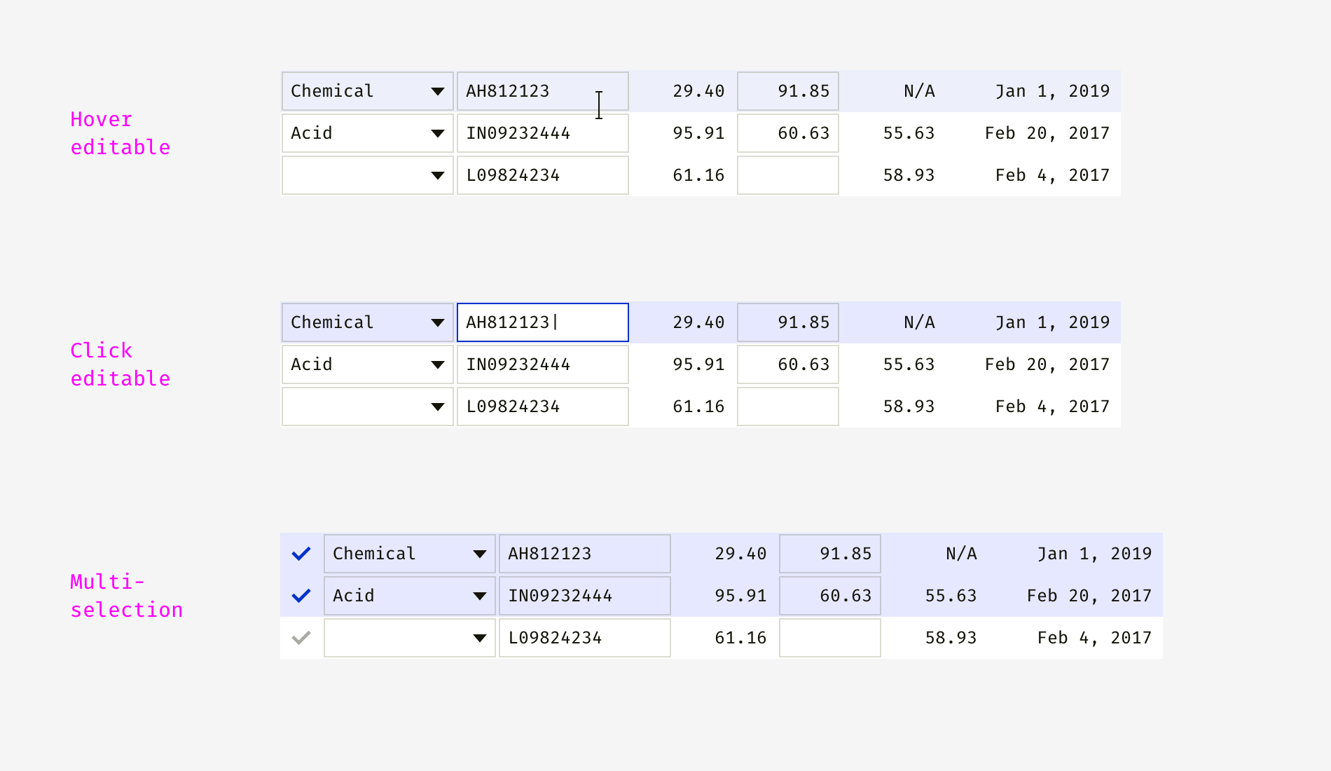
When the cells are designed, you can make lines and see if the various combinations work well. Below I showed a mix of read-only and editable cells in one row. Once I developed a table with complex editing logic. Some properties were provided by users, while others were automatically calculated or populated with default values.
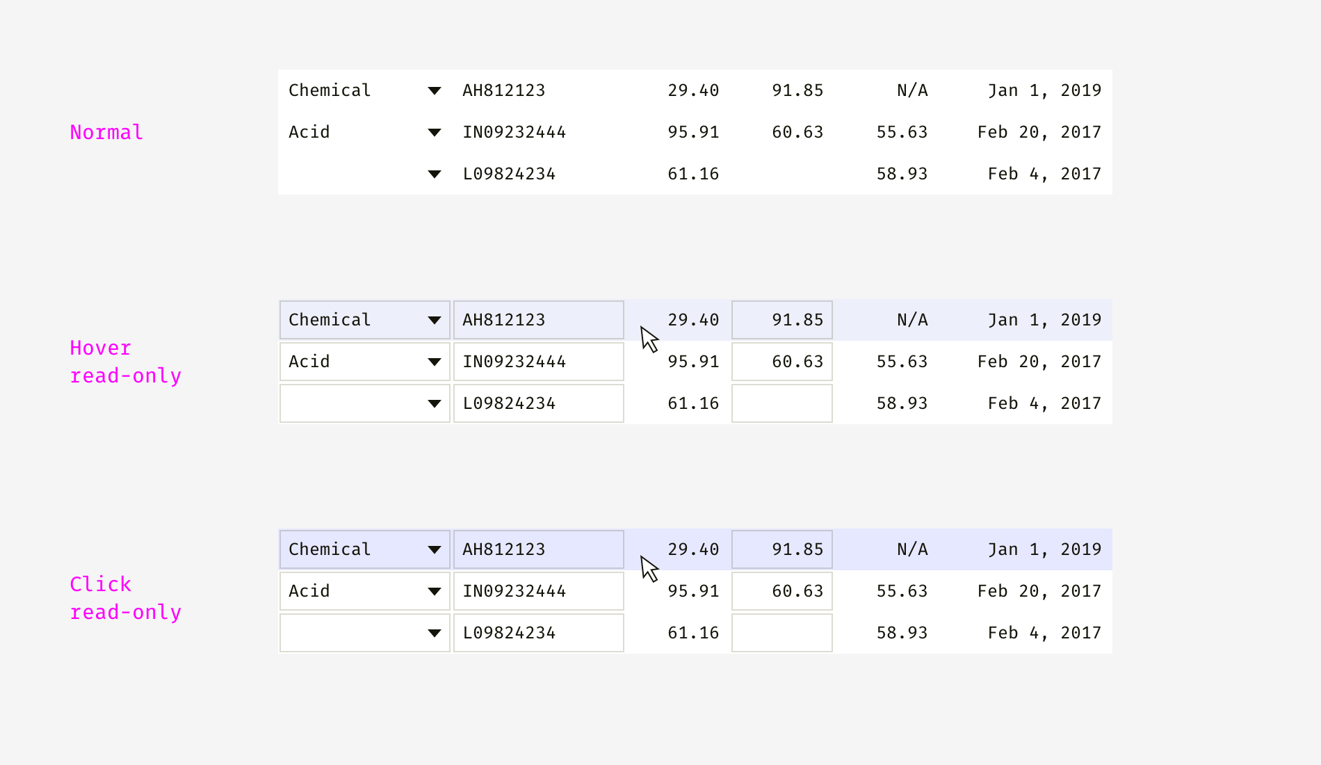
Note that when you hover over read-only and editable cells, the cursor is different. And clicking on them causes either row selection or transition to cell editing mode. Below you can see that people can select one or more lines.
Now it's time to think about the table headers. Based on my experience, it is often impossible to control the length of the column heading and stick to one line. Even with a good writer on the team, you will not cut all the texts. Some of the tables require long technical names or localization. Phrases that were single-line in English can become two- or three-line in Greek, German, or Hungarian. Therefore, I showed different options below.
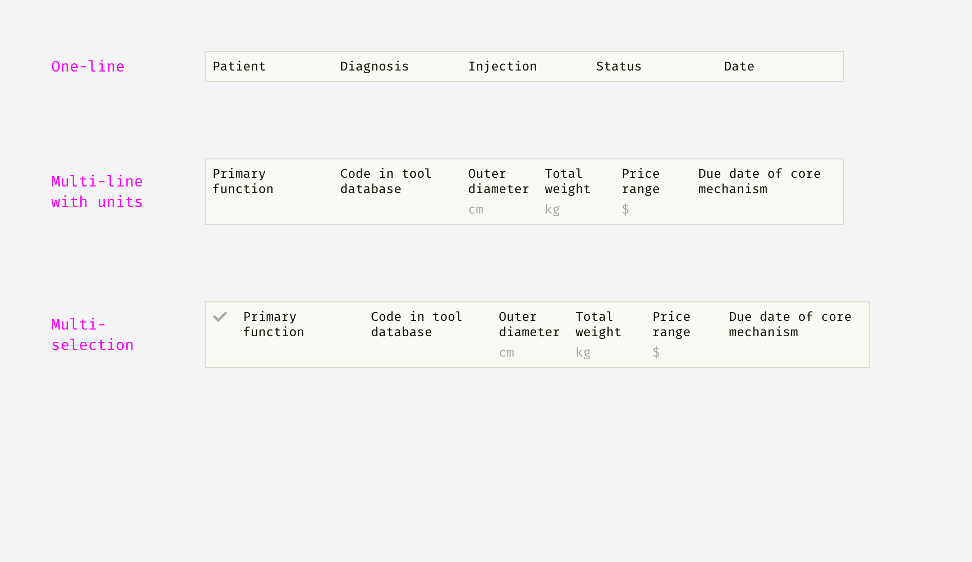
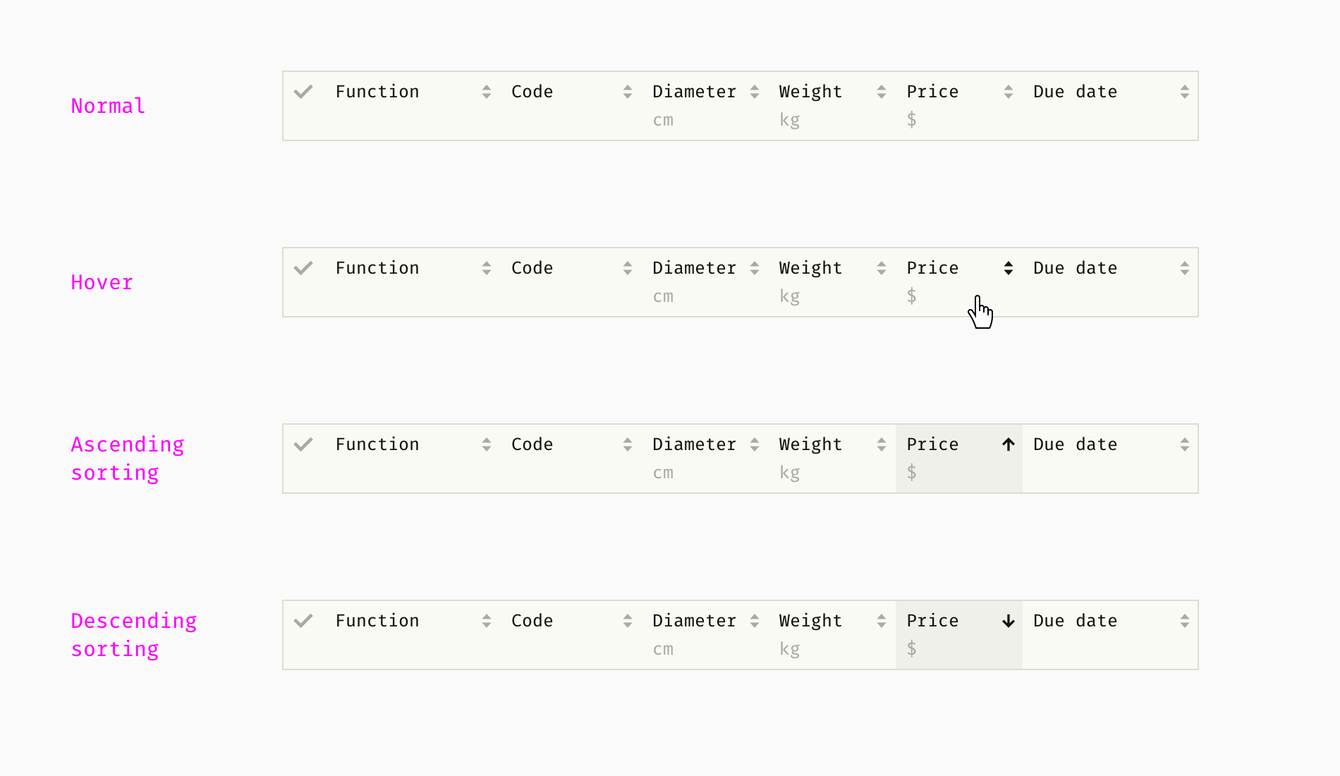
Data-based software users often need sorting and filtering. This helps them find valuable information in large chunks of data. The task of sorting and filtering is to combine the sorting controls and filtering fields with other header elements - headers, units, etc.
Unlike table cells, filter fields usually have a “reset” icon on the right so that users can explicitly disable them and see unfiltered content.

In my example, there are three types of filter blocks. An alphanumeric filter allows you to search by letters and numbers. Wildcards are supported - an unknown number of unknown characters. For example, if I enter “45 * A1”, this may result in lines with values such as “45A1”, “45982A1B”, “45A109B” and “096445-A1” being displayed.
Wildcards are a complex function because they depend on people's habits. When I developed the tables for technicians, we assigned an asterisk (*) to an unknown number of unknown characters. For insurance analysts, I chose the traditional SQL symbol - the percent sign (%) - because they are used to it. As for the drop-down filter, it switches between a certain number of mutually exclusive text options, numbers or numeric ranges.

The date picker has a calendar and works like its cell equivalent. It’s good if users can enter the date manually and select from the calendar. If they know what they’re looking for, entering a date is much easier than pressing. Another important thing is to automatically format any meaningful input and not to bother people with "incorrect format" errors. In one of my projects, we allowed to enter dates such as “January 25, 2017”, “6 12 17” and “September 4, 2016”, and filter only by months or years without a day.
Columns
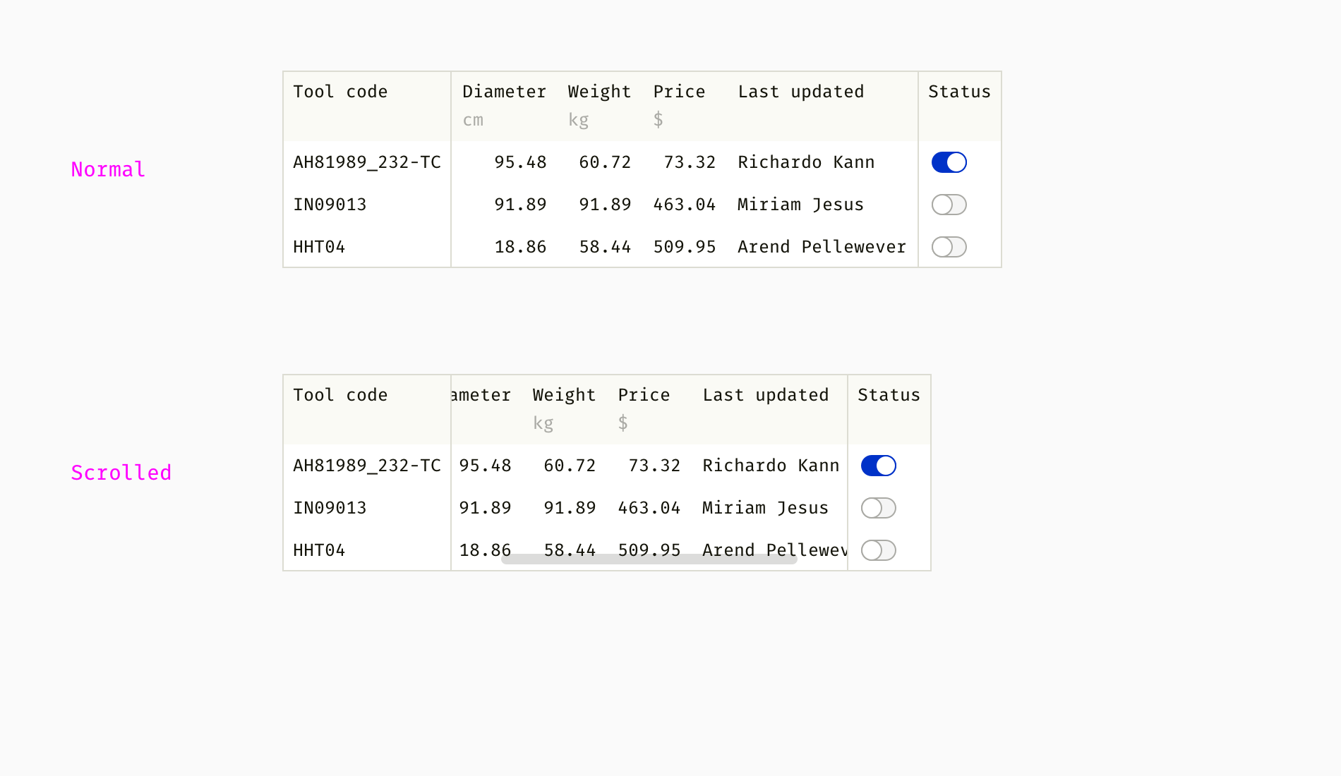
One common feature of complex tables is pinned columns. Typically, columns containing key information, such as item names or statuses, do not scroll.
Although the columns of the table should be correctly adjusted to the size of the content, this happens when the text is truncated. In this case, a resizable column helps. Users can drag the edge of the column and see long content. They may also need to squeeze an unimportant column or a column with short text.
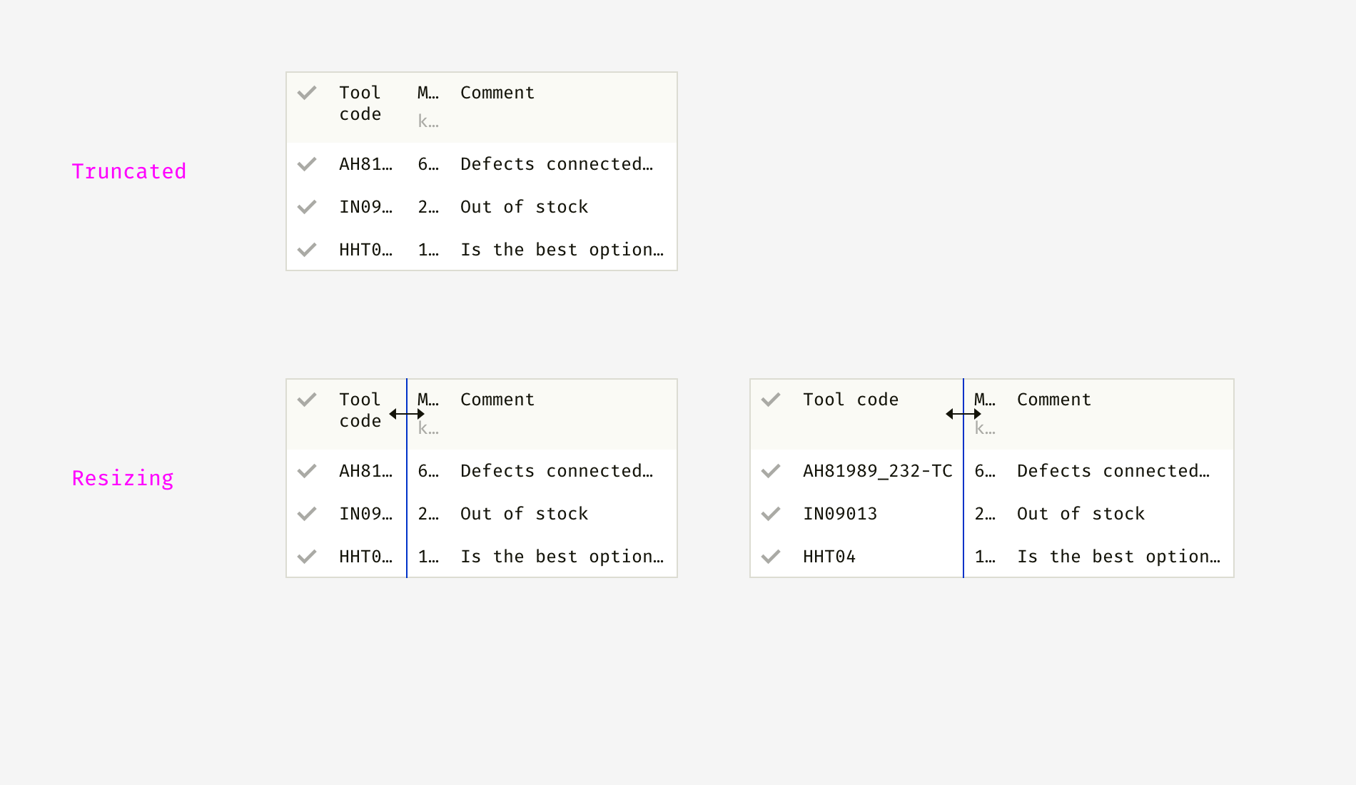
Another way to handle long text strings is to either stretch the column to the longest content, or put in multiple rows. The first approach works better for similar text strings. The second option works better when seeing all the content for people is more important than making the table vertically compact.

In one of my projects, we set the default minimum column width so that the tables do not resize. We disabled column compression at a certain width depending on the type of content.

Top panel
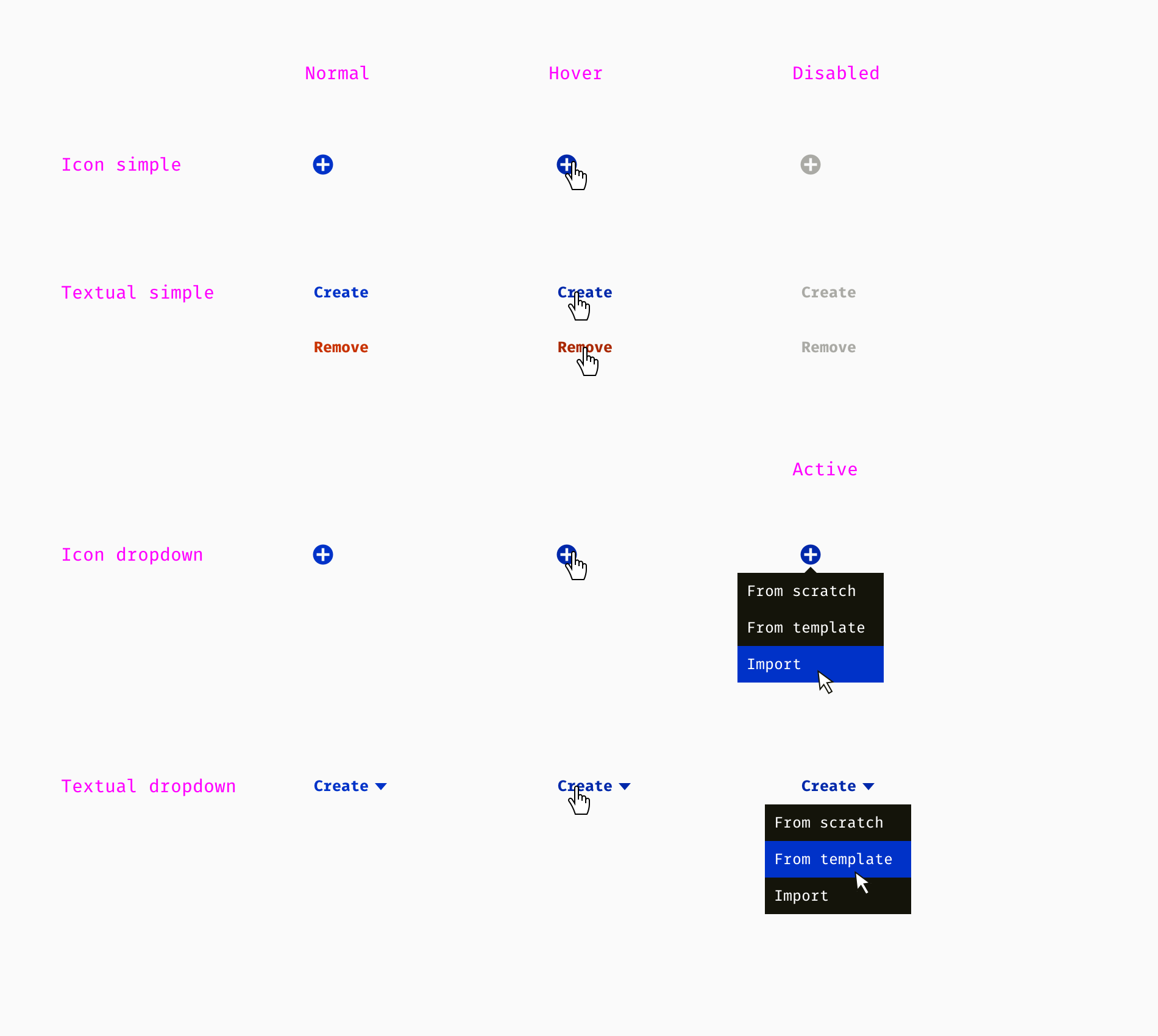
What makes up the table? Cells, columns, rows. In addition, complex tables often have a top bar. Like other components, the top panel consists of smaller elements - the title bar and buttons. Below I have compiled a list of buttons with all the variety of states that we used in one of the products. We had obvious icon buttons, such as “plus = add or create”, “trash bin = delete”, “arrow = move”. Non-universal buttons (for example, assign, archive, balance) needed an explicit text name. Moreover, some buttons were accompanied by a drop-down menu.
Now we can try to combine the various elements and see if this works. Here are some examples.
Of course, this is not a complete list of functions and elements. It differs from one project to another and may include other things, for example:
- sort by multiple columns;
- customizable set of columns (the ability to switch them);
- expandable rows (the parent row can have child rows);
- logical operators for filtering and searching ("and", "or", "more", etc.).
If you are not sure which features to design and which not, here is a good principle. This is Occam's razor or the law of stinginess. The designer should not create new instances if existing ones satisfy the needs. You should "cut out" those geek functions that theoretically users may need in the indefinite future. The same story with features that are perfect for one out of a hundred situations, but are useless in the remaining ninety-nine cases.
Finished table
When all the building blocks are ready, you can assemble several tables for various purposes. This is a chance to discover inconsistencies and illogical decisions. Most often I dealt with the following three types.
The table is read only . The simplest type of table to build, since it only shows data as it is. There are no filtering or editing options. Sorting or row hierarchies can help analyze large chunks of data. Such a table is used to display data, informing people about something.
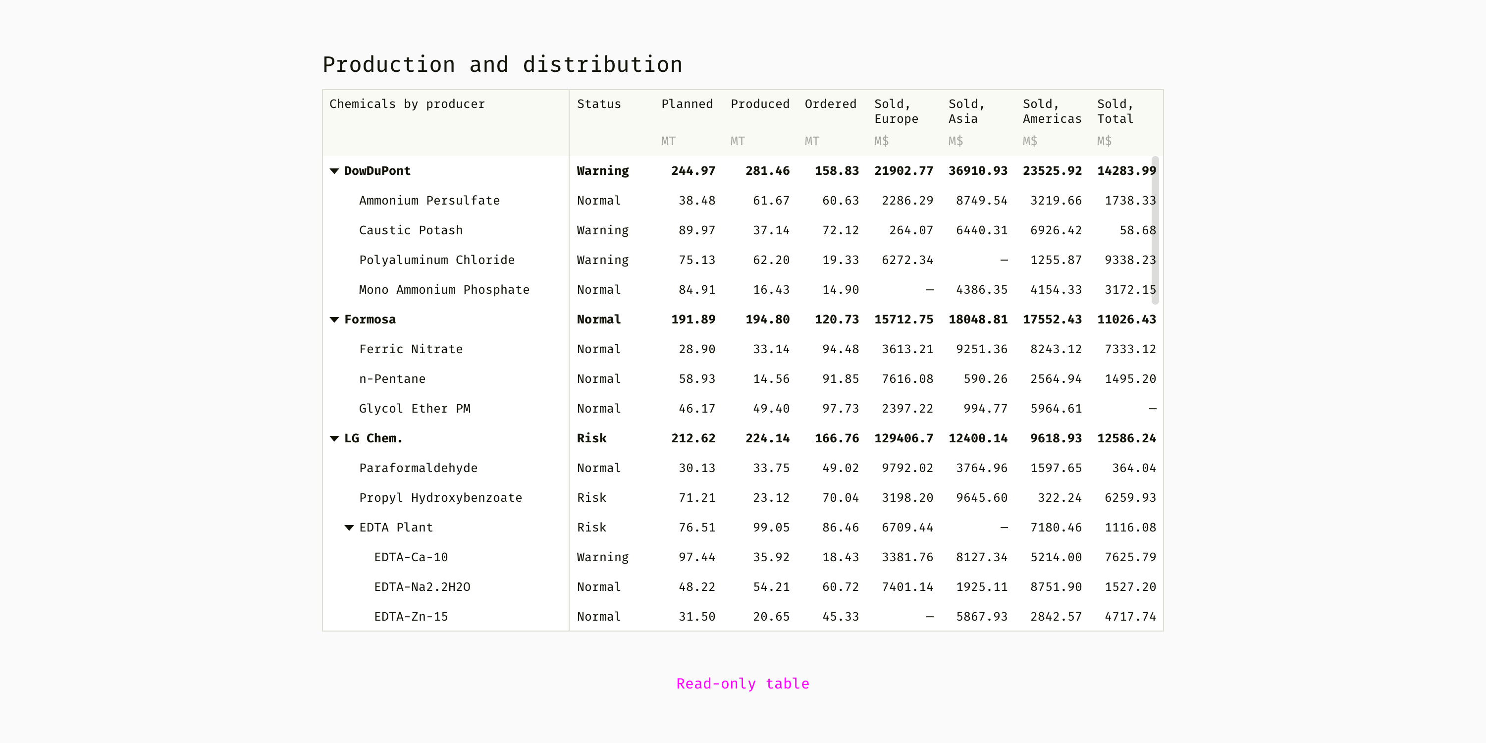
Table to search. The cells are not editable, the header has filter fields and sorting controls, you can select rows. From my practice, such tables help to find, compare and select an item or several items from a large number of similar things. For example, filter out five of the six thousand unwanted tools from the catalog, and then select one tool you need.

Editable table . All or some cells are editable, usually there is no filtering, since the order of the rows can be changed. Such tables are usually accompanied by a toolbar and allow you to perform actions with rows.
Subtotal
- Start with the smallest components. Then gradually move on to larger ones and finally make a mockup of it all.
- Think in advance of all the possible conditions for each component.
- Use Occam's razor principle to keep the minimum number of elements, but covering all use cases.
3. Define the interaction and environment
Building blocks are not enough to create such a complex interface element as a table. The designer should think about the "rules of the game" and develop the logical principles and conventions behind the visual part. I will describe some typical things you should consider.
Numeric data
How many decimal places should a number have in your table? One, two, five? What is the optimal level of accuracy? I make a decision based on the accuracy users need to make the right decision. In some professions, the fluctuations between 10932.01 and 10932.23 are significant, while in other areas the numbers 14 and 15 really are not important. This is an example of the numerical data rules that my team used in a complex engineering product.
- Length : 2 decimal places (57.53 m, 3.16 km), spaces are used as thousands separators (403 456.56 m).
- Weight : 2 decimal places (225.08 kg, 108.75 t), spaces are used as thousands separator (12 032.17 kg).
- Money : 2 decimal places ($ 9.45), commas are used as thousands separators ($ 16,408,989.00).
- Diameter : 3 decimal places (10.375 cm), no separators needed.
- Latitude and longitude : 8 decimal places (26.4321121), minus is used for west longitude and south longitude (-78.05640132).
- By default, for units not listed above: 2 decimal places (32.05 g / m³, 86.13 C °).
Another thing we looked at was the difference between the “true” data stored on the servers and the “approximate” data in the interface. The system used extremely accurate numbers with dozens of decimal places in all calculations, but people did not need to see this all the time. Therefore, we decided to show the number of decimal places described above and set the full number only when the table cell is active. For example, an engineer can enter “134432.97662301”, and after pressing “Enter”, “134 432.98” will be shown in the table. Clicking again, the engineer will again see "134432.97662301".
Input confirmation
Unlike the previous paragraph on numbers, checking is important only for editable tables. This has two aspects. Firstly, the rules that qualify the entered data as valid or invalid. Secondly, either messages that help correct invalid data, or mechanisms that fix it automatically. Validation rules are usually too complex to be mocked up or prototyped. Thus, designers can document them in text form or in block diagram format.
This is an example of the message templates I once used. The text in angle brackets is dynamic and comes from a calculation engine or database.
- Must have more
number
measurement unit
.Optional explanation
. - Must be less than
number
measurement unit
.Optional explanation
. - Must be between
value 1
andvalue 2
measurement unit
.Optional explanation
. - The minimum value must be less than the maximum value.
- The maximum value must be greater than the minimum value.
- The minimum and maximum values should not be equal.
Teams
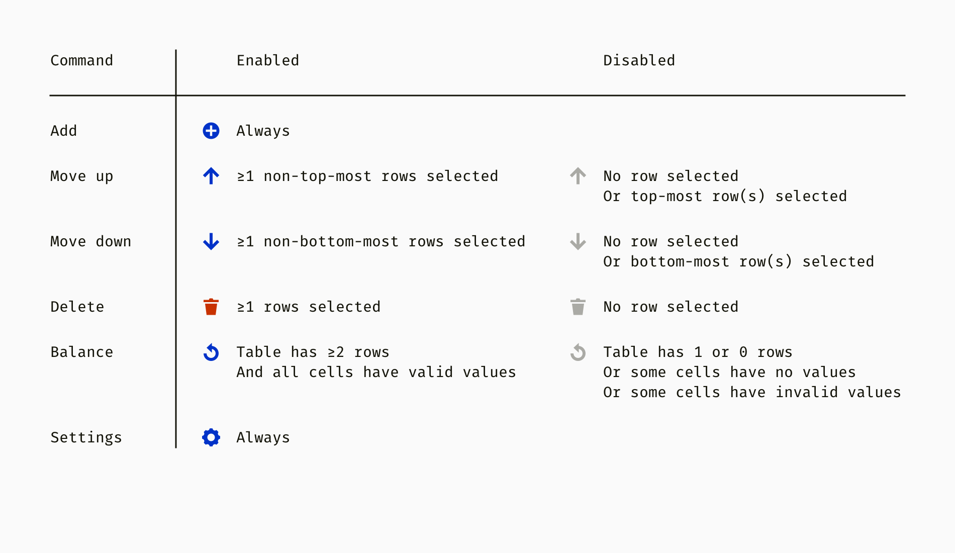
Editable toolbar tables usually need a set of rules when toolbar buttons are enabled and when disabled. These conditions may depend on whether the row is selected, the number of rows selected, the position or contents of the selected row or rows, and other conditions. The following is one of many ways to document such logical rules.
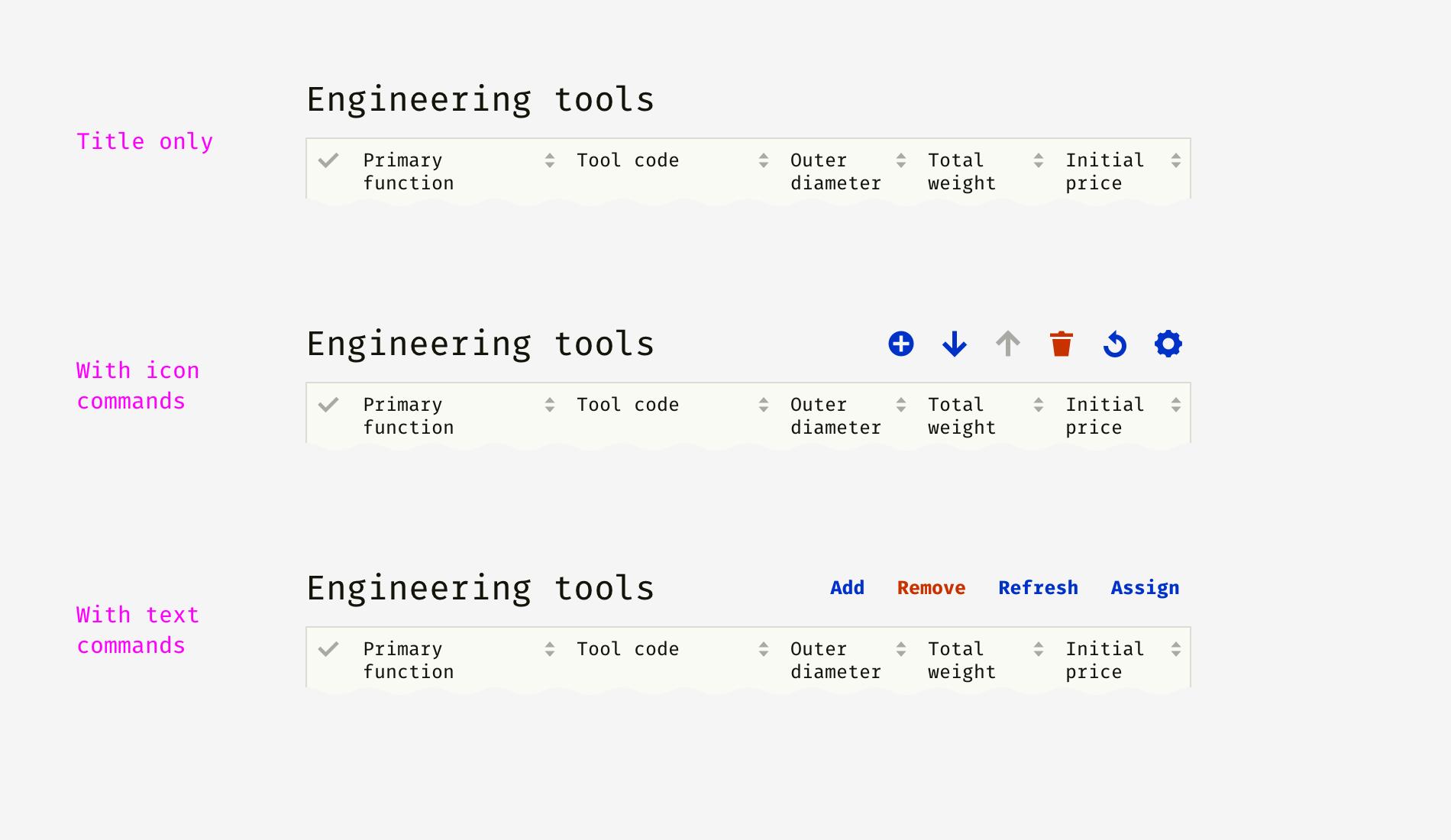
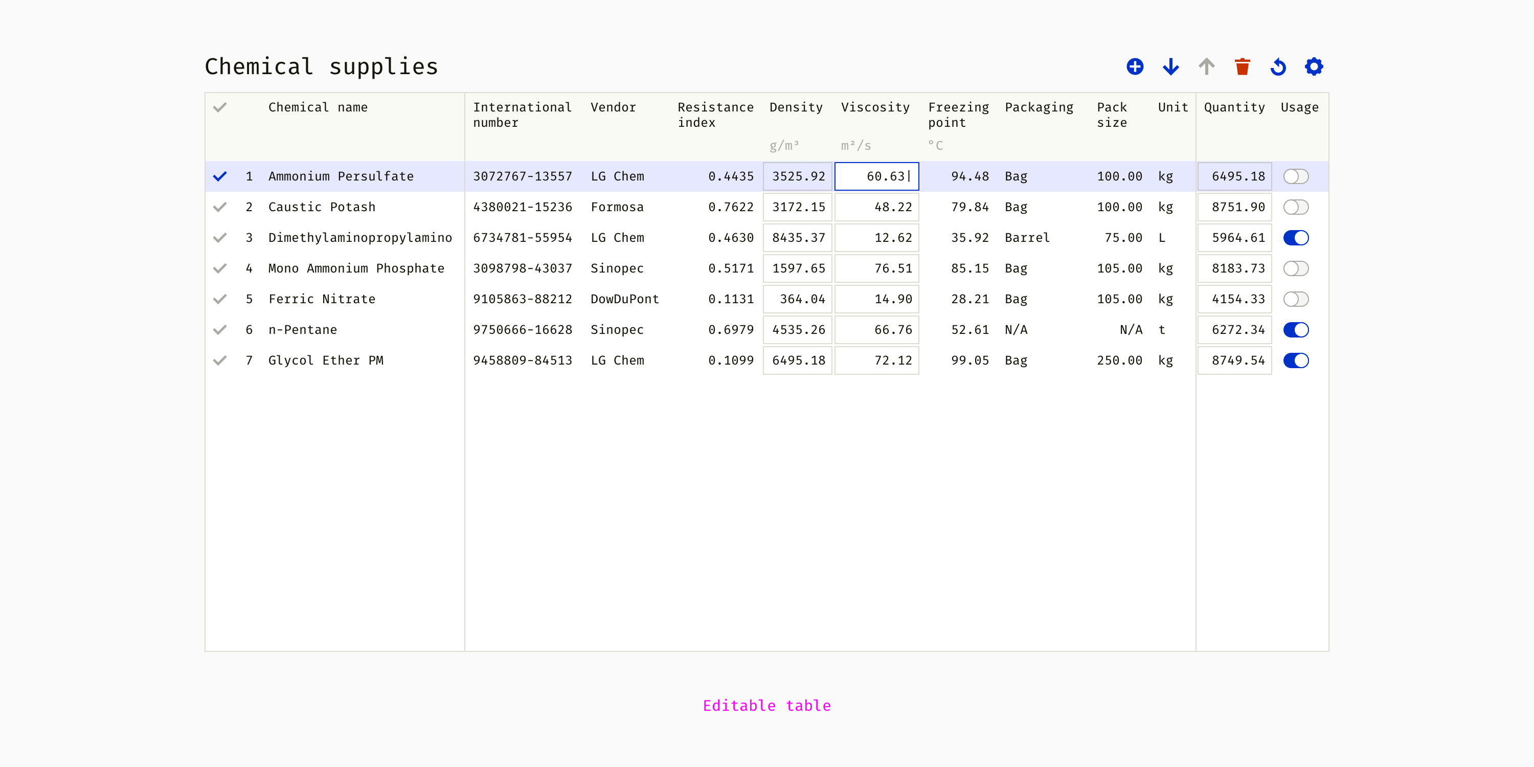
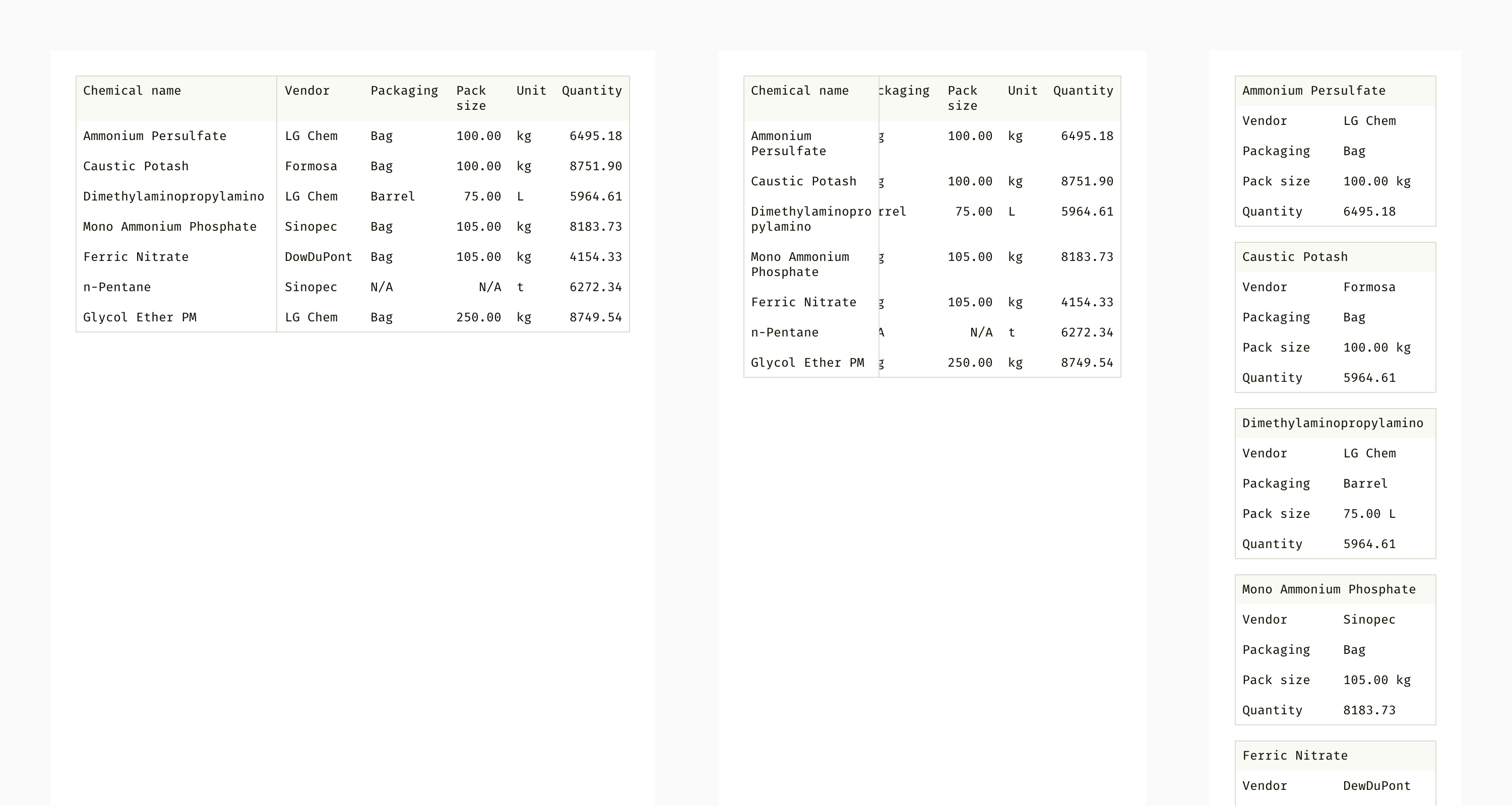
So, we have a table with some chemicals. It has buttons such as “Add Line”, “Move Up”, “Move Down”, “Delete”, “Recalculate” and “Settings”.

And here is the description of the button states. It turns out that their availability depends on one or more conditions.
The next step is to determine the result of each team. For example, what happens when I select two lines that are not near and click Move Up? Or what is the result of clicking "Recalculate"? All these questions need to be answered, or at least considered in advance.
Container and adaptability
How will the table be placed in the interface? For example, will it occupy some space in an existing container or will it be a separate module? The answers to these questions are completely product dependent, and it’s best to anticipate potential problems and carefully define principles.
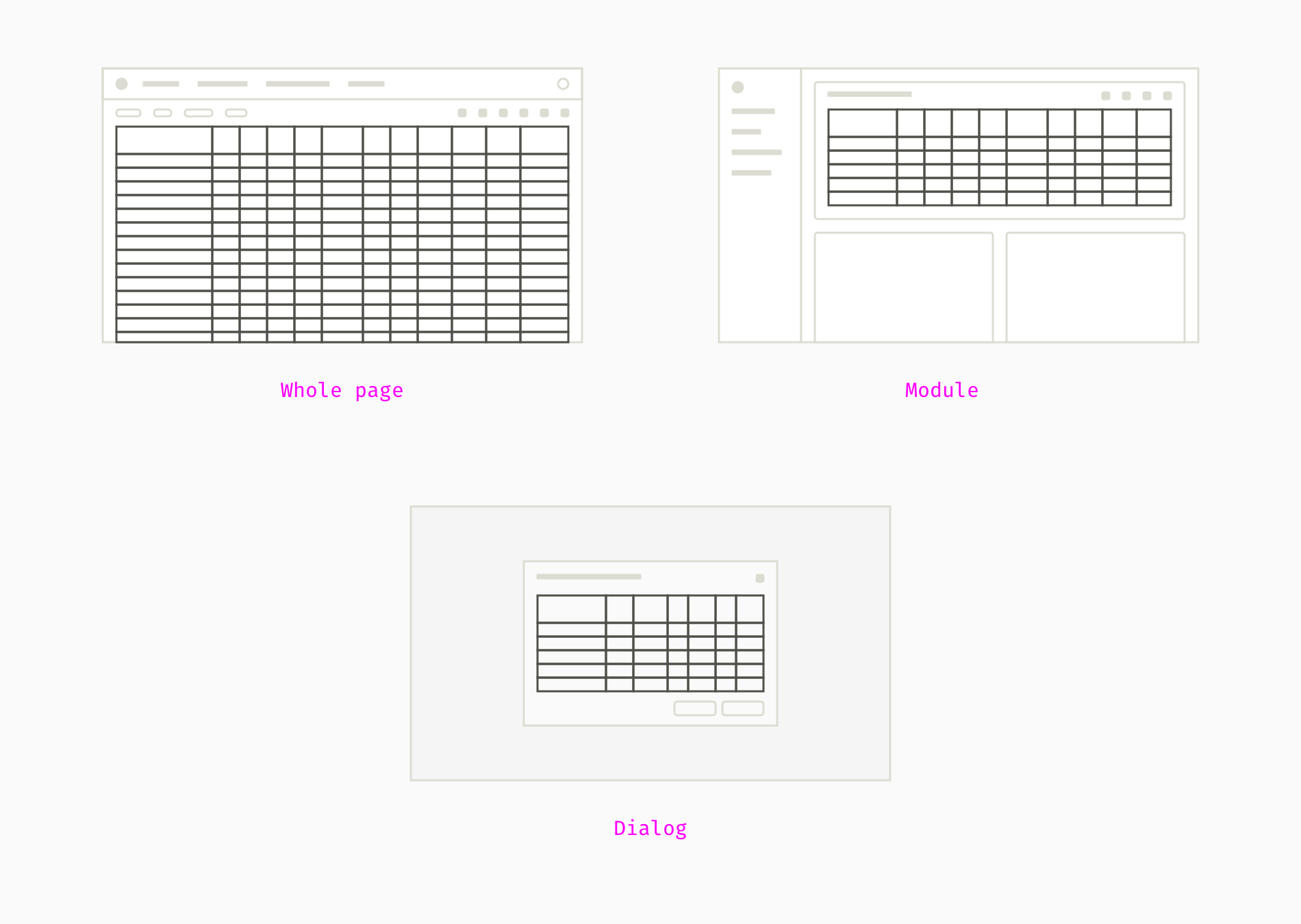
When I develop web applications, I usually think of three types of containers for tables. The most typical case is when a large table is in the center of the screen and occupies almost the entire space. Such a table may not have its own title and may have a page name. Small and medium tables can become modules of the toolbar, as well as other content, such as graphs, charts, diagrams. In this case, the top panel of the table acts as the title of the module. Finally, in large enterprise applications, tables are often found in pop-up dialog boxes. There should be wise recommendations so that the dialogs do not break due to too much content.
Another aspect of placing a table in a user interface environment is the available area of the screen. Most enterprise applications are designed primarily for use on desktop computers. Adaptability of the table is limited by simple stretching and compression. Typically, tables with many rows and multiple columns occupy 100% of the available width. As a result, the cells are evenly distributed on the screen, and most text can be displayed without cropping or wrapping. On the other hand, huge gaps appear between the columns, which contradicts the law of proximity. This is why some applications use lines or white and gray zebras to make information easier to read.
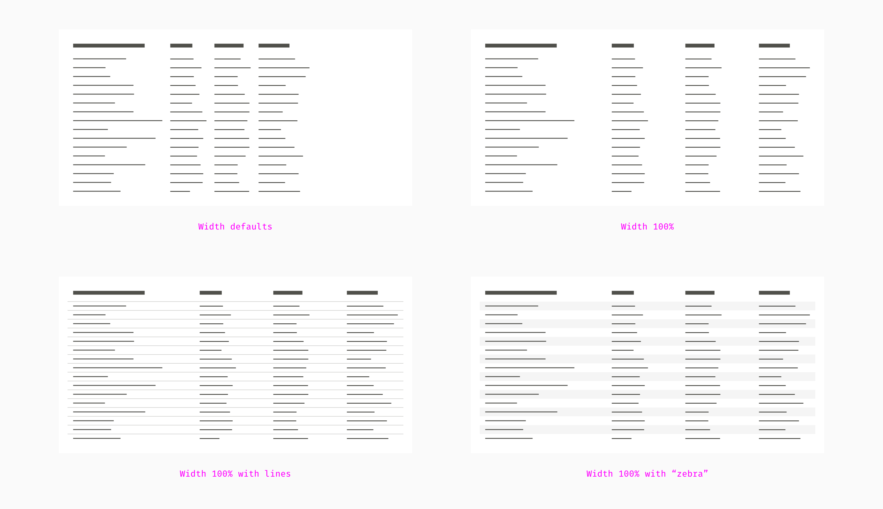
The best way is to determine the default rational width and allow manual resizing if necessary. To read a table, it is better to have free space on the right than spaces between columns. But if the table contains many rows and columns, horizontal and vertical scrolling are inevitable.
The key essence of a complex table is its large size, which gives an idea of the data from a bird's eye view. Unfortunately, I can’t remember a really good method of using large tables on smartphone screens. Excel and Google spreadsheets lose their power on small screens, but there are effective ways to handle small spreadsheets. For example, convert them to a list of cards.
Accessibility
Even an exceptionally smooth and beautiful table can be a nightmare for users. Therefore, it is important to follow the principles of accessibility. The Web Content Accessibility Guide ( WCAG 2.0 ) has a chapter on tables. Most of the material is about proper programming. However, the designer also has something to think about. Here are the basic design considerations in terms of accessibility.
Give a heading to the table and give a brief summary. A visually impaired user should be able to get an idea of the table without voice processing of all its cells.
Watch the font size. Although there is no official minimum size for the web, 16 pixels (12 pt) is considered optimal. In addition, the user should be able to increase it to 200% without breaking the entire layout.
Check colors for people with color blindness. Text and controls should have enough contrast with the background. A 3: 1 color ratio is minimally necessary (the more the better). And color should not be the only way to label things. For example, error messages should not rely solely on red text, the warning icon will provide additional hint for color blind.
Avoid small and ambiguous controls. Click-sensitive components are considered good if they are at least 40 × 40 pixels in size. Buttons represented by icons should either be marked or have prompts and alternative text. Designers should not abuse icons, as users may misunderstand complex metaphors.
You can use online accessibility tools like Wave . He not only finds problems and accessibility opportunities, but also highlights them directly on the page and explains how to fix them.
Subtotal
- Unification and formatting of content is also a designer’s job.
- Think not only about “things”, elements of your interface, and consider use cases, rules, and common patterns.
- When all the elements of the table are consistent and compatible, it's time to think about how the tables will correspond to the rest of the interface.
Conclusion and additional reading material
We just went through the process of creating a complex table. Different projects require different approaches, but there is one universal principle. The designer must make all the elements work together in any combination. Therefore, it is good to start by first collecting the necessary things and making small blocks. And, of course, testing with users as soon as you get something clickable and realistic.
Here you can read more about table design.
- " Table Design Patterns on The Web, " an article by Chen Hui Jing for Smashing Magazine.
- " Atomic Design ", a book by Brad Frost.
- " Refactoring UI, " a book by Adam Watanand and Steve Shoger.
- " Design Better Data Tables " by Andrew Coyle for UX Design.
- " Design Systems ", a book by Alla Kholmatova.