
Image: Pexels
In our blog we write a lot about the implementation of email marketing, the use of this tool to promote a business and increase its effectiveness. At the same time, until we had time to elaborate on the issues, in fact, the creation of high-quality letters.
We are correcting - today we will talk about the main trends in email design with examples of real mailings of various companies.
Trend # 1. Departure from symmetry and breaking borders
In the past few years, an image of a “good” letter template has formed. Usually it involves the use of a rigid grid, which allows you to create a clear, easily perceived by the user design.
But the fact that a rigid grid allows you to create consistently high-quality letters has led to the fact that everyone uses this format. As a result, letters from most companies are extremely difficult to distinguish. In this situation, brands are forced to experiment, add abstractions to their layouts and go beyond the usual framework - this is the only way to “hook” subscribers.
For example, the Behance service uses disordered image blocks in its letters. The message still looks beautiful, but the lack of symmetry makes it memorable.

An interesting point: such experiments do not require significant resources. For example, a similar asymmetric arrangement of blocks can be implemented in the DashaMail editor. To do this, you do not even have to attract a layout designer. In this video, we talked about how to implement this.
We went even further with Boden. Their template uses an unconventional composition of images that seem to “fall out” of their blocks. It also makes the message more lively.

Trend # 2: Using vibrant colors, gradients, and animations
At the moment, one of the main tasks of any newsletter is to stand out in the subscriber’s mailbox. To solve this problem, designers are increasingly using bright colors, bold gradients and other visual elements. This is done to highlight the most important parts of the message, to attract the attention of readers.
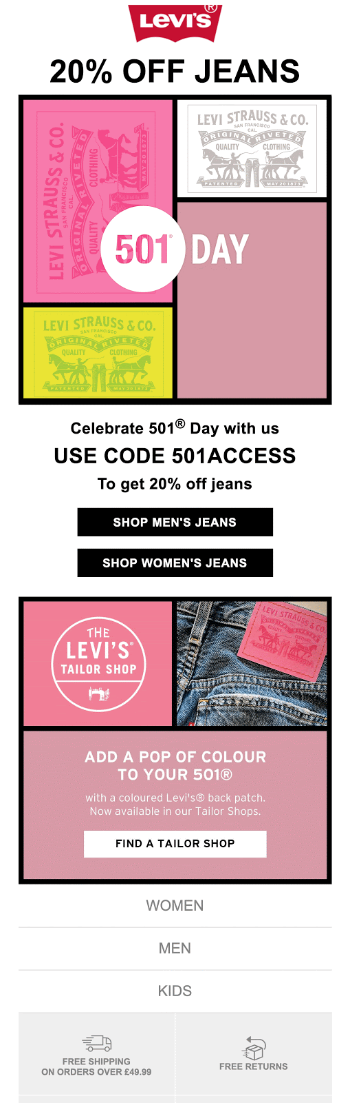
For example, Levi's brand uses this trick to highlight information about discounts and offers. Specifically, in this letter, the focus is not only on discount information, but also on information about the service for ordering branded color stripes.
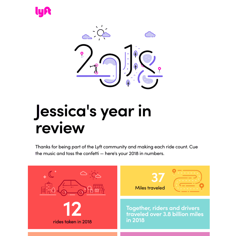
In turn, the taxi service Lyft uses all available visual methods for highlighting information. Here's how they designed their letter for the year: the data is visualized using vibrant colors and animations.
Trend # 3: Bold typography work
Typography in email marketing has been a hot topic for many years. The advent of new fonts allows designers to experiment more actively and boldly with letters. This year has become perhaps the most breakthrough in this sense.
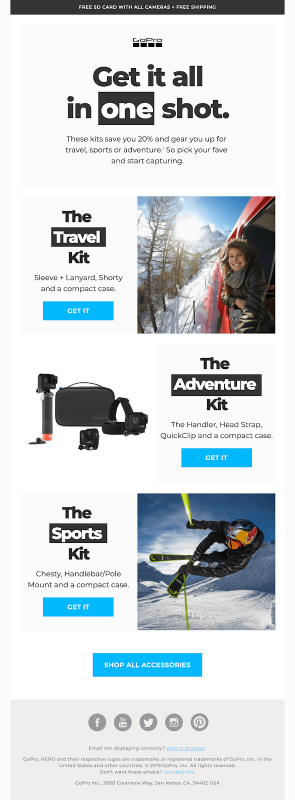
Take a look at the letter from GoPro - a very bright and bold typography was used ... Using the inversion of individual words in the headings, the designer illustrates the main message - regardless of background noise, you can catch the perfect shot. This letter uses the Montserrat font, which perfectly complements clean, concise compositions.
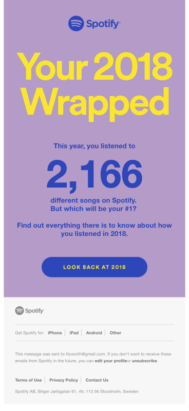
The competent use of typography allows you to make the letter visually attractive and highlight it even without images at all. An example is a year-end letter from the Streamify streaming service. Here, in the text design, large typography and bright colors are used, which allows you to quickly convey the most important information. Spotify designers used the Helvetica font stack throughout the design, with an animated header.
Conclusion
Design is not an easy task requiring skills and experience. Often it is this fact that scares away small companies that do not have their own good designer from using email marketing. But in fact, anyone can create a good, bright and attractive letter, even without special layout and design skills.
For example, our DashaMail service has a professional editor for this, as well as a set of ready-made templates that you can quickly adapt to your newsletter. You can also order a design template “tailored” for your needs from us, and then use it in newsletters.
To keep abreast of current trends in email marketing in Russia, to receive useful life hacks and our materials - subscribe to the DashaMail Facebook page and read our blog .