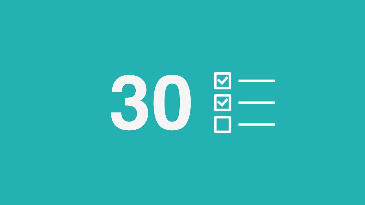
This article is a reminder about what you need to double-check in the design of your application before sending it to AppStore / GooglePlay. The list is divided into thematic blocks:
- Login Registration
- First experience
- Daily interactions
- Notifications
- Account Settings
- Tape
- Search
- AppStore / GooglePlay

This article was translated with the support of EDISON Software, a company that develops applications and sites , and also deals with user interfaces .
1. Login / Register
1. Screensaver
A splash screen is displayed when the application starts. This is the first thing the user sees, this creates the first impression of the product, even before the start of work.

Logo splash screen by Gleb Kuznetsov

Rider Launch Transition by Uber
Here are some tips for making good screensavers .
2. Forgot your password
The average person is registered in 90 online services that require a password. Therefore, passwords are often “forgotten”. According to statistics, 21% of users forget their password for 2 weeks, and 25% forget one password at least once a day. If your application requires a password, then take care of the password recovery form.
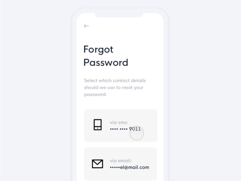
Forgot password flow by Emmanuel Torres
2. First experience
3. Welcome screen / instruction on first run (Onboarding)
Onboarding is a UX-design term meaning how to understand the user what to do with your application, how to navigate it, where to click. Good onboarding increases the likelihood that “newcomers” will become “permanent.”
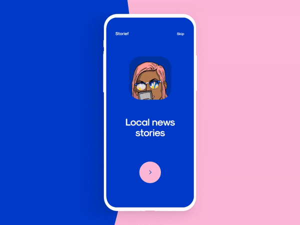
Animated onboarding experience by Cuberto
Here are practical tips for good onboarding .
Here are creative concepts for onboarding .
4. Screen with notification of successful confirmation of data
Many mobile applications ask for confirmation of mail / phone. A notification about a successful data confirmation operation appears after the user has completed everything necessary.
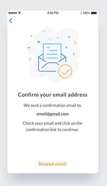
Confirmation screens by Diana Caballero
For this screen, it is vital to ensure:
- ability to send confirmation code again (for phones)
- instructions on how to find a confirmation message (search by title, search in spam, etc.) (for mail)
5. Stubs for "No content yet"
Content is what users install most applications for. It is important to think over those places where the user managed to glance, where there is no content yet. These unexplored places should not be empty.
Instead of leaving a void, insert a tutorial or instructions on what to do next.

Symplicity careers app empty state
6. Default user avatar
Most users (~ 95% according to Jared M. Spool ) do not change the default settings. This means that users will have the avatar that you have chosen for them.

Cute default user avatar in Dropbox
Here are some ideas on how to make a default avatar .
3. Daily interactions
7. Resolution request screen
When a user opens a new application, the last thing they want to see is a lot of pop-ups asking:
- Allow the app to access your location.
- Allow the app to access your contacts.
- Allow the app to access your camera.
Such requests negatively affect the user experience, and lead to the fact that the application can be deleted in an anger. Such permission requests have a very negative impact on user experience and usually leads to the app abandonment. Therefore, it is better to ask permission at the time of user interaction.
Notification Permission Dialog by Anton Tkachuk
Here in more detail about the request for permission .
8. Various states for interactive elements
Buttons and other interactive elements have several states. It is very important to think over the default / pressed / not available states for each interactive element in your application.

Three button states
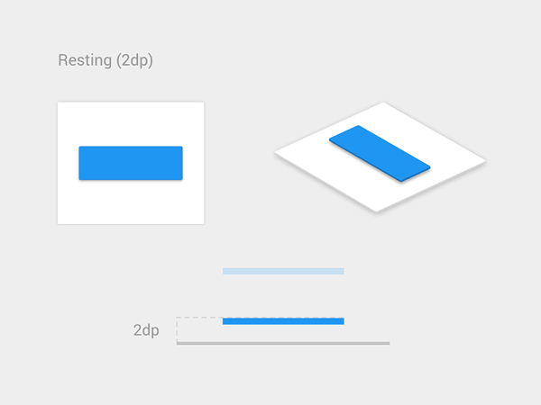
Material design button by Vadim Gromov
Here are tips on how to design buttons .
9. Icon set
It will be better if your icons are of the same style.

Tab bar icons in the Twitter app for iOS
Here's a checklist for the icons .
10. Error messages
The best error message is one that does not appear at all. A better way to prevent mistakes is to properly instruct the user in advance. But if, nevertheless, an error has occurred, then a competent error message not only teaches the user how to prevent it in the future, but also makes it clear to the user that they are taken care of and not ignored.
Error Interaction by Dwinawan
Here are a few cases for which you need to think about error messages:
- No internet connection. Think about what the user should see when there is no connection.
- The user entered the data incorrectly.
- System error.
Here's a how-to article on how to make good error messages .
11. The boot process
Although the instant response from the application is the best, there are times when your application will have to “dive”. A poor internet connection may cause a slow response, or the operation itself may take a long time. In such cases, in order to minimize user stress, you must assure users that the application is working on their request. When an application cannot notify users that it takes time to complete an action, users often think that the application has not received the request and they try again. Due to the lack of feedback, the user can press all the buttons hard.
An animated progress indicator is the most common form of providing system status to users when something happens or loads.
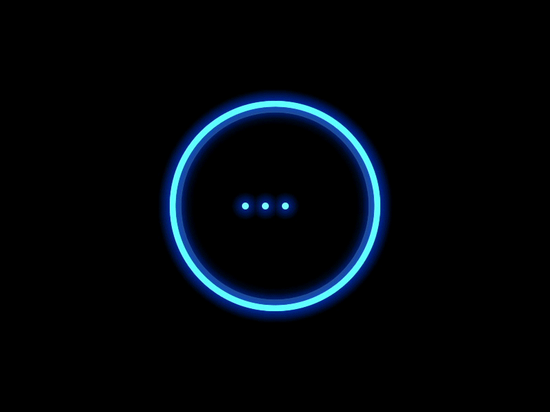
Smile loader for AI product design by Gleb Kuznetsov
Here are some tips for creating loading indicators .
12. The message that you did everything right
Success states are screens that we show users when they complete tasks. Designers should consider the following types of success conditions:
- Amazing states (first success). At the moment when the user first performs an important task, you have a great opportunity to create a positive emotional connection between him and your product. Let your users know that they are succeeding, recognizing their progress and celebrating success with the user.
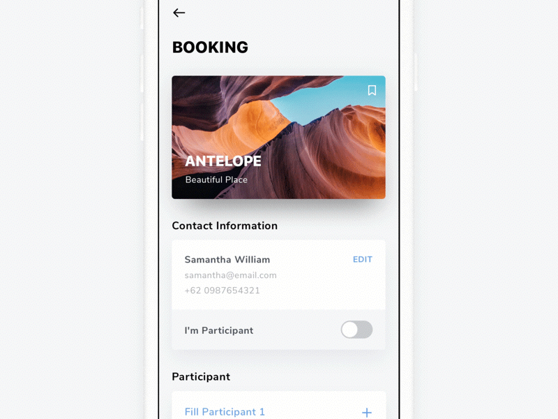
- Confirmation screen. A confirmation screen is a required screen for e-commerce applications. At the moment when the user completes the purchase, we need to show a screen that will provide all the necessary information about the purchase.
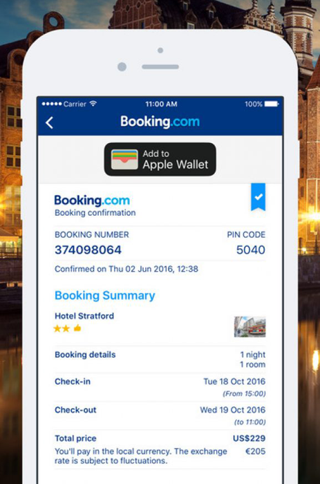
Confirmation screen in Booking.com
13. Autofill
Designers should always strive to minimize the cost of interaction by removing unnecessary actions. Autocomplete simplifies user input, reducing the number of clicks that the user must complete to complete the request.
Image: Louise Chang
14. Cancel the operation
We all make mistakes, but when it comes to interacting with the user, it is extremely important to provide an option that helps the user recover important data.
Undo for Delete item. Image: Sashoto Seeam
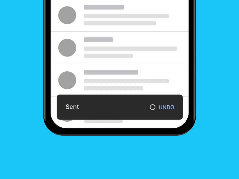
Undo for sending email. Image: Tyler Beauchamp
15. Localization / Internationalization
Since many development teams have plans for global reach, it is important to make localization / internationalization a natural part of the design process. The visual properties of the elements (e.g. size) and UX copies should be selected taking into account localization / internationalization.

Upvote button in different languages. Image: Chier Hu
16. Help / Instructions
When users have a problem, their first natural reaction will be to find a solution in the application. Therefore, it is a good idea to provide a link to the help / frequently asked questions section in the application.
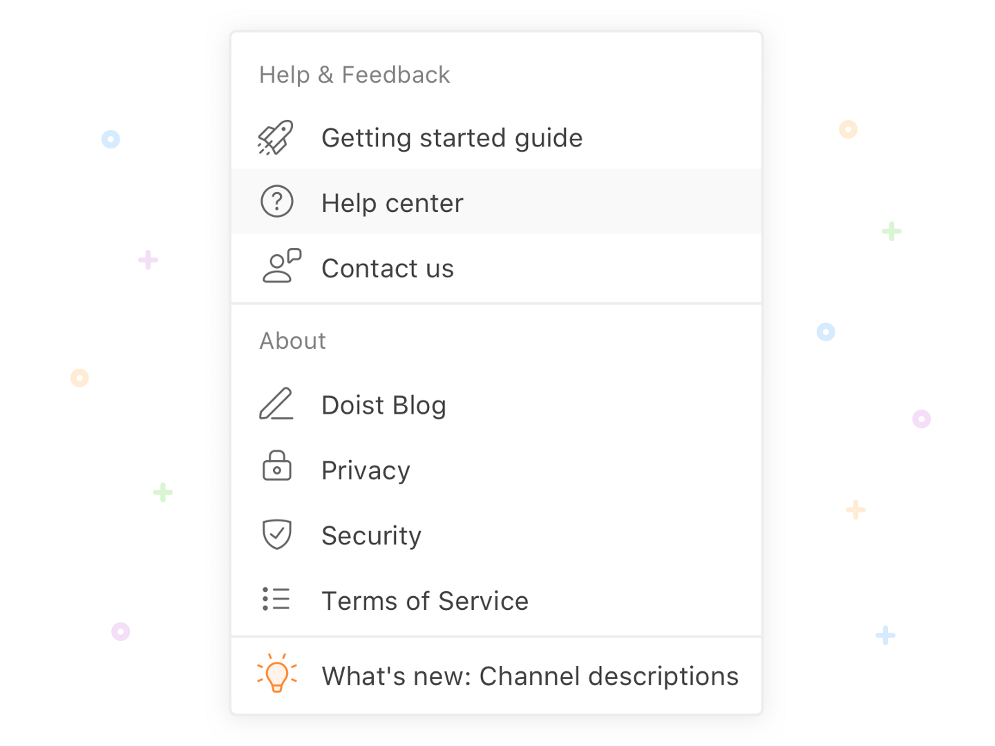
Help and Feedback by Alex Muench
17. Accessibility
Accessibility allows people with all abilities to perceive, understand and interact with your product. Here's a great summary from Lillian Xiao about what designers need to know about the availability of mobile devices.
And here is a list of tools for checking color contrast .
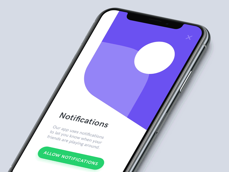
4. Notifications
18. App notifications / Push notifications
Did you know that lousy notifications are the main reason why users uninstall the application?

Annoying notifications are the reason people uninstall mobile apps (71% of respondents say).
However, you can turn this UX antipattern into something meaningful and useful for both business and the user. To achieve good results with notifications in the application, designers need a publishing strategy that is best suited for mobile devices.
Here is an article that provides information on how to create good notifications .
And here are some inspirational design ideas .
19. Notification Settings
It is always a pleasure to give users freedom of choice. In the context of mobile notifications, this means being able to choose which notifications they want to receive.

Set notification options in Slack
5. Account Settings
20. Tool for cropping profile photo
Allow users to not only upload an avatar, but also modify it to suit their needs right in your application.
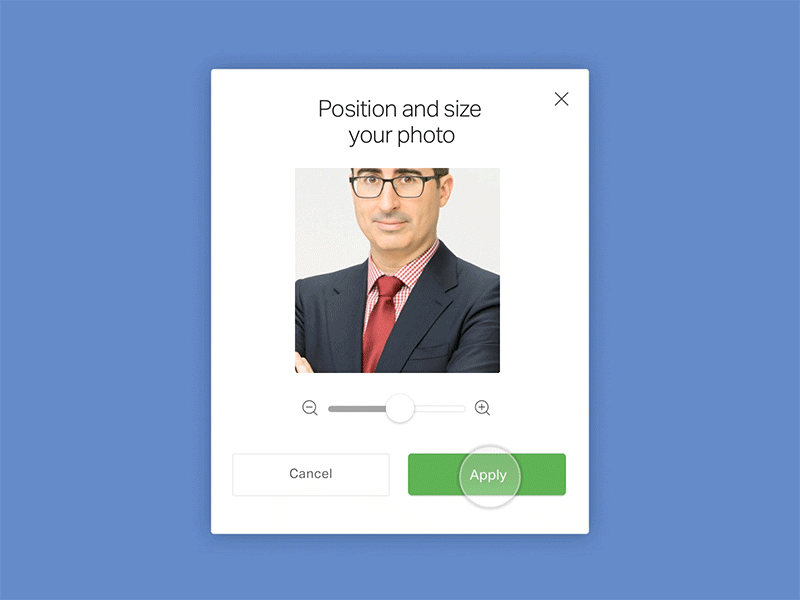
Editing avatar by Scott Thomas
21. Screens for viewing / changing personal data
Allow users to edit their personal data directly in the mobile application. Create screens to preview shipping / billing information and to add this information to an editable list.
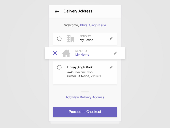
Home and office addresses are editable. Select a shipping address from Dhiraj S. Karki
22. Log out
If your application requires logging in, then there should also be an opportunity to log out.
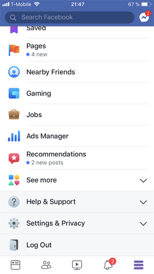
Logout in Facebook for iOS
23. Terms of use
Add the Terms of Service to your application to avoid legal action.

Image: Cristian Dina / Shutterstock
24. Privacy settings
Let users see what data they send to you and let them choose.
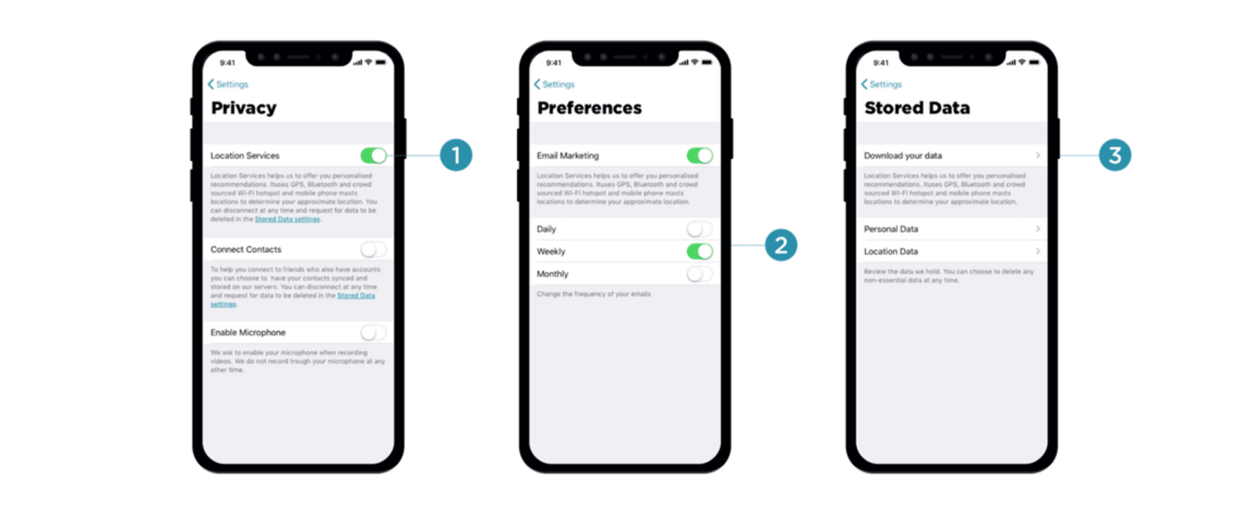
Image: Vitaly Friedman
Here are tips on how to deal with privacy in applications .
25. Send feedback
Providing a quick way to share feedback on your product, you not only collect valuable information about your product from real users, but also make them believe that their reviews are valuable to you.
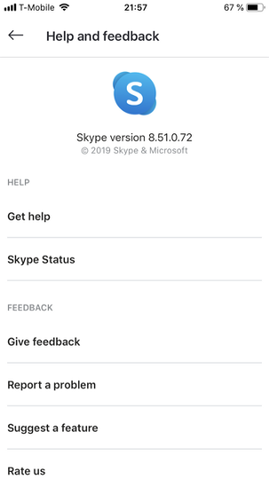
Skype for iOS gives users the option to "Leave feedback", "Report a problem" or "Suggest a feature."
6. Tape
26. Scrolling
Mobile displays are small. To save space on the screen, designers often want to optimize the displayed information and hide everything that does not represent value to the user. This is why many channel screens have two states: the default state (the screen that users see when they enter the channel) and the scroll state (when the user scrolls up to see more content).
Note that the title area collapses when scrolling. Craiglist Mobile animation by Aurélien Salomon
Search inside the application
27. The default behavior
Wang needs to decide what the default search order will be. For example, if you are designing a search results page for an e-commerce application, you need to decide whether to sort the output according to the best match / price / delivery time.
28. Share / Bookmark
Allow users to share and bookmark what they find.
Like, Bookmark and Share options in the App AE by Martin Berbesson
29. Empty form for “No results”
What will users see if they are looking for something, but there are no search results? The “No Results” screen should not mean the end. Tell the user what step to take next.
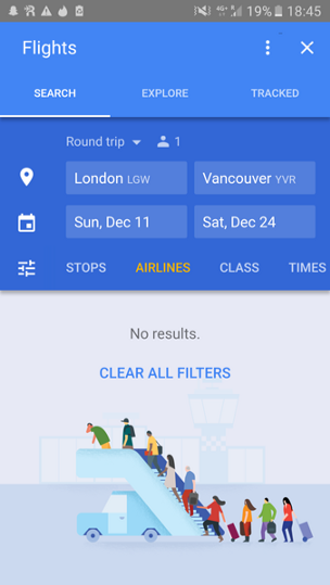
Google Flights app offers users clear all filters to find flights
8. AppStore / GooglePlay
30. Icon for the application
You need to design a catchy icon for your application, something that reflects the essence of your product and arouses interest among potential users.
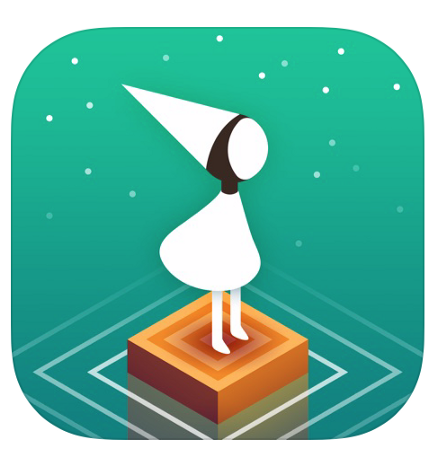
Monument Valley is a beautiful game, and the OS app icon is perfect for the wonderful adventure you're about to take.