In this article I want to share several similar laws and show how to put them into practice in the design of the user interface.
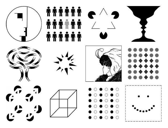
1. The law of similarity
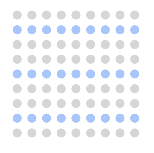
Elements that have a similar appearance seem more connected. In the image below, you probably see groups of colored circles as rows, rather than as a collection of individual circles.
Application in user interface design:
Elements can be visually grouped if they are visually similar. This similarity can be created using size, color and shape.

2. The law of symmetry
Our mind loves symmetrical objects, because symmetry gives the impression of stability and order.

Application in user interface design:
When you customize user interface elements so that they are symmetrical with respect to each other, you simplify the process of perceiving these elements for users. For example, a symmetric navigation menu tends to be perceived as more stable than asymmetric.

Note: Sometimes symmetrical layouts may look boring. Thus, you may want to introduce some asymmetry into the design if you want to make it more dynamic.
3. The law of the general region
Elements tend to be perceived as a set of elements in a common group if they are separated by an area with a well-defined boundary.

Application in user interface design:
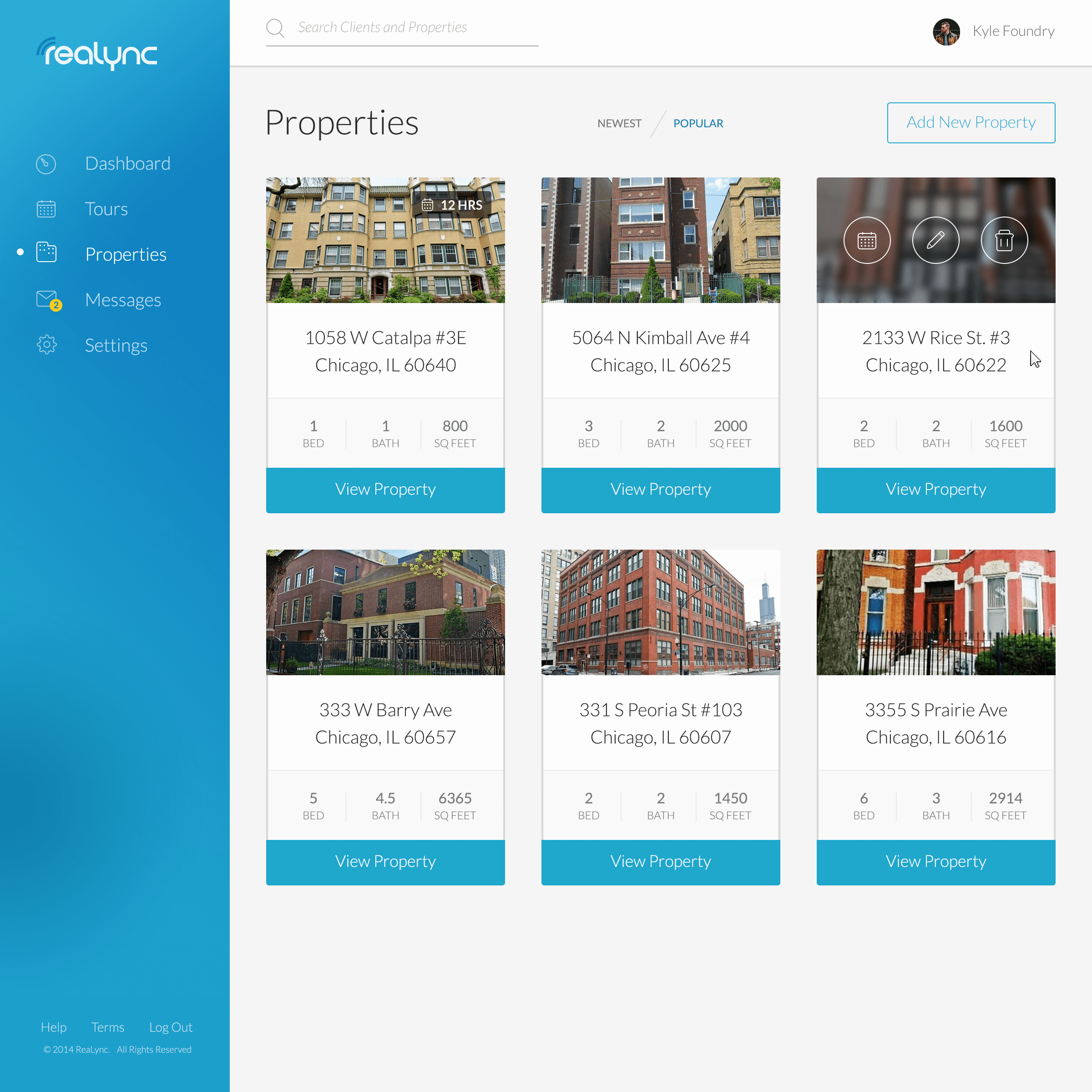
By adding borders around an element (or group of elements), you separate it from surrounding elements. Look at the cards in the image below. Subtle shadows and clearly visible borders give the impression of individual objects.
4. The basic figure
The principle of "figure-base" refers to the ability of a person to visually separate objects at different levels of focus. We know which elements are in the foreground and which are in the background.

Application in user interface design:
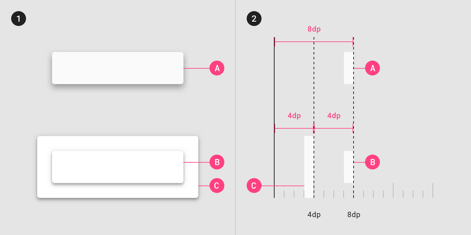
There are several methods for distinguishing focus plans: you can use translucent blending, shadows, or blurring elements in the background.
5. The law of proximity
Objects that are next to each other seem to be grouped together.
Spaces play an important role in principle. In the following figure, the circles on the left appear to be part of one group, and the circles on the right appear to be part of another.

Application in user interface design:
The proximity principle helps designers make content more user-friendly. Place related objects denser to each other to create a proximity effect.

This principle can also reduce the error rate for interactive elements, as it enhances the relationship between elements.

Left: additional efforts will be required by the user to determine the correspondence between the button and its corresponding product.
Right: Using the proximity principle, you bind a button to a specific element.
6. The law of continuity
Our perception tends to see objects arranged in lines or curves as connected or grouped. This is because objects connected by straight or curved lines are visible to follow this path.
In the image below, lines are created from circles that are considered to belong to each other.

Application in user interface design:
Direct the user's gaze to create a visual connection between objects. Use this principle when designing menus.

If you compare the examples of the menu on the left and on the right, it will become obvious that the menu on the right is more convenient for perception and understanding.
7. Law of Closure
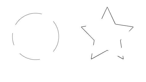
Our brain tends to fill information gaps.
In the image below, you probably see two objects (a circle and a star) because your brain fills in the missing spaces to create a complete image.
Application in user interface design:
Every time you design a progress bar or progress bar, remember the closing law.

8. The principle of common destiny
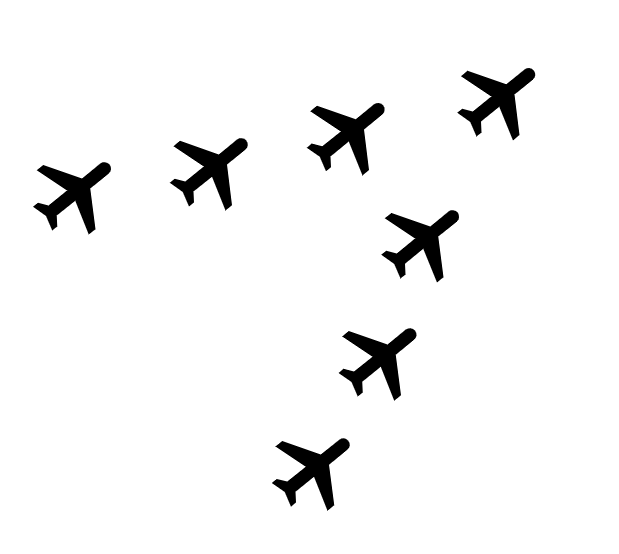
When elements move in the same direction, our brain perceives them as part of the same group.
Application in user interface design:
This principle is one of the main in the design of the movement. Functional animation uses a shared destiny to guide the user's eyes.
