
In 2018, Apple proudly shared its anniversary indicators: the number of subscriptions purchased in the App Store products reached 300 million and continues to grow at a rate of about 10 million per month. It is noteworthy that the bulk of purchases were made over the past couple of years: compared to 2017, the total number of subscribers increased by 60% , and the profit they brought to developers and the market almost doubled .
The ever-increasing popularity of the SaaS (Software as a service) model is understandable and hardly accidental. Back in 2017, there were rumors about a secret meeting between Apple representatives and selected developers, which discussed problems with the monetization of products - the share of profit from paid applications at that time was negligible (about 15%). Management strongly encouraged customers to switch to the subscription model as a “way to get paid from users on a regular basis” for both the developer and the distributor; otherwise, the development of their business may “stop” over time.
Subsequent events generally confirm these rumors: starting from this moment, subscriptions gradually come to the fore in updates, guidelines and company presentations. In this article, we would like to share our observations regarding these changes, outline Apple’s new subscription policy and see what strategies the most enterprising developers choose for themselves in the new environment.
First, let's define the concepts. In the developer’s guide, Apple discloses the concept of subscription as follows: “A type of in-app purchase that provides people with access to virtual content on an ongoing basis over a period of time.” Formally, subscriptions are divided into two categories: non-auto-renewable and auto-renewable, but the administration clearly pays more attention to the latter - it is to them that the detailed sections with tips and instructions are devoted. In other words, the following scheme is in priority: by purchasing a subscription, the user agrees to the charges, which will be carried out with the agreed frequency for a certain period of time. In order to stop paying ahead of schedule, he needs to complete a chain of additional actions.
Apple’s decision in favor of automatic renewal of subscription, perhaps, can be called one of the determining factors for the formation of the policy as a whole. On the one hand, such a scheme is very beneficial for developers - it gives a more stable flow of funds and allows you to "monetize" the forgetfulness or inertia of the buyer, who can continue to pay for an already unnecessary service for a long time simply because of the lack of external incentives to refuse it. On the other hand, a SaaS model, on the other hand, poses additional risks to the user. In this scenario, fraud becomes even more serious threat: if the buyer does not understand the conditions of the subscription poorly, he may unintentionally agree not to a single payment, but to a number of charges. With insufficient attention or mobile literacy, this can result in a systematic loss of money and considerable damage.
Thus, in order to protect the interests of both parties and not lose the support of either developers or buyers of the market, the company must maintain a strict balance of rights and opportunities. On the one hand, it is necessary to ensure that developers make full use of all the features of the subscription model and benefit from them. On the other hand, care must be taken to ensure that this does not prejudice users, that is, to monitor the integrity and transparency of transactions. Hence the twofold feeling that customers have with Apple’s new policy. On the one hand, heating enthusiasm - emphasized attention to the subscription model, new tools and recommendations on how to use them; on the other hand, strict control, strict rules for the design of screens and pages in the store, “nit-picking” on trifles and refusals of moderation.
At the beginning of 2019, an updated guide for developers appeared on the company's website with a section devoted entirely to subscriptions, where this ambivalence is especially pronounced. As the editors of 9to5Mac noted , the latest version of the guideline should be considered the publication of those principles that have been used for some time while checking products: “Apparently, the moderation rules regarding subscriptions have not changed - new pages just more clearly determine how applications should look and work” . Characteristically, in the text, tips for increasing conversion are mixed with the requirements for design and a list of the necessary information on the screen. Below we will try to divide this mixture into recommendations that are in the interests of the developer, and the rules that are designed to protect the user.
Best practics
The advice that Apple developers give, for the most part, goes back to proven marketing strategies, combined with a careful attitude to the user experience (offer without intrusiveness, do not distract from the main occupation, do not try to sell the unnecessary). In general, we single out four main principles that, according to the manual, can provoke an increase in the number of subscriptions.
Good moment
A screen with an offer to purchase a subscription should lie in wait for people when they are especially inclined to pay for additional content or features. Guideline encourages you to begin familiarizing the user with the application by listing the benefits that different types of subscriptions will provide. This will help the newcomer to organize information about the functions or contents of the application and immediately find out how much the set will cost him.
For more experienced users, it makes sense to remind you of the opportunity to switch to a paid model when its bonuses are especially not enough. The best cases are selected taking into account the monetization scheme and the specifics of the product. Suppose, in a news application with paywall, the offer would be appropriate when the reader has almost exhausted the limit of articles available for free, in a photo editor such as freemium - when trying to use a locked tool, and so on.
Another aspect of timeliness is the ability to remain silent when necessary. Apple categorically does not recommend showing the same purchase offer to everyone, without separating those who have already signed up from those that have not yet been converted. For a person with a subscription, the call to buy it again can cause not only irritation, but also wariness - this suggests that something went wrong with the paid product. You can offer him to switch to the tariff with other conditions, but it should be clearly indicated that the current subscription is still active, for example, using the Sign In or Restore Purchase button.
Metered Content Delivery
The subscription model involves a combination of paid and free materials, and you need to draw the line between these two sets with jewelry accuracy. Apple emphasizes the effectiveness of such a promotion method as previews, that is, the opportunity to try for free everything that the paid version offers in therapeutic doses. For this purpose, developers are immediately provided with two limiter tools:
- Free Trial - timeline restriction. The user subscribes without writing off funds and, during the time period specified by the developer, freely uses paid content or services. It should be noted that after the expiration of the period of automatic cancellation of the subscription does not occur - instead, payment starts to be charged as usual; here the administration of the App Store is clearly playing along with the developers.
- Paywall - quantity limit. This scheme is suitable for applications with a large amount of content, which is easily divided into units - articles, videos and so on. The user can view a certain number of units of content for free, after which access is closed. In this model, on the contrary, there is no smooth and inconspicuous transition from the free version to the paid one - a subscription is issued only when the limit of free content has been exhausted and only at the request of the buyer.
Flexible pricing
Games with a price are an integral part of any promotion plan, and now Apple officially recognizes and supports it. Developers are offered several ready-made effective templates for profitable offers that can give an influx of purchases:
- Discount for the first periods . To quickly break the ice, the developer can offer new subscribers a special, reduced price for the period that he considers appropriate. After this period, the price rises to normal. Such a gradual increase in value with a parallel increase in value will be less painful for many than the need to pay a large sum for a product that has not yet been tested.
- Discount for "wholesalers" . Similarly, at the first purchase, the user receives a special offer - to subscribe immediately for a long period and pay significantly less than the usual cost of the corresponding period. This time is often enough to allow the user to form a habit for the application, which will encourage him to leave a subscription. The benefit, by the way, is mutual: long-term relationships are also preferable for the seller - for the second year of subscription, the market commission is reduced from 30 to 15%.
- Bundles . Several subscriptions can be grouped into one package and sold at a discount - this is a good way to introduce users to the entire range at once.
- Geocenes . Apple gives developers implementing auto-renewable subscriptions a useful opportunity to vary the price depending on which region the customer comes from. In total, 200 variations in the value of the product are available for different countries in the respective currencies. This model allows you to take into account the specifics of each market in pricing and makes the marketing strategy much more flexible.
In addition, the developer can organize their own sales and promotions at any time and on any conditions that do not contradict these rules.
Minimum effort to buy
The final touch in the set of practices is self-evident, but fair: you need to take care not to push the user away already at the very stage of subscribing. Hence the calls of the App Store administration for conciseness and information in the interfaces.
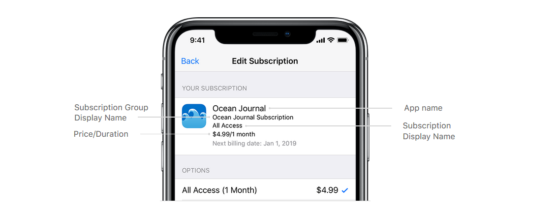
Transparency is needed not only to ensure that the user makes a deal with his eyes open, but also so that he does not waste unnecessary efforts in searching and assimilating information about its conditions. Developers are encouraged to display all the basic information (duration of the subscription, base price, set of features or content, description of the payment procedure) on one screen and request as little personal information as possible to minimize the number of steps. The same principles of clarity and conciseness should be followed when choosing names for subscriptions - they should speak for themselves and indicate the difference between options from the same group.
Along with the windows that pop up during certain interactions, the administration also proposes to provide a fixed link to the checkout, which would be available on all screens. This precaution will provide the user with the ability to easily conduct a transaction as soon as a decision is made. The guideline also introduces the idea of simplifying the management of subscriptions through a link built into the interface that would directly display the user on the screen with the appropriate settings. However, so far such assistance with the cancellation procedure is not charged to the developer.
Subscription Offer Rules
Bans and strict requirements for developers are, in fact, Apple's reflection on the bottlenecks in the new policy, an attempt to pre-define vulnerabilities and regulate work so that they cannot be exploited. For the most part, it all comes down to two problems: the user must give informed consent to the subscription and at the same time receive everything that is due to him.
Content Uniqueness
First of all, the application must have reason in principle to use a subscription model. The manual provides a list of varieties of products that may qualify for regular payments: "applications that provide new game levels, serial content, software as a service or support for cloud services." In any case, developers who are thinking about introducing subscriptions are required to “bring newness to the user experience on a long-term basis,” that is, “improve functionality or expand the content”. This rule is most difficult to break by virtue of its fundamental nature.
But there are other problems, smaller problems associated with the authenticity of the value for which the user pays. So, the process of switching to a new monetization model and building a complex system of subscription groups creates excellent conditions for unreliable sellers to sell the same function to the same buyer twice in different packages. To avoid this, the manual also spells out the corresponding prohibitions - once having paid for a certain list of features, the user retains rights to it until the end of the application life cycle. The fact that the seller makes changes to the subscription system, changes the cost of various functions and the conditions for access to them does not affect those who managed to subscribe according to the old scheme - the developer is not entitled to interrupt it or require an additional payment.
Content Availability
Transferring the amount indicated on the window with the offer is the only step necessary to gain access to the content or service. Any additional requirements are considered a violation of the rules and grounds for refusal of publication or ban. In particular, blocking functionality is considered to be “black schemes” until the user performs an action: he gives a rating, writes a review on social networks, gives access to contacts, downloads something, and so on.
The promised opportunities should also remain available from a purely technical point of view - it is assumed that the user will retain access to them when switching to any compatible device from the Apple ecosystem.
Offer transparency
This rule is highlighted in the developer's guide as a key one - it is for him that the most detailed and clear list of requirements is provided. If you recall that it is now extremely important for Apple to resist the influx of fraudulent schemes, such attention is justified. Mistakes, omissions, and the approach to false conclusions are the most popular tools for conducting dishonest transactions.
The requirements relate to both the method of supplying information and its volume. The proposal should be written “in a clear, unambiguous language with consistent use of terms” and include the following information:
- List of available subscriptions in the group - the user should see that he has options
- A specific list of opportunities that will be open for payment
- Subscription validity, expiration time
- The current price for the specified period in the currency corresponding to the localization (the indicated price must correspond to the amount that will be debited at checkout)
All this information should be visually accessible, that is, displayed directly on the window with the offer, not hiding behind the cat and other interface elements. However, there are a couple of mandatory components of the proposal, which, due to their volume, can be present in a “compressed” form. Firstly, these are the legal texts of Terms of Use and Privacy Policy - in the box you should provide links to these documents. Secondly, this is an extremely detailed description of the payment procedure: when exactly the funds are withdrawn, under what conditions cancellation occurs, how are the subscriptions managed. This text allows Apple to make it less catchy: on the example screens, it is placed under all other elements, written in small print and presented as a fragment that unfolds on a click. The text of the manual does not mention the rules for combining these two elements, but judging by the screenshots, they should be considered interchangeable.

Apple Subscription Window
We note an interesting point: in addition to the general principles for the design of the proposal, the App Store administration separately identifies several smaller rules that are clearly aimed at combating the popular black schemes. For example:
- The button that starts the purchase process should be marked with a clear and unambiguous call for the appropriate action (“Subscribe”, “Buy”).
- The call to try the free trial should be accompanied by detailed explanations of how this scheme works, including the fact that in the future funds will begin to be debited from the user without asking for consent. This somewhat compensates for the head start that developers receive from current rules.
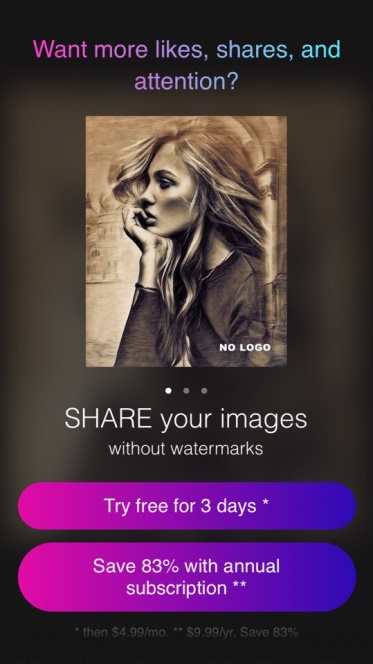
- If the seller offers a special price for special subscription conditions (for example, a discount when paying a year in advance), he does not have the right to present it as a base. Here Apple speaks as specifically as possible, up to a ban on a larger and brighter font for a more favorable (and less affordable) price. It is possible to prescribe more budget options and emphasize savings - but in such a way that it does not draw attention from the cost of the “default” subscription.
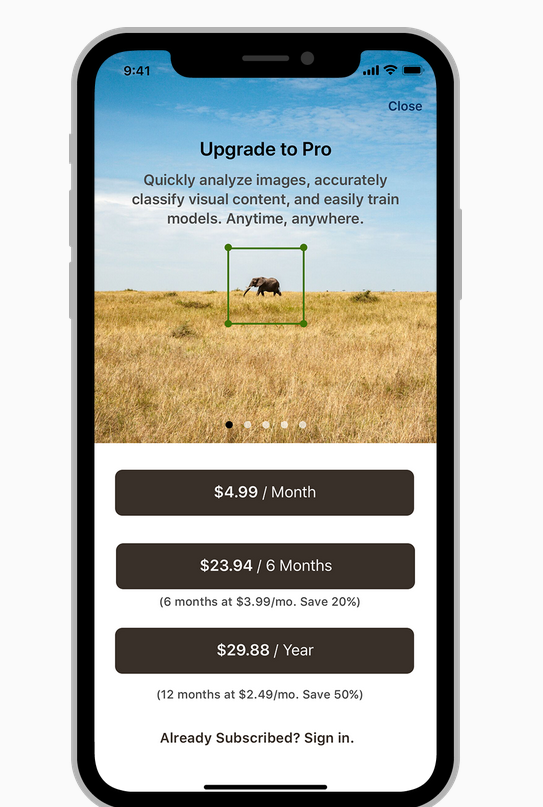
Proper submission of the terms of the promotion
So, the position of the App Store administration is generally clear. Now let's see how the developers adopt the new policy - but we will be interested not in what they say, but in what decisions they find influenced by innovations. Obviously, in this situation, you can choose one of two ways: either keep up with Apple and try to implement the practices proposed by the company, or look for loopholes. We conducted a small study of applications from several interesting niche team niches and found that both approaches have their followers. Moreover, sometimes best practices and outright violations coexist within the same product.
Among the best practices, the most successful and active developers are mastering, perhaps, the art of metered delivery of content through previews. Not only are the free trial and paywall models popular in principle, some teams add additional teasers on their own, intensely drawing the user's attention to paid content.
An example is, let's say, this is a coloring application that periodically gives a gift to unsigned users and seems to remind you what needs to be done to get more pictures of the top class. With an extensive collection of content, such generosity is likely to pay off.



Another application is more economical: it does not give personalized content to the user, but holds it ready in case he subscribes. In this case, an unexpected individual offer encourages impulsive buying.
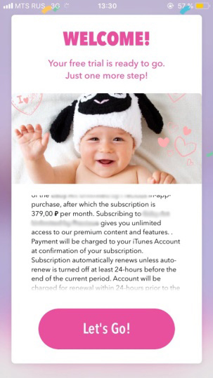
Cases come across when the display of a proposal, especially organically embedded in the interaction, catches your eye. For example, in the same coloring, a reminder about the ability to open a complete collection is built directly into the interface in a strategically selected location - next to the list of all available paintings.

The combination of flexibility and timeliness can often be seen in the way developers submit information about the availability of free trial. Somewhere - usually in products where the price is high or the value is revealed gradually - the attention of the beholder is intentionally focused on it as the best option.

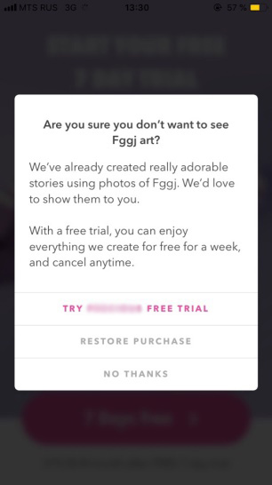
Other applications use free trial as a backup alternative for those who are not ready to immediately accept the subscription terms. Such switching can to some extent reduce the failure rate.

This scheme has been brought to the limit in one of the entertainment applications we have encountered. Here the application enters into a bidding with the user - if he refuses three free days, they immediately give him a whole week:


Now let's move on to more risky methods that could potentially mislead the user. The appropriateness of Apple’s intensified struggle for transparency of conditions can be judged by how persistently developers continue to violate this principle. In the course of our research, we have collected a whole collection of buttons with ambiguous texts that do not make it clear what exactly will happen when pressed. Signs like “Continue” or “Next”, which may mean either returning to the previous screen or switching to a subscription, increase the likelihood of an accidental purchase.
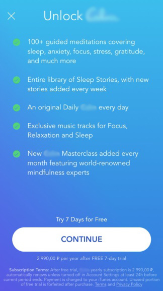


Sometimes hazy language is also accompanied by confusing navigation. In this application, for example, with the help of persistent pop-ups and unexpected transitions, a user journey turns into a labyrinth where any ill-considered step will bring the user to the same fateful design window.
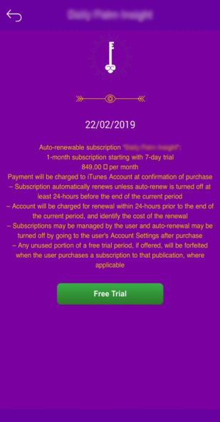
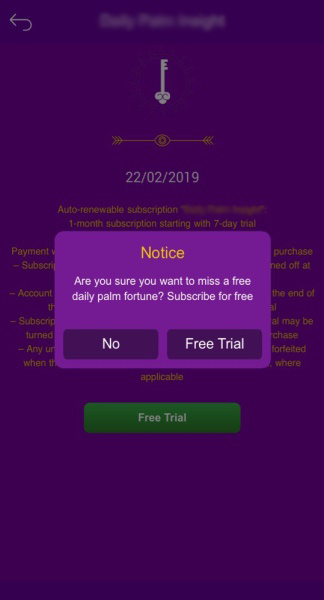

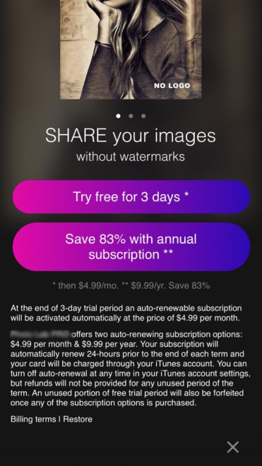
The principle of content accessibility also sacrifices increased conversions, albeit somewhat less often. So, one of the schemes that we came across regularly provokes a purchase by simply leading the user into a dead end - he sees no other way out of the offer screen except for the target action button. In fact, in this case, the freemium application is disguised as completely paid, creating the false impression that without writing off funds, all functions remain blocked.
The exit from the screen is usually usually provided in this case - it’s simply well hidden. For example, in the screenshot below, the cross is located at the very bottom, under the whole text, and is visible only after scrolling.
Thus, we can conclude that in its current state, the App Store subscription policy gives great scope for applying marketing strategies and still leaves room for tricks balancing on the verge of fraud. However, those who are inclined to the second path should understand: the introduction of a subscription model is Apple's long-term and priority project. Judging by the trends of recent years, in the future, selection algorithms will be improved (just remember the recent innovation - post-moderation), and the rules will be clarified. It is already obvious that the changes are aimed at preventing transactions that are made by the user accidentally or in error. Therefore, if we ignore ethical arguments, half-fraud strategies should be considered rapidly receding into the past. We can only advise ourselves to get ahead of the events and abandon them in advance.