Food Design Digest, September 2019

Patterns and best practices
How Video Games Inspire Great UX
Scott Jenson talked to Raph Koster, author of A Theory of Fun, and analyzed the differences in the approaches of digital product and game interfaces. Very cool detailed analysis.

Email Love - Email Inspiration, Templates and Discovery
A collection of examples of good mailing letters.

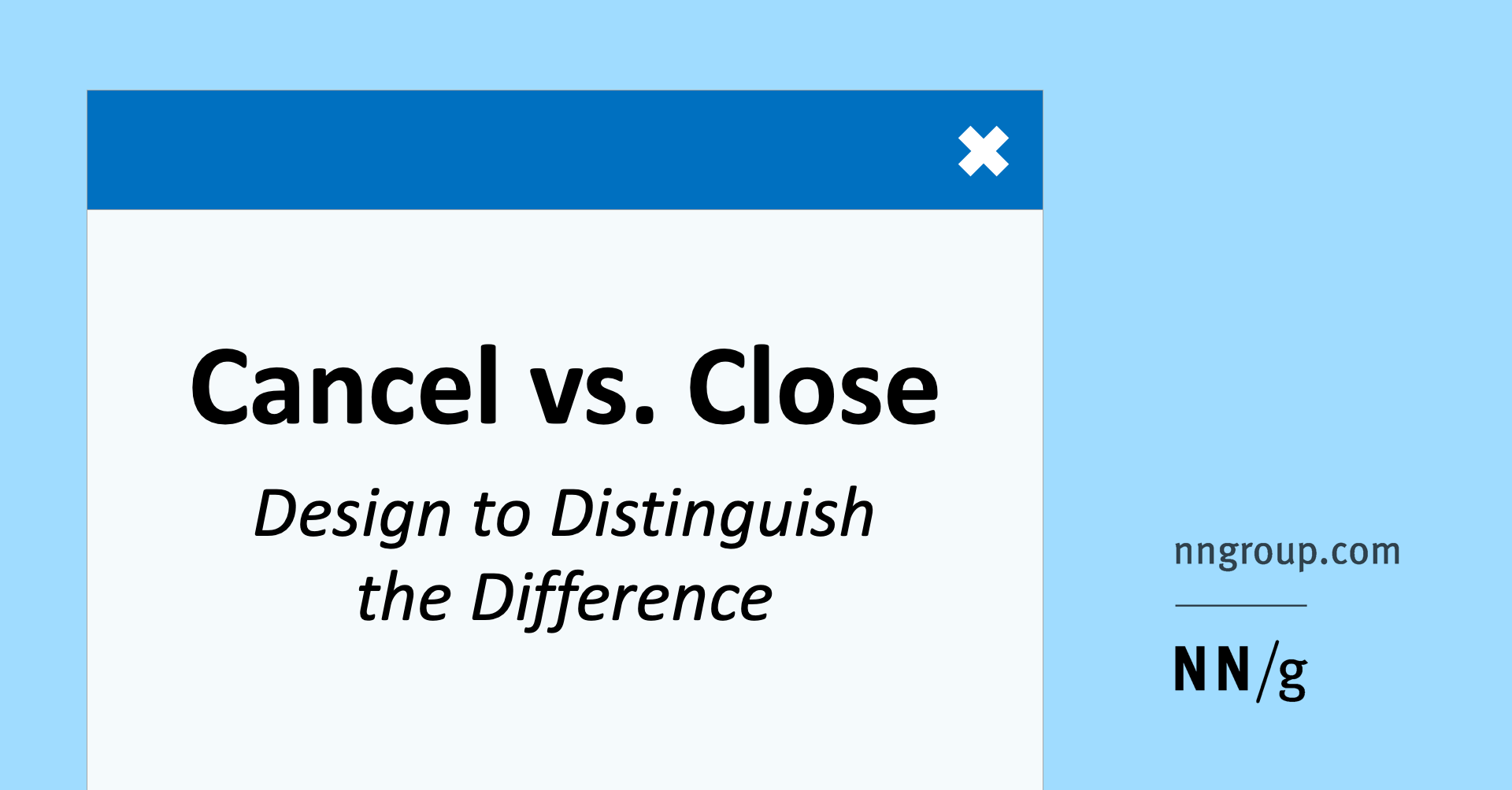
Cancel vs Close - Design to Distinguish the Difference
Aurora Harley of the Nielsen / Norman Group writes about how to clearly show the user the difference between the cancel and close actions, which are often represented by the cross icon in pop-ups and mobile applications. Translation
The UX of Online Job Searching Websites & Apps
Jeff Sauro conducted a comparative study of the interfaces of American job search sites.
Design systems and guidelines
Cooperative design systems
Cloud Four's Tyler Sticka of Cloud Four describes the development models of a design system that several product teams use. Not all of them benefit from a unified approach, but life situations.

Light Theme, Redeemed
Discord's Kevin Wilson talks about how the company remade a bright theme. Dark has long been the most popular, but they wanted to make a solid and familiar.
A guide to implementing dark modes on websites
Koos Looijesteijn describes a way to define a dark or light theme that a user needs to enable based on his settings and time of day. It also makes a smooth transition when switching.
Capturing the bigger picture
Interview with Bridget Harris from Airbnb, who built a new approach to photos in the product. They perfectly convey the spirit of the brand and its new positioning, and the format of their creation is distributed and relies on local photographers.

The Gradual Design System - How We Built Slack Kit
Garrett Miller and Zack Sultan talk about the Slack Kit design system. It is not accessible from the outside, but general details are described. Translation

Icon Rambler’s internal guide
Lena Liseeva talks about the principles of creating pictograms in the Rambler design system.
Visual Regression Testing in Design Systems
A small overview of visual regression testing tools for design systems.
iOS 13
Josh Commons is trying to understand the logic of using the ellipsis icon . Different applications use it for completely different tasks.
User understanding
Usability for Seniors - Challenges and Changes
Lexie Kane talks about a series of Nielsen / Norman Group studies on older interfaces. The report itself is paid, but the article has a lot of calculations from it.
New Interface Design Tools
Sketch 58
Automatic resizing of components when changing the content in them, displaying projects from the command version in the application. This has been expected for years and somehow solved through plugins, but now one of the stupidest problems of design tools is behind. What can be done with their help .
Plugins
- Color System : allows you to organize variables for color into tokens and switch the light and dark theme. A few words from Søren Clausen , author.
- Zecoda : Vue.js code generator from Sketch layouts.
Adobe xd
Plans for 2019 and a review already launched this year. Basic design and prototyping functions, collaboration, design systems.
UXPin 2.0
In November, a new interface and improved prototyping capabilities (interaction by condition, element status), duplication of elements a la Adobe XD will appear.
Figma
A quick response to the automatic resizing of components when resizing content in them in Sketch. Competition works wonders - this feature has been asked for tools for years, but in the grocery plan, it only went up when the neighbors did it.
Since many of you have asked, we thought we should let the cat out of the bag ... pic.twitter.com/3rHtyvtNKy
- Figma (@figmadesign) September 23, 2019
Other important updates:
Figmac
An alternative Figma application for Mac from Norm, a big enthusiast of design tools. He solved a number of inconveniences , although the tool itself has not changed.

Plugins
The telegram channel @figmaplugin reviews plugins. Sasha Okunev has a memo about their capabilities and limitations .
Figma help
Help site for working with the tool. Articles, videos, plugin reviews, product updates.
Useful materials
- A guide to creating a good component system from Jake Tsacudakis .
- Denis Rojčyk talks about the Kiwi.com design system device in Figma and provides links to the sources.
- Icon tips from the Iconfinder team.
- Step-by-step instruction of Sasha Belichenko on creating tables .
- Help Scout Buzz Usborne memo for moving from Sketch to Figma . What it translates into for a design team.
Glimpse
A branch of the GIMP editor with a new brand and interface.
Vectormator
Vector editor for illustrators on the iPad.
VeoLuz
An experimental design tool that allows you to create abstract graphics by adjusting light reflections from a single source.
Eagle
The tool helps to collect mudboards on the computer.
Copypalette
Another color palette generator. It allows you to export them to Sketch and Figma.
Nodes and Cables
Tools for visualizing data and creating 3D graphics using visual node programming.

Webflow
With Lottie, you can import animations from AfterEffects .
Creo community edition
A free version of the tool has appeared that is trying to marry design and development.
Artyline
The tool allows you to turn a sketch of a mobile application interface into an approximate layout, and then an interactive prototype.
Glorify
A simple banner and promotional image editor for online stores.
Voxgun
Service for creating simple promotional videos.
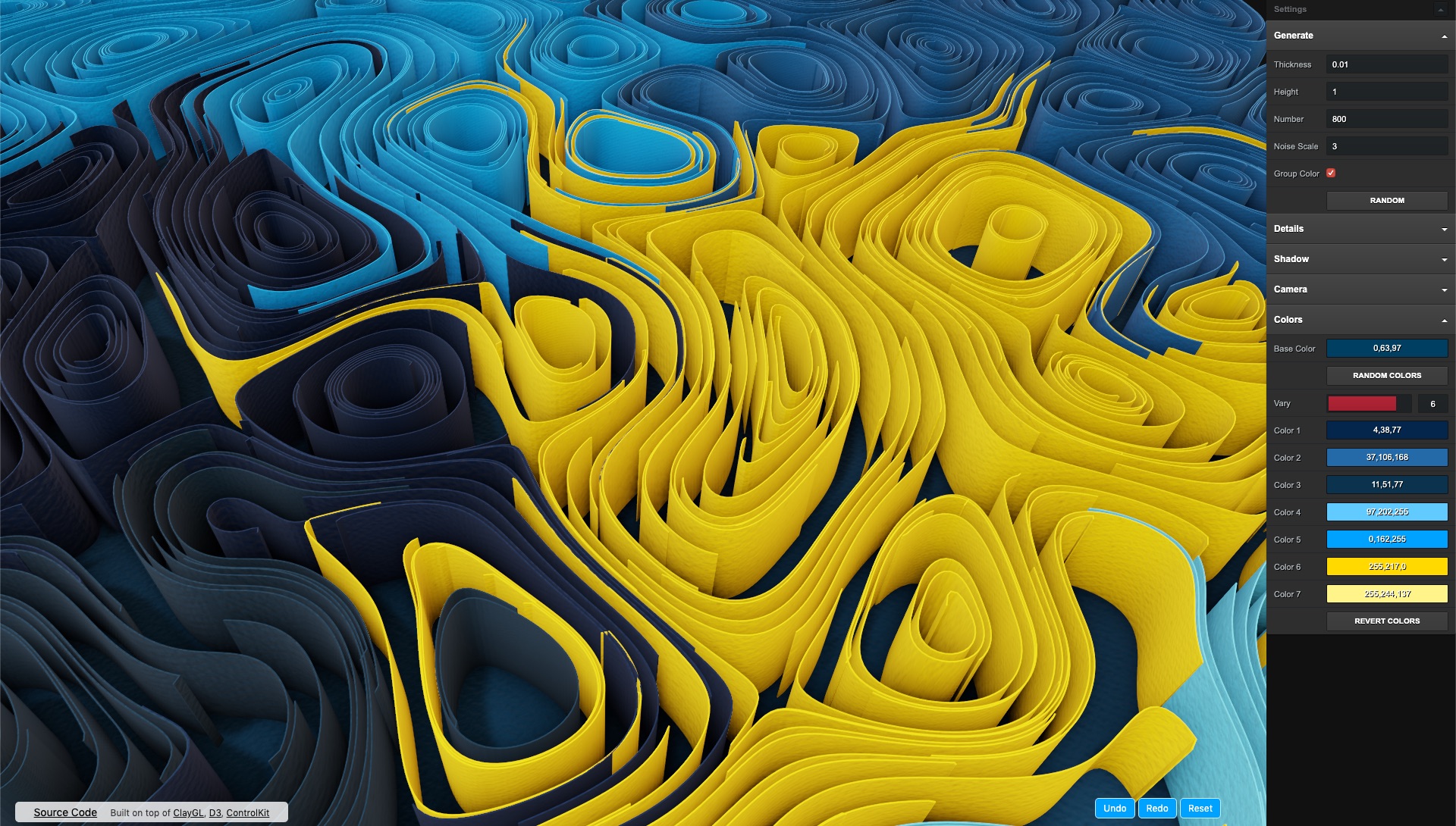
Paper quilling art generator
The online tool generates abstract graphics in the style of labyrinths from curved paper.
Aditus Button Contrast Checker
The service checks the contrast of the color of text and background on the buttons of the site in all their states (normal, hover and others).
Epilepsy blocker
The service helps to check the interface for safety for people with epilepsy. They also got a plug-in for Figma.
User research
Eyetato
The service promises to predict the eye tracking heatmap based on the data from thousands of user studies conducted earlier. True, of course, he will not give a scheme of movement of his gaze.
Bonus: A similar analyzer .
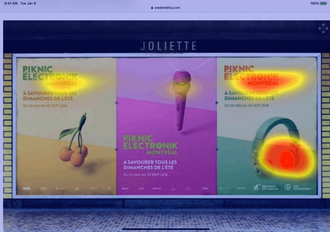
Visualeyes
A very similar service. They promise in some magical way to also predict the depth of the page scrolling.

UXtweak
Another service for remote usability testing. Comes with tools for checking information architecture.
Userbility
And another service for remote usability testing.
Usability tests with people with disabilities
Valeria Kurmak from Sberbank advises usability testing approaches for people with disabilities. How and whom to look for, process features.
Sample Size in Usability Studies - How Well Does the Math Match Reality?
Jeff Sauro is trying to get confirmation that the old bike about “only 5 users for usability testing” allows you to find only the most common problems.
David Travis & Philip Hodgson - Think Like a UX Researcher
UserFocus David Travis and Philip Hodgson have released Think Like a UX Researcher. It helps you get through the entire process of user research and is intended not only for the specialists themselves. Interview for Shopify .

How to Analyze Qualitative Data from UX Research - Thematic Analysis
Maria Rosala of the Nielsen / Norman Group describes thematic analysis methods for user research data. How to parse a large amount of unstructured data.
Tools for Unmoderated Usability Testing
An overview of remote non-moderated usability testing tools from Kathryn Whitenton of the Nielsen / Norman Group.
Visual programming and design in the browser
Can I email ... Support tables for HTML and CSS in emails
The service shows HTML and CSS support by popular email clients.
Less Data Doesn't Mean a Lesser Experience
Users can set the Save Data mode on their device, which saves traffic. Tim Kadlec gives advice on optimizing content that will not degrade the basics of the service.
New scripts
- The effect of image distortion when interacting with it .
- Effective cursor trace .
- The effect of flying interface blocks in the projection of science fiction films .
Metrics and ROI
What metrics and KPIs do the experts use to measure UX effectiveness?
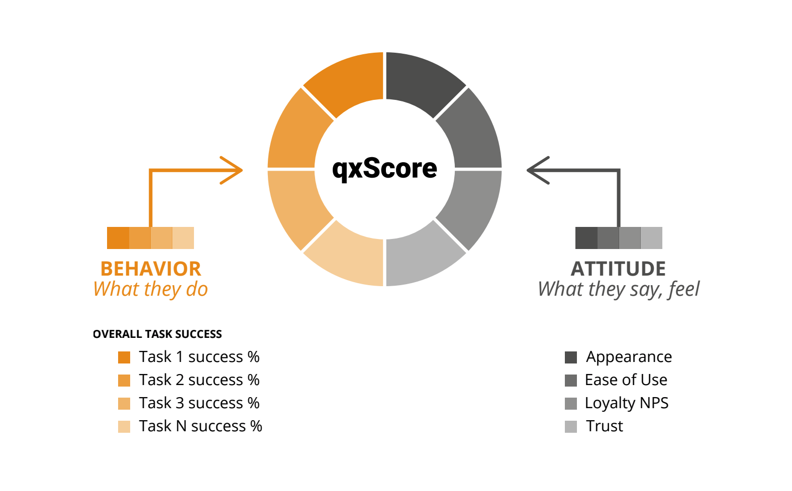
UserZoom's Christopher Ratcliff and Kuldeep Kelkar memo on some front-end behavior and product metrics. They also talk about their combined qxScore , which allows you to evaluate different facets of the product and track improvements.
Design Management and DesignOps
Design critiques at Figma
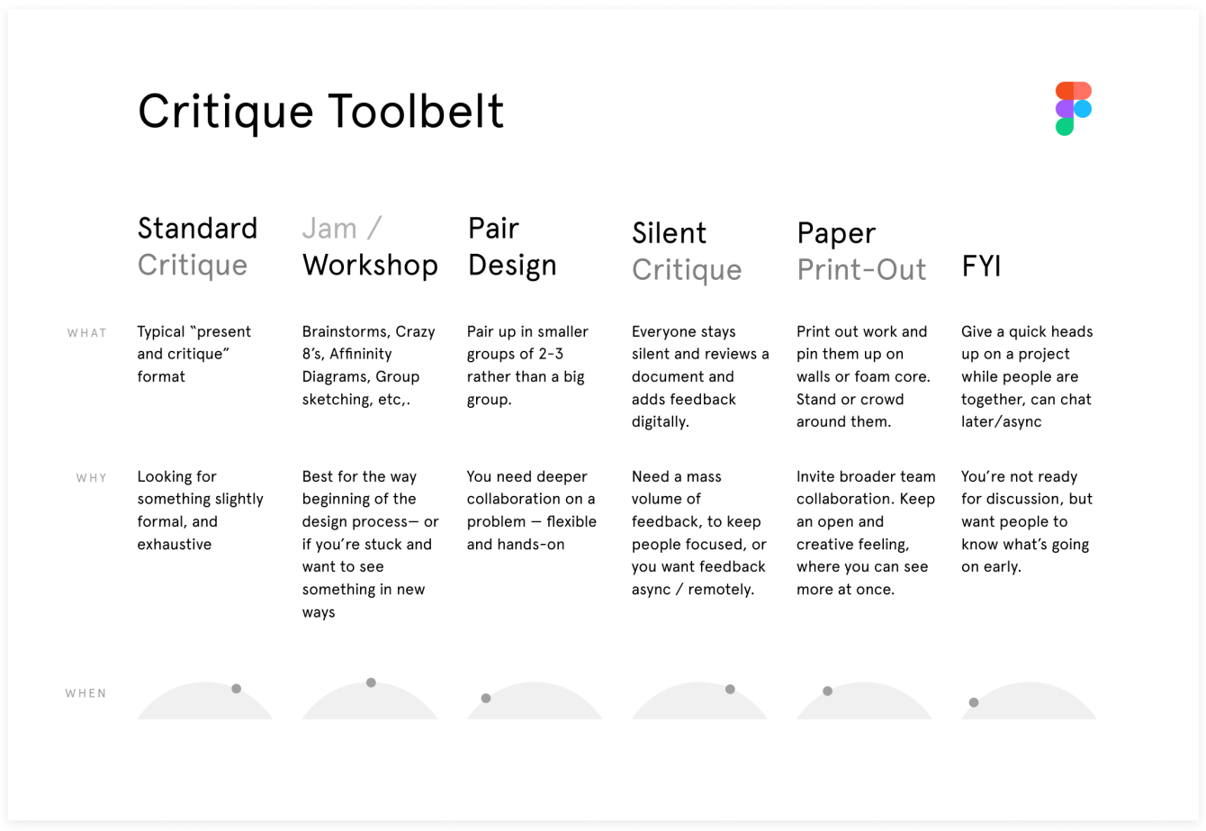
Gorgeous reminder for conducting design criticism sessions by Noah Levin of Figma. It offers several formats depending on the stage of the task - this is generally an excellent approach to the description of methods.
The power of critique - How to improve feedback on your team
Braden Kowitz tips for conducting design criticism sessions on the team.
How to deal with people who don't “get” design - design and strategy
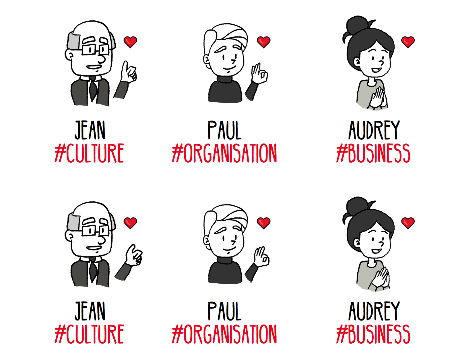
Societe Generale's Morgane Peng gives tips on working with complex managers. She divides them into three categories and suggests specific methods.
Good Customer Experience Demands Organizational Fluidity
Kim Flaherty of the Nielsen / Norman Group writes about the restructuring of the organization that is needed to systematically improve the customer experience.
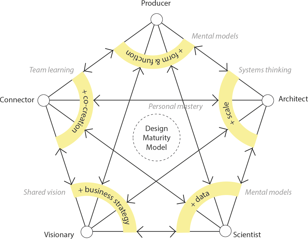
The Design Maturity Model And The Five Disciplines Of The Learning Organization
Fun design maturity model by Dennis Hambeukers. He combined the approaches of InVision and Peter Senge to get away from the linearity of the classic "ladder".
Hiring UX Professionals: 3 Critical Mistakes to Avoid
Jared Spool describes his method of hiring designers. This is a preliminary preparation and agreement on the requirements on the basis of which the interview is conducted. Another method from him is a letter on the achievements of the candidate for the year . This allows you to synchronize the understanding of his tasks within the team.
Customer Experiences Mirror Employee Experience
IBM's Gina Oh talks about employee experience map analysis that helps improve product team performance. In turn, this has a positive effect on the custom customer journey map.
How to Make Sense of Inherited Design
Headout's Sidharth talks about a product’s health map that helps you select points of effort to improve your interface.
Team interaction
Parking Lots in UX Meetings and Workshops
Sarah Gibbons of the Nielsen / Norman Group talks about how to “park” ideas in work sessions and meetings. If some of them do not fit into the topic of discussion, then they can be put off in a separate list, which is regularly parsed.
Product Management and Analytics
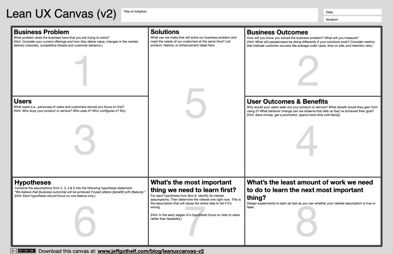
Lean UX Canvas V2
Jeff Gothelf has updated its Lean Canvas framework. The changes are small, but based on the experience of using the first version.
Methodologies, Procedures, Standards
A New Model for the Design Thinking Process
Yosef Shuman reviewed all the well-known design thinking patterns and proposed his own version.

Cases
Amazon's Beautifully Designed And Failed Three vs. Two Column Layout Experiment
An overview of one of Amazon’s product card experiments.
Trends
Algorithmic Design
AI generates logos from whole cloth
A logo generator that looks at the solution space very broadly, unlike earlier experiments like Logojoy. The result so far looks more like a sketch on paper, but it gives out more ideas.

100,000 Faces Generated by AI
A large collection of faces generated using algorithmic design.

AI Meets Design
A framework for designers working with products based on artificial intelligence from Nadia Pret. An extensive set of patterns and design methods for such interfaces.

Smarter patterns
A collection of interaction patterns with interfaces using an algorithmic design. How to make them more transparent and predictable.

Mixing UX and Research Science to Make Music
Claire Kayacik and Signe Nørly from Google talk about the collaboration of designers and researchers on an experimental application that helps to write music.
For general and professional development
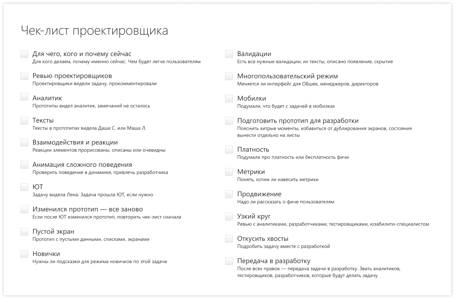
Novice designer
A series of notes for the beginning interface designer from Olga Konovalova from SKB Kontur. How to communicate with colleagues, work on a task, understand yourself and develop professionally. There is no separate table of contents, but in the last note there are links to all the others .
Juggling multiple product teams
Tips for product line designers from Jonathan Walter of Rockwell Automation. Formation of the right expectations and competent planning.
Innovation by Design Awards, 2019
Winners of the annual Innovation by Design award from Fast Company.
Coffee Chat Series # 1: Getting Ahead as an Early-Career Designer
Tips for novice designers from Julie Zhuo of Facebook.
Gabriel Kirmaier - UX Bites
A book for beginner interface designers from Gabriel Kirmaier, the author of the Instagram channel of the same name.
Establishing Patterns - How IBM Reveals the Shape of Things to Come for New Designers
Maia Herring talks about the Patterns curriculum at IBM, which pumps out new designers recently hired by the company.
Conference proceedings
Future London Academy 2019 UX and Product Design Course
The fifth time I go to the Future London Academy course and the fourth time I’m supervising the UX and product design course. This time we were in Huge, Map Project Office, Progression Pack, Phantom, Societe Generale, Deepmind, UserZoom, Clearleft, Smart Design, Signal Noise, Trainline, Bulb. I collected a ton of useful insights for myself and the team (as usual, a lot of photos).

Subscribe to the digest on Facebook , VKontakte , Telegram or by mail - there fresh links appear every week. Thanks to everyone who shares the links in the group, especially Gennady Dragun, Pavel Skripkin, Dmitry Podluzhny, Anton Artemov, Denis Efremov, Alexei Kopylov, Taras Brizitsky, Evgeny Sokolov and Anton Oleinik. Special thanks to the Setka team for the editor and Alexander Orlov for the visual style.
All Articles