Designing online stores. Part 3. Home page and catalog
In the previous parts I talked about the design of online stores for SEO and about the usability of the basket and checkout . In this part, I will tell you about the most ambitious part of the online store.
The catalog is the most important thing in the online store. Everything depends on how it is designed. Ease of finding a product by a buyer. Indexing by search engines. Conversion. Payback.
Catalog design begins long before the start of technical work. Design begins with a directory structure.

(click to open in large size)
The first step is to determine the assortment. This is not the topic of this article, my goal is only to note its importance. If you already have an offline store, then everything is obvious: we take its range. If the online store operates as an independent unit, then you need a good buyer who understands which products are in demand, who are more willing to buy, and which are often returned under warranty. An analysis of search queries can help the buyer: in addition to the demand for goods, the demand for them online is important: if you are not looking for something on the Internet, then it will be much more difficult to sell.
It is important to understand which products are used with which (and which are not), which categories are needed in a particular industry, and how to specifically fill them.
One common mistake is to trade everything in a row. - I have 100 suppliers, I will take a price list for 10,000 products from each and collect a store for a million goods from it.
Unfortunately, such reasoning is heard very often. Doing this is not worth it, because such an online hypermarket will require huge resources for you to collect data for product cards, to maintain current prices and balances, for consultants who are versed in assortment, for competitive prices and services. Without all this, this huge mass of goods will not be sold, and to find among them something adequate will be almost impossible.
I was looking for a leather bag with 2 compartments on wildberries and having reviewed 1000 cards of goods, I could not find it.
In a small specialized store of 100 well-selected products, I found it in 5 minutes.
Having decided on the assortment, we begin to build a hierarchy of the catalog of goods. The appearance of the site directly depends on it. Up to 8 sections with names of 1-2 words can be placed in 1 line in the horizontal menu. For more, you need a vertical menu. It is not so convenient and on its basis it is more difficult to build a good design.
In general, the catalog is built on the principle of “from general to particular” (thanks, cap). Which is much less obvious: the same product can be in different categories. For example, a bed is both “furniture” and “products for sleeping”. Is the mattress closer to the first or second?
A little research can help us with such contentious issues. The research method is called "card sorting." At the same time, respondents lay out cards according to their correspondence: for example, “where would you look for a mattress in the first place”?

According to such studies, you can
Place a section in the desired category
Rename a section Put a section at once in two categories Technically, it is not difficult, but it is better not to abuse this method so as not to inflate the categories. A little test - where do you think the batteries are?

Portraits of the target audience are being designed for the site. Portraits of Central Asia are collective images of characters who buy goods from you under certain conditions for various purposes.
An example of a portrait of Central Asia

For example, in a store of goods for repair, it can be: A woman on maternity, choosing wallpaper, a man choosing a drill for himself, a professional repairman who is constantly buying putty. Having identified the main portraits of the target audience, we proceed to the design of their paths on the site. Each character has its own search script. Their selection criteria, their own ways of choosing goods. In accordance with them, we determine what features are required on the site. For a woman choosing a wallpaper, obviously, the big photos in the product list are important. For a man buying a drill, mini descriptions and basic properties are important.
For a professional, searching by name and the ability to quickly add several different products in large quantities to the basket are important.
An example of the needs and pains of CA

Understanding who and why our store will use, what products it sells, what catalog structure we need and what it is filled with, we can proceed to designing pages.
Main page
We start designing from the main page of the site. The basic concept of structure is being worked out on it.
We will analyze the page into blocks to describe what functions are embedded in them.
Here is an example of a hat designed by us
The catalog can be horizontal (right under the header) and vertical (usually on the left). The first option is more convenient, as it leaves a place for filters on the side. The second is more universal - it is practically unlimited in the number of first-level sections on the site. Here are examples of directories on the sites we designed
Vertical

Horizontal

Announcements and Banners
The block, usually located in the central part of the main page. They allow you to convey the benefits of the company, new arrivals, promotions, sales, special offers.
Announcements can be in different formats. Slider
Multiple banners
Text Announcements
An example of announcements in a designed site
Product Samples
Blocks with selected items. Usually these are hits, novelties, promotional items.
It can be some kind of thematic collections, for example, “ready-made images” in fashion
Product selections on the site
There is information that can be announced only in the basement of the site.
Usually these are links to social networks
Alternative contact information (multiple phones)
An extensive menu on the information sections of the site
Main sections of the catalog
Basement example in the site
Section List
The section list page partially duplicates the catalog drop-down menu. It is needed to facilitate the indexing of the site by search engines and in order to be able to go over breadcrumbs.
The page with the list of sections is quite simple in design.
Usually it comes in two versions
The first option is clearer
The second accelerates the search for the desired section and simplifies the indexing of the site.

If the site has up to 100 sections, then you can use the photo option.
If more than 100, then it is definitely better to use the option with subsections
Listing (product listing page) is one of the most difficult in the store. It should simultaneously work out all possible search scenarios for the site.
The main functions on the page
What data is needed in the product block in the list
Photo
Functions in the product block in the list

Card Product
In the product card, the task is to facilitate the choice as much as possible, present all the advantages of the product and convince you to use this particular store
Accordingly, five main functions can be distinguished in the card
Visual part
Photo, video, panoramic rotator
Allow you to inspect the product from different sides, zoom in, examine in detail
Purchase Functions
Detailed information
Cross Cell and Upsell
Analog Products
Here we offer products from the same section, series, collection or manufacturer. Analogs can be selected manually, or can be algorithms.
Related products
Items purchased with this item. Sconce to the chandelier. Arrows to the crossbow. Paint to the tile. Well and so on. They can be associated with both the product and the section (for example, 2-3 types of lamps for all chandeliers)
A block reminiscent of the advantages of the store and why it is worth making an order now.
Mistakes in development are unpleasant. Design errors are fatal.
Everything depends on the design quality of your online store.
Design errors are very difficult to fix on the finished product. Sometimes the price of a fix exceeds the cost of developing a site.
For high-quality design, it is important to understand the amount of content that will be on the site, as well as the paths of users to the site and the tool they need
PS To keep abreast of new publications, follow me on Facebook .
The catalog is the most important thing in the online store. Everything depends on how it is designed. Ease of finding a product by a buyer. Indexing by search engines. Conversion. Payback.
Catalog design begins long before the start of technical work. Design begins with a directory structure.
(click to open in large size)
Structure design
The first step is to determine the assortment. This is not the topic of this article, my goal is only to note its importance. If you already have an offline store, then everything is obvious: we take its range. If the online store operates as an independent unit, then you need a good buyer who understands which products are in demand, who are more willing to buy, and which are often returned under warranty. An analysis of search queries can help the buyer: in addition to the demand for goods, the demand for them online is important: if you are not looking for something on the Internet, then it will be much more difficult to sell.
It is important to understand which products are used with which (and which are not), which categories are needed in a particular industry, and how to specifically fill them.
One common mistake is to trade everything in a row. - I have 100 suppliers, I will take a price list for 10,000 products from each and collect a store for a million goods from it.
Unfortunately, such reasoning is heard very often. Doing this is not worth it, because such an online hypermarket will require huge resources for you to collect data for product cards, to maintain current prices and balances, for consultants who are versed in assortment, for competitive prices and services. Without all this, this huge mass of goods will not be sold, and to find among them something adequate will be almost impossible.
A small personal case.
I was looking for a leather bag with 2 compartments on wildberries and having reviewed 1000 cards of goods, I could not find it.
In a small specialized store of 100 well-selected products, I found it in 5 minutes.
From general to specific
Having decided on the assortment, we begin to build a hierarchy of the catalog of goods. The appearance of the site directly depends on it. Up to 8 sections with names of 1-2 words can be placed in 1 line in the horizontal menu. For more, you need a vertical menu. It is not so convenient and on its basis it is more difficult to build a good design.
In general, the catalog is built on the principle of “from general to particular” (thanks, cap). Which is much less obvious: the same product can be in different categories. For example, a bed is both “furniture” and “products for sleeping”. Is the mattress closer to the first or second?
A little research can help us with such contentious issues. The research method is called "card sorting." At the same time, respondents lay out cards according to their correspondence: for example, “where would you look for a mattress in the first place”?
According to such studies, you can
Place a section in the desired category
Rename a section Put a section at once in two categories Technically, it is not difficult, but it is better not to abuse this method so as not to inflate the categories. A little test - where do you think the batteries are?
Search logic
Portraits of the target audience are being designed for the site. Portraits of Central Asia are collective images of characters who buy goods from you under certain conditions for various purposes.
An example of a portrait of Central Asia
For example, in a store of goods for repair, it can be: A woman on maternity, choosing wallpaper, a man choosing a drill for himself, a professional repairman who is constantly buying putty. Having identified the main portraits of the target audience, we proceed to the design of their paths on the site. Each character has its own search script. Their selection criteria, their own ways of choosing goods. In accordance with them, we determine what features are required on the site. For a woman choosing a wallpaper, obviously, the big photos in the product list are important. For a man buying a drill, mini descriptions and basic properties are important.
For a professional, searching by name and the ability to quickly add several different products in large quantities to the basket are important.
An example of the needs and pains of CA
Understanding who and why our store will use, what products it sells, what catalog structure we need and what it is filled with, we can proceed to designing pages.
Main page
We start designing from the main page of the site. The basic concept of structure is being worked out on it.
- Menu location
- Contact Information
- City selection
- Banners and announcements
- Conclusion of Key Benefits
We will analyze the page into blocks to describe what functions are embedded in them.
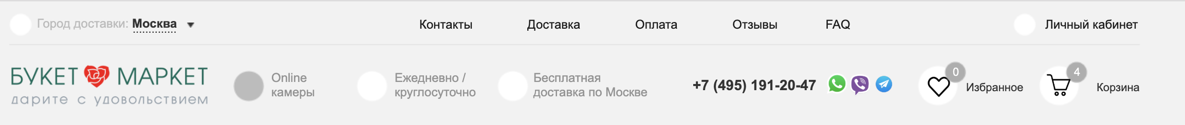
Site header
- What is important in the hat
- Logo (on all pages except the main one, it is a link to the main one)
- Information menu (about the company, payment and delivery, contacts)
- Phone / Email (if the company's strategy does not imply their maximum hidden from the user)
- Application (for B2B stores, where the processing of applications without specific orders is provided)
- Basket
- Favorite
- Personal account (registration, authorization)
- Language versions
Here is an example of a hat designed by us
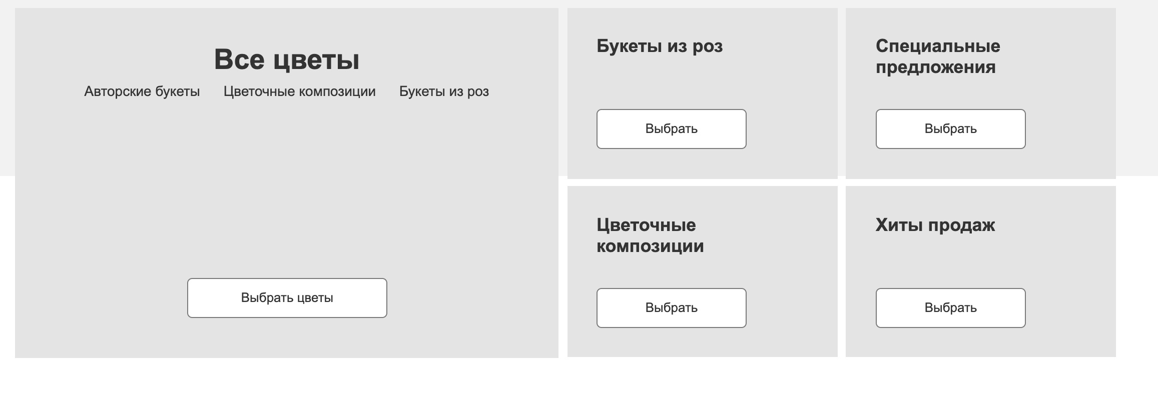
Catalog
The catalog can be horizontal (right under the header) and vertical (usually on the left). The first option is more convenient, as it leaves a place for filters on the side. The second is more universal - it is practically unlimited in the number of first-level sections on the site. Here are examples of directories on the sites we designed
Vertical
Horizontal
Announcements and Banners
The block, usually located in the central part of the main page. They allow you to convey the benefits of the company, new arrivals, promotions, sales, special offers.
Announcements can be in different formats. Slider
Multiple banners
Text Announcements
An example of announcements in a designed site
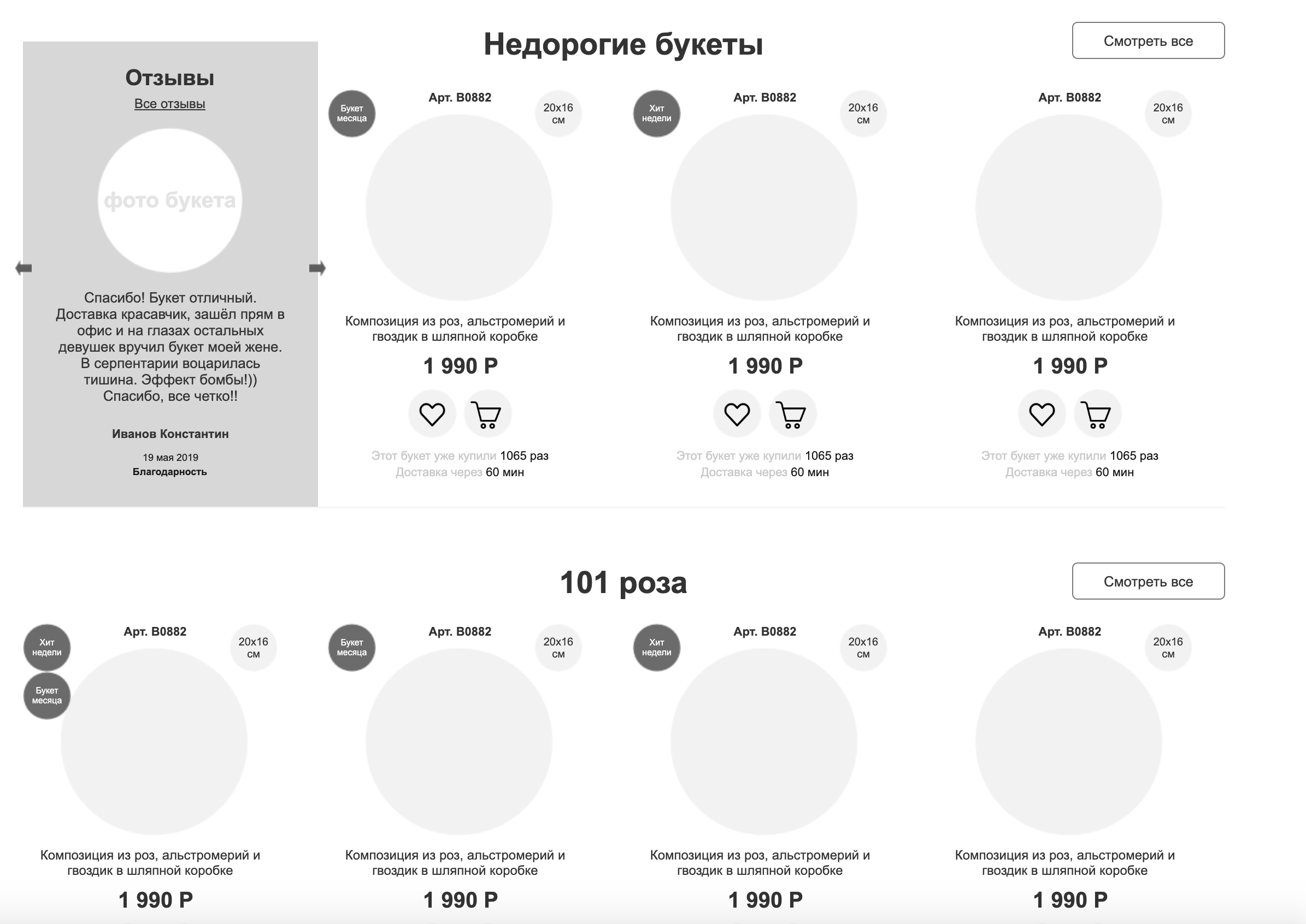
Product Samples
Blocks with selected items. Usually these are hits, novelties, promotional items.
It can be some kind of thematic collections, for example, “ready-made images” in fashion
Product selections on the site
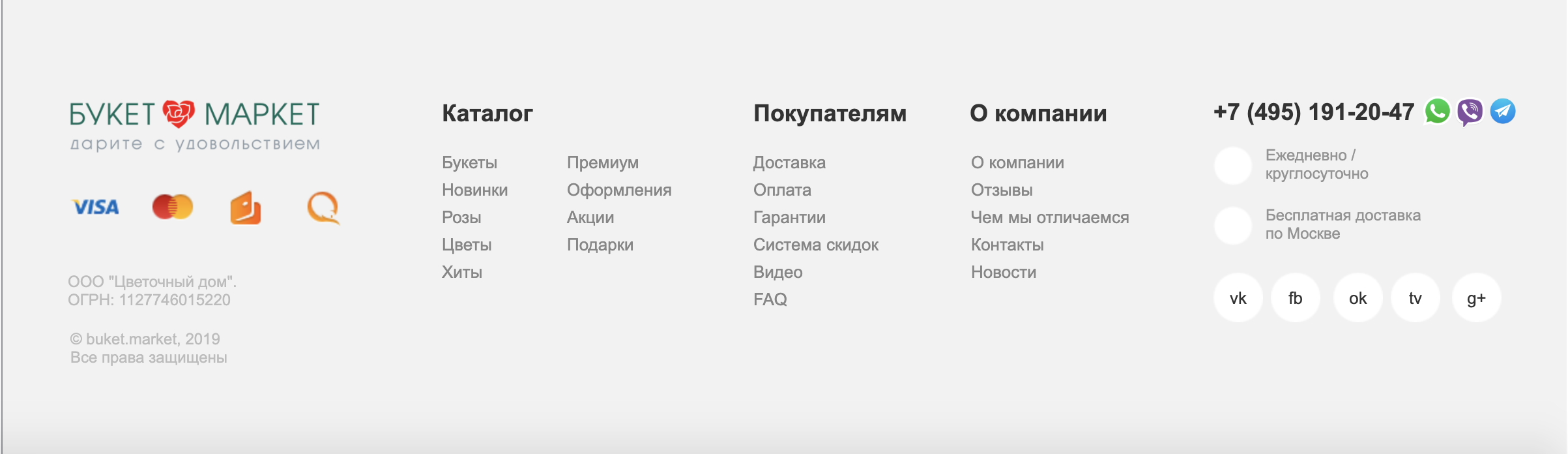
Basement
There is information that can be announced only in the basement of the site.
Usually these are links to social networks
Alternative contact information (multiple phones)
An extensive menu on the information sections of the site
Main sections of the catalog
Basement example in the site
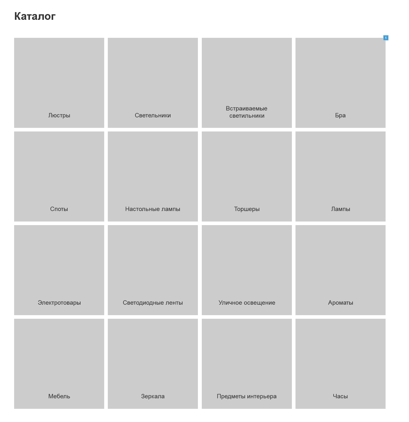
Section List
The section list page partially duplicates the catalog drop-down menu. It is needed to facilitate the indexing of the site by search engines and in order to be able to go over breadcrumbs.
The page with the list of sections is quite simple in design.
Usually it comes in two versions
- With photo
- With subsections
The first option is clearer
The second accelerates the search for the desired section and simplifies the indexing of the site.
If the site has up to 100 sections, then you can use the photo option.
If more than 100, then it is definitely better to use the option with subsections
Product List
Listing (product listing page) is one of the most difficult in the store. It should simultaneously work out all possible search scenarios for the site.
The main functions on the page
- Product List
- Switching the view of the list of goods (option with large photos, with a detailed description, compact view of the price list)
- Sorting (by price, popularity, availability)
- Filtration (by price, by properties, by availability, by availability in stores)
- Section Description
- List of Subsections
- Tags for filtering
- Search
- Page navigation
What data is needed in the product block in the list
Photo
- Price
- A discount
- Availability
- Mini description
- Colors available
- Sizes available
Functions in the product block in the list
- Preview
- Add to Cart
- Adding to Comparison
- Add to Favorites
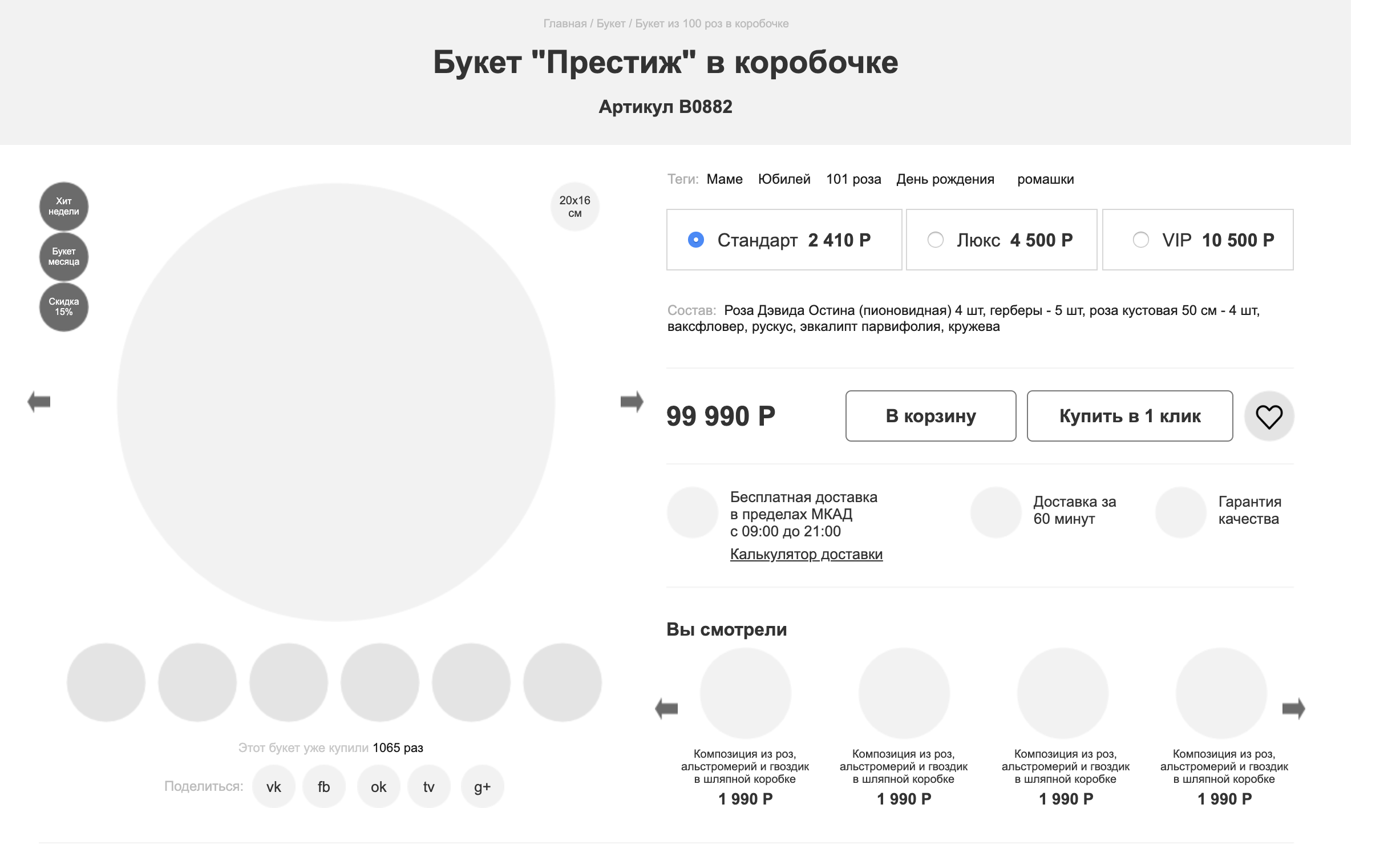
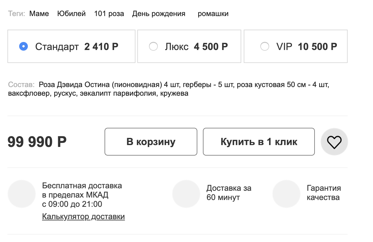
Card Product
In the product card, the task is to facilitate the choice as much as possible, present all the advantages of the product and convince you to use this particular store
Accordingly, five main functions can be distinguished in the card
Visual part
Photo, video, panoramic rotator
Allow you to inspect the product from different sides, zoom in, examine in detail
Purchase Functions
- Price
- Availability
- A discount
- Add to Cart Features
- Favorite
- Comparison
- Delivery
- Payment
- Return and exchange
- Participation in the bonus program
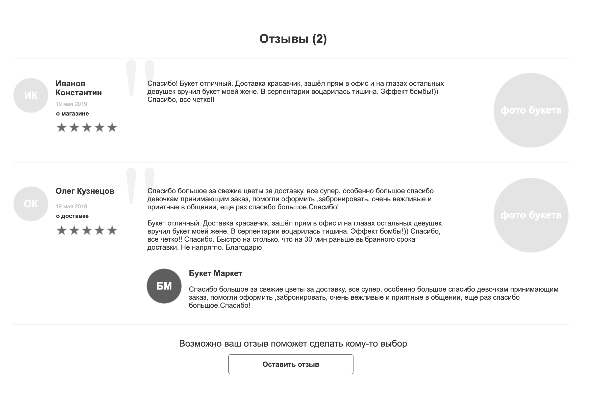
Detailed information
- Product Attributes
- Property Groups
- Documentation
- Reviews
- FAQ
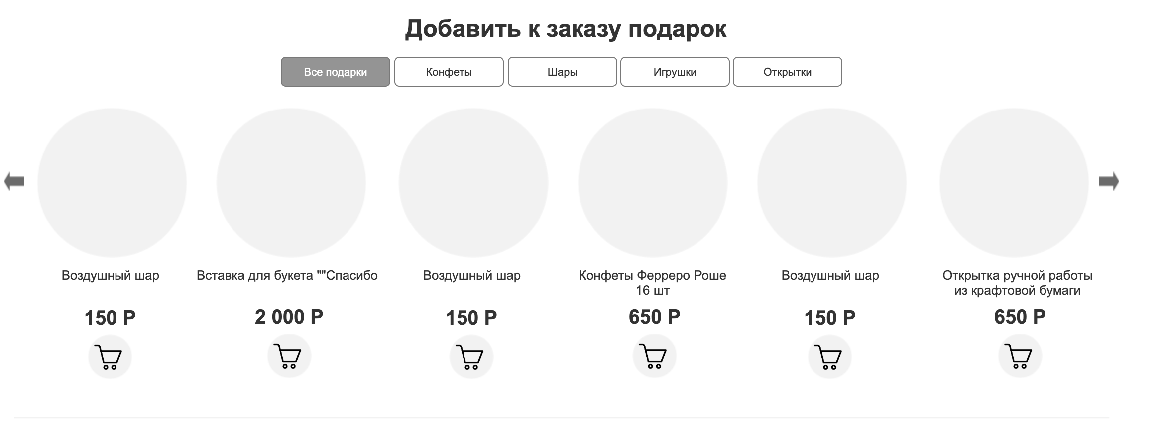
Cross Cell and Upsell
Analog Products
Here we offer products from the same section, series, collection or manufacturer. Analogs can be selected manually, or can be algorithms.
Related products
Items purchased with this item. Sconce to the chandelier. Arrows to the crossbow. Paint to the tile. Well and so on. They can be associated with both the product and the section (for example, 2-3 types of lamps for all chandeliers)
Store Benefits
A block reminiscent of the advantages of the store and why it is worth making an order now.
findings
Mistakes in development are unpleasant. Design errors are fatal.
Everything depends on the design quality of your online store.
- Will all sections and products fit in the catalog
- Will the search engine be able to index them correctly
- Will it be convenient for the buyer to choose products and look for important information
Design errors are very difficult to fix on the finished product. Sometimes the price of a fix exceeds the cost of developing a site.
For high-quality design, it is important to understand the amount of content that will be on the site, as well as the paths of users to the site and the tool they need
PS To keep abreast of new publications, follow me on Facebook .
All Articles