Four rules of intuitive UX
These are tips for improving the UX of your projects WITHOUT hours of user experience, paper prototyping, or any other buzzwords.
(Seriously, look for “design thinking.” 100,500 results!)
Who is this article for?
If you are already a UX designer, then it is unlikely that the article will suit you superbly. I skipped whole areas to completely focus on the main skill that new UX designers (or people from related areas who have to do this) lack .
This skill is “to understand the interface language” .
At the beginning of my career, I was struck by how often clients passed initial drafts (or live, working prototypes) with completely obvious UX errors . I am not talking about errors that can be identified after prolonged A / B testing. I am talking about simple, most stupid mistakes.
For lack of a better example:
Somewhere there is a group of developers who know HTML but don’t know the difference between a radio button and a checkbox
My clients are not so bad, but damn it, you do not need to be seven spans in your forehead to understand: if you can select ONE element from the list, you need SWITCHES, not flags. To understand this , you just need to know the interface language. And for me it's the craziest. Fluency in the interface is available to everyone . You do not need a college, you do not need courses and so on.
To be honest, you only need the presence of the spirit to (A) stop and think when an application is embarrassing or annoying you, (B) verbalizing what annoys / annoys you in the interface, and then (C) figure out how to avoid this specific bug in your own projects.
Repeat this procedure constantly - and become a professional in the shortest possible time.
Today I want to talk about four small rules that will help eliminate these pain points in your own projects. These heuristics are one to two levels deeper than "use switches if the user can select only one item." But, if you adhere to the requirements of this list, then your projects will become much easier to use from the very beginning, which will free up time for other, more important things.
(Just then start listening to lectures by other UX designers about the latest academic user research methods!)
Here's what we cover:
No questions? Then go ahead.
Place interface elements where they cause change.
All other things being equal, the interface elements should be placed next to the place where the change occurs . Because when the user wants to make changes to the system, he involuntarily looks at the place where these changes will occur .
Let's say you have a list of items. Where to place the “ADD NEW ITEM” button?
Question: Well, where is the change ?
Answer: At the end of the list.
Ok, put a button at the end of the list.
WAIT. You think this is pretty simple. But there is a temptation.
The temptation is simply to put it where there is free space.
For example, if you have a menu, then you might think: “We have a menu! Why not just put it on the menu !? ”

Violation of the law of locality in the music interface
The answer is obvious: because no one will look for her there.
(And the full answer lies in the fact that if you simply place the elements in free places, then in the end the application will become unusable for chaos, from which people will run away as soon as possible).
Think I'm joking? Ever met this interface?

Violation of the law of locality in the Evernote interface
An equally bad and widespread alternative is simply to take the decision that you saw at the Dear Technical Company, without thinking about whether this makes sense to you . “Need a“ Add ”button? No problem. I saw one such button. Hold the beer! ”
Take a look. Another button where users will never look for it . Generally speaking, they will suspect that this button adds something new to the large empty white space. Because it is there that she is.
Your users want you to follow the law of locality.
So now let's use it.

Bam.
Perhaps you are a born UX designer and always visually imagine what will happen if there are thousands of elements instead of five , and you understand that there will be a problem. If the user creates a ton of playlists, the button will go hundreds of pixels down!
Therefore, it may be better to pin the button at the bottom of the list so that it is always visible, regardless of the number of playlists.
Brilliantly! That's exactly what Spotify did.

For a bonus (1) use the built-in button until it goes out of the screen, and at that moment switch to the pinned item and (2) make it more visible than the Spotify button, which I personally noticed only a few months later, helplessly right-clicking click to add individual songs to playlists!
Another option is to acknowledge that we cannot reliably and consistently show the button at the bottom of the list. Where is the closest suitable place for her?
And the answer (I think is pretty obvious) is at the top of the list .

This is my wish
Hell! That's exactly what Rdio, the Spotify competitor, did before Pandora bought it.

Reconstruction from memory (like all reality, if you think about it)
The conclusion is clear. Never sell your company and always, always respect the law of locality.
(Actually, there are three laws of locality, and “placing UI elements where they influence change” is only the first. If interested, read here ).
Following!
Every time you feel tempted to use the drop-down list, think about all possible alternatives.
One non-obvious lesson in UX design is that drop-down lists are usually the worst option .
Welcome to Hell!
They are not always bad, but the following factors play against you:
It's quite simple, so let's look at the main alternatives to the drop-down list.
We have some fantastic ways to choose one of two options. All of them (a) immediately show options and (b) require less clicks / clicks.
For questions that do not have a “default” answer, try the segmented button .

If there is a default state that matches 'OFF', try checking the box . It is also good for settings that do not affect the change until the user clicks “Save” or “Submit” .
The switch works in a similar way: it is good for changes that should be applied immediately .

Flags and switches make sense only when there are two options. The following items are useful when the number of options is from two to about five, so you can try some of them.
Above, we looked at segmented buttons (here they are also used). It is worth noting that with more options, vertical segmented buttons give greater flexibility along the length of the text.
Switches (radio buttons) operate in a similar way, but are especially useful for displaying sub-elements of each choice.

For detailed display of several options, cards are well suited.

I like the trick of displaying visual options literally, not a list.

Apparently Tesla likes it too.
When there are many options and scrolling is annoying, consider typeahead type completion . It looks like a search bar that shows the best results when entering characters.

For a date, drop down lists are the worst. If I ever do that, then I really failed as a UX designer.
Which alternative? Well, it depends on the circumstances. First question: what type of date do you choose ?
(Yes, I called "Poisson dates" in honor of the mathematical distribution :-)
Different types of controls are suitable for different types.
For Poisson dates, we want to MAKE THE MAXIMUM SIMPLIFICATION of the date selection in the most probable range (for example, for scheduling a meeting, it can be the next, say, 14 days). It is perfectly normal to select a date outside this range will be a little more difficult.
The calendar control fully meets these requirements for Poisson dates. If you know that the date is highly likely to fall within the next 2-4 weeks, you are in chocolate.

Quite creatively, Google Flights by default offers you a flight in about two weeks, which sometimes causes confusion (“I didn’t choose this!”), But this is probably the most likely choice for the Poisson distribution.
The date text box is probably the best option for dates with high variability, where (A) there is no reason to prefer one date over another, i.e. (B) all options are equally difficult to choose.
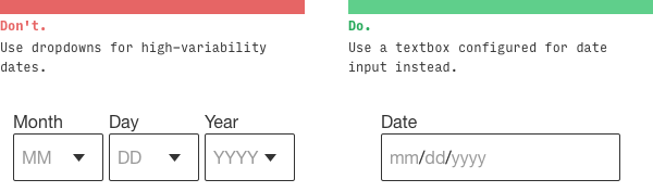
Remember that input [type = date] is your friend ... at least on the desktop
Numbers come in many forms. Most likely, you will be tempted to put a drop-down list for the amount of something: tickets, people, rooms, etc.
How often do you need 1 ticket? Very often .
How often do you need 10 tickets? Not too much .
How often do you need 10,000 tickets? Is this some kind of cruel joke?
Here we again deal with the Poisson distribution and must use a control shifted to lower numbers: for example, a stepper .
For numbers in a wide range (for example, social security numbers), you still were not going to use the drop-down list ... I hope .
Of course.
Remember that they work fine when ...
Perhaps the most observant among you have noticed that in the Google Flights interface, which I praised above, there are actually three noticeable drop-down lists !

What is remarkable, in the mobile interface there is no drop-down list 'Economy'
They actually did a good job here. Potential usability problems are quickly mitigated by the following:
Okay. Let's go further.
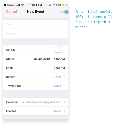
If you squint, the most important thing should be the first to catch the eye, and the least important elements should be the last.
Security question: what should a user do to use this page ?
(Note: I blurted it, so follow my instincts, but I can give a hint: this is a form of data entry)

I would suggest two things :
You thought so too?
Error and error.
The squint test says that the most important thing should be the most noticeable . What is the most important thing here? This is a text box (or a stepper;) and a “Submit” button.
If you go further, the next page is even worse.

What will you press: the gray button on the left or the same gray button on the right ?
I hope you have chosen the left one!

In a hurry on this form, I actually first clicked the Help button. Oh. When I entered the second time, I clicked “Back”, even scanning the names of both buttons fluently, because on 99,999% of other sites (with the direction of the letter from left to right), the “Back” button is always left
Again, if you squint your eyes, I cannot say what is important.
Like the law of locality and the exclusion of drop-down lists, the squint test is pretty simple. Scheme correction in 30 seconds.
In a real redesign, I would like to put a selection of the number of tickets on the SAME PAGE. But this is a different law for a different time
It works?
Say it yourself. Four switches and a button. And a tiny link below.
I’m not trying to find fault with the AlaskaTrain.com website, this is common.
Here is the sign-up screen for my favorite social network based on Foursquare recommendations (well-watched, of course).
How to actually send the entered data (the most important thing)?
Hint: the button is hidden behind the plain text in the upper right corner.

But Foursquare here simply follows Apple's design standards. Unfortunately, a squint test violation is often found even among industry leaders.
One way to determine the main element on a page is to consider how much of the page views includes a particular action. Here are the relevant indicators of the Anki program (a program for memorizing words, expressions and any other information using interval repetitions - approx. Per.).
For every hundred cards I’ve looked at, then I’ll go to ...
Such an analysis really hints which interface will work better here.

But this is only the beginning (for example, I would like to see if users understand that a button with a plus without a signature adds cards ). But with just a few simple heuristics, we've reduced the messy, confusing interface of ten UI elements to just five. This ... check here my calculations ... half as much.
For more information about the squint test, you can watch my video demonstrating the redesign of the Timezon.es web application. Or, if you don’t have ten minutes, here is an illustrated blog article with the same step-by-step redesign.
If you introduce users to new concepts, then a few examples are worth a thousand words that people still won’t read.
We have a strange tendency to try to explain everything in words, when the examples are much clearer.
Take the new startup Teeming.ai, who recently contacted me to consult on the design of the main page. Headings on this page:
But here is the question. What does teeming really do?
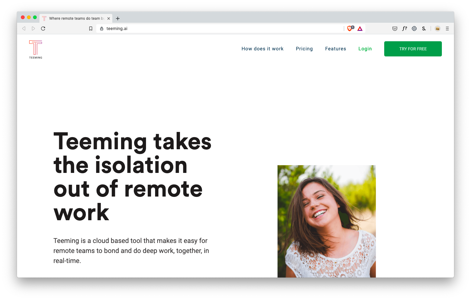
Hard to say. It is clear that this is somehow connected with ... positive for remote workers ? But I don’t have concrete ideas how this will help me personally, so I won’t try this service, recommend it, etc.
(Sorry, Teeming, you know, I love you).
Next, take a look at IFTTT . Maybe you already know what they are doing - then pretend you don’t know , and try to understand this from the headings on the main page:

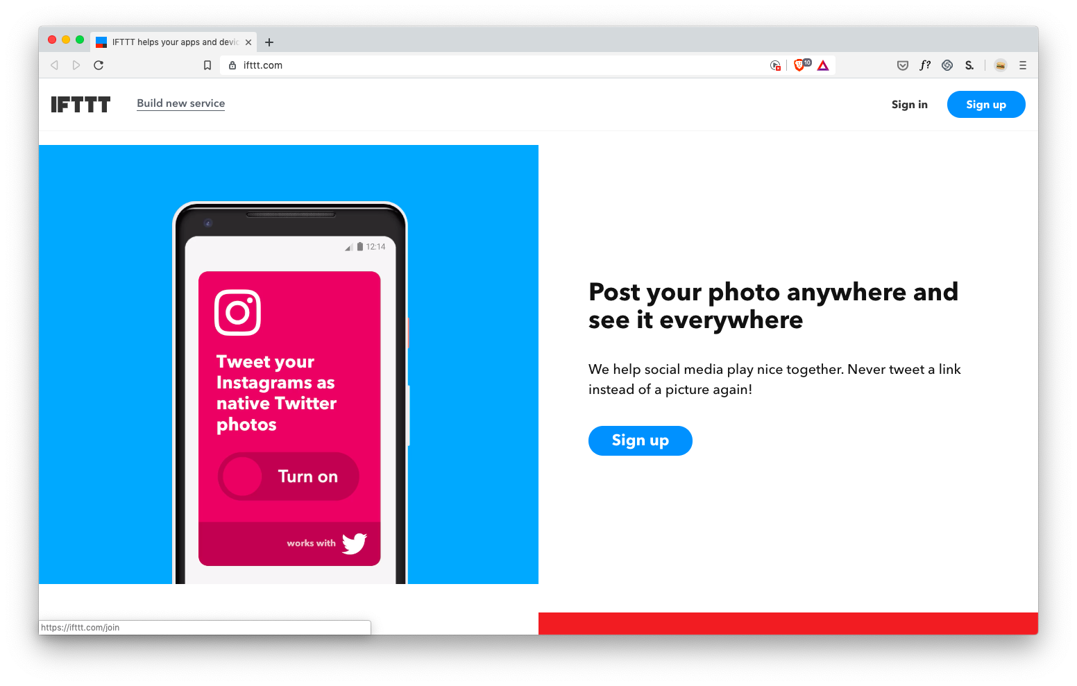

It’s not necessary to list a lot of examples to draw a pretty clear picture: IFTTT brings applications together to do what they are not capable of separately .
The crazy thing is that on the main page they first explain this with the text:
IFTTT helps your applications and devices work together in a new way. IFTTT is a free way to make all applications and devices talk to each other. Not everything on the Internet works well, so our mission is to build a more connected world.
Bliiin.
Question: what better explains the idea of the application ? Examples or description?
I think that examples . The description is completely clear only when I see a few examples of how this can help me.
But examples are needed not only on the landing page. This is what we see when we first enter the Basecamp project management tool .

Instead of a completely blank page, you see two clearly prepared projects that teach by examples how the entire application works (and also give an idea of how the system will look when you use it for a while).
Seriously, I can read fake chats from fake users who discuss fake file downloads and fake tasks in the scheduler .

Is there even a friendly ... mountain? ... which says I can watch a two-minute explanatory video about this tutorial.
And thank you, Mr. Gora, for your guidance: demo videos are another way to learn by example ! The examples show how my projects will look, and the video shows how to use the software.
Brilliantly.
If your application gives users something to create , then a demo is a great way to show the possibilities with an example.
The remarkable Procreate drawing application won the Apple Design Award, the Editor’s Choice on the App Store and the App Store Essential, and John Gruber called it “groundbreaking”, etc. - but no awards delight like real-life examples of the work created in this the editor.
This is not an ordinary drawing application.
Wow.
This is not MS Paint.
Demonstration is a powerful tool to understand the capabilities of your application.
So, if your application does something new and unfamiliar or relies on new and unfamiliar concepts - you should learn how to learn with examples . If users have not seen this application before, then you need to immediately ask the question: how to give an example to make it more clear?
In short, my favorite ways to do this are:
It makes sense? Come on and round off.
(Seriously, look for “design thinking.” 100,500 results!)
Who is this article for?
- Developers You have created your own application, but each user is tormented with it. And you know: if they tell you this in person, then the matter is really bad.
- Graphic designers . Studying UX on articles on the Internet is some ... a very painful way to die.
- Project managers . You are already a quarter UX designer. It would be nice to learn the rest of the skills.
- And the other crooks . Everyone who piles over their projects in the evenings and weekends. You will also come in handy.
If you are already a UX designer, then it is unlikely that the article will suit you superbly. I skipped whole areas to completely focus on the main skill that new UX designers (or people from related areas who have to do this) lack .
This skill is “to understand the interface language” .
At the beginning of my career, I was struck by how often clients passed initial drafts (or live, working prototypes) with completely obvious UX errors . I am not talking about errors that can be identified after prolonged A / B testing. I am talking about simple, most stupid mistakes.
For lack of a better example:
Somewhere there is a group of developers who know HTML but don’t know the difference between a radio button and a checkbox
My clients are not so bad, but damn it, you do not need to be seven spans in your forehead to understand: if you can select ONE element from the list, you need SWITCHES, not flags. To understand this , you just need to know the interface language. And for me it's the craziest. Fluency in the interface is available to everyone . You do not need a college, you do not need courses and so on.
To be honest, you only need the presence of the spirit to (A) stop and think when an application is embarrassing or annoying you, (B) verbalizing what annoys / annoys you in the interface, and then (C) figure out how to avoid this specific bug in your own projects.
Repeat this procedure constantly - and become a professional in the shortest possible time.
Today I want to talk about four small rules that will help eliminate these pain points in your own projects. These heuristics are one to two levels deeper than "use switches if the user can select only one item." But, if you adhere to the requirements of this list, then your projects will become much easier to use from the very beginning, which will free up time for other, more important things.
(Just then start listening to lectures by other UX designers about the latest academic user research methods!)
Here's what we cover:
No questions? Then go ahead.
1. The law of locality
Place interface elements where they cause change.
All other things being equal, the interface elements should be placed next to the place where the change occurs . Because when the user wants to make changes to the system, he involuntarily looks at the place where these changes will occur .
Let's say you have a list of items. Where to place the “ADD NEW ITEM” button?
Question: Well, where is the change ?
Answer: At the end of the list.
Ok, put a button at the end of the list.
WAIT. You think this is pretty simple. But there is a temptation.
The temptation is simply to put it where there is free space.
For example, if you have a menu, then you might think: “We have a menu! Why not just put it on the menu !? ”
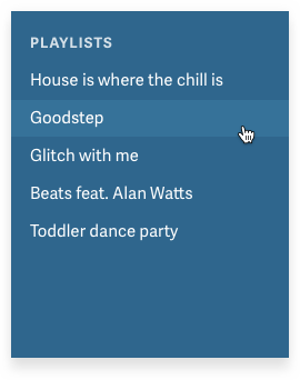
Violation of the law of locality in the music interface
The answer is obvious: because no one will look for her there.
(And the full answer lies in the fact that if you simply place the elements in free places, then in the end the application will become unusable for chaos, from which people will run away as soon as possible).
Think I'm joking? Ever met this interface?
Violation of the law of locality in the Evernote interface
An equally bad and widespread alternative is simply to take the decision that you saw at the Dear Technical Company, without thinking about whether this makes sense to you . “Need a“ Add ”button? No problem. I saw one such button. Hold the beer! ”
Take a look. Another button where users will never look for it . Generally speaking, they will suspect that this button adds something new to the large empty white space. Because it is there that she is.
Your users want you to follow the law of locality.
So now let's use it.
Bam.
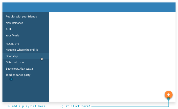
Perhaps you are a born UX designer and always visually imagine what will happen if there are thousands of elements instead of five , and you understand that there will be a problem. If the user creates a ton of playlists, the button will go hundreds of pixels down!
Therefore, it may be better to pin the button at the bottom of the list so that it is always visible, regardless of the number of playlists.
Brilliantly! That's exactly what Spotify did.
For a bonus (1) use the built-in button until it goes out of the screen, and at that moment switch to the pinned item and (2) make it more visible than the Spotify button, which I personally noticed only a few months later, helplessly right-clicking click to add individual songs to playlists!
Another option is to acknowledge that we cannot reliably and consistently show the button at the bottom of the list. Where is the closest suitable place for her?
And the answer (I think is pretty obvious) is at the top of the list .
This is my wish
Hell! That's exactly what Rdio, the Spotify competitor, did before Pandora bought it.
Reconstruction from memory (like all reality, if you think about it)
The conclusion is clear. Never sell your company and always, always respect the law of locality.
(Actually, there are three laws of locality, and “placing UI elements where they influence change” is only the first. If interested, read here ).
Following!
2. Anything but drop-down lists
Every time you feel tempted to use the drop-down list, think about all possible alternatives.
One non-obvious lesson in UX design is that drop-down lists are usually the worst option .
Welcome to Hell!
They are not always bad, but the following factors play against you:
- Drop-down lists require too many clicks / clicks . One to open, several more to scroll to the desired option (on a mobile phone), another to select the correct option and (on a mobile phone) the last to close (compare with one click to select from the listed options).
- Drop-down lists do not show options ! To see them, you must first click on the list, and on the mobile phone is often not displayed the entire list at a time.
- In long drop-down lists it’s hard to navigate . There can be more than 195 items in the drop-down list of countries. At some point, almost any other version of the UI will be faster than scrolling through the drop-down list.
It's quite simple, so let's look at the main alternatives to the drop-down list.
If the choice is between two options ...
We have some fantastic ways to choose one of two options. All of them (a) immediately show options and (b) require less clicks / clicks.
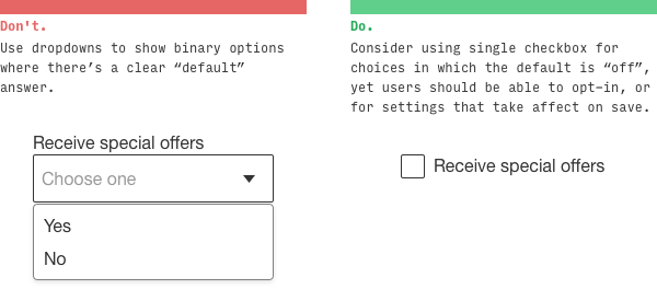
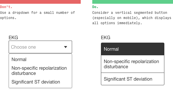
For questions that do not have a “default” answer, try the segmented button .
If there is a default state that matches 'OFF', try checking the box . It is also good for settings that do not affect the change until the user clicks “Save” or “Submit” .
The switch works in a similar way: it is good for changes that should be applied immediately .
Flags and switches make sense only when there are two options. The following items are useful when the number of options is from two to about five, so you can try some of them.
If the choice is between 2-5 options ...
Above, we looked at segmented buttons (here they are also used). It is worth noting that with more options, vertical segmented buttons give greater flexibility along the length of the text.
Switches (radio buttons) operate in a similar way, but are especially useful for displaying sub-elements of each choice.
For detailed display of several options, cards are well suited.
I like the trick of displaying visual options literally, not a list.
Apparently Tesla likes it too.
If the choice is between many options ...
When there are many options and scrolling is annoying, consider typeahead type completion . It looks like a search bar that shows the best results when entering characters.
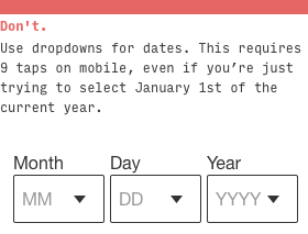
If you choose a date ...
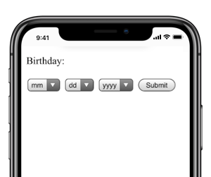
For a date, drop down lists are the worst. If I ever do that, then I really failed as a UX designer.
Which alternative? Well, it depends on the circumstances. First question: what type of date do you choose ?
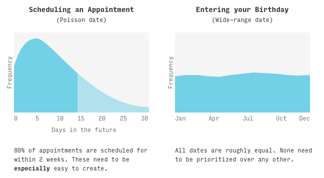
- Poisson dates . First, more likely dates, and then down the list, less likely dates. For example, the date of a scheduled meeting or flight.
- Dates with high volatility . Dates that have approximately the same probability over a wide range of time . For example, a birthday.
(Yes, I called "Poisson dates" in honor of the mathematical distribution :-)
Different types of controls are suitable for different types.
For Poisson dates, we want to MAKE THE MAXIMUM SIMPLIFICATION of the date selection in the most probable range (for example, for scheduling a meeting, it can be the next, say, 14 days). It is perfectly normal to select a date outside this range will be a little more difficult.
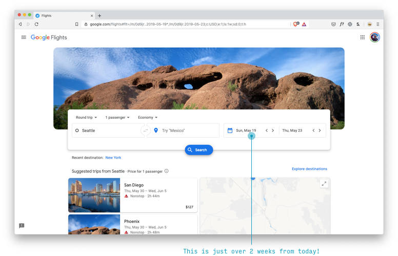
The calendar control fully meets these requirements for Poisson dates. If you know that the date is highly likely to fall within the next 2-4 weeks, you are in chocolate.
Quite creatively, Google Flights by default offers you a flight in about two weeks, which sometimes causes confusion (“I didn’t choose this!”), But this is probably the most likely choice for the Poisson distribution.
The date text box is probably the best option for dates with high variability, where (A) there is no reason to prefer one date over another, i.e. (B) all options are equally difficult to choose.
Remember that input [type = date] is your friend ... at least on the desktop
If you choose a number ...
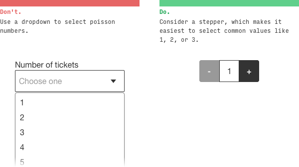
Numbers come in many forms. Most likely, you will be tempted to put a drop-down list for the amount of something: tickets, people, rooms, etc.
How often do you need 1 ticket? Very often .
How often do you need 10 tickets? Not too much .
How often do you need 10,000 tickets? Is this some kind of cruel joke?
Here we again deal with the Poisson distribution and must use a control shifted to lower numbers: for example, a stepper .
For numbers in a wide range (for example, social security numbers), you still were not going to use the drop-down list ... I hope .
Can I use drop-down lists at least somewhere?
Of course.
Remember that they work fine when ...
- Users rarely need to change the default value.
- There are very few options . For example, in an iOS control, only three options are visible by default.
- The user is not on the mobile phone (on the desktop, many of these problems are mitigated)
Perhaps the most observant among you have noticed that in the Google Flights interface, which I praised above, there are actually three noticeable drop-down lists !
What is remarkable, in the mobile interface there is no drop-down list 'Economy'
They actually did a good job here. Potential usability problems are quickly mitigated by the following:
- Special controls that, when pressed, show all the parameters (including on a mobile phone) - and replace four drop-down lists (adults, children, babies in the seat, babies in their arms) with four steppers in one drop-down list .
- Removing the 'Economy' drop-down list in the mobile interface
- Few options and smart defaults for each item
Okay. Let's go further.
3. Squint test
If you squint, the most important thing should be the first to catch the eye, and the least important elements should be the last.
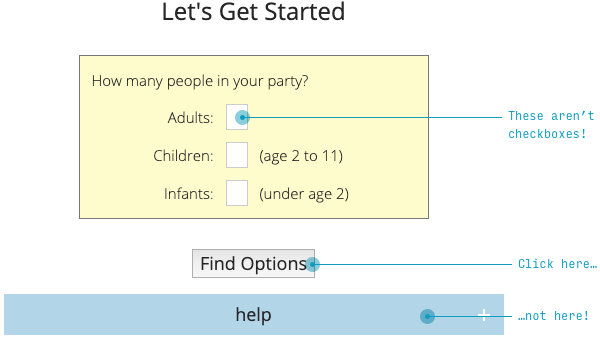
Security question: what should a user do to use this page ?
(Note: I blurted it, so follow my instincts, but I can give a hint: this is a form of data entry)
I would suggest two things :
- Set all relevant checkboxes (??) in the yellow area
- Click the blue Submit button
You thought so too?
Error and error.
- “Flags” are actually very small fields for entering textual data (if you read the previous section, you know that there should be steppers).
- The most important thing (“Find Options” - by the way, this is a very confusing way to say “Submit”) is framed by a gray and inconspicuous button. A much less important thing (“Help”) is right next to it, but larger and more visible.
The squint test says that the most important thing should be the most noticeable . What is the most important thing here? This is a text box (or a stepper;) and a “Submit” button.
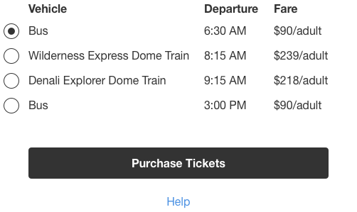
If you go further, the next page is even worse.
What will you press: the gray button on the left or the same gray button on the right ?
I hope you have chosen the left one!
In a hurry on this form, I actually first clicked the Help button. Oh. When I entered the second time, I clicked “Back”, even scanning the names of both buttons fluently, because on 99,999% of other sites (with the direction of the letter from left to right), the “Back” button is always left
Again, if you squint your eyes, I cannot say what is important.
Like the law of locality and the exclusion of drop-down lists, the squint test is pretty simple. Scheme correction in 30 seconds.
In a real redesign, I would like to put a selection of the number of tickets on the SAME PAGE. But this is a different law for a different time
It works?
Say it yourself. Four switches and a button. And a tiny link below.
I’m not trying to find fault with the AlaskaTrain.com website, this is common.
Here is the sign-up screen for my favorite social network based on Foursquare recommendations (well-watched, of course).
How to actually send the entered data (the most important thing)?
Hint: the button is hidden behind the plain text in the upper right corner.
But Foursquare here simply follows Apple's design standards. Unfortunately, a squint test violation is often found even among industry leaders.
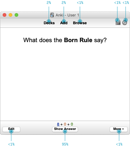
One way to determine the main element on a page is to consider how much of the page views includes a particular action. Here are the relevant indicators of the Anki program (a program for memorizing words, expressions and any other information using interval repetitions - approx. Per.).
For every hundred cards I’ve looked at, then I’ll go to ...
- Show answer (about 95 times)
- Back to the list of cards (twice)
- Start adding cards (twice)
- Some other features (very rare)
Such an analysis really hints which interface will work better here.
- Accentuate the most frequently used functions (in the first approximation, the “most used” equals the “most important”)
- Loosen, hide or remove less used features
But this is only the beginning (for example, I would like to see if users understand that a button with a plus without a signature adds cards ). But with just a few simple heuristics, we've reduced the messy, confusing interface of ten UI elements to just five. This ... check here my calculations ... half as much.
For more information about the squint test, you can watch my video demonstrating the redesign of the Timezon.es web application. Or, if you don’t have ten minutes, here is an illustrated blog article with the same step-by-step redesign.
4. Case studies
If you introduce users to new concepts, then a few examples are worth a thousand words that people still won’t read.
We have a strange tendency to try to explain everything in words, when the examples are much clearer.
Take the new startup Teeming.ai, who recently contacted me to consult on the design of the main page. Headings on this page:
- “Teeming eliminates isolation in remote work ”
- “Teeming helps with remote team building ”, it is also “ learning, solving problems, having fun and motivating each other ”
- “Teeming and video for synchronous [communication] ”
- “Works with all your favorite video platforms ”
But here is the question. What does teeming really do?
Hard to say. It is clear that this is somehow connected with ... positive for remote workers ? But I don’t have concrete ideas how this will help me personally, so I won’t try this service, recommend it, etc.
(Sorry, Teeming, you know, I love you).
Next, take a look at IFTTT . Maybe you already know what they are doing - then pretend you don’t know , and try to understand this from the headings on the main page:
- Automatically light up the road for a guy with pizza delivery (Dominoes + Hue)
- Post your photos everywhere and see them everywhere (Instagram + Twitter)
- Make your voice assistant more personal (Google Assistant + iOS Calendar)
It’s not necessary to list a lot of examples to draw a pretty clear picture: IFTTT brings applications together to do what they are not capable of separately .
The crazy thing is that on the main page they first explain this with the text:
IFTTT helps your applications and devices work together in a new way. IFTTT is a free way to make all applications and devices talk to each other. Not everything on the Internet works well, so our mission is to build a more connected world.
Bliiin.
Question: what better explains the idea of the application ? Examples or description?
I think that examples . The description is completely clear only when I see a few examples of how this can help me.
But examples are needed not only on the landing page. This is what we see when we first enter the Basecamp project management tool .
Instead of a completely blank page, you see two clearly prepared projects that teach by examples how the entire application works (and also give an idea of how the system will look when you use it for a while).
Seriously, I can read fake chats from fake users who discuss fake file downloads and fake tasks in the scheduler .
Is there even a friendly ... mountain? ... which says I can watch a two-minute explanatory video about this tutorial.
And thank you, Mr. Gora, for your guidance: demo videos are another way to learn by example ! The examples show how my projects will look, and the video shows how to use the software.
Brilliantly.
If your application gives users something to create , then a demo is a great way to show the possibilities with an example.
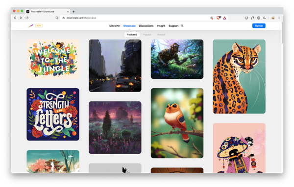
The remarkable Procreate drawing application won the Apple Design Award, the Editor’s Choice on the App Store and the App Store Essential, and John Gruber called it “groundbreaking”, etc. - but no awards delight like real-life examples of the work created in this the editor.
This is not an ordinary drawing application.
Wow.
This is not MS Paint.
Demonstration is a powerful tool to understand the capabilities of your application.
So, if your application does something new and unfamiliar or relies on new and unfamiliar concepts - you should learn how to learn with examples . If users have not seen this application before, then you need to immediately ask the question: how to give an example to make it more clear?
In short, my favorite ways to do this are:
- On any page that tries to offer the user a function / application, etc., show examples of what can be done with this tool.
- Use the “bootstrapping” method, show sample data and an example of how a properly working application will look.
- Strategically embed background information (such as articles, videos, or tips) along with usage examples.
- Does your application allow you to create something creative? Show a gallery of works to boost your imagination.
It makes sense? Come on and round off.
All Articles