.container is no longer needed
All typesetters in their projects use div.container to center the content, and this method has some features that you can get rid of. After reading this article, you will learn about a method that will completely abandon the container. I will try to talk about the pros and cons of using a container and an alternative way to center content using css only.
PS I hope the quality of the GIF allows you to see something.
Navigation:
CSS:
The image above and the code clearly show how the standard container works in a typical site layout. Probably everyone knows that the section tag is usually created, div.container is placed in it and various content is already placed in it. It occupies the entire width of the screen, for example, up to 1170px, and when the screen becomes larger, it plays the role of a wrapper and fixes the content in the center of the page, preventing it from “scattering” to the sides.
So why not immediately set these styles for the content? If you set these styles for a section without a container, then everything seems to look normal.
HTML:
But as soon as you need to set the background for the section, the situation immediately gets out of control:

If you set the background for the section, put the container with its styles inside the section, and the content is already in it, then everything will work as it should:

HTML:
The most obvious minus of the container is the creation of extra blocks in the markup, which leads to an increase in the chain of nesting of elements and lower readability of the code.
Also, creating a container can cause difficulties in class names (sometimes you need to come up with an additional class for wrapping inside the container). This all just increases the code.
Above we examined the simplest example. But if the site has 15 sections or more? These are 15 extra blocks. And if we need to divide the section into two parts inside the container and make them flex-elements? You need to create a div wrapper, this is one more block per container. And already +2 extra blocks per section! As I said above - these div’s nesting "garbage" in the markup. But the possibilities of css allow us to do without them.
Not so long ago in web development, but I already found a way to work adequately with the container and as a result got rid of it altogether. As I understand it .container was "born" in bootstrap and now it is used absolutely everywhere.
Based on the bootstrap grid, you can greatly simplify your work with css media queries using the following code:
CSS:
What is he doing? In short, it keeps the content always in the center and changes its size on different screens:
Such a grid system provides clear advantages:
Using this setting of media queries with a container is very convenient. If you are not using it, then try and you will definitely agree. In the end, Twitter isn’t fools, it’s not just that they came up with such a grid of screen sizes.
The figure below shows the work of .container in conjunction with the media queries that I spied on bootstrap.
Finally, we come to the most interesting. So how do you replace .container? First, let's figure out what we need to do. We need two things:
What can push the content to the center of the section, while the background remains everywhere inside? The answer was simple: we set padding for the section — padding. But padding is not easy. But for an example, let's first try setting simple padding.
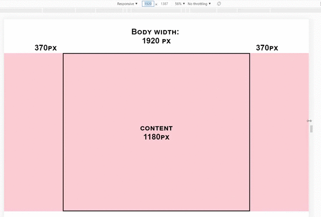
Suppose we need a content width of 1180px, so 1920 - 1180 = 740/2 = 370px - there will be side margins in our section. We look:
HTML:
CSS:
Yeah. As the screen shrinks, our indents compress the content. Not good. Could it be possible to indent dynamic? Maybe! And the resources of only css!
To do this, use the calc () function. At the moment, the css function calc () is supported at 96.5% , which is only 1% less than flexbox, which means that it can be safely used. For dynamic indentation you need to perform one mathematical operation.
Let's look at an example soon:
I like! Without any additional blocks, our section behaves exactly the same as with .container. As the screen shrinks, padding decreases, and the content remains fixed in width. And this is just one css property:
CSS:
UPD: I simplified the formula. Thanks Metotron0 .
Thus, we set the side indents using the calc () function, which at any screen resolution calculates these indents so that the content is 1180px! You just try it.
You can play around with the corrective value of 590px and make the content 1140px or 1170px, as you wish!
See a comparison of this method with a container right now!
It would be very nice to embed this in the bootstrap grid to make it easier to adapt the site.
Let's try:
CSS:
Result:
Total on different screen sizes we have:
This is absolutely the same as with div.container! Only without extra blocks.
Still not seeing the benefits of a dynamic indent method? Then let's take a look at a real-life example. Wear developer glasses - there is the following section (clickable):
What thoughts? There is a section, in it there are two separate blocks, to scatter them around, it would be nice to set display: flex and jcsb for the section. But if you use .container, then you will have to wrap these two blocks in another one and already set df for it. Is it convenient? We try:
HTML:
CSS:
Now look how it looks if you use dynamic indentation:
HTML:
CSS:
Just look at how the code decreased, it became cleaner, it became easier to read. The result is a section that contains a block with text and a form - nothing more! And this is just one section. I repeat: what if the site has 15 sections?
So, we begin to summarize:
Pros .container :,
Cons .container:
Pros of padding (relative to .container):
Cons of padding:
That is not:
That's how:
Otherwise, they will overwrite the dynamic indentation.
I like the method with dynamic indentation. Try it instead of the usual “container” layout and you will quickly notice how the purity of your code has increased. If there are any doubts about this method, then write them in the comments - we will discuss!
I recommend using not%, but vw. So that the width is not considered from the parent, but from the width of the browser promoter area. So just more reliable. Vw support - 96% here .
CSS:
Create your template for these styles with media queries, for example:
A method with dynamic indentation performs the same function as div.container, but is completely devoid of all its shortcomings. Perhaps this method has some pitfalls, but I have not met them yet. So far, everything works in exactly the same way as with a container.
Do not be afraid of something new. Just start using this method and soon you will feel some relief. Use css to the fullest!
PS If during use of this method some pitfalls come up - describe them in the comments! We'll figure out.
PS I hope the quality of the GIF allows you to see something.
Navigation:
- A bit about the standard .container
- Cons .container
- Work with .container and media queries
- Replacing .container with one css property
- Combination with media queries
- Real-world example, method comparison
- Recommendations
- Conclusion
CSS:
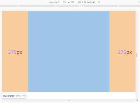
.container { max-width: 1170px; margin: auto; height: 1000px; }
A bit about the standard .container
The image above and the code clearly show how the standard container works in a typical site layout. Probably everyone knows that the section tag is usually created, div.container is placed in it and various content is already placed in it. It occupies the entire width of the screen, for example, up to 1170px, and when the screen becomes larger, it plays the role of a wrapper and fixes the content in the center of the page, preventing it from “scattering” to the sides.
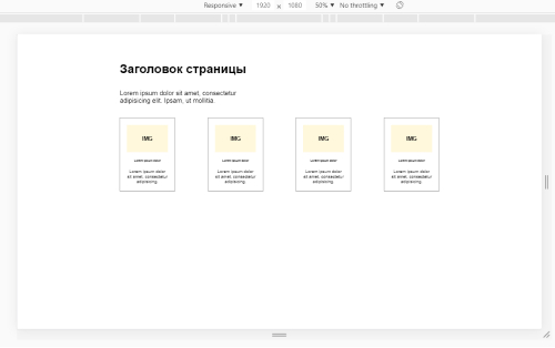
So why not immediately set these styles for the content? If you set these styles for a section without a container, then everything seems to look normal.
HTML:
<section class="main-section"> <h1 class="main-title"> </h1> <p class="main-subtitle">Lorem ipsum dolor.</p> <div class="cards"> ... </div> </section>
But as soon as you need to set the background for the section, the situation immediately gets out of control:
If you set the background for the section, put the container with its styles inside the section, and the content is already in it, then everything will work as it should:
HTML:
<section class="main-section"> <div class="container"> <h1 class="main-title"> </h1> <p class="main-subtitle">Lorem ipsum dolor.</p> <div class="cards"> ... </div> </div> </section>
Cons .container
The most obvious minus of the container is the creation of extra blocks in the markup, which leads to an increase in the chain of nesting of elements and lower readability of the code.
Also, creating a container can cause difficulties in class names (sometimes you need to come up with an additional class for wrapping inside the container). This all just increases the code.
Above we examined the simplest example. But if the site has 15 sections or more? These are 15 extra blocks. And if we need to divide the section into two parts inside the container and make them flex-elements? You need to create a div wrapper, this is one more block per container. And already +2 extra blocks per section! As I said above - these div’s nesting "garbage" in the markup. But the possibilities of css allow us to do without them.
Work with .container and media queries
Not so long ago in web development, but I already found a way to work adequately with the container and as a result got rid of it altogether. As I understand it .container was "born" in bootstrap and now it is used absolutely everywhere.
Based on the bootstrap grid, you can greatly simplify your work with css media queries using the following code:
CSS:
.container { padding: 0 15px; } @media (min-width: 575.98px){ .container { max-width: 540px; margin: auto; padding: 0; } } @media (min-width: 767.98px){ .container { max-width: 720px; } } @media (min-width: 991.98px) { .container { max-width: 960px; } } @media (min-width: 1199.98px){ .container { max-width: 1140px; } }
What is he doing? In short, it keeps the content always in the center and changes its size on different screens:
- On screens up to 576px, content is stretched, but side margins of 15px are preserved.
- On screens from 576px to 768px, the content is in the center and its width is 540px.
- On screens from 768px to 992px, the content in the center and its width is 720px.
- On screens from 992px to 1200px, the content in the center and its width are 960px.
- On screens from 1200px, the content in the center with a width of 1140px.
Such a grid system provides clear advantages:
- We have 4 clear media queries: for large screens, for medium screens, for small screens, for tablets.
- we have only one small gap from 320px to 576px, which you need to adapt as if “manually” - reducing 1px the width of the content.
Using this setting of media queries with a container is very convenient. If you are not using it, then try and you will definitely agree. In the end, Twitter isn’t fools, it’s not just that they came up with such a grid of screen sizes.
The figure below shows the work of .container in conjunction with the media queries that I spied on bootstrap.
Replacing .container with one css property
Finally, we come to the most interesting. So how do you replace .container? First, let's figure out what we need to do. We need two things:
- So that the content is a fixed width, for example 1180px and does not scatter to the sides.
- So that you can set the color or background for the entire section.
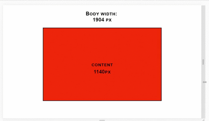
What can push the content to the center of the section, while the background remains everywhere inside? The answer was simple: we set padding for the section — padding. But padding is not easy. But for an example, let's first try setting simple padding.
Suppose we need a content width of 1180px, so 1920 - 1180 = 740/2 = 370px - there will be side margins in our section. We look:
HTML:
<section> <div class="content"> content </div> </section>
CSS:
section { background-color: pink; height: 1000px; padding: 0 370px; }
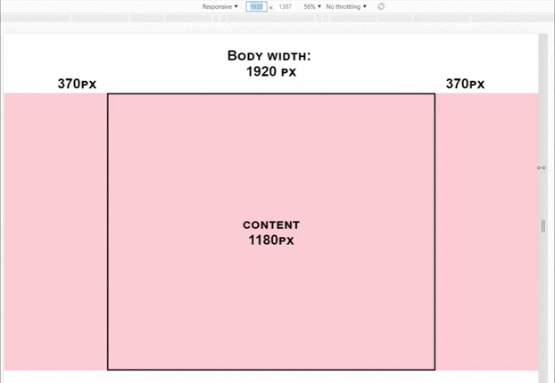
Yeah. As the screen shrinks, our indents compress the content. Not good. Could it be possible to indent dynamic? Maybe! And the resources of only css!
To do this, use the calc () function. At the moment, the css function calc () is supported at 96.5% , which is only 1% less than flexbox, which means that it can be safely used. For dynamic indentation you need to perform one mathematical operation.
Let's look at an example soon:
I like! Without any additional blocks, our section behaves exactly the same as with .container. As the screen shrinks, padding decreases, and the content remains fixed in width. And this is just one css property:
CSS:
section { padding: 0 calc(50% - 590px); }
UPD: I simplified the formula. Thanks Metotron0 .
Thus, we set the side indents using the calc () function, which at any screen resolution calculates these indents so that the content is 1180px! You just try it.
You can play around with the corrective value of 590px and make the content 1140px or 1170px, as you wish!
See a comparison of this method with a container right now!
Combination with media queries
It would be very nice to embed this in the bootstrap grid to make it easier to adapt the site.
Let's try:
CSS:
section{ padding: 0 15px; } @media (min-width: 575.98px){ section { padding: 0 calc(50% - 270px); } } @media (min-width: 767.98px){ section { padding: 0 calc(50% - 360px); } } @media (min-width: 991.98px) { section { padding: 0 calc(50% - 480px); } } @media (min-width: 1199.98px){ section { padding: 0 calc(50% - 590px); } }
Result:
Total on different screen sizes we have:
- 320px to 576px auto content width and fixed margins of 15px.
- 576px to 768px 540px wide and dynamic indentation.
- from 768px to 992px 720px wide and dynamic indentation.
- 992px to 1200px 960px wide and dynamic indentation.
- from 1200px wide to 1180px and dynamic indentation.
This is absolutely the same as with div.container! Only without extra blocks.
Real-world example, method comparison
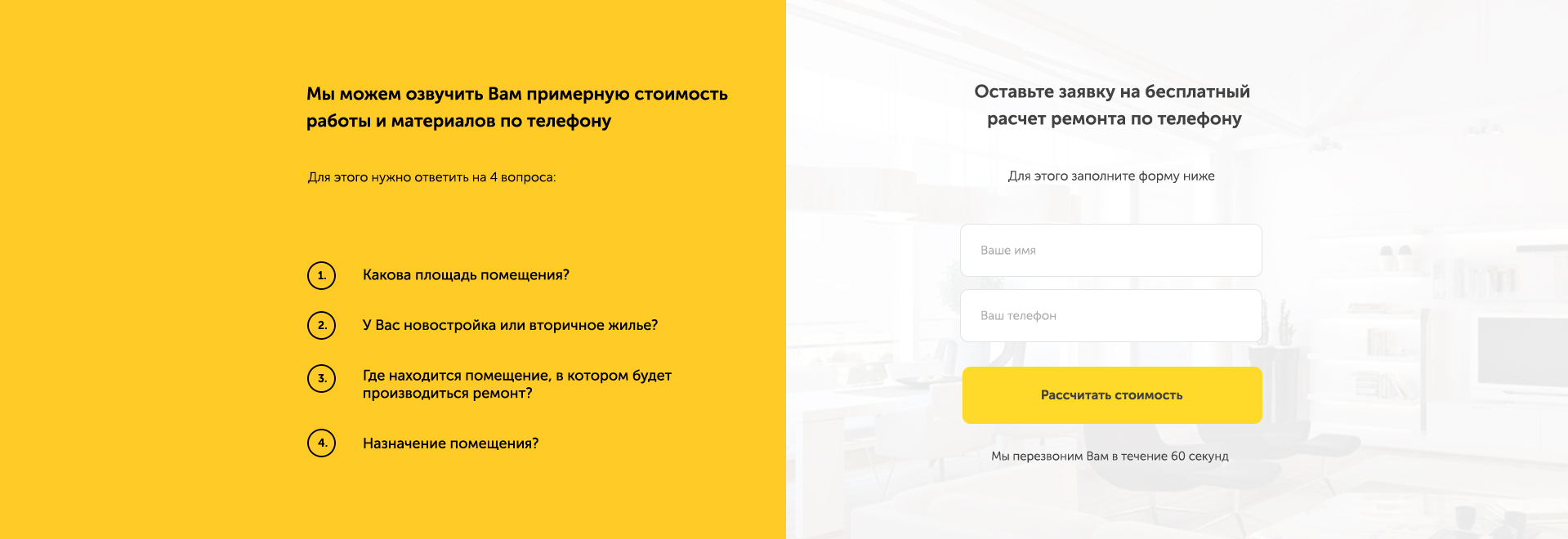
Still not seeing the benefits of a dynamic indent method? Then let's take a look at a real-life example. Wear developer glasses - there is the following section (clickable):
What thoughts? There is a section, in it there are two separate blocks, to scatter them around, it would be nice to set display: flex and jcsb for the section. But if you use .container, then you will have to wrap these two blocks in another one and already set df for it. Is it convenient? We try:
HTML:
<section class="brif-section"> <div class="container"> <div class="brif-wrapper"> <div class="brif-text-block"> .... </div> <form action="#" class="brif-form"> .... </form> </div> </div> </section>
CSS:
.brif-section { background: background; } .container { max-width: 1180px; margin: auto; } .brif-wrapper { display: flex; justify-content: space-between; }
Now look how it looks if you use dynamic indentation:
HTML:
<section class="brif-section"> <div class="brif-text-block"> .... </div> <form action="#" class="brif-form"> .... </form> </section>
CSS:
.brif-section { display: flex; justify-content: space-between; padding: 0 calc(50% - 590px); background: background; }
Just look at how the code decreased, it became cleaner, it became easier to read. The result is a section that contains a block with text and a form - nothing more! And this is just one section. I repeat: what if the site has 15 sections?
So, we begin to summarize:
Pros .container :,
- The content is fixed in the center and has the desired width.
- You can set the desired background for the entire section.
Cons .container:
- It is an additional div.
- Sometimes you need to create another additional div.
- The code is bloated and harder to read.
- Sometimes you need to set the background for the section, and other styles for the wrapper block.
- You need to come up with some class for the wrapper block.
Pros of padding (relative to .container):
- The content is fixed in the center and has the desired width.
- You can set the desired background for the entire section.
- No additional blocks, wrappers.
- The code is cleaner and easier to read.
- All necessary styles are set only for the section.
Cons of padding:
- It is necessary for sections to set padding-top and padding-bottom as separate properties.
That is not:
section { padding: 50px 0; }
That's how:
section { padding-top: 50px; padding-bottom: 50px; }
Otherwise, they will overwrite the dynamic indentation.
Recommendations
I like the method with dynamic indentation. Try it instead of the usual “container” layout and you will quickly notice how the purity of your code has increased. If there are any doubts about this method, then write them in the comments - we will discuss!
I recommend using not%, but vw. So that the width is not considered from the parent, but from the width of the browser promoter area. So just more reliable. Vw support - 96% here .
CSS:
section { padding: 0 calc(50vw - 590px); }
Create your template for these styles with media queries, for example:
section, header, footer { padding: 0 15px; } @media (min-width: 575.98px){ section, header, footer { padding: 0 calc(50vw - 270px); } } @media (min-width: 767.98px){ section, header, footer { padding: 0 calc(50vw - 360px); } } @media (min-width: 991.98px) { section, header, footer { padding: 0 calc(50vw - 480px); } } @media (min-width: 1199.98px){ section, header, footer { padding: 0 calc(50vw - 590px); } }
Conclusion
A method with dynamic indentation performs the same function as div.container, but is completely devoid of all its shortcomings. Perhaps this method has some pitfalls, but I have not met them yet. So far, everything works in exactly the same way as with a container.
Do not be afraid of something new. Just start using this method and soon you will feel some relief. Use css to the fullest!
PS If during use of this method some pitfalls come up - describe them in the comments! We'll figure out.
All Articles