Unity auto-layout and styles: our new pipeline and tools for UI
I'll start with the main thing: we made a convenient layout tool and changed the work pipeline. Now in order.
There are many different interfaces in mobile games, including HUD and a huge number of screens for meta. UX-designers design them, UI-designers draw, and for all this to appear in the engine, there are specially trained people - technical UI-designers. Well, or simply layout designers. Part of their job is to painstakingly transfer everything from the PSD layout to the prefab, number by number. They also engage in UI-animations, fill in sprites, make adaptive layouts, arrange localization keys and so on.
And we set ourselves several goals:
- Speed up the layout and relieve it of routine;
- optimize the interaction between the departments of UI design and development;
- make uniformity in UI: create guidelines and form Unity assets on their basis;
- provide the extensibility and versatility of the UI, the reusability of assets, resistance to edits, and easy optimization.
This is how it happened.
We tried to create some kind of design system from the Unity engine and Adobe Photoshop (which, it seems, except for a game dev, is hardly used for creating interfaces). Roughly speaking, we were faced with the task of making friends Photoshop and Unity.
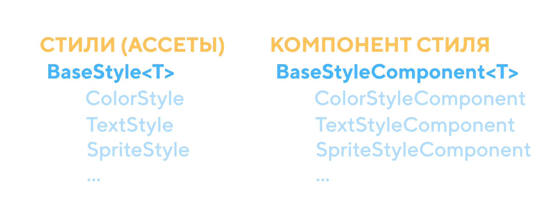
First of all, it was necessary to project the whole set of “visual language” in Unity. To do this, we chose styles and tailored them to our own needs. This is a fairly common practice among companies. So a font set has become a font style, a set of layouts has become a style with sprites of these layouts, a set of colors has become a style with colors, and so on. It was enough to create all this once, and then just reuse and supplement along with the psd extension with guidelines. Thus, the UI designer is forced to abandon 1001 substrates on different screens and create several universal ones.
Current styles that are:
- Color Style <Name, Color>
- Text Style <Name, Font, Font size, Font material, Line spacing>
- Font Style <Title, Font, Font Material>
- Button Style <Name, Button Settings>
- Layout Style <Name, Sprite, Indentation>
- Sprite Style <Name, Sprite>
- Localization Style <Name, Key>
- Icon Style <Name, Sprite>
And in general, you can create styles easily and simply, inheriting it from the base. For example:
[CreateAssetMenu(menuName = "UIStyles/ColorStyle")] public class ColorStyle : BaseStyle<Color> { }
The only limitation: the type must be Serializable. So even the typesetter will cope with the creation of his own type of style.
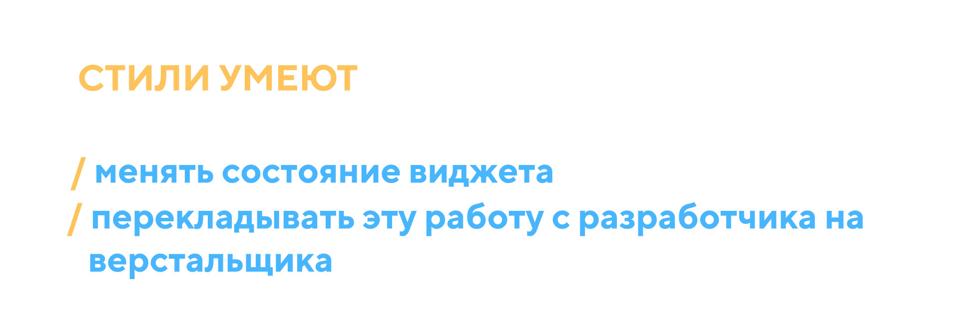
Some styles are needed to change the state of the UI. For example, Color Style, Text Style, Sprite Style, Button Style, Localization Style. All of them affect different gameobjects. Pictures are painted in different colors, different sprites are substituted in them, and so on.
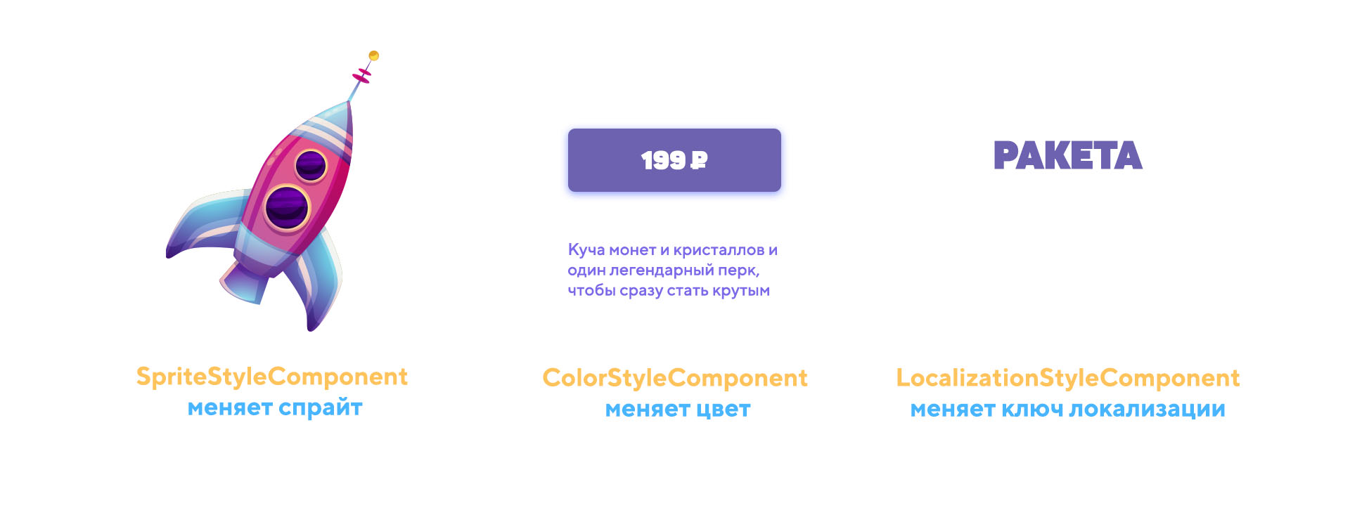
Until now, it was not clear how to use all this. I will give a simple example. Let's say we have one button of offers of different colors. The color of the button depends on the offer itself. And they look like this:
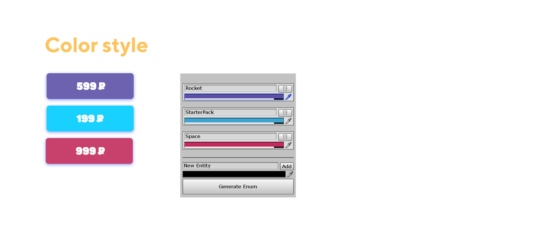
Then we create one prefab with Image, on which we hang the ColorStyleComponent, insert the ColorStyle style into it, where all the colors that the button can be repainted will be stored, and then apply styles depending on the offer inside the code.
The styles FontStyle, IconStyle and LayoutStyle are used for the auto-builder. This is a library of all the fonts, icons and underlays in the project.
A system with styles has a huge number of advantages (only a bunch of assets in a project can be annoying):
- reuse;
- when changing the style, the prefab does not change, but if something needs to be changed, this will affect all prefabs;
- typesetters create styles themselves, change them and delete them, which allows programmers to forget about the heap of fields in monobekh with flowers;
- styles can be applied directly in the editor due to the fact that for Editor BaseStyleComponent <T, TStyle> is written its Editor.
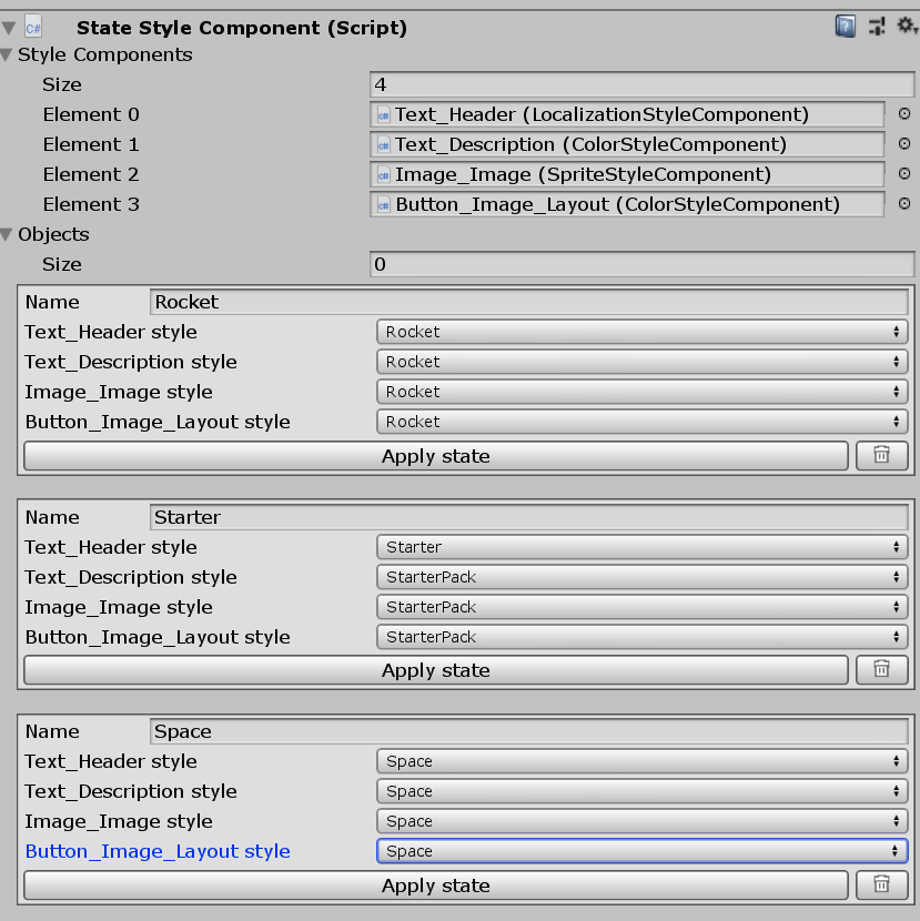
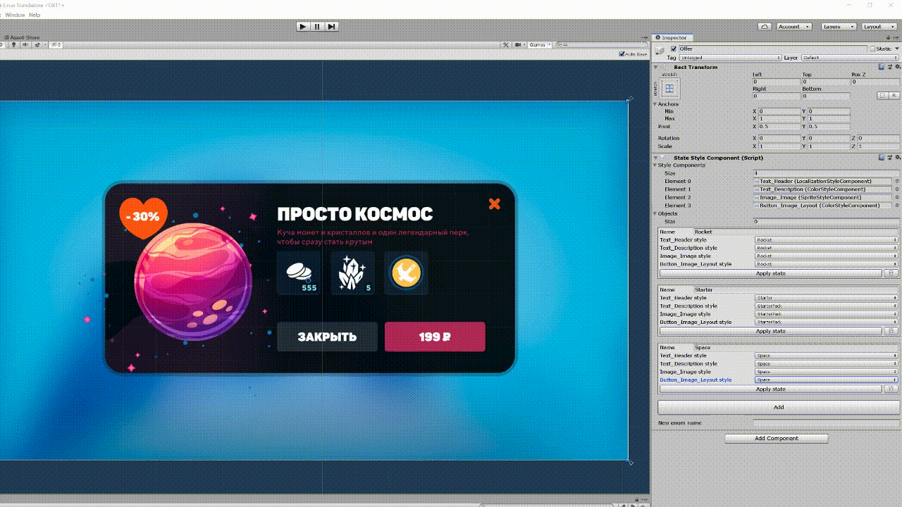
To change the state of one large widget, several styles can be used, different objects can be turned on / off. To do this, the StateStyleComponent was created in the project, which collects all the styles and objects that need to be turned on / off. Then right in the widget, all its possible states are created and switched. This saves programmers from a bunch of the same code for switching colors / fonts / texts / sprites.
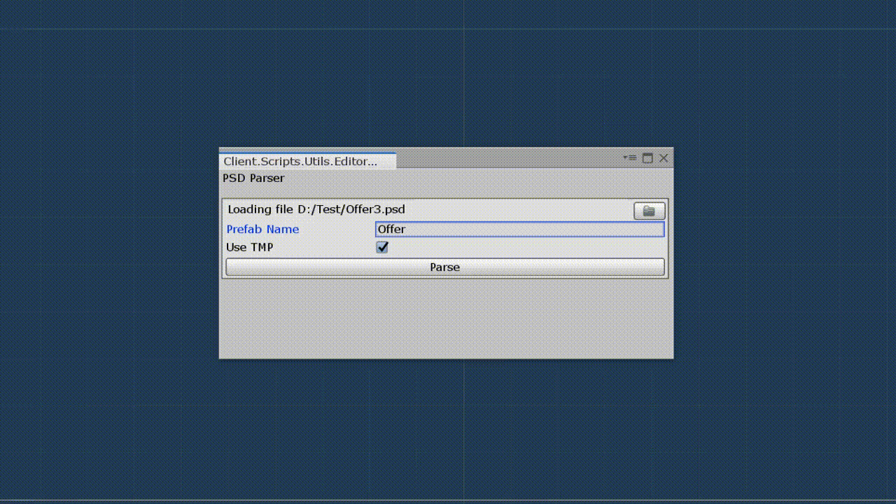
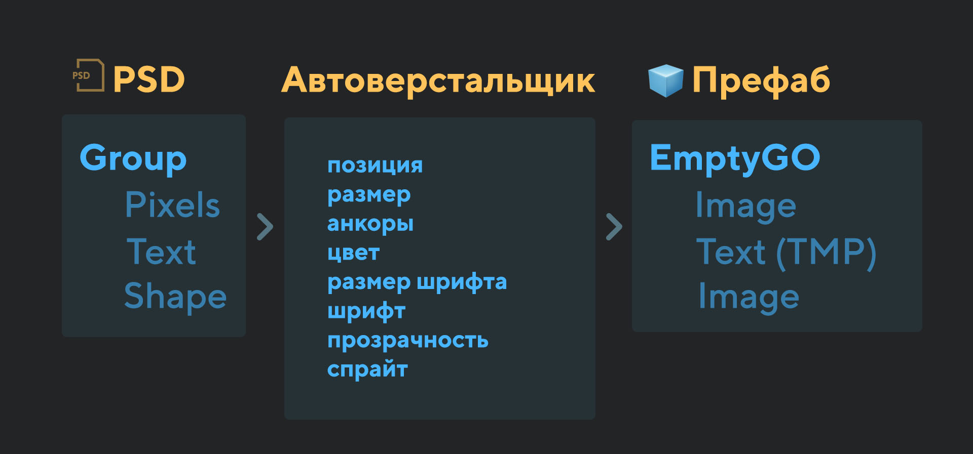
Then we created an auto-maker. This is a tool in which you stick psd, and on the output a raw prefab is created, in which some sprites are already substituted, positions, names, fonts, sizes, aliases are put down - everything that is so carefully copied from the psd by the layout designers with pens. It even roughly anchors and maintains a hierarchy. And it does it in a matter of seconds, which ultimately saves hours of painstaking copying.
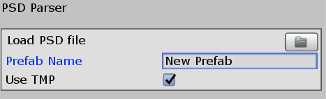
The autocomputer window itself looks meager in settings. During use, these settings will be added.
To get all the data, the psd parser was written specifically for these needs based on the psd specification. This is a rather boring process, you can take ready-made libraries. But since we wanted to do everything with one button, we had to write from scratch.
The auto-maker copies the entire hierarchy in Photoshop. First, a root object is created with the name prefab, which is anchored to the edges of the screen. Inside it, objects are created according to the principle described above - the object is created in the root object, and then a real parent is assigned to it while maintaining the global position. Anchors are placed according to the principle - to which edge or center the object is located closest to which it is nailed separately along the axes and Y. All positions and sizes are made integer. The auto-maker ignores hidden objects.
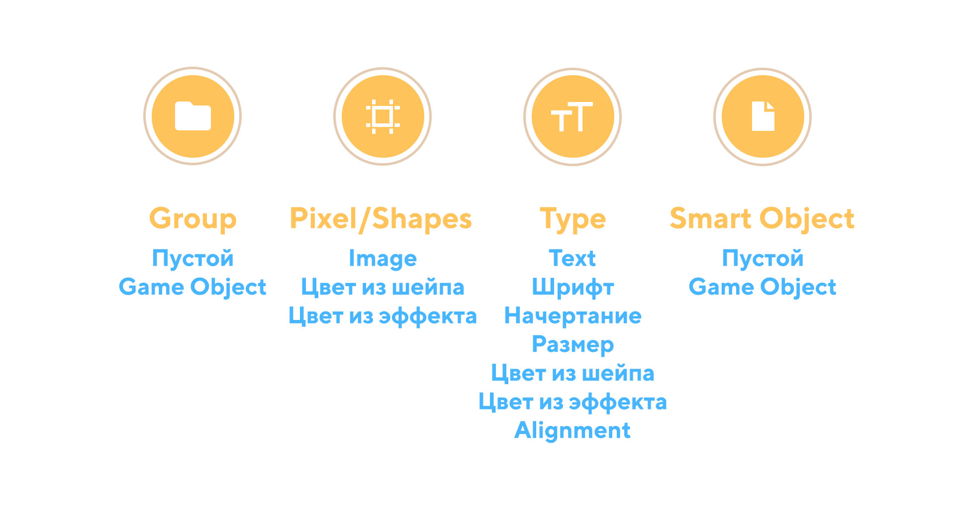
In Photoshop, there are 5 types of layers: groups, pixel, shapes, texts and smart objects.
- Groups (group layer) in the auto-maker turn into an empty gameobject, so you can easily combine any large interface component such as a had, slot, group of slots, and so on into a group.
- Pixel layer simply becomes Image with white color. It can be icons, backs, pictures, fireflies. Then they are manually added to the project, like sprites and inserted into Image.
- Shapes (shape layer) become a picture with the shape color. It can be any vector elements: layouts, icons and others.
- Texts in the autocomputer becomes TextMeshProUGUI and inherits text, font, color, stroke, shadow, gradient, font size, positioning (right, center, left).
- Smart objects become ordinary empty gameobjects. It’s logical to use smart objects to do what has already been imposed as nested prefabs (for example, the top bar, which is the same everywhere)
The auto-wrapper also knows how to collect colors from all places (for example, shape color, font color, color effect, color layer) and convert them to one hex. Similarly with transparency.
Separately, the UI designer immediately puts options in the names of layers and groups (as in Zeplin).
Examples of options in the table
| Option | Arguments | Value | Example | Object in Unity |
|---|---|---|---|---|
| -l | Guideline name from the guidelines (no spaces) | Adding a sprite to a picture | Hud Layout -l pink228 | Image_HudLayout with the Image component with pink228 layout sprite inserted from the guidelines |
| -cs | Style_name. Optional (no spaces) | Adds a ColorStyleComponent with the style StyleName. | Hud Layout -cs HudLayoutColors
Hud layout -cs | Image_HudLayout with ColorStyleComponent component with style inside HudLayoutColors
Image_HudLayout with the ColorStyleComponent component |
| -ts | Style_name. Optional (no spaces) | Adds a TextStyleComponent with the style StyleName. | Ability -tsAbilityColors
Ability -ts | Text_Ability with TextStyle component with style inside AbilityColors
Text_Ability with the TextStyle component |
| -bs | Style_name.
Optional (no spaces) | Adds ButtonStyleComponent with style StyleName | Play -b -bs | |
| -b | This is the button. | Play -b
Play -b -l 1 | Button_Play with Button and Image
Button_Play with Button and Image component with inserted layout sprite 1 from guidelines | |
| Optional | ||||
| -hg | Horizontal group (exclusively on the group) | Module Buttons - hg | ModuleButtons with component Horizontal layout group | |
| -vg | Vertical group (exclusively on the group) | Module Buttons - vg | ModuleButtons with component
Vertical layout group |
Advantages of the tool: fast layout, saving the hierarchy, adding the necessary components, unifying the names of game objects, automatically adding styles by name, turning off rakecasts where it is not needed, approximate affixing.
But the approach has its drawbacks: if the psd layout is made of 1000 layers for one button only, it will be practically useless, in this case it is recommended to add the button to the smart object. Also, the tool requires a normal and correct naming from the UI designer - it will no longer be possible to name the layers "Rectangle_copy_21_1005". On the other hand, this makes layouts more readable for other UI designers.
The plans are to come up with a system that would save from the export of substrate sprites.
Layout with the auto-maker popup from this article took 3 minutes 13 seconds (except for throwing sprites into the project). Pens takes 18 minutes 32 seconds. At the same time, there are also problems in the layout with pens - in some places, incorrect positions that the keen eye of a UI designer will notice and have to be redone. Therefore, automatic layout is also good because it eliminates the human factor.
And a few reviews about the auto-maker:
“Auto-maker significantly speeds up the work, but so far, it seems that it is necessary to simplify the threshold of entry, installation and configuration”
“I think that if you set up the styles for the typesetter, it’s timeless, but the designers and programmers will save time and nerves for sure”
"The thing is very cool))"
“Styles - the topic is very cool, this is not enough in our project, because they like to repaint buttons on layouts, texts, etc. It’s great that now this can be fixed in the stylist and there’s no headache, that you have different colors or different sprites in uniform places ”
“UI designers themselves must do the layout, because only they know the features of their layouts. And the auto-layout designer is a great thing for those who do not want to understand the intricacies of layout. If the instrument has an intuitive interface and learns from Figma, it will be simply luxurious. ”Personally, I think that everything that can be automated should be automated, and people should be given the opportunity to engage in more creative and inventive work.
All Articles