Monitor size selection: angular size theory, rationale and comparison
Choosing another monitor, I decided to "simplify" the process of choosing among the abundance of monitors on the market. But it turned out to use some, perhaps even scientifically based, theory covering many areas of human activity, in general, and the choice of monitor, in particular.
I hope that my research will also be useful to someone, and will also help to maintain vision and nerves.
All of the following are my personal considerations, observations, and conclusions. All of the following applies exclusively to geometric and dimensional issues. Matrix types, frequencies, and other issues are not considered in this article.
However, I do not pretend to have unique judgments or the discovery of something completely new: On the size of the screen, pixel and element ; From adaptive design - back to rubber ; The size of the characters on your monitor: marketing versus vision , etc. In my case, at first there was a theory as applied to the choice of a monitor, and then there was a search for like-minded people.
Monitor resolution
As usual, when choosing a permission, you can be guided by a comparison of permissions. In general, the higher the resolution, the better. About why this is not always an axiom - below.
But what does permission tell us? Permission speaks only about the size of the workspace. How many virtual windows / buttons / controls / letters will fit on a given workspace.
However, there are some features to consider. This applies to connection interfaces - at this time, always check with the available version of the connection / cable. For example, on the English version of Wikipedia about HDMI there is a table (at the bottom of the page) with a very clear dependence of the resolution on the channel bandwidth. From which, for example, it follows that any monitor that has better characteristics than 1920x1080x60Hz requires particularly careful selection of the cable, as well as supporting the corresponding standard from the side of the video adapter. As an example, my adventures about connecting an UltraWideHD monitor to a laptop , which could not work at a frequency of 75Hz due to interface limitations.
But then the fun begins. The market offers a ton of interpretations of the workspace. I am talking about the same resolution and different diagonals of monitors.
Choosing the right diagonal and aspect ratio is a bit more complicated. The use of an informal apparatus “this is for films, this is for video, this is for games” is not scientifically sound. It is required not only to compare the diagonal, height or width, but to approach this issue from the point of view of some theory.
Theory
Let's try to translate the argument that "the more the better" on a theoretical plane.
Take the starting point of the table of Dmitry Alexandrovich Sivtsev . This is the one used to test visual acuity.
The second line below, which is considered an indicator of 100% vision, has a letter size of 7mm. Unfortunately, I did not find the information - we are talking about lowercase or uppercase letters. I propose to consider that about capital.
The angular size of the letter from a distance of 5 meters is 0 degrees 4 minutes 49 seconds (0º 4 '49' '). Let's say the distance to the monitor is 60cm, then the minimum size of a letter that can be read will be about 0.84mm.
But the obtained value is the minimum that can be read by a person with 100% vision. And now we are talking about capital letters, the size of which is 1.5-2 times larger than lowercase. To call this level comfortable would not be right; for a long time to work under such a load would be neither comfortable nor right. GOST R ISO 9241-3-2003 also operates with angular dimensions and, for example, speaks of a minimum size of 20'-22 '. And this is approximately 3.69-3.84mm. Also, in paragraph 5.4, the minimum sign height of 16 'or 2.79mm is determined.
Double the size of the letters. Those. the lowercase letter must be at least 1.68mm or 9 '38' 'in size, capital 1.5-2 times larger, or 2.52-3.36mm or 14'26' '- 19'15' '(the upper border is slightly smaller than the lower border from GOST).
Consider the example of three fonts: Arial, Times New Roman, Segoe UI.

As you can see from the picture - the smallest are the letters of the Times New Roman font. At the same time, the size of the smallest letters from the lowercase letters (the sizes were obtained using the Inkscape vector editor).
- 1.433x1.657mm for a font of 10 points;
- 1.576x1.823mm - 11pt;
- 1.72x1.989mm - 12pt, the size of the capital letter 2.977x2.867mm;
- 1.863x2.154mm - 13pt;
- 2.006x2.32mm - 14pt;
- 2.15x2.486mm - 15pt;
- 2.293x2.651mm - 16pt, the size of the capital letter is 3.969x3.823mm.
In other words, if the font size is less than 10 points, we run the risk of running into unreadability or the need to get closer to the monitor closer than 60cm. Therefore, 10 points is the lower threshold for comfortable reading, 12 is the middle of the comfortable reading zone, 14 is the upper limit of comfortable reading. It is clear that the font size can be increased almost infinitely, but this part of the article aims to find a theoretical justification for further comparisons.
It should also be understood that this calculation is valid for a stand-alone monitor, if you are working, for example, with a laptop and the screen is closer, then the font size can be reduced.
If we talk about the width and height of the screen, then the concept of the Visual field can be taken as a basis. In the section "1.11. Ergonomic fundamentals of labor safety ”of the training manual“ SAFETY OF LIFE ”(N. A. Chulkov,“ National Research Tomsk Polytechnic University ”, 2011) - it is said that the optimal viewing angles are from -15º to 15º. Those. 30º. Based on a distance of 60cm, this is about 321mm in height and width. Those. anything higher or wider will require tension of the eye muscles or rotation of the head (to the question of buying a 50-inch TV and installing it at arm's length).
In other words: all the information that does not fit in the visual field will require forced eye strain or turning the head. The maximum angle of horizontal eye rotation is about 40º, total - 80º or about 1007mm. But it should be understood that this figure is already outside the comfort zone.
The scope of the theory
All of the above can be applied in completely different areas of human activity.
In the case of web design, you can theoretically justify the page width no more than 1000px, only this will not be an exact value, because it would be more correct to talk about the width of the visual field and the limitation of 32cm (which currently corresponds to a value, albeit very rough, of no more than 1000px, if we talk about a kind of spherical monitor in a vacuum).
You can also justify the use of 16px fonts on websites - the angular size of such a font will try to fit into the angular size justified above, regardless of the monitor and resolution.
The theory can also be used in software development, given the size of the visual field and the minimum font size.
In the case of mobile development, I would recommend reducing the distance to 30cm
It was surprising to me that the concept of angular dimensions and their relationship with visual acuity is so poorly used in everyday life. But using angular dimensions you can, for example:
- legislatively fix the minimum font size in contracts (exclude “small print”);
- font size on labels (so that the composition can be read without a magnifying glass);
- font size about drinking beer and other conditions in advertising;
- font size for a running line in television;
- to certify jobs for the use of suitable means of production;
- determine the size of objects in advertising (any object on the banner should be no less than ... so that it can be seen from a distance ...);
- etc. etc., in fact, it is possible to describe all cases where the informal concept of “small” or “large” is now used.
Practical use
Let's try to put the theory into practice: to select the optimal monitor size.
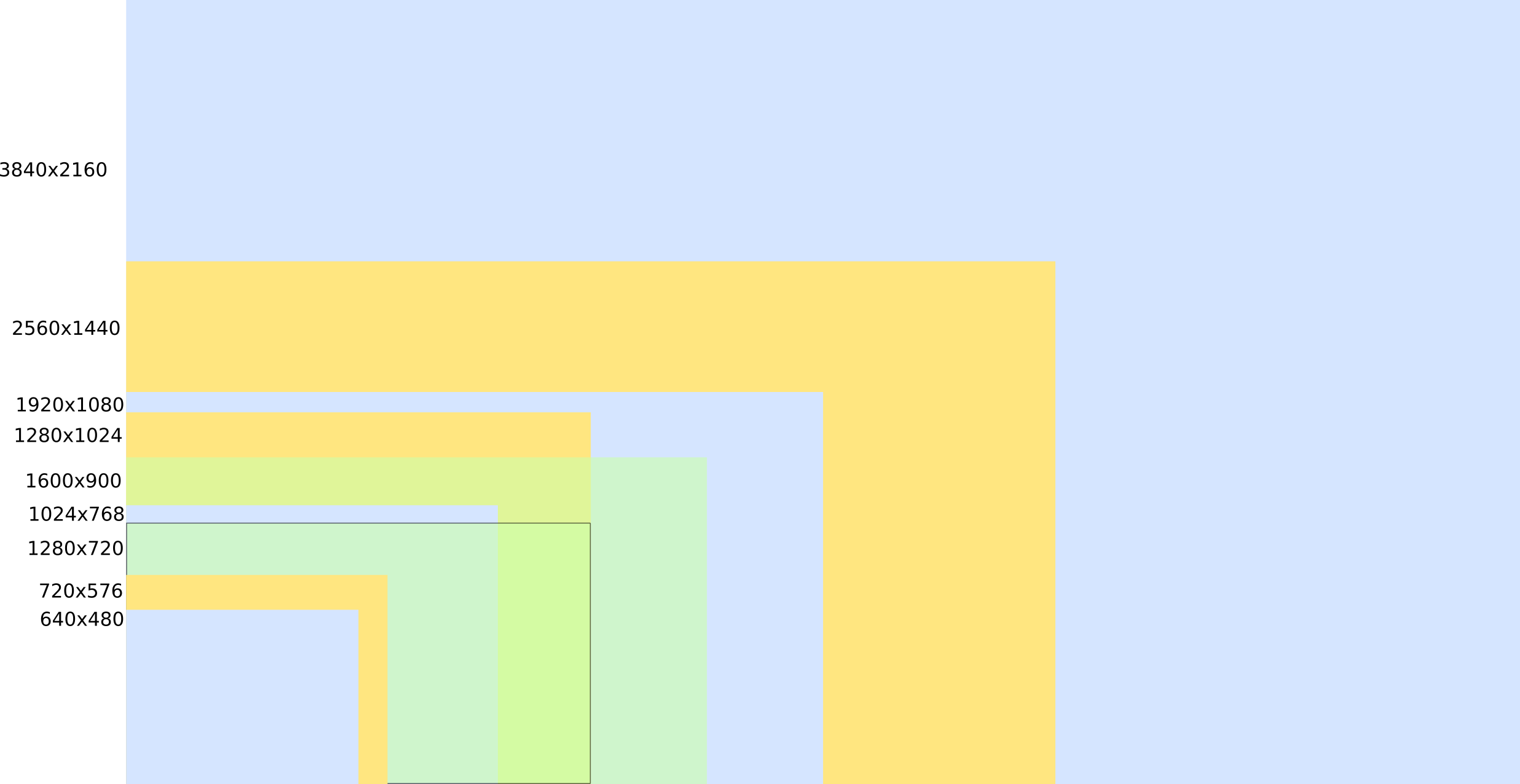
In order to more conveniently work with data, you need to get a clear comparison of how the sizes of objects on the screen change depending on the resolution and diagonal.
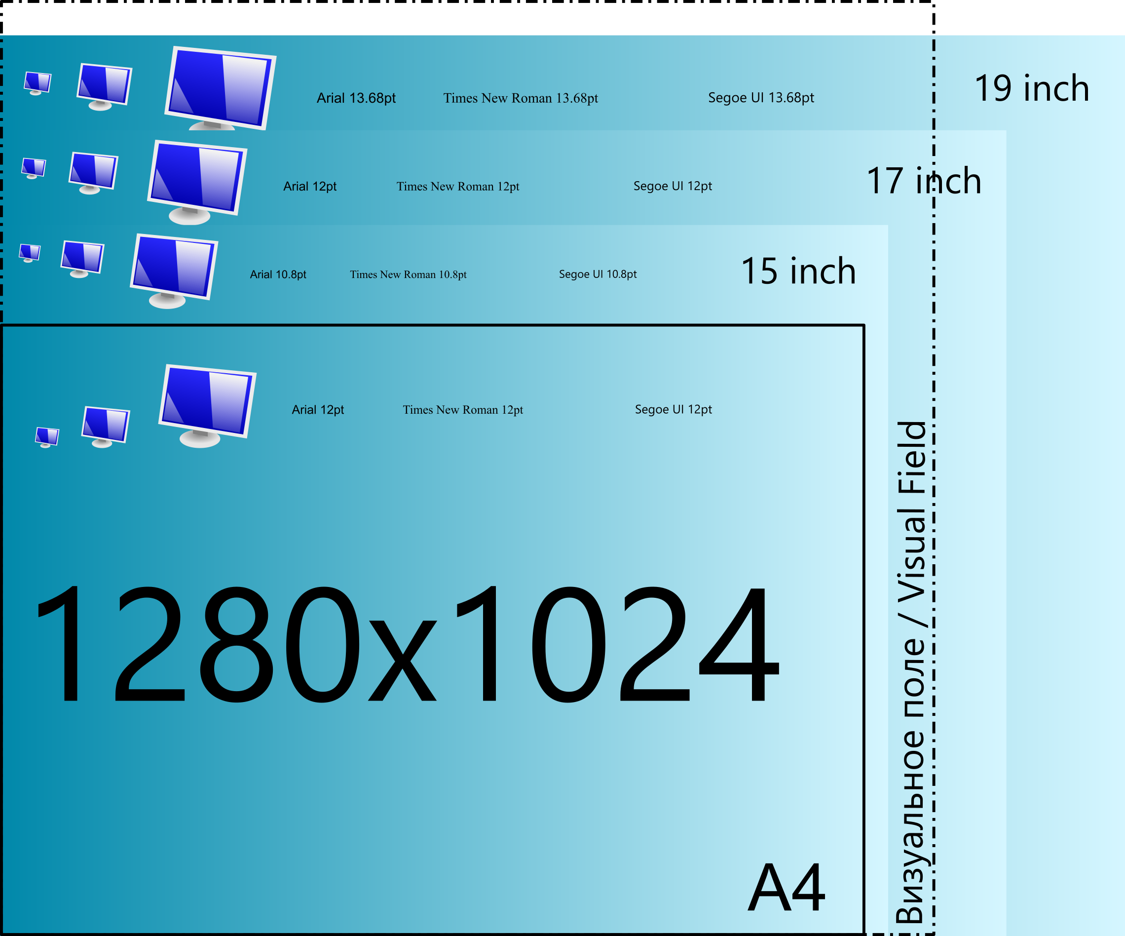
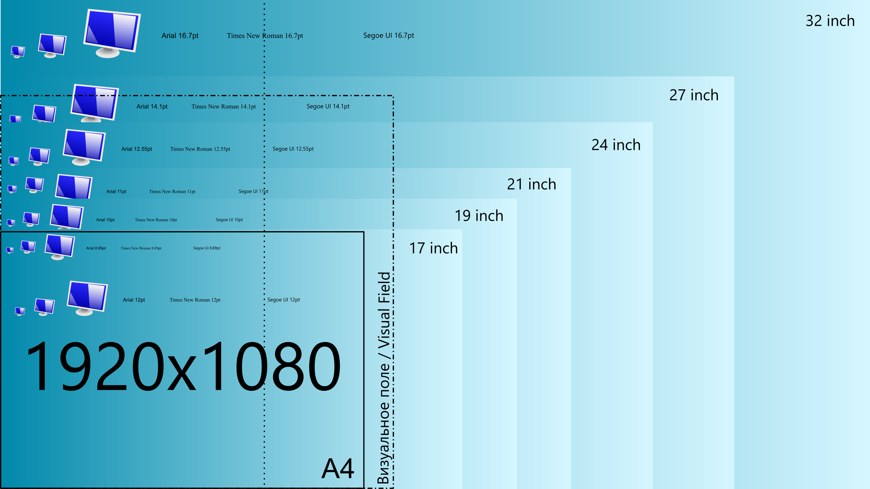
To easily make comparisons at the household level, the following method is proposed.
The basis was an A4 sheet with text written in different fonts and ranging in size from 10 to 14-16 points. In other words, if you printed such a sheet, the text on the screen without scaling will be comparable more or less. So - print out a sheet written in fonts of different sizes and move it away from you as much as you plan to install a monitor (here we are talking about 60cm). If you read a text with a size of less than 12 points comfortably, you can watch a smaller diagonal / higher resolution. If reading 12pt is not comfortable, you should look at a larger diagonal or lower resolution.
For comparison, images of monitors are also given (similar to the desktop icons), from left to right: 32px, 64px, 128px. Since time immemorial, it has been customary that the size of the desktop icon is 32x32 pixels (of course, I'm talking about Windows until the icons became 64 or more pixels).
The most amazing thing is that if we take the initial justification, then the “ancient square monitors” are almost perfect. Their geometrical dimensions are less than 321mm or permissible more: 304x244mm - 15 inches, 345x276 - 17 inches, 386x309mm - 19 inches. Those. Square monitors almost completely cover the human field of view.
And now what happened to me for modern resolutions and monitor sizes. Click on the image to open in its original size.
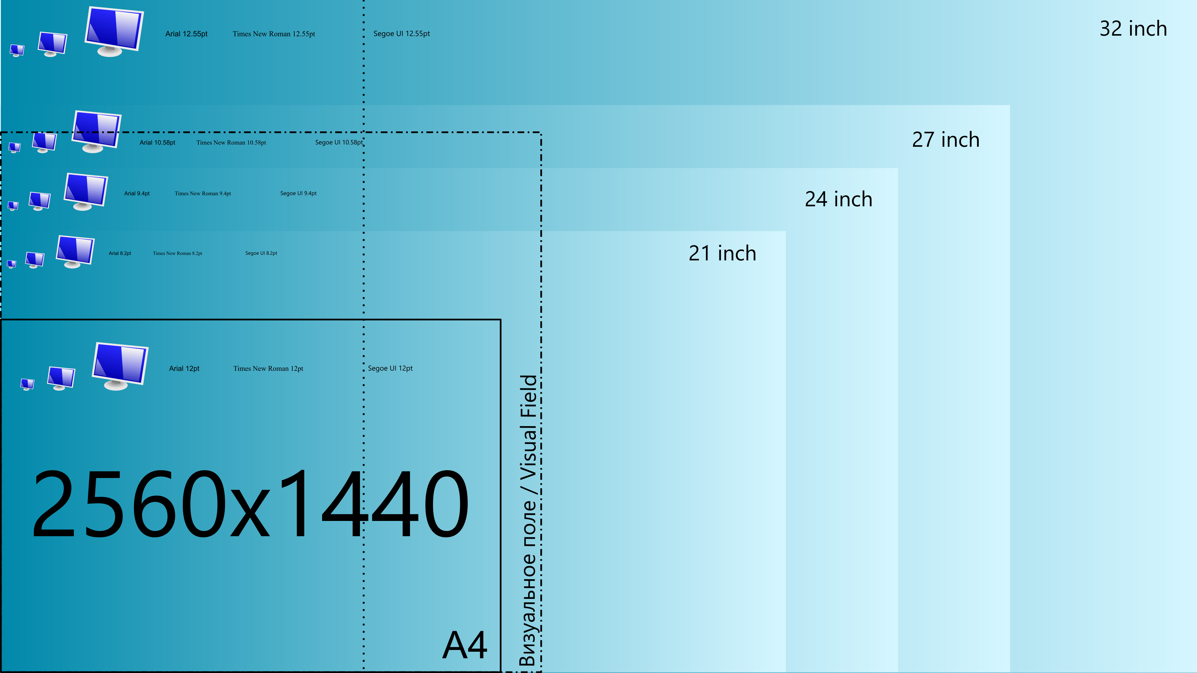
Full HD, 1920x1080 (16: 9)
WQHD, 2560x1440 (16: 9)
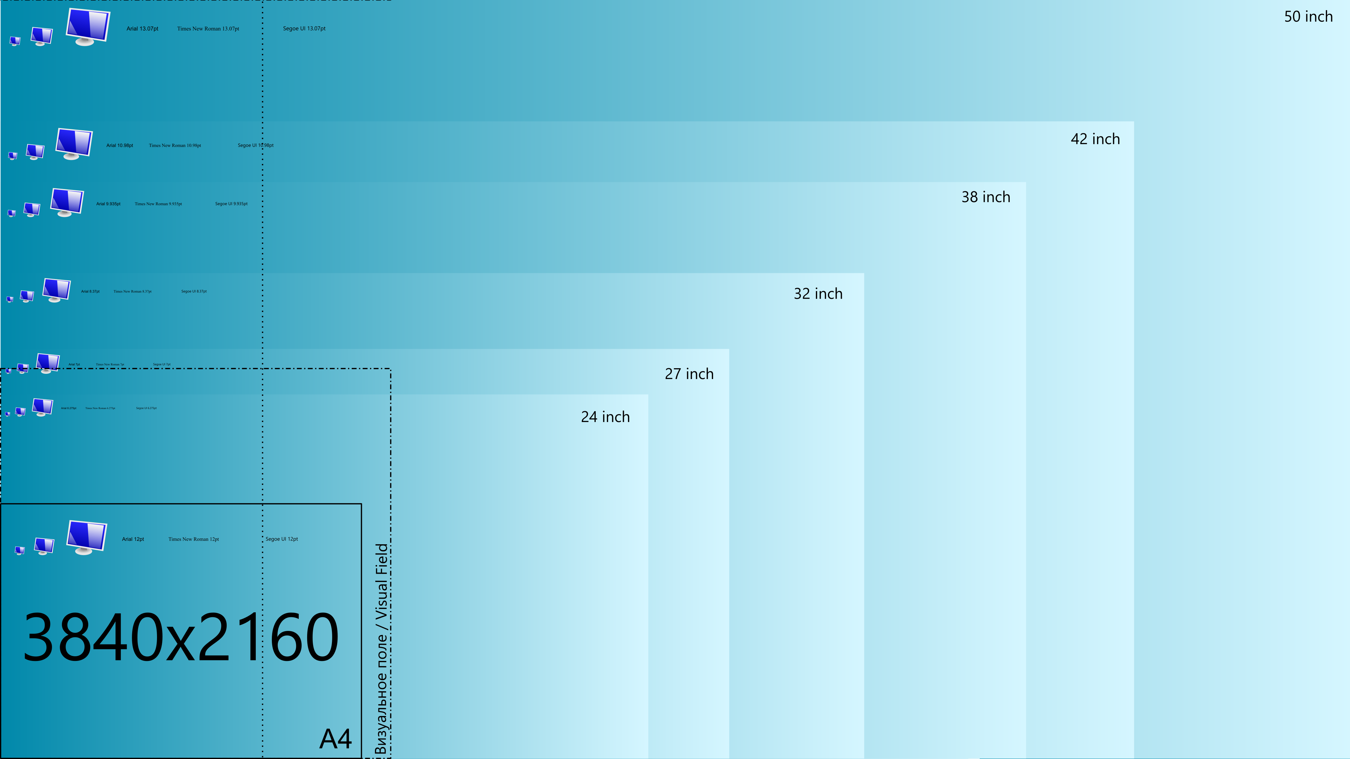
UltraHD, 3840x2160 (16: 9)
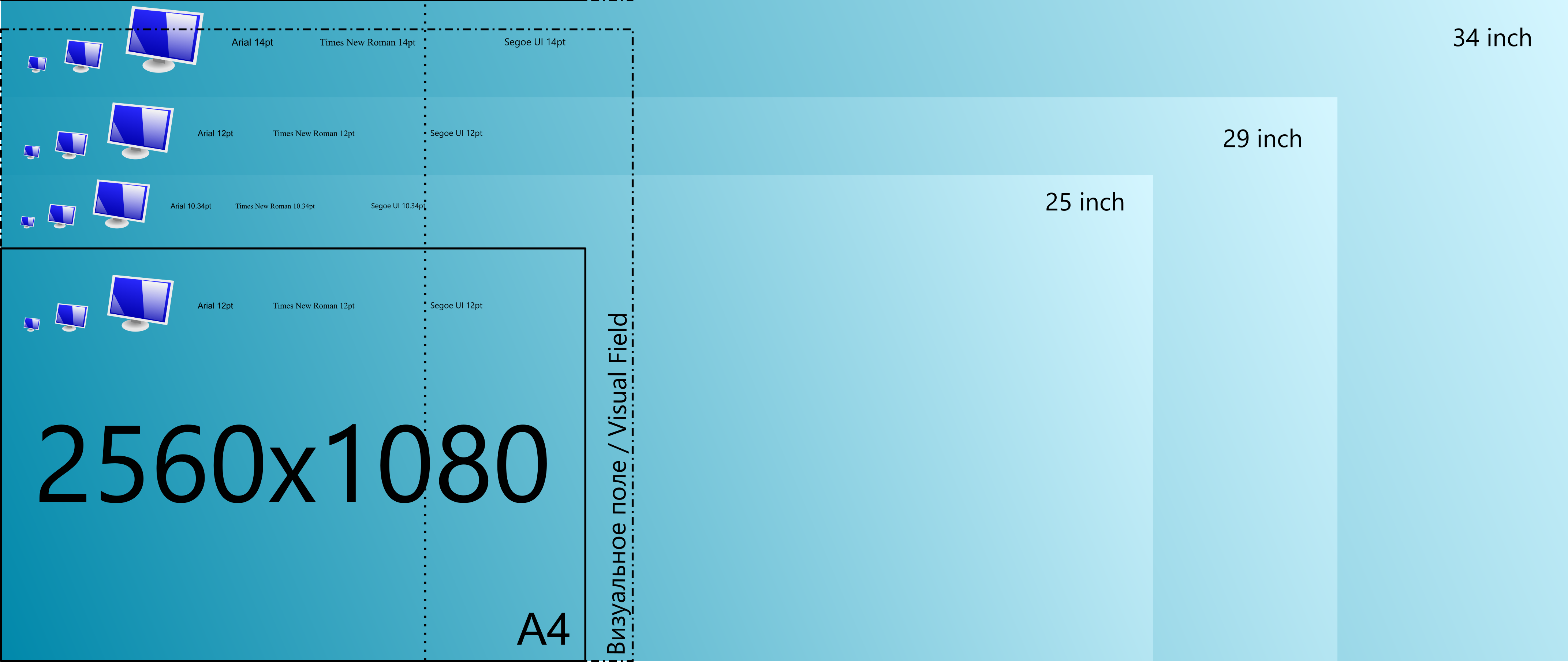
UltraWideHD, 2560x1080 (21: 9)
findings
For example, in the case of UltraHD resolution and 32 inches of diagonal, the 12pt font size will be as if it were printed at about 8pt (almost a third smaller). And with a smaller diagonal - even less. And if, in the case of game content, this is not so important, then for programs that are not scalable, it will not be comfortable.
Also, if you now have a monitor with a resolution of 1920x1080 and a diagonal size of 21 inches, then when you switch to a larger monitor with a resolution of 2560x1440 and a diagonal size of 27 inches, everything will remain approximately the same size. And with 2560x1440 and a diagonal of more than 27 inches, the objects will become slightly larger.
The largest UltraHD monitor will display objects smaller than 19 inches with FullHD resolution. And, according to the above logic, with UltraHD resolution and without scaling, a size of 42 inches will be comfortable.
Why is this all? I repeat, it all depends on which applications you have to work with the most. If these are all relatively old applications that cannot be scaled by means of the OS, then it is better to avoid high resolutions, it will be too small.
Again, if the operating system performs quite normal scaling, you can always choose the appropriate scale and get the image “without a ladder”.
But, at the same time, do not forget about the size of the visual field. And if you move the monitor further, then its diagonal will decrease. You can also see from the images above that for some sizes of diagonals, the size of the visual field divides the total area in half, either by a quarter, or in any other way. This means that you can split this screen into several work areas. But personally, my practice shows that working with one window, in this case, is not convenient. Although playing or watching a movie is quite normal.
Also, for specialists of certain professions, it can be very convenient on the contrary to free the visual field from all kinds of control panels and other windows that do not require constant attention. In this case, it will be better to choose the monitor that is most suitable for your needs with additional space around the visual field. For example, UltraWideHD monitors for working in graphic editors are very convenient, because allow you to free the workspace from unnecessary windows.
Thank you for reading to the end.
And what do you follow when choosing a resolution and monitor size? Do your personal feelings fit the theory described?
All Articles