Flat UI elements attract less attention and raise doubts.
Illustration from the Nielsen Norman Group's UI research textbook using user eye tracking
In the design of the UI there is the concept of a symbol of a clue or an accent (a signifier, Don Norman wrote about them). A strong character clearly stands out from the background, especially attracts attention. Strong characters are traditionally considered underlined text, blue text or a shiny 3D button. There are also weak or missing characters - a hyperlink stylized as plain text, without bright highlighting and underlining, or a ghost button that doesn't look like a button at all until you click on it or hover the mouse cursor on it.
According to experts of the Nielsen Norman Group , the problem of modern design is that the popularity of flat design in digital interfaces has now coincided with a shortage of strong characters. As a result, in many modern UIs there are simply no “hooks” for the eye - people are lost and do not immediately understand where you can click. Of course, if you think about it a bit, then hidden buttons and hidden links can be found, but you have to strain, this is not at all a user-friendly design.
In Nielsen Norman Group conducted a special study on this topic. They took nine of these web pages and modified them in a special way to make two almost identical versions of each page, with the same layout, content and visual design. They differed only in that one version contained strong symbols, and the other weak, that is, without shadows, gradients, and other ways of isolating clickable elements. That is, an ultra-flat UI version. In some cases, they took a normal design - and created a second ultra-flat version. In other cases, on the contrary, they took a super-flat original - and created a second version with a normal selection of characters.
A total of nine web pages worked in six thematic categories:
- e-commerce;
- non-profit organization;
- hotel;
- travel (car rental, ticket search);
- technology;
- finance.
In each thematic category, it was necessary to perform some simple task. For example, on the website of the hotel the task was to book a room. The volunteer had to tell when he would find where to click to complete the task.
All 18 web pages and related tasks are listed on this page .
The experiment involved 71 users. The direction of view of each of them was tracked by a video camera, the number of movements of the look at the page and the total time of the task were recorded. Each user was shown only one version of a web page. The experiment was terminated as soon as the user reported finding the item to be clicked on, then went to the next web page.
The results of the experiment were quite predictable. On pages with a flat design and weak signals, users spent 22% more time before they knew where to click. The average number of glances on these pages was 25% more .
Experts emphasize that more time on the page does not mean at all that users are immersed in it with interest and they like the design so much that they cannot take their eyes off. On the contrary, a long stay on the page is a negative sign. People were given the task to perform a certain action, but with such a design it was more difficult to complete the task. That is, a flat design really makes navigation and task performance more difficult. In addition, the occurrence of such uncertainty may push the user to click on the wrong link, and in this case, the delay in the execution of the task may be much more than the specified 22%. The associated unpleasant emotional effects, according to researchers, directly harm the perception of the brand .
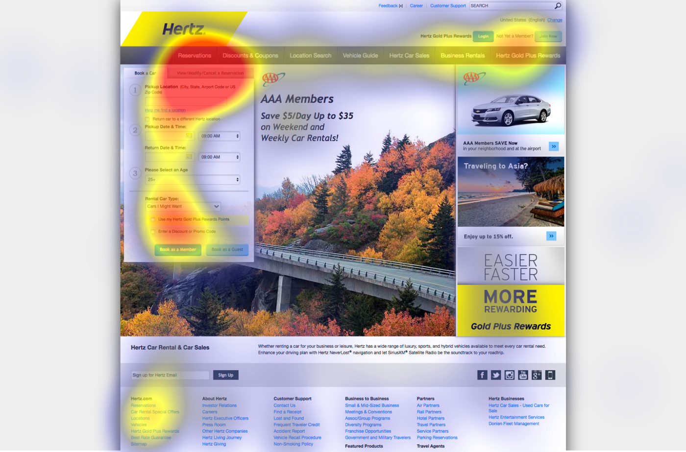
On the heat cards it is especially clearly seen how people are lost on pages with a flat design without visual clues symbols. In the absence of such elements, attention is sort of blurred between other interactive elements on the page.
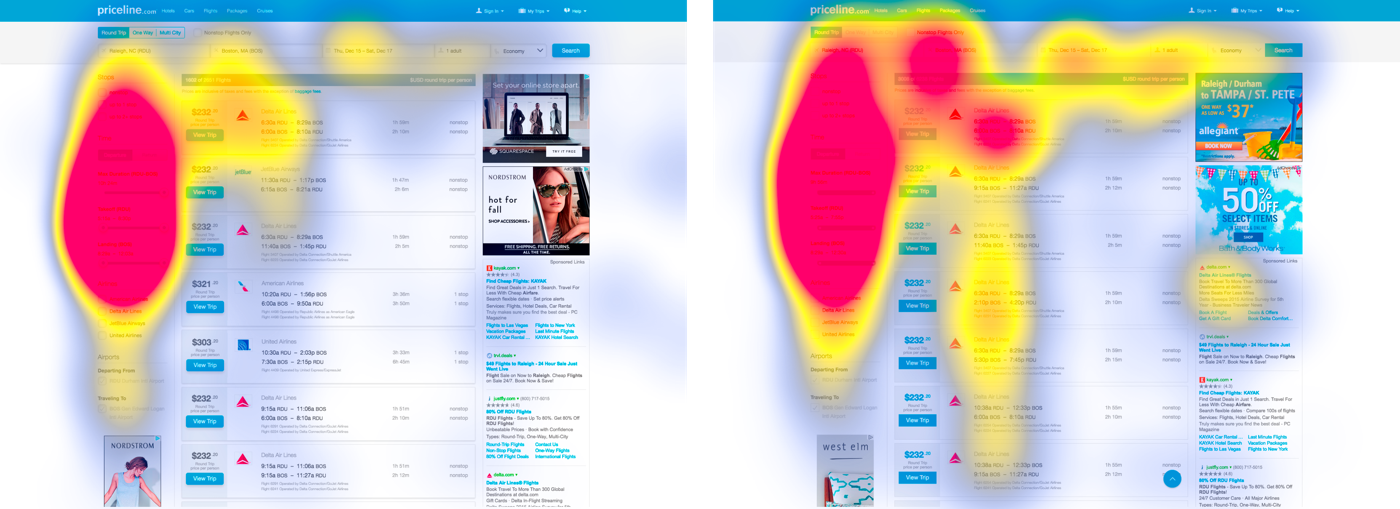
The following two examples show the distribution of users' attention on the car rental page, where the task was to cancel the booked reservation. First, the version with strong characters.
On the version with weak characters, particular concern is caused by increased attention to the footer of the page. According to experts, this is a sign that users can not find the desired item on the page and fall into despair.
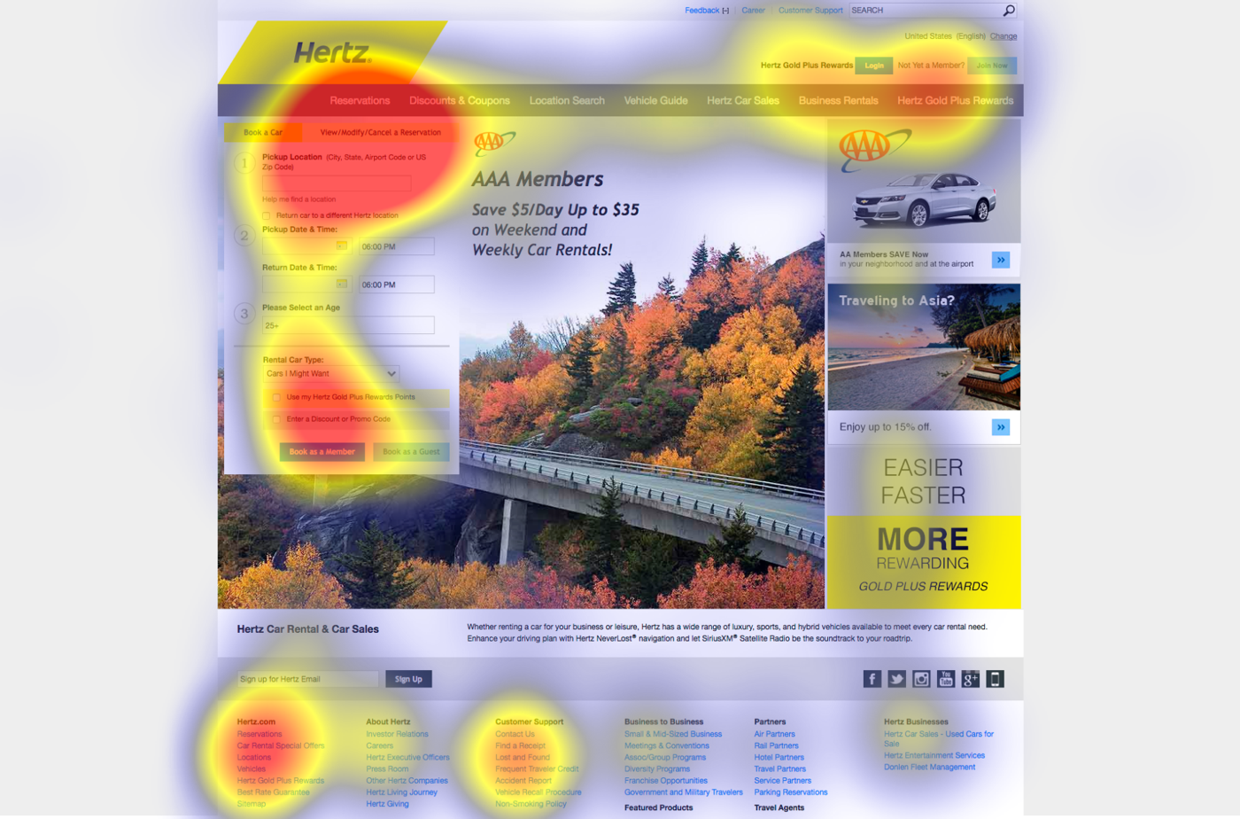
On all pairs of pages, the heat maps showed a significant difference between the distribution of users' attention on pages with normal and flat design.
The study showed that a flat design may be appropriate and does not harm if it is used on a website with low information density, with traditional layout, where elements and buttons are in familiar places or stand out among the surrounding elements. Ideally, all these three criteria should be met, rather than one or two. In general, if the design is good, then the flat elements will not cause damage. The main thing is to always think about users and adhere to the basic principles of UX - visual simplicity, external consistency, clear visual hierarchy and contrast .
All Articles