デモ / ダウンロードソース
アイコンフォントの準備
アイコンフォントを手動で作成すると問題が発生する可能性がありますが、幸いなことに、開発者にとってこのようなタスクを簡単にするWebサービスがあります。 IcoMoonはそのようなツールの1つです。
まず、SVGアイコンファイルを準備し、IcoMoonにインポートします。
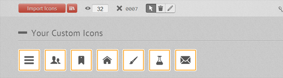
このサイトには、フォントを作成するための既製のファイルがすでに多くあり、それらを部分的に使用できます。 各アイコンにはキーを割り当てることができます。
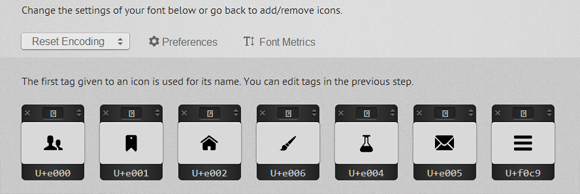
出力は、SVG、EOT、TTF、およびWOFFの4つの形式のフォント、およびCSSファイルとデモページを含むZIPファイルです。 ところで、Chromeでフォントの見栄えを良くするために、 特別なハックを使用できます。
HTML
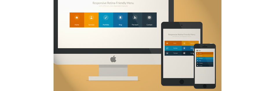
メニューのレイアウト:
<nav id="menu" class="nav"> <ul> <li> <a href="#" title=""> <span class="icon"> <i aria-hidden="true" class="icon-home"></i></span><span>Home</span> </a> </li> <li> <a href="#" title=""><span class="icon"> <i aria-hidden="true" class="icon-services"></i></span><span>Services</span></a> </li> <li> <a href="#" title=""><span class="icon"><i aria-hidden="true" class="icon-portfolio"></i></span><span>Portfolio</span></a> </li> <li> <a href="#" title=""><span class="icon"><i aria-hidden="true" class="icon-blog"></i></span><span>Blog</span></a> </li> <li> <a href="#" title=""><span class="icon"><i aria-hidden="true" class="icon-team"></i></span><span>The team</span></a> </li> <li> <a href="#" title=""><span class="icon"><i aria-hidden="true" class="icon-contact"></i></span><span>Contact</span></a> </li> </ul> </nav>
アイコンフォントを追加するには、 iタグ内でCSS icon-iconnameクラスを使用します。 また、 bodyに「no-js」クラスを追加します。これは、 Modernizrを使用して「js」クラスに変更されます。 これは、JavaScriptが無効になっているユーザーに対してメニューが正しく機能するために必要です。
CSSとJavaScript
すべてのタイプの画面用の基本的なCSS:
.nav ul { max-width: 1240px; margin: 0; padding: 0; list-style: none; font-size: 1.5em; font-weight: 300; } .nav li span { display: block; } .nav a { display: block; color: rgba(249, 249, 249, .9); text-decoration: none; transition: color .5s, background .5s, height .5s; } .nav i{ /* Chrome */ transform: translate3d(0, 0, 0); } /* Webkit- - */ a, button { -webkit-tap-highlight-color: rgba(0,0,0,0); }
主なホバー効果:
.no-touch .nav ul:hover a { color: rgba(249, 249, 249, .5); } .no-touch .nav ul:hover a:hover { color: rgba(249, 249, 249, 0.99); }
メニュー項目の背景色を追加します。 nth-childを使用することで、リストの要素を好きなだけ追加でき、色が継承されます:
.nav li:nth-child(6n+1) { background: rgb(208, 101, 3); } .nav li:nth-child(6n+2) { background: rgb(233, 147, 26); } .nav li:nth-child(6n+3) { background: rgb(22, 145, 190); } .nav li:nth-child(6n+4) { background: rgb(22, 107, 162); } .nav li:nth-child(6n+5) { background: rgb(27, 54, 71); } .nav li:nth-child(6n+6) { background: rgb(21, 40, 54); }
メディアクエリを使用して、小さい画面でメニューの形式を変更します。
@media (min-width: 50em) { /* Transforms the list into a horizontal navigation */ .nav li { float: left; width: 16.66666666666667%; text-align: center; transition: border .5s; } .nav a { display: block; width: auto; }
メニュー項目に異なる色の境界線を追加します。
.no-touch .nav li:nth-child(6n+1) a:hover, .no-touch .nav li:nth-child(6n+1) a:active, .no-touch .nav li:nth-child(6n+1) a:focus { border-bottom: 4px solid rgb(174, 78, 1); } .no-touch .nav li:nth-child(6n+2) a:hover, .no-touch .nav li:nth-child(6n+2) a:active, .no-touch .nav li:nth-child(6n+2) a:focus { border-bottom: 4px solid rgb(191, 117, 20); } .no-touch .nav li:nth-child(6n+3) a:hover, .no-touch .nav li:nth-child(6n+3) a:active, .no-touch .nav li:nth-child(6n+3) a:focus { border-bottom: 4px solid rgb(12, 110, 149); } .no-touch .nav li:nth-child(6n+4) a:hover, .no-touch .nav li:nth-child(6n+4) a:active, .no-touch .nav li:nth-child(6n+4) a:focus { border-bottom: 4px solid rgb(10, 75, 117); } .no-touch .nav li:nth-child(6n+5) a:hover, .no-touch .nav li:nth-child(6n+5) a:active, .no-touch .nav li:nth-child(6n+5) a:focus { border-bottom: 4px solid rgb(16, 34, 44); } .no-touch .nav li:nth-child(6n+6) a:hover, .no-touch .nav li:nth-child(6n+6) a:active, .no-touch .nav li:nth-child(6n+6) a:focus { border-bottom: 4px solid rgb(9, 18, 25); }
メニューのアイコンとテキストのスタイル:
.icon { padding-top: 1.4em; } .icon + span { margin-top: 2.1em; transition: margin .5s; }
少しのメニューアニメーション:
/* */ .nav a { height: 9em; } .no-touch .nav a:hover , .no-touch .nav a:active , .no-touch .nav a:focus { height: 10em; } /* */ .no-touch .nav a:hover .icon + span { margin-top: 3.2em; transition: margin .5s; }
アイコンのCSS遷移:
.nav i { position: relative; display: inline-block; margin: 0 auto; padding: 0.4em; border-radius: 50%; font-size: 1.8em; box-shadow: 0 0 0 0.8em transparent; background: rgba(255,255,255,0.1); transform: translate3d(0, 0, 0); transition: box-shadow .6s ease-in-out; }
目的の視覚効果を得るには、要素の影を変更します。
.no-touch .nav a:hover i, .no-touch .nav a:active i, .no-touch .nav a:focus i { box-shadow: 0 0 0px 0px rgba(255,255,255,0.2); transition: box-shadow .4s ease-in-out; } }
800〜980ピクセルの画面用の別のメディアクエリ:
@media (min-width: 50em) and (max-width: 61.250em) { /* Size and font adjustments to make it fit better */ .nav ul { font-size: 1.2em; } }
「デスクトップ」バージョンのメニューのCSSを完成させ、「タブレット」と「モバイル」に移動します。
/* "tablet" "mobile" */ @media (max-width: 49.938em) { /* border */ .no-touch .nav ul li:nth-child(6n+1) a:hover, .no-touch .nav ul li:nth-child(6n+1) a:active, .no-touch .nav ul li:nth-child(6n+1) a:focus { background: rgb(227, 119, 20); } .no-touch .nav li:nth-child(6n+2) a:hover, .no-touch .nav li:nth-child(6n+2) a:active, .no-touch .nav li:nth-child(6n+2) a:focus { background: rgb(245, 160, 41); } .no-touch .nav li:nth-child(6n+3) a:hover, .no-touch .nav li:nth-child(6n+3) a:active, .no-touch .nav li:nth-child(6n+3) a:focus { background: rgb(44, 168, 219); } .no-touch .nav li:nth-child(6n+4) a:hover, .no-touch .nav li:nth-child(6n+4) a:active, .no-touch .nav li:nth-child(6n+4) a:focus { background: rgb(31, 120, 176); } .no-touch .nav li:nth-child(6n+5) a:hover, .no-touch .nav li:nth-child(6n+5) a:active, .no-touch .nav li:nth-child(6n+5) a:focus { background: rgb(39, 70, 90); } .no-touch .nav li:nth-child(6n+6) a:hover, .no-touch .nav li:nth-child(6n+6) a:active, .no-touch .nav li:nth-child(6n+6) a:focus { background: rgb(32, 54, 68); } .nav ul li { transition: background 0.5s; } }
サイズが520px(32.5em)から799px(49.938em)の画面の場合、メニューは2列に表示されます。 タッチスクリーンを簡単にタップできるように、インデントを追加します。
@media (min-width: 32.5em) and (max-width: 49.938em) { /* */ .nav li { display: block; float: left; width: 50%; } /* */ .nav a { padding: 0.8em; } /* */ .nav li span, .nav li span.icon { display: inline-block; } .nav li span.icon { width: 50%; } .nav li .icon + span { font-size: 1em; } .icon + span { position: relative; top: -0.2em; }
大画面ナビゲーションはモバイルデバイスには複雑すぎるため、単純化します。
.nav li i { display: inline-block; padding: 8% 9%; border: 4px solid transparent; border-radius: 50%; font-size: 1.5em; background: rgba(255,255,255,0.1); transition: border .5s; } .no-touch .nav li:hover i, .no-touch .nav li:active i, .no-touch .nav li:focus i { border: 4px solid rgba(255,255,255,0.1); } }
フォントのサイズと幅を調整します。
@media (min-width: 32.5em) and (max-width: 38.688em) { .nav li span.icon { width: 50%; } .nav li .icon + span { font-size: 0.9em; } }
最小の画面では、すべてのアイテムを開くをクリックして、「メニュー」ボタンのみを残して、ナビゲーション全体を非表示にする必要があります。 JavaScriptを使用します。
// var changeClass = function (r,className1,className2) { var regex = new RegExp("(?:^|\\s+)" + className1 + "(?:\\s+|$)"); if( regex.test(r.className) ) { r.className = r.className.replace(regex,' '+className2+' '); } else{ r.className = r.className.replace(new RegExp("(?:^|\\s+)" + className2 + "(?:\\s+|$)"),' '+className1+' '); } return r.className; }; // var menuElements = document.getElementById('menu'); menuElements.insertAdjacentHTML('afterBegin','<button type="button" id="menutoggle" class="navtoogle" aria-hidden="true"><i aria-hidden="true" class="icon-menu"> </i> Menu</button>'); // / document.getElementById('menutoggle').onclick = function() { changeClass(this, 'navtoogle active', 'navtoogle'); } // document click // http://tympanus.net/codrops/2013/05/08/responsive-retina-ready-menu/comment-page-2/#comment-438918 document.onclick = function(e) { var mobileButton = document.getElementById('menutoggle'), buttonStyle = mobileButton.currentStyle ? mobileButton.currentStyle.display : getComputedStyle(mobileButton, null).display; if(buttonStyle === 'block' && e.target !== mobileButton && new RegExp(' ' + 'active' + ' ').test(' ' + mobileButton.className + ' ')) { changeClass(mobileButton, 'navtoogle active', 'navtoogle'); } }
よりクリーンなHTMLコードの場合、メニューボタンはJavaScriptで直接作成されます。 ボタンのCSS:
.nav .navtoogle{ display: none; width: 100%; padding: 0.5em 0.5em 0.8em; font-family: 'Lato',Calibri,Arial,sans-serif; font-weight: normal; text-align: left; color: rgb(7, 16, 15); font-size: 1.2em; background: none; border: none; border-bottom: 4px solid rgb(221, 221, 221); cursor: pointer; } .navtoogle i{ z-index:-1; } .icon-menu { position: relative; top: 3px; line-height: 0; font-size: 1.6em; }
デフォルトでは、画面サイズが519px(32.438em)未満の場合、ボタンは非表示になります。
@media (max-width: 32.438em) { .nav .navtoogle{ margin: 0; display: block; }
「no-js」クラスを使用して、JavaScriptサポートのないユーザーにメニューを表示します。
.no-js .nav ul { max-height: 30em; overflow: hidden; }
JavaScriptがサポートされている場合、メニューを非表示にします。
.js .nav ul { max-height: 0em; overflow: hidden; } /* */ .js .nav .active + ul { max-height: 30em; overflow: hidden; transition: max-height .4s; }
最小画面用のメニューの調整:
.nav li span { display: inline-block; height: 100%; } .nav a { padding: 0.5em; } .icon + span { margin-left: 1em; font-size: 0.8em; }
左に境界線を追加します。
.nav li:nth-child(6n+1) { border-left: 8px solid rgb(174, 78, 1); } .nav li:nth-child(6n+2) { border-left: 8px solid rgb(191, 117, 20); } .nav li:nth-child(6n+3) { border-left: 8px solid rgb(13, 111, 150); } .nav li:nth-child(6n+4) { border-left: 8px solid rgb(10, 75, 117); } .nav li:nth-child(6n+5) { border-left: 8px solid rgb(16, 34, 44); } .nav li:nth-child(6n+6) { border-left: 8px solid rgb(9, 18, 25); }
結果として生じるナビゲーションは、ウィンドウのサイズを変更するときにデスクトップブラウザーでは適切に見えますが、モバイルデバイスでは、同じメニュー項目に問題がある可能性があります。 タッチデバイスを判別するには、 Modernizrを使用します。 タッチがサポートされている場合、「touch」タグが追加されます。
.touch .nav a { padding: 0.8em; } }
それだけで、美しい網膜対応のナビゲーションが判明し、どのデバイスでもうまく表示されます!