スタイルのデモンストレーション / ソースのダウンロード
基本設計
例では、ブロックの基本設計は次のようになります。
<div class="block-level"></div>
.block-level { width: 120px; height: 120px; margin: 20px; position: relative; float: left; }
影
ブロックはさまざまな方向に影を落とします:
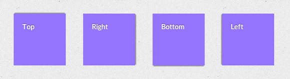
.drop-shadow { background: #9479fa; } .drop-shadow.top { box-shadow: 0 -4px 2px -2px rgba(0,0,0,0.4) } .drop-shadow.right { box-shadow: 4px 0 2px -2px rgba(0,0,0,0.4) } .drop-shadow.bottom { box-shadow: 0 4px 2px -2px rgba(0,0,0,0.4) } .drop-shadow.left { box-shadow: -4px 0 2px -2px rgba(0,0,0,0.4) }
影のあるブロックを選択します。
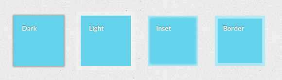
div[class*="emphasize-"] { background: #69D2E7; } .emphasize-dark { box-shadow: 0 0 5px 2px rgba(0,0,0,.35) } .emphasize-light { box-shadow: 0 0 0 10px rgba(255,255,255,.25) } .emphasize-inset { box-shadow: inset 0 0 7px 4px rgba(255,255,255,.5) } .emphasize-border { box-shadow: inset 0 0 0 7px rgba(255,255,255,.5) }
凸ブロック:
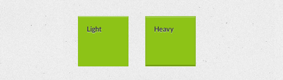
div[class*="embossed"] { background: #8ec12d; color: #333; text-shadow: 0 1px 1px rgba(255,255,255,0.9); } .embossed-light { border: 1px solid rgba(0,0,0,0.05); box-shadow: inset 0 1px 0 rgba(255,255,255,0.7); } .embossed-heavy { border: 1px solid rgba(0,0,0,0.05); box-shadow: inset 0 2px 3px rgba(255,255,255,0.3), inset 0 -2px 3px rgba(0,0,0,0.3), 0 1px 1px rgba(255,255,255,0.9); }
勾配
さまざまな種類のグラデーション:
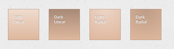
div[class*="gradient"]{ background-color: #DEB8A0; box-shadow: 0 0 0 1px #a27b62; } .gradient-light-linear { background-image: linear-gradient(rgba(255,255,255,.5), rgba(255,255,255,0)); } .gradient-dark-linear { background-image: linear-gradient(rgba(0,0,0,.25), rgba(0,0,0,0)); }
丸い角
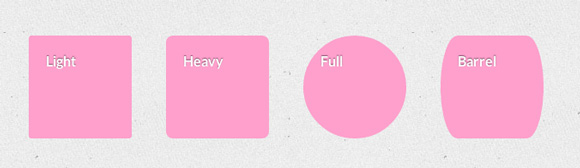
div[class*="rounded"] { background: #fca1cc; } .light-rounded { border-radius: 3px; } .heavy-rounded { border-radius: 8px; } .full-rounded { border-radius: 50%; } .barrel-rounded { border-radius: 20px/60px; }
参照資料
基本設計:
<!-- Inline --> - <a href="#"></a>. <!-- Block --> <a href="#"></a>
テキスト内のリンクのスタイルの例:
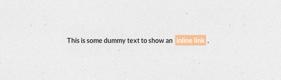
.inline-link-1 { display: inline-block; margin: 0 0.2em; padding: 3px; background: #97CAF2; border-radius: 2px; transition: all 0.3s ease-out; /* Font styles */ text-decoration: none; font-weight: bold; color: white; } .inline-link-1:hover { background: #53A7EA } .inline-link-1:active { background: #C4E1F8 } .inline-link-1:visited { background: #F2BF97 }
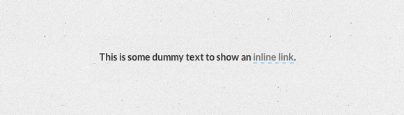
.inline-link-2 { display: inline-block; border-bottom: 2px dashed rgba(0,0,0,0.9); /* Font styles */ text-decoration: none; color: #777; } .inline-link-2:hover { border-bottom-style: dotted; } .inline-link-2:active { border-bottom-style: solid; } .inline-link-2:visited { border-bottom: 2px solid #97CAF2; }
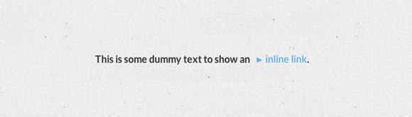
.inline-link-3 { display: inline-block; position: relative; padding-left: 6px; /* Font styles */ text-decoration: none; color: #6AB3EC; text-shadow: 0 1px 1px rgba(255,255,255,0.9); } .inline-link-3:hover { color: #3C9CE7; } .inline-link-3:before { content: "\25BA"; font-size: 80%; display: inline-block; padding-right: 3px; pointer-events: none; } .inline-link-3:hover:before { color: #F2BF97; }
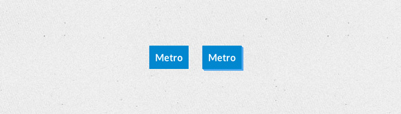
メトロスタイルのリンク:
.metro { display: inline-block; padding: 10px; margin: 10px; background: #08C; /* Font styles */ color: white; font-weight: bold; text-decoration: none; } .metro:hover { background: #0AF }
.metro.three-d { position: relative; box-shadow: 1px 1px #53A7EA, 2px 2px #53A7EA, 3px 3px #53A7EA; transition: all 0.1s ease-in; } .metro.three-d:active { box-shadow: none; top: 3px; left: 3px; }
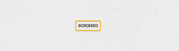
ストロークリンク:
.bordered-link { display: inline-block; padding: 8px; border: 3px solid #FCB326; border-radius: 6px; box-shadow: 0 2px 1px rgba(0, 0, 0, 0.2), inset 0 2px 1px rgba(0, 0, 0, 0.2); /* Font styles */ text-decoration: none; font-size: 14px; text-transform: uppercase; color: #222; } .bordered-link:hover { border-color: #FDD68B } .bordered-link:active { border-color: #FEE8BD }
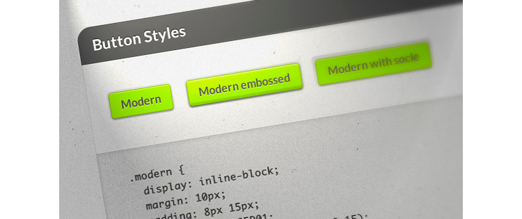
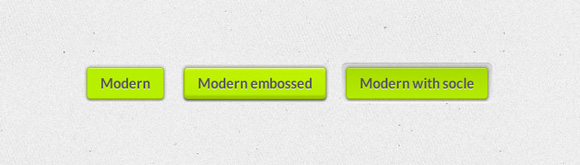
美しいボタン:
.modern { display: inline-block; margin: 10px; padding: 8px 15px; background: #B8ED01; border: 1px solid rgba(0,0,0,0.15); border-radius: 4px; transition: all 0.3s ease-out; box-shadow: inset 0 1px 0 rgba(255,255,255,0.5), 0 2px 2px rgba(0,0,0,0.3), 0 0 4px 1px rgba(0,0,0,0.2); /* Font styles */ text-decoration: none; text-shadow: 0 1px rgba(255,255,255,0.7); } .modern:hover { background: #C7FE0A }
.embossed-link { box-shadow: inset 0 3px 2px rgba(255,255,255,.22), inset 0 -3px 2px rgba(0,0,0,.17), inset 0 20px 10px rgba(255,255,255,.12), 0 0 4px 1px rgba(0,0,0,.1), 0 3px 2px rgba(0,0,0,.2); } .modern.embossed-link { box-shadow: inset 0 1px 0 rgba(255,255,255,0.5), 0 2px 2px rgba(0,0,0,0.3), 0 0 4px 1px rgba(0,0,0,0.2), inset 0 3px 2px rgba(255,255,255,.22), inset 0 -3px 2px rgba(0,0,0,.15), inset 0 20px 10px rgba(255,255,255,.12), 0 0 4px 1px rgba(0,0,0,.1), 0 3px 2px rgba(0,0,0,.2); } .modern.embossed-link:active { box-shadow: inset 0 -2px 1px rgba(255,255,255,0.2), inset 0 3px 2px rgba(0,0,0,0.12); }
.socle { position: relative; z-index: 2; } .socle:after { content: ""; z-index: -1; position: absolute; border-radius: 6px; box-shadow: inset 0 1px 0 rgba(0,0,0,0.1), inset 0 -1px 0 rgba(255,255,255,0.7); top: -6px; bottom: -6px; right: -6px; left: -6px; background: linear-gradient(rgba(0,0,0,0.1), rgba(0,0,0,0)); }
入力
基本構造:
<input type="text" placeholder="Input name">
クリック時に境界線半径を追加します。
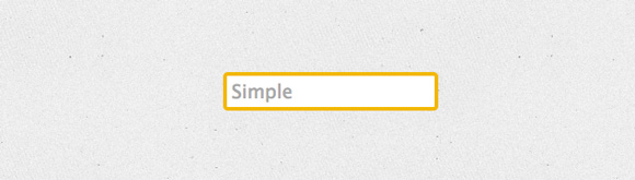
.simple-input { display: block; padding: 5px; border: 4px solid #F1B720; border-radius: 5px; color: #333; transition: all 0.3s ease-out; } .simple-input:hover { border-radius: 8px } .simple-input:focus { outline: none; border-radius: 8px; border-color: #EBD292; }
iOSの入力を繰り返します:
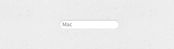
.mac { display: block; border: none; border-radius: 20px; padding: 5px 8px; color: #333; box-shadow: inset 0 2px 0 rgba(0,0,0,.2), 0 0 4px rgba(0,0,0,0.1); } .mac:focus { outline: none; box-shadow: inset 0 2px 0 rgba(0,0,0,.2), 0 0 4px rgba(0,0,0,0.1), 0 0 5px 1px #51CBEE; }
勾配あり:
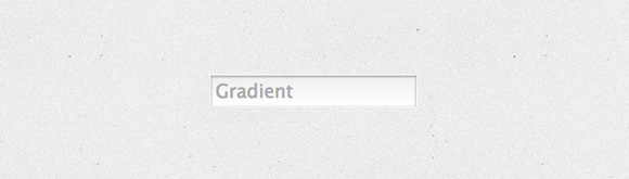
.depth { display: block; border: 1px solid rgba(255,255,255,0.6); background: linear-gradient(#eee, #fff); transition: all 0.3s ease-out; box-shadow: inset 0 1px 4px rgba(0,0,0,0.4); padding: 5px; color: #555; } .depth:focus { outline: none; background-position: 0 -1.7em; }
入力フォームの代わりに、1行だけ:
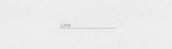
.line { display: block; border: none; color: #333; background: transparent; border-bottom: 1px dotted black; padding: 5px 2px 0 2px; } .line:focus { outline: none; border-color: #51CBEE; }
基本的なすぐに使用できるCSSスタイルの記事からの例。