
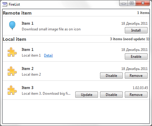
これを行うには、Qtに実装されているMVCアプローチを使用します。 出力は次のようになります。
プロセス全体は3つの部分に分かれています。
- モデル作成
- デリゲート作成
- プレゼンテーションを作成する
モデル作成
Qtでモデルを操作する一般的な原則はドキュメントに記載されており、すべてが詳細に説明されています。
それでは始めましょう。 まず、基本モデルを決めましょう。 リストにはセクションが含まれている可能性があるため、単純なツリーモデルが必要です。 基本構成では使用できませんので、自分で実装します。
これを行うには、 QAbstractItemModelを継承し、すべての抽象メソッドを実装します(これは、モデルを構築するために必要な最小限の要件です)。
int columnCount ( const QModelIndex & parent = QModelIndex() ) const; QVariant data ( const QModelIndex & index, int role = Qt::DisplayRole ) const; QModelIndex index ( int row, int column, const QModelIndex & parent = QModelIndex() ) const; QModelIndex parent ( const QModelIndex & index ) const; int rowCount ( const QModelIndex & parent = QModelIndex() ) const; Qt::ItemFlags flags ( const QModelIndex & index ) const;
また、モデルを変更できるように、メソッドをオーバーライドします。
bool setData ( const QModelIndex & index, const QVariant & value, int role = Qt::EditRole );
モデルの詳細は説明しませんが、完全な実装は添付のソースで確認できます。
デリゲート作成
最も興味深い重要な部分はここにあります。 このクラスは、データがどのように表示され、ユーザーと対話するかを担当します。
この実装により、CheckBoxでの作業がQItemDelegateデリゲートでどのように実装されたかがわかりました。 したがって、ドキュメントを読むことに加えて、ソースコードを調べることも有用です。そこには多くの有用なソリューションがあります。
したがって、デリゲートの仕事は、ビューに要素を表示し、そのクリックを処理することです(Firefoxなどのあらゆる種類のボタンが必要です)。
描画
このエントリポイントは、paintメソッドにあります。
void QvObjectDelegate::paint( QPainter * painter, const QStyleOptionViewItem & option, const QModelIndex & index ) const { painter->save(); if(index.parent().isValid()) { if(needRestart(index)) { drawItemBackground(painter, option, index); paintObjectHeader(painter, option, index); } paintObject(painter, option, index); } else { paintHeader(painter, option, index); } painter->restore(); painter->save(); painter->setPen(QColor(0xD7, 0xD7, 0xD7)); painter->drawLine(option.rect.bottomLeft(), option.rect.bottomRight()); painter->restore(); }
表示された要素がヘッダーかどうかに応じて、適切なメソッドを呼び出します。 すべてを1つに入れると、ひどく読めないフットクロスが得られ、メソッドが小さく/単純であればあるほど、それらをナビゲートしやすくなります。
セクションタイトルのレンダリング
void QvObjectDelegate::paintHeader( QPainter * painter, const QStyleOptionViewItem & option, const QModelIndex & index ) const { QPainter &p = *painter; p.save(); p.setClipRect(option.rect); p.setPen(QColor(77, 77, 77)); // QRect tr; QString name = index.data(Qt::DisplayRole).toString(), desc = index.data(QvObjectModel::DetailRole).toString(); QFont f = option.font; f.setPointSize(12); f.setWeight(QFont::Bold); QFontMetrics fm(f); tr = fm.boundingRect(name); p.setFont(f); p.drawText(option.rect, Qt::AlignVCenter | Qt::AlignLeft, name); f = option.font; f.setWeight(QFont::DemiBold); p.setFont(f); p.drawText(option.rect, Qt::AlignVCenter | Qt::AlignRight, desc); p.restore(); }
ここではすべてが非常に簡単です。 テキストスタブを取得し、高さと左端を揃えて表示します。 要素の数とその他の情報を含む説明は右に揃えられます。
要素本体の描画
void QvObjectDelegate::paintObject(QPainter * painter, const QStyleOptionViewItem & option, const QModelIndex & index ) const { QRect tr; QString name = index.data(Qt::DisplayRole).toString(), description = index.data(QvObjectModel::DescriptionRole).toString(); QPainter &p = *painter; p.setClipRect(option.rect); p.setPen(QColor(210, 210, 210)); p.setBrush(QColor(240, 240, 240)); p.setPen(QColor(77, 77, 77)); p.translate(option.rect.topLeft()); p.translate(0, sizeHint(option, index).height() - ITEM_HEIGHT); p.translate(OFFSET_H, OFFSET_H); QImage img = index.data(Qt::DecorationRole).value<QImage>(); if(!img.isNull()) { p.drawImage(0,0, img); } else { p.drawImage(0,0, defaultIcon_); } p.translate(ICON_SIZE + OFFSET_H, 0); // 10px // QFont f = option.font; f.setPointSize(10); f.setWeight(QFont::Bold); QFontMetrics fm(f); tr = fm.boundingRect(name); p.setFont(f); p.drawText(0, tr.height()-5, name); // p.setFont(option.font); fm = QFontMetrics(option.font); QDate date_ = index.data(QvObjectModel::DateRole).toDate(); int version_ = index.data(QvObjectModel::VersionRole).toInt(); QString versionStr_; if(!date_.isNull()) { versionStr_ = date_.toString("dd MMMM yyyy"); } else if(version_ > 1000000000){ int ver_min = 0; int ver = version_ / 1000000000; ver_min = version_ % 1000000000; int major = ver_min / 10000000; ver_min = ver_min % 10000000; int minor = ver_min / 100000; ver_min = ver_min % 100000; versionStr_ = QCoreApplication::translate("list", "%1.%2.%3.%4", "Version in list") .arg(ver).arg(major, 2, 10, QLatin1Char('0') ) .arg(minor, 2, 10, QLatin1Char('0')).arg(ver_min); } if(!versionStr_.isEmpty()) { tr = fm.boundingRect(versionStr_); tr.moveTo(option.rect.width() - ICON_SIZE - 2*OFFSET_H - tr.width() - OFFSET_BUTTON, 0 ); painter->drawText(tr, Qt::TextSingleLine, versionStr_); } int maxWidth(option.rect.width() - widthButtonGroup(index) - ICON_SIZE - OFFSET_H - DETAIL_OFFSET ); if(!index.data(QvObjectModel::DetailRole).toString().isEmpty()) { maxWidth -= fm.boundingRect(QCoreApplication::translate("list", "Detail")).width(); } description = fm.elidedText(description, Qt::ElideRight, maxWidth); p.translate(0, ICON_SIZE / 2); tr = fm.boundingRect(description); p.drawText(0, tr.height(), description); if(!index.data(QvObjectModel::DetailRole).toString().isEmpty()) { paintDetail(painter, option, index); } if(index.flags().testFlag(Qt::ItemFlag(QvAbstractListItem::Downloading))) { paintObjectProgress(painter, option, index); } paintObjectBtn(painter, option, index); }
まず、描画領域を制限し、誤って隣人を登らないようにクリッピングを設定します。
2番目のステップは、コンテンツを表示する相対的なポイントに移動することです。
p.translate(option.rect.topLeft()); p.translate(0, sizeHint(option, index).height() - ITEM_HEIGHT); p.translate(OFFSET_H, OFFSET_H);
2行目は、情報メッセージの高さを考慮するために必要です。それについては低くなります。 次に、アイコン、名前、説明、およびバージョンを表示します。 スケジュールを表示するとき、テキストがボタンやその他の要素の下に収まらないようにすることも考慮します。 したがって、最大許容幅を計算し、より見やすくするために切り取ります。
描画ボタンと読み込みバー
コントロールがシステムと同じように見えるようにしたいので、アプリケーションのスタイルセットとレンダリング用に提供されたプリミティブを使用します。
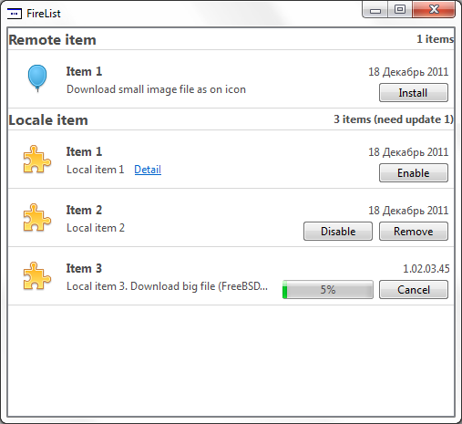
ダウンロードインジケーターから始めましょう。
void QvObjectDelegate::paintObjectProgress( QPainter * painter, const QStyleOptionViewItem & option, const QModelIndex & index ) const { QStyleOptionProgressBarV2 opt; initStyleProgressOption(&opt, index); QStyle *style = QApplication::style(); opt.rect.setLeft(option.rect.width() - (CHECK_WIDTH + OFFSET_H) * 2 - ICON_SIZE - OFFSET_BUTTON - buttonRect.width() - OFFSET_BUTTON ); opt.rect.setTop( 4 ); opt.rect.setWidth(CHECK_WIDTH * 2); opt.rect.setHeight(PROGRESS_HEIGHT); painter->setPen(QColor(77, 77, 77)); style->drawControl(QStyle::CE_ProgressBar, &opt, painter); } void QvObjectDelegate::initStyleProgressOption( QStyleOptionProgressBar *option, const QModelIndex & index ) const { int value = index.data(QvObjectModel::ProgressRole).toInt(); if (!option) return; option->rect = QRect(100, 100, 100, 100); option->state |= QStyle::State_Active; option->state |= QStyle::State_Enabled; option->state |= QStyle::State_Horizontal; option->minimum = 0; option->maximum = 100; //maximum?maximum:100; option->progress = value; option->textAlignment = Qt::AlignCenter; option->textVisible = true; option->text = QString("%1%").arg(value); if (QStyleOptionProgressBarV2 *optionV2 = qstyleoption_cast<QStyleOptionProgressBarV2 *>(option)) { optionV2->orientation = Qt::Horizontal ; // ### Qt 5: use State_Horizontal instead optionV2->invertedAppearance = false; optionV2->bottomToTop = true; } }
このフラグメントの基礎は、ソース、つまりQProgressBarから再度取得されました。 出力については、QStyleOptionProgressBarV2構造体に置き換え不可能な値を入力します(詳細についてはドキュメントを参照してください)。 初期値、最大値、現在値、およびインディケーターの上部に表示される碑文のテキストを設定します。 その後、これらすべてが処理のためにスタイルに送信されます。
style->drawControl(QStyle::CE_ProgressBar, &opt, painter);
インジケータの後、ボタンに進みます。
各リスト項目は、さまざまな有効な操作を提供できる状態に応じて、さまざまな状態になります。 最初に、実行可能なアクションのリストを作成します。
QVector<QvObjectDelegate::ButtonAction> QvObjectDelegate::getButtons( const QModelIndex &index ) const { QVector<ButtonAction> tags_; if(needRestart(index) ) { tags_ << baRestart << baCancel; } else if( index.flags() & Qt::ItemFlag(QvAbstractListItem::Downloading) ) { tags_ << baCancel; } else { bool installed = index.data(QvObjectModel::InstalledRole).toBool(), enabled = index.data(QvObjectModel::EnabledRole).toBool(), buildin = index.data(QvObjectModel::BuildInRole).toBool(); if (installed && (index.flags() & Qt::ItemFlag(QvAbstractListItem::hasUpdate))) { tags_ << baUpdate;} if (installed && index.flags() & Qt::ItemFlag(QvAbstractListItem::canBeToggled)) { tags_ << (enabled ? baDisable : baEnable);} if (installed && !buildin) { tags_ << baRemove;} if (!installed) { tags_ << baInstall; } } return tags_; }
QStyleOptionButton構造体に入力し、アクションリストの各要素に対してボタンを描画します。
void QvObjectDelegate::drawButton( QStyleOptionButton &o, const QPoint &p, QPainter * painter ) const { if(o.rect.contains(p)) o.state |= QStyle::State_Sunken; QStyle * style = QApplication::style(); if(style) style->drawControl(QStyle::CE_PushButton, &o, painter ); o.state &= ~QStyle::State_Sunken; o.rect.translate(buttonRect.width() + OFFSET_BUTTON, 0); }
最後に、必要に応じて、情報メッセージを表示します。
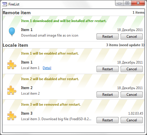
これで結論に達しましたが、その意味は、描かれたボタンを押すように教えられていない場合です。 したがって、次の部分であるマウスクリックの処理に進みます。
処理をクリックします
ビューの要素をクリックすることに関するすべてのイベントはメソッドに送られます:
bool editorEvent( QEvent *event, QAbstractItemModel *model, const QStyleOptionViewItem &option, const QModelIndex &index );
再定義します。
Q_ASSERT(event); Q_ASSERT(model); // make sure that we have the right event type if ((event->type() == QEvent::MouseButtonRelease) || (event->type() == QEvent::MouseMove) || (event->type() == QEvent::MouseButtonPress)) { return validateLabel(index, option, event) || validateButton(index, option, event); } else if (event->type() == QEvent::KeyPress) { if (static_cast<QKeyEvent*>(event)->key() != Qt::Key_Space && static_cast<QKeyEvent*>(event)->key() != Qt::Key_Select) return false; } else { return false; } return false;
ボタンは、ボタンを押したり、離したり、ホバリングしたときに反応するはずです。
ボタンのクリックを確認すると、使用可能な操作のリストが再び表示されます。出力の順序はその時点で受け取った順序と一致するため、配列を調べてどのボタンが正方形に当たるかを判断することで対応を確立するのは簡単です。 クリックがあった要素のインデックスで対応する信号を送信した後。 詳細リンクについても同じことを行います。
ビューを作成
QTreeViewを使用して、ツリー構造を表します。 したがって、インデントは必要ないので、コンストラクターで適切なパラメーターを設定します。 主な操作はモデルのインストール中に行われ、デリゲート信号とモデルスロットの関係を確立します。
その結果、モデル、デリゲートを構築し、すべての接続を構成すると、Firefoxの要素のリストが取得されます。
以下のリンクでは、リストの操作と要素のさまざまな状態を示すデモプロジェクトのソースコードをダウンロードできます。 私のプロジェクトでそれを使用して利用可能なアップデートとモジュールのリストを表示するため、ネットワークからファイルをダウンロードする機能もサンプルに含めました( この例では、FreeBSD 8.2イメージファイルがダウンロードされます )。
建設的な批判とコメントを歓迎します。
ソース: ajieks.ru/download/file_list.zip
免責事項
与えられた例は既製のコンポーネントのふりをするものではなく、情報提供を目的として提示されており、使用する際には適応が必要です。 作業ドラフトから取られ、タスクを完全に実行します。