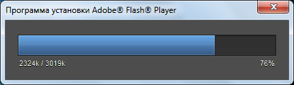
habrakatの下で、すべてのコードと実際の例へのリンク。
まず、簡単なマークアップを作成します。
<div class="bar_wrap"> <div class="bar" style="width:76%"></div> </div> <div class="captions"> <div class="left">2324k / 3019k</div> <div class="right">76%</div> </div>
それでは、スタイルを書きましょう。
body { background: #4D4D4D; } .bar_wrap { border: 1px solid #1C1C1C; background-color: #313131; -webkit-box-shadow: 0 0 1px #666, inset 0 1px 1px #222; -moz-box-shadow: 0 0 1px #666, inset 0 1px 1px #222; -o-box-shadow: 0 0 1px #666, inset 0 1px 1px #222; box-shadow: 0 0 1px #666, inset 0 1px 1px #222; background-image: -webkit-linear-gradient(#323232, #2E2E2E 50%, #323232); background-image: -moz-linear-gradient(#323232, #2E2E2E 50%, #323232); background-image: -o-linear-gradient(#323232, #2E2E2E 50%, #323232); } .bar { height: 30px; max-width: 100%; background-color: #5387BA; border-right: 1px solid #282828; -webkit-box-shadow: inset 0 0 1px #ddd; -moz-box-shadow: inset 0 0 1px #ddd; -o-box-shadow: inset 0 0 1px #ddd; box-shadow: inset 0 0 1px #ddd; background-image: -webkit-linear-gradient(#66A3E2, #5387BA 50%, #4B79AF 51%, #385D87); background-image: -moz-linear-gradient(#66A3E2, #5387BA 50%, #4B79AF 51%, #385D87); background-image: -o-linear-gradient(#66A3E2, #5387BA 50%, #4B79AF 51%, #385D87); } .captions { color: #FDFDFD; padding: 5px 2px 0; font: 11px/14px sans-serif; text-shadow: 0 1px 0 #000; } .left { float: left; } .right { float: right; }
その結果、以下が得られます。
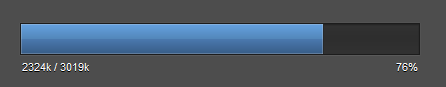
はい、これは記事の冒頭のスクリーンショットではなく、Firefox 7で表示される結果です!
Safari 5.1、Opera 11.52、Chrome 15でもテストされています。
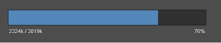
古いブラウザでも見た目が良い
実際の例はこちらにあります。
UPD:ホバーアニメーションを追加して、サンプルを盛り上げました。
javascriptアニメーションについてはここによく書かれていますが 、繰り返したくありません。