
上部の角は問題ではありませんが、下部の角はより複雑です。 猫の下で方法を説明します。
純粋なhtml
Webサイトのレイアウトでは、ほとんどすべての視覚効果に出会うことができます。 最悪の場合、それらを実現するには画像を使用する必要があります。 この場合のタスクは、いつものように、それらを使用しないことです(迅速にロードされ、手頃な価格で、更新が容易であるため)。 マークアップは次のとおりです。
<ul class="tabs group"> <li class="active"><a href="#one">One</a></li> <li><a href="#two">Two</a></li> <li><a href="#three">Three</a></li> <li><a href="#three">Four</a></li> </ul>
クラス名「アクティブ」はアクティブなタブを示します。
仕組み
これが難しい理由は、最初のブロックを超えるフォームを取得する必要があるためです。 追加のマークアップなしでこれを実現するには、疑似要素を使用します。 これらの要素が何であるかについて記憶をリフレッシュする必要がある場合は、 この記事とこの記事を読んでこれを行うことができます。 cssを介して直接、様式化された要素をページに追加できます。 各要素は、擬似セレクターを使用して、beforeおよび:afterの2つの追加要素を生成できます。 各タブには4つ使用します。 これは、各タブがリスト項目とアンカーの2つの要素で構成されているために可能です。
とりあえずコードを確認せずに、ステップごとにプロセスを視覚化しましょう。
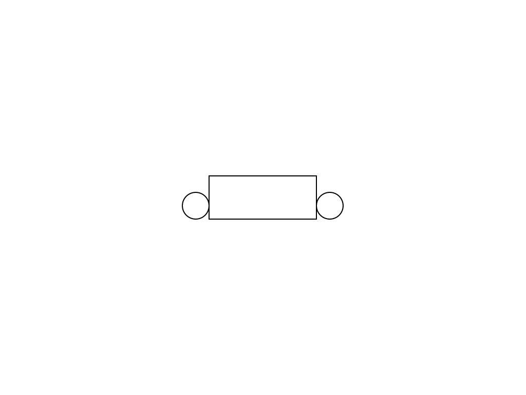
1)初期状態
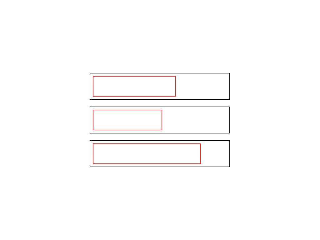 通常、リストアイテムはブロックアイテムであり、アンカーは小文字のアイテムです。 だから私たちはそのような樹皮を手に入れます。
2)1列に構築する
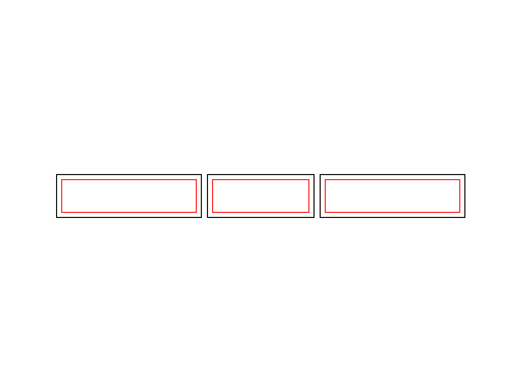 フロートの割り当て:リストの要素の左に、それらを一列に並べて、内側のアンカーの幅を短くします。 実際には-コンテンツの幅に。
3)同じサイズにする
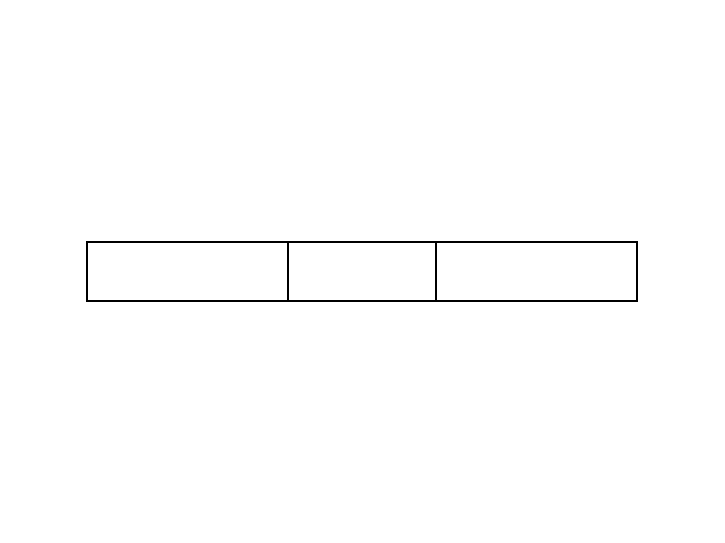 それ自体では、リストアイテムにはパディングまたはマージン(マージンまたはパディング)がないため、リストアイテムとそれらにネストされたアンカーのサイズは同じです。
4)1つのタブを検討する
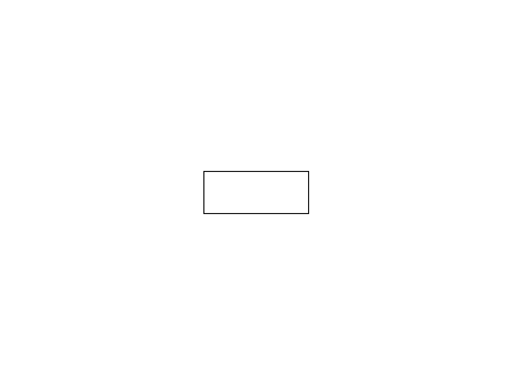 1つのタブを詳しく見てみましょう
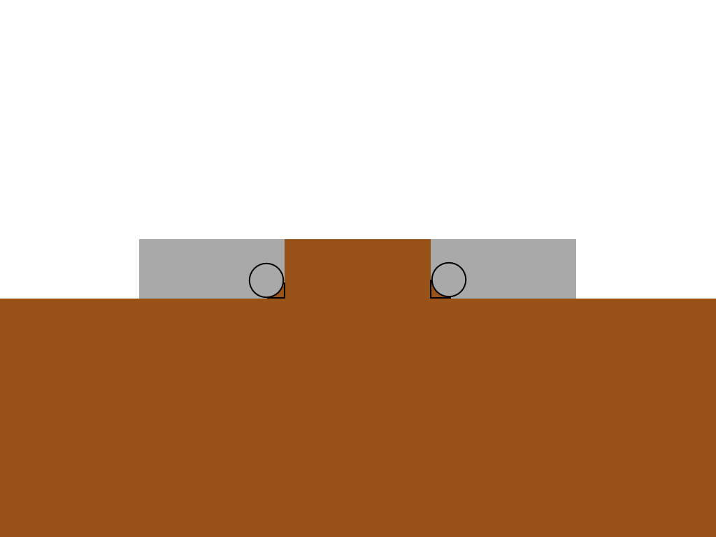
5)サークル
 4つの擬似要素のうち2つを使用して、 円をタブの下端の左右に配置します。
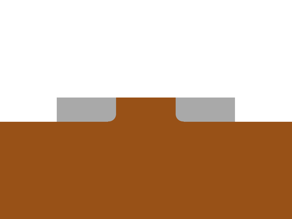
6)長方形
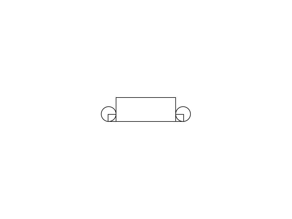 残りの2つの擬似要素を使用して、小さな長方形を作成します。
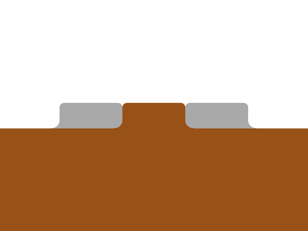
7)タブとコンテンツの色付け
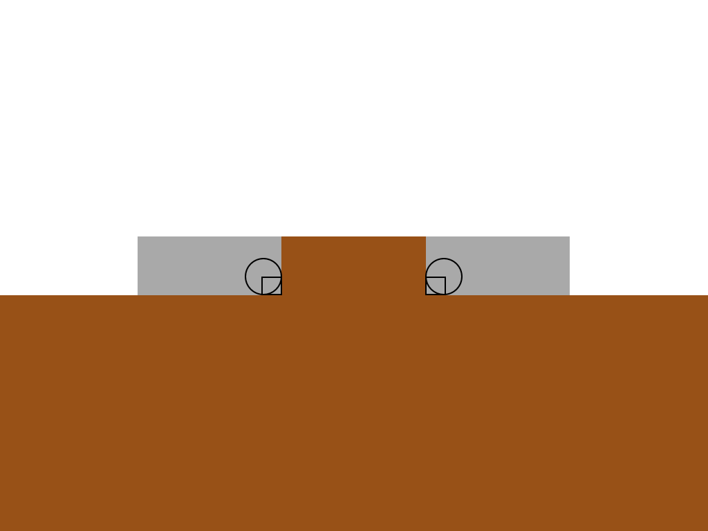 アクティブなタブとコンテンツには共通の背景色があります。
8)擬似要素の色付け
 四角形はアクティブなタブの色に対応し、円はその背後の背景色に対応します。
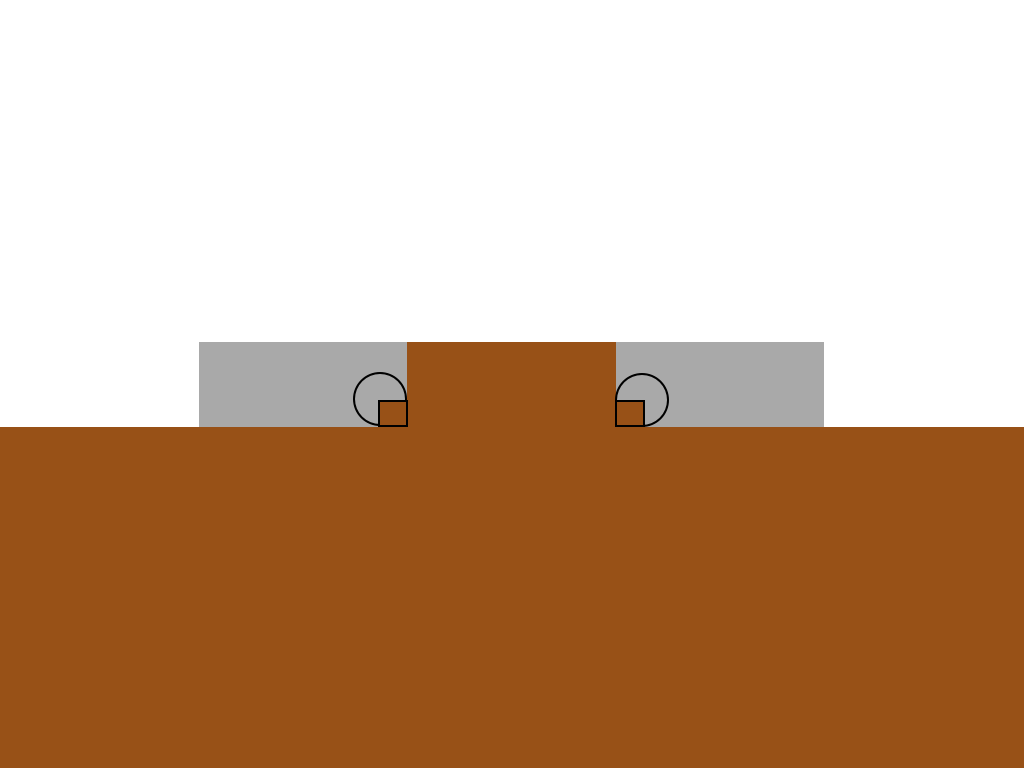
9)重複する要素
 z-indexを使用して、円と重なる長方形を提供します。
10)フレームなし
 フレームはちょうど図にありましたが、実際にはこのようになります。
11)仕上げ
 同じ原則を外側のタブに適用し、境界線の半径を使用して上部の角を丸めます。 できた
CSS
これは巨大なCSSブロックですが、理解しやすいように詳細にコメントしました。
.tabs li { /* */ float: left; /* */ position: relative; } .tabs a { /* */ float: left; padding: 10px 40px; text-decoration: none; /* */ color: black; background: #ddc385; /* */ -webkit-border-top-left-radius: 15px; -webkit-border-top-right-radius: 15px; -moz-border-radius-topleft: 15px; -moz-border-radius-topright: 15px; border-top-left-radius: 15px; border-top-right-radius: 15px; } .tabs .active { /* */ z-index: 3; } .tabs .active a { /* */ background: white; color: black; } .tabs li:before, .tabs li:after, .tabs li a:before, .tabs li a:after { /* */ position: absolute; bottom: 0; } /* , , */ .tabs li:last-child:after, .tabs li:last-child a:after, .tabs li:first-child:before, .tabs li:first-child a:before, .tabs .active:after, .tabs .active:before, .tabs .active a:after, .tabs .active a:before { content: ""; } .tabs .active:before, .tabs .active:after { background: white; /* */ z-index: 1; } /* */ .tabs li:before, .tabs li:after { background: #ddc385; width: 10px; height: 10px; } .tabs li:before { left: -10px; } .tabs li:after { right: -10px; } /* */ .tabs li a:after, .tabs li a:before { width: 20px; height: 20px; /* … … */ -webkit-border-radius: 10px; -moz-border-radius: 10px; border-radius: 10px; background: #222; /* */ z-index: 2; } .tabs .active a:after, .tabs .active a:before { background: #ddc385; } /* */ .tabs li:first-child.active a:before, .tabs li:last-child.active a:after { background: #222; } .tabs li a:before { left: -20px; } .tabs li a:after { right: -20px; }
以上です!
IE9以降を含む最新のすべてのブラウザーで動作します。 古いブラウザでは性能が低下します(角が丸くなることはありません)。
軽度の劣化の改善
この章は、IEに丸い角がないことはレイアウトデザイナーの個人的なin辱ではないとクライアントに説明できなかった不幸な人々のために翻訳者によって書かれました。 できるだけ軽度の劣化を改善しましょう。
追加のCSS:
<style> /* */ /*ie 7*/ *+html .tabs li{ background: url("img/tabs.png") 0 -37px no-repeat; } *+html .tabs li a{ background: url("img/tabs.png") 100% -37px no-repeat; padding: 10px 40px 10px 20px; margin:0 0 0 20px; } *+html .tabs li.active{ background:url("img/tabs.png") 0 0 no-repeat; } *+html .tabs li.active a{ background:url("img/tabs.png") 100% 0 no-repeat; } *+html .tabs li{ zoom:expression(function(t) { t.runtimeStyle.zoom = 1; var before = document.createElement('span'); var after = document.createElement('span'); before.className = 'before-fix-for-ie'; after.className = 'after-fix-for-ie'; t.appendChild(before); t.appendChild(after); }(this)); } /*ie 6*/ * html .tabs li{ background:url("img/tabs.png") 0 -37px no-repeat; } * html .tabs li a{ background:url("img/tabs.png") 100% -37px no-repeat; padding: 10px 40px 10px 20px; margin:0 0 0 20px; } * html .tabs li.active{ background-position:0 0; } * html .tabs li.active a{ background:url("img/tabs.png") 100% 0 no-repeat; } * html .tabs li{ zoom:expression(function(t) { t.runtimeStyle.zoom = 1; var before = document.createElement('span'); var after = document.createElement('span'); before.className = 'before-fix-for-ie'; after.className = 'after-fix-for-ie'; t.appendChild(before); t.appendChild(after); }(this)); } /* */ .tabs li .before-fix-for-ie{ position:absolute; overflow:hidden; font-size:0; line-height:0; top:27px; left:-10px; width:10px; height:10px; background:url("img/left.png") 0 0 no-repeat; } * html .tabs li .before-fix-for-ie{ background:none; filter: progid:DXImageTransform.Microsoft.AlphaImageLoader( src='img/left.png', sizingMethod='image'); } .tabs li.active .before-fix-for-ie{ background:url("img/active-left.png") 0 0 no-repeat; } * html .tabs li.active .before-fix-for-ie{ background:none; filter: progid:DXImageTransform.Microsoft.AlphaImageLoader( src='img/active-left.png', sizingMethod='image'); } .after-fix-for-ie{ position:absolute; overflow:hidden; font-size:0; line-height:0; top:27px; right:-10px; width:10px; height:10px; background:url("img/right.png") 0 0 no-repeat; } * html .tabs li .after-fix-for-ie{ background:none; filter: progid:DXImageTransform.Microsoft.AlphaImageLoader( src='img/right.png', sizingMethod='image'); } .tabs li.active .after-fix-for-ie{ background:url("img/active-right.png") 0 0 no-repeat; } * html .tabs li.active .after-fix-for-ie{ background:none; filter: progid:DXImageTransform.Microsoft.AlphaImageLoader( src='img/active-right.png', sizingMethod='image'); } </style> <!--[if IE 8]> <style> /*ie 8*/ .tabs li{ background:transparent url("img/tabs.png") 0 -37px no-repeat; } .tabs li a{ background:transparent url("img/tabs.png") 100% -37px no-repeat; padding: 10px 40px 10px 20px; margin:0 0 0 20px; } .tabs li.active{ background:transparent url("img/tabs.png") 0 0 no-repeat; } .tabs li.active a{ background:transparent url("img/tabs.png") 100% 0 no-repeat; } body .tabs li:before{ content:"."; text-indent:-9000px; overflow:hidden; height:10px; width:10px; font-size:0; line-height:0; display:block; position:absolute; top:27px; left:-10px; z-index:10; zoom:1; background:transparent url("img/left.png") 0 0 no-repeat; } body .tabs li:after{ content:"."; text-indent:-9000px; overflow:hidden; height:10px; width:10px; font-size:0; line-height:0; display:block; position:absolute; top:27px; right:-10px; z-index:10; zoom:1; background:transparent url("img/right.png") 0 0 no-repeat; } body .tabs li.active:before{ content:"."; text-indent:-9000px; overflow:hidden; height:10px; width:10px; font-size:0; line-height:0; display:block; position:absolute; top:27px; left:-10px; z-index:10; zoom:1; background:transparent url("img/active-left.png") 0 0 no-repeat; } body .tabs li.active:after{ content:"."; text-indent:-9000px; overflow:hidden; height:10px; width:10px; font-size:0; line-height:0; display:block; position:absolute; top:27px; right:-10px; z-index:10; zoom:1; background:transparent url("img/active-right.png") 0 0 no-repeat; } </style> <![endif]-->
ie8では、ie8で機能し、ie9で機能しないハックが見つからなかったため、CSSを条件付きコメントで強調表示された別のブロックに配置する必要がありました。 誰かがこれを知っているなら、共有してください。
詳細を調べる必要はありませんでしたが、必要がある場合は、質問を提起する可能性のある点を喜んで説明します。
追加が役立つことを願っています。