Over the years, I have styled the states of the elements
:hover
:focus
and
:active
same way. I don’t remember exactly when exactly I started to do this. But this is far from the best approach. Why, I will try to explain in this article.
Here is an example of the code that I always used.
.selector { &:hover, &:focus, &:active { ... } }
When I began to pay more attention to the availability of the interface when working with the keyboard (the state of focus in particular), I came to the conclusion that we should not stylize different states of elements equally.
Guidance, focus and active state should be styled differently.
The reason is simple: These are different conditions!
Today I want to show you the magical way to arrange all three states without much effort.
Let's start with
:hover
.
Hover Styling (: hover)
:hover
fires when the user hovers over an element.
Usually this condition is to change the background color of the
background-color
and / or text
color
. The differences do not have to be obvious, because users already know that they hover over some element.
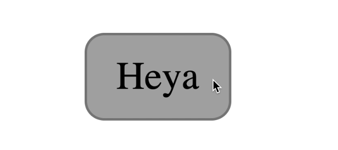
button { background-color: #dedede; } button:hover { background-color: #aaa; }

Styling Focus (: focus)
:focus
fires when an element receives focus. This is achieved in two ways:
- when selecting an item with the Tab button
- when you click on an item with the mouse
Focal elements include:
- Links (
<a>
) - Buttons (
<button>
) - Form elements (
<input>
,<textarea>
, etc.) - Elements with the
tabindex
attribute
Some important points to keep in mind:
- Users cannot select with the Tab button an element with the attribute
tabindex="-1"
, but can click on it with the mouse. A click causes a state of focus. - On Safari and Firefox Mac OS browsers, click does not cause focus on
<button>
elements - When you click on the <a> link, the focus remains on it while the mouse button is pressed. When you release the button, focus is redirected to another place if the
id
existing on the same page is specified in thehref
attribute
By stylizing the focus state, we care more about users who work with the keyboard interface than those who use the mouse.
When users press Tab, they don’t know which element the focus will go to, but they can only guess. That is why we need a noticeable change in state - to draw the user's attention to the focused element .
In most cases, focus design by default is fine. If you want to style it in your own way , remember these four points:
- Adding a stroke (outline)
- Create animations
- Change
background-color
-
color
change
Since changing the
background-color
and
color
properties is often done with
:hover
, it makes sense to arrange the
:focus
state with a stroke or animation.
You can use combinations of the
outline
,
border
and
box-shadow
properties to create interesting focus styles. How this can be done, I described in the article " Creating a custom focus style ".
button { background-color: #dedede; } button:hover { background-color: #aaa; } button:focus { outline: none; box-shadow: 0 0 0 3px lightskyblue; }

Stylization of the active state (: active)
When interacting with something in real life, you expect a kind of response. For example, when you press a button, you expect it to be pressed.
On websites, this response is also useful. You can stylize the moment of "pressing the button" with
:active
. This state is called when you interact with an element . In this case, interaction means:
- Holding the left mouse button on an element (even when it is out of focus)
- Hold the spacebar (on the buttons)
button:active { background-color: #333; border-color: #333; color: #eee; }

Two points to note:
- Holding a space causes the
:active
state on the buttons (<button>), but holding Enter does not - Enter launches links but does not cause an active state. Spacebar doesn't launch links at all
Default Link Styles
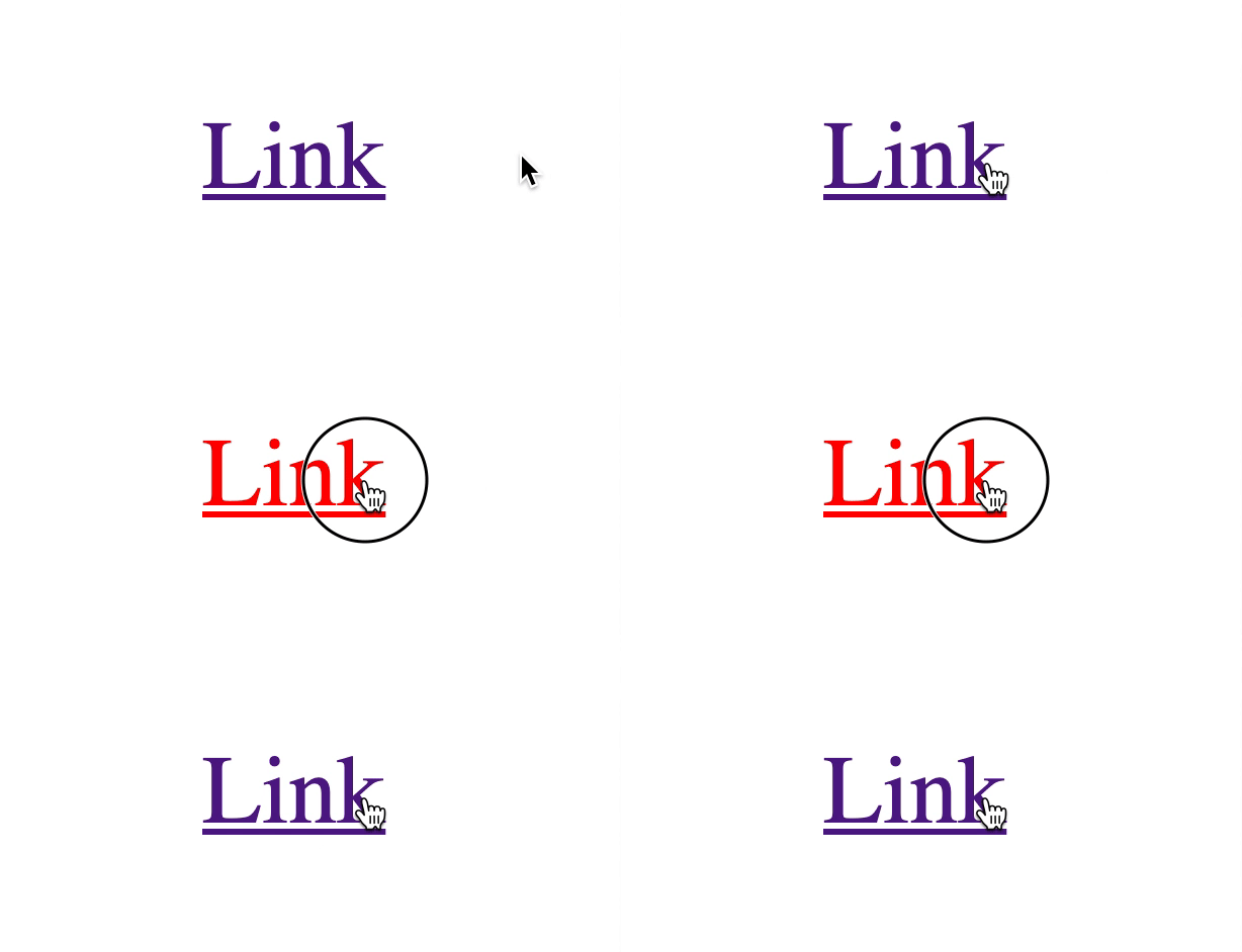
Links have active state styles by default. When pressed, they turn red

Relationship between: active and: focus
When you hold the left mouse button on the focused element, its active state is called up. But at the same time, the focus state is also called up.
When you release the left mouse button, the focus remains on the element.
This applies to most focusable items except links and buttons.
For links:
- Holding down the left mouse button in Firefox and Chrome causes the states
:active
and:focus
. In Safari, only state:active
(tested only on Mac OS) - If you release the mouse button
:focus
remains on the link (if thehref
attribute does not link toid
on the same page). In Safari, focus returns to<body>
For buttons:
- When you hold the left mouse button: both states
:active
and:focus
are called only in Chrome. State:focus
is not called at all in Safari and Firefox (Mac). I wrote about this strange behavior here .
If you want the clicks to cause focus for the buttons, you need to add this JavaScript as soon as possible (for what it's necessary, you can read in the article, the link to which I indicated above).
document.addEventListener('click', event => { if (event.target.matches('button')) { event.target.focus() } })
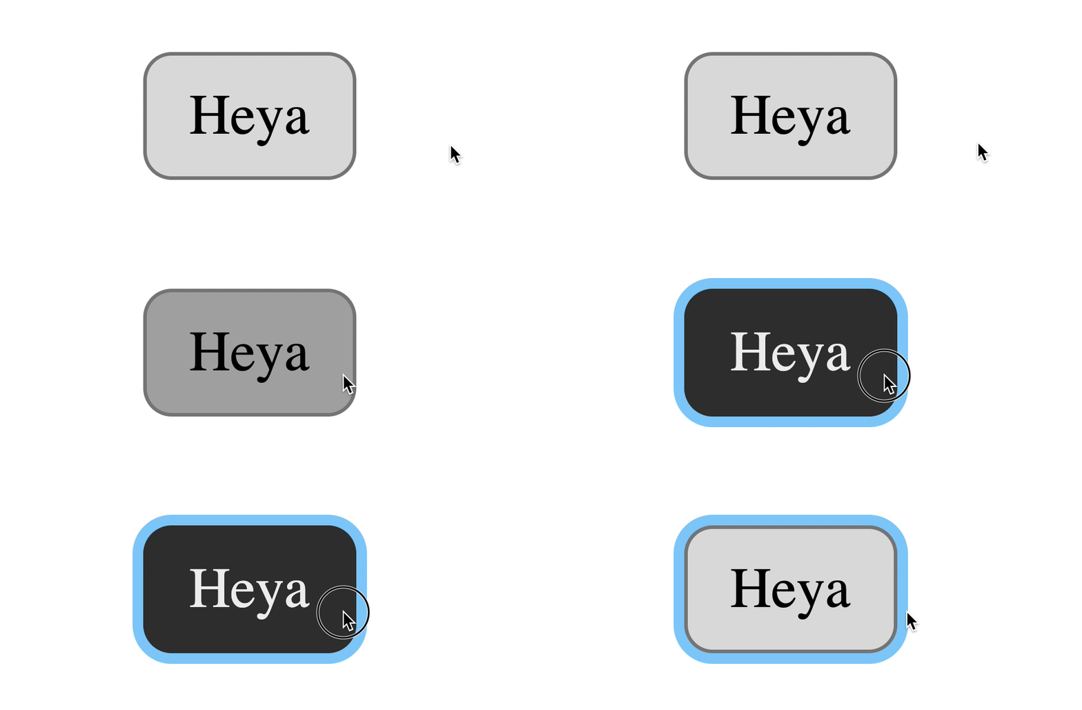
Adding this code will change the button behavior to the following:
- When you hold down the mouse button,:
:active
is called in all browsers:focus
only in Chrome - If you release the mouse button, it calls
:focus
on Safari and Firefox (Mac OS).:focus
remains on the button in all browsers

Button behavior in Safari after adding a piece of JS code
Now that you know everything you need about the hover, focus, and active states, I want to talk about styling all three
Magic combination
The magic combination allows users to get a response when they aim, focus or interact with an element. Here is the code you need:
.element:hover, .element:active { /* / */ } .element:focus { /* */ }
For mouse users:
- When the user hovers over an element,
background-color
(and / orcolor
) changes. There is a response. - When the user clicks on an element, the stroke outline of the focus is displayed. There is a response.

For keyboard users:
- When the user selects an item with the Tab button, the focus stroke is displayed. There is a response.
- When they interact with an element,
background-color
(and / orcolor
) changes. There is a response.

The best of both worlds!
- I have not tested the magic combination carefully . This is just an argument in favor of this concept concept. I would be grateful if you could help me check it out and let me know about possible problems.
- If you will check, do not use Codepen . The focus state for links in Codepen is very strange. If you hover over a link, the focus stroke is deleted. Why? I dont know. Sometimes it seems to me that it is best to check such things without the use of additional tools. Just the good old HTML, CSS, JS.
Not a magical (but maybe even better) combination
As I mentioned above, button clicks have weird behavior in Safari and Firefox on Mac OS. If you added the snippet of JavaScript code that I suggested above, the magic combination still works. But not perfect.
Here's what happens on Safari and Firefox on Mac OS:
- When the user holds the mouse button down, nothing changes
- When users release the button, the item receives focus.

If you think this is enough, then the magic combination works. You can stop there.
But if you think this behavior is not accessible enough, you might want to style the states
:hover
:focus
and
:active
separately.
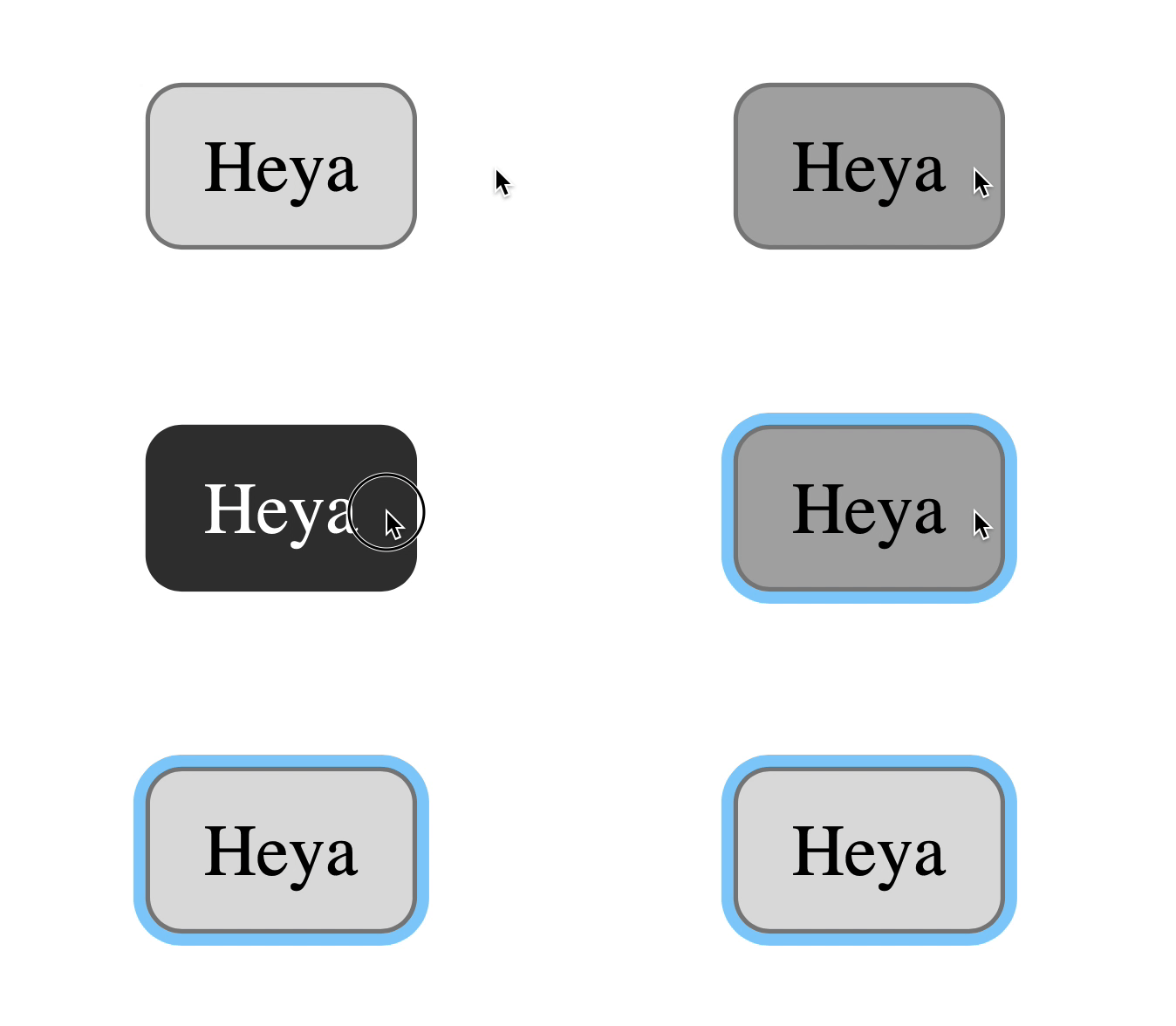
.element:hover { /* / */ } .element:active { /* */ } .element:focus { /* */ }

Button behavior in Safari if all three states have been styled
That's all! Thank you for reading and hope you learned something new today.