A brief history of data visualization. Part 1: from ancient times to the 17th century
There are 4.3 billion internet users on our planet. Every minute they add 46,740 photos on Instagram, write 456,000 tweets, 120 professionals register on LinkedIn, and 990,900 swipes happen on Tinder. And Facebook has 2 billion users - more than a quarter of the world's population! [one]
Data is everywhere and its quantity is only increasing. As McKinsey & Company writes in their report, “Data Science is a simple part. Getting the right data and data suitable for analysis is a much more complicated task ”[2]. Data visualization simplifies perception, makes data more accessible and understandable, helps to understand which part is best used. And they pay well for it. Let's see how in different epochs people differently solved the problem of visualization, look at the most ancient and most famous examples.
The earliest visualization known today is the layout of the houses of Chatalhüyuk in modern Turkey. This scheme was created around 6300 BC. You may argue that cave art is much more ancient. But cave art did not carry an information load, it was more a subject of art than a source of information. That is why we started with this scheme.
An example of the first known diagram, similar to visualization in a Cartesian coordinate system, is a diagram of the motion of celestial bodies. It was created in the X century. Note that it contains a timeline (30 cells horizontally) and depicts several celestial bodies at once. This is exactly what we so often do now - visualization of several time series at once. I could not find the reason why there are exactly 30 cells on the timeline, maybe you have any ideas?
In the fourteenth century, humanity will come to the idea of constructing function graphs based on tabular data when the data is logically interconnected. But a truly massive need for visualization of dependencies will arise three centuries later.
In the XVII century, a significant part of the scientific community was occupied with measurements of basic physical quantities: time, distance and space. This was due to the significant development of astronomy, cartography, navigation and the creation of new colonies by European countries. This is the heyday of analytical geometry and coordinate systems. We will look at one significant one-dimensional graph (1664), which is considered the first known visualization of statistical data. The author, Michael Florent van Langren, interviewed 12 astronomers and plotted longitude measurements between Toledo and Rome. The graph clearly shows that he received a bimodal distribution and even emphasized this fact with the word “Roma”, assuming that the truth is somewhere in between. But, unfortunately, not one of the groups and not one of the astronomers was right. The actual value lies slightly below the minimum value.
In the next article I will talk about the golden age of the development of data visualization and the dark times of statistical analysis. In addition, we will look at the 3 most outstanding visualizations and talk about the effect that they have produced on the world.
If you want to learn more about the history of data visualization, I want to draw your attention to the small book “A Brief History of Data Visualization”, Michael Friendly, which is available for free on the author’s website .
[1] “How Much Data Do We Create Every Day? The Mind-Blowing Stats Everyone Should Read
” Www.forbes.com/sites/bernardmarr/2018/05/21/how-much-data-do-we-create-every-day-the-mind-blowing-stats-everyone-should-read
[2] www.mckinsey.com/~/media/McKinsey/Business%20Functions/McKinsey%20Analytics/Our%20Insights/Analytics%20comes%20of%20age/Analytics-comes-of-age.ashx
Data is everywhere and its quantity is only increasing. As McKinsey & Company writes in their report, “Data Science is a simple part. Getting the right data and data suitable for analysis is a much more complicated task ”[2]. Data visualization simplifies perception, makes data more accessible and understandable, helps to understand which part is best used. And they pay well for it. Let's see how in different epochs people differently solved the problem of visualization, look at the most ancient and most famous examples.
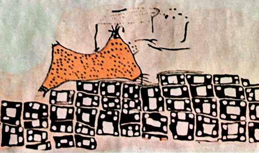
Chatalhyuk City Map
The earliest visualization known today is the layout of the houses of Chatalhüyuk in modern Turkey. This scheme was created around 6300 BC. You may argue that cave art is much more ancient. But cave art did not carry an information load, it was more a subject of art than a source of information. That is why we started with this scheme.
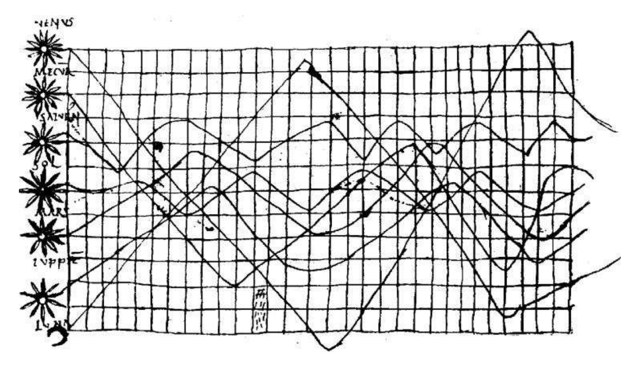
Motion of celestial bodies
An example of the first known diagram, similar to visualization in a Cartesian coordinate system, is a diagram of the motion of celestial bodies. It was created in the X century. Note that it contains a timeline (30 cells horizontally) and depicts several celestial bodies at once. This is exactly what we so often do now - visualization of several time series at once. I could not find the reason why there are exactly 30 cells on the timeline, maybe you have any ideas?
In the fourteenth century, humanity will come to the idea of constructing function graphs based on tabular data when the data is logically interconnected. But a truly massive need for visualization of dependencies will arise three centuries later.
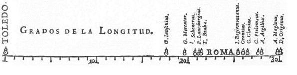
Distance from Toledo to Rome
In the XVII century, a significant part of the scientific community was occupied with measurements of basic physical quantities: time, distance and space. This was due to the significant development of astronomy, cartography, navigation and the creation of new colonies by European countries. This is the heyday of analytical geometry and coordinate systems. We will look at one significant one-dimensional graph (1664), which is considered the first known visualization of statistical data. The author, Michael Florent van Langren, interviewed 12 astronomers and plotted longitude measurements between Toledo and Rome. The graph clearly shows that he received a bimodal distribution and even emphasized this fact with the word “Roma”, assuming that the truth is somewhere in between. But, unfortunately, not one of the groups and not one of the astronomers was right. The actual value lies slightly below the minimum value.
Conclusion
In the next article I will talk about the golden age of the development of data visualization and the dark times of statistical analysis. In addition, we will look at the 3 most outstanding visualizations and talk about the effect that they have produced on the world.
If you want to learn more about the history of data visualization, I want to draw your attention to the small book “A Brief History of Data Visualization”, Michael Friendly, which is available for free on the author’s website .
Sources
[1] “How Much Data Do We Create Every Day? The Mind-Blowing Stats Everyone Should Read
” Www.forbes.com/sites/bernardmarr/2018/05/21/how-much-data-do-we-create-every-day-the-mind-blowing-stats-everyone-should-read
[2] www.mckinsey.com/~/media/McKinsey/Business%20Functions/McKinsey%20Analytics/Our%20Insights/Analytics%20comes%20of%20age/Analytics-comes-of-age.ashx
All Articles