Climate change: we analyze the temperature in different cities over the past 100 years
Hi, Habr.
Only lazy people are not talking about climate change. And by chance finding a good site with historical data, it became interesting to check how the temperature really changed over the years. For the test, we will take data from several cities and analyze them using Pandas and Matplotlib. At the same time, we will find out whether the Chelyabinsk frosts are so severe, and where it is warmer, in Moscow or St. Petersburg.

Also found some more interesting patterns. Who cares to know the details, please, under the cat.
I will not provide a link to the site here, just type in Google "weather and climate annals", it will be the first. The data itself is displayed as an HTML table:
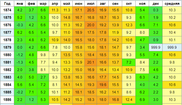
It looks beautiful, but for analysis it is not very convenient. We will copy the data to csv, for this I used a free extension for Chrome called Copytables . You can already work with this further, if everything is done correctly, you should get a file of the following form:
Now load the data into the Pandas dataframe. We will be looking at the data from 1900.
There is one peculiarity here - I use the “inverted” graph for negative temperatures, for which I had to use the FuncFormatter class and the neg_tick function.
With the code, everything, as you can see, is nothing complicated. Now let's see what happens. For comparison, I took several cities - Moscow, St. Petersburg and Amsterdam. Those who wish can see for themselves.
I display the data on one graph, because at the same time it was interesting to compare Moscow temperatures with St. Petersburg.
For winter temperature, take January. The picture was already on KDPV, but for integrity I will bring it again.
Winter, January:
Summer, June:

In Moscow, the climate is indeed more continental - it is colder in winter and hotter in summer. Another interesting peak, visible on the graph - really cold winters in 1941-1945 - is noticeably below average. Complaints of the Germans about the "general winter" had their own reasons.
Overall, the results are interesting. Average temperatures do change in the positive direction, but winters have become milder somewhere around the 80s, and summers have become warmer somewhere around the 50s. Why dont know.
It is also interesting how selective human memory is. My childhood was in the 80s, and I remember the frosty winters under -20, walking in felt boots and earflaps and all that. It turns out that in the 80s frosts in January were not so much as it seemed to me, but apparently, the coldest days were more remembered.
By the way, it became interesting to check how severe colds in Chelyabinsk correspond to jokes:
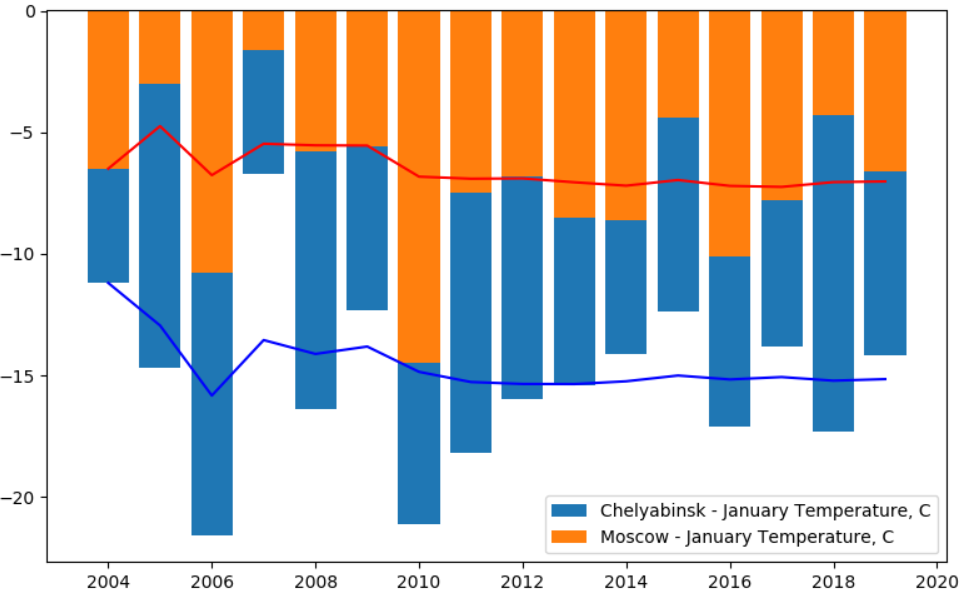
Yes, the difference in average temperature is almost 2 times. When in Moscow the average January temperature is -6, in Chelyabinsk -12. If in Moscow the average temperature suddenly drops to -20 ... however, according to statistics, this was the last time in 1942. How much then was unknown in Chelyabinsk, no data.
Now consider European cities.
In Amsterdam, the climate is quite warm, although the trend as a whole continues. Interesting "outliers" of negative temperatures.
Winter, January:
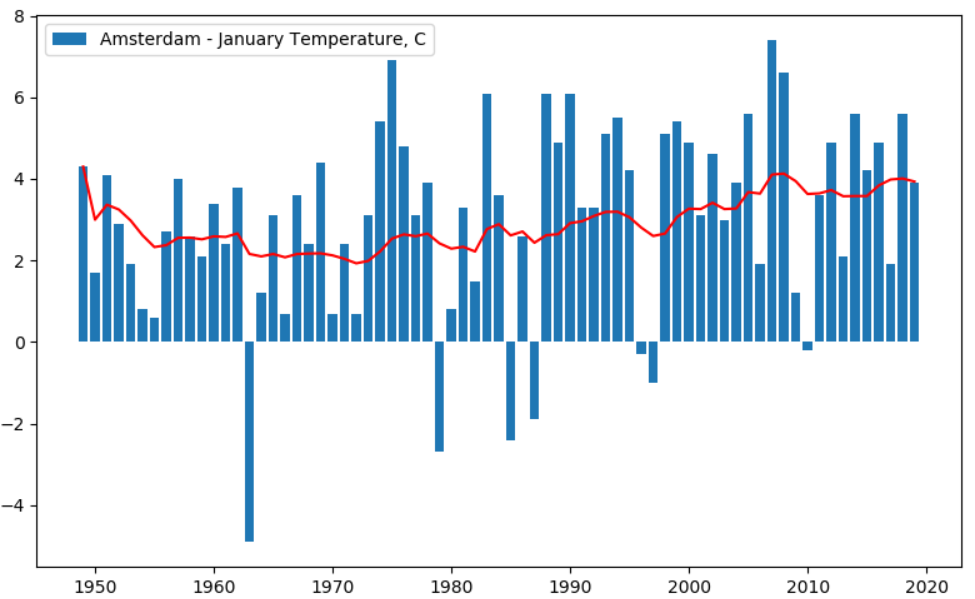
It's funny that the average January temperature at -7 in 1963m impressed the Dutch so much that it even got into local cinema .
Summer temperatures also change.
Summer, June:
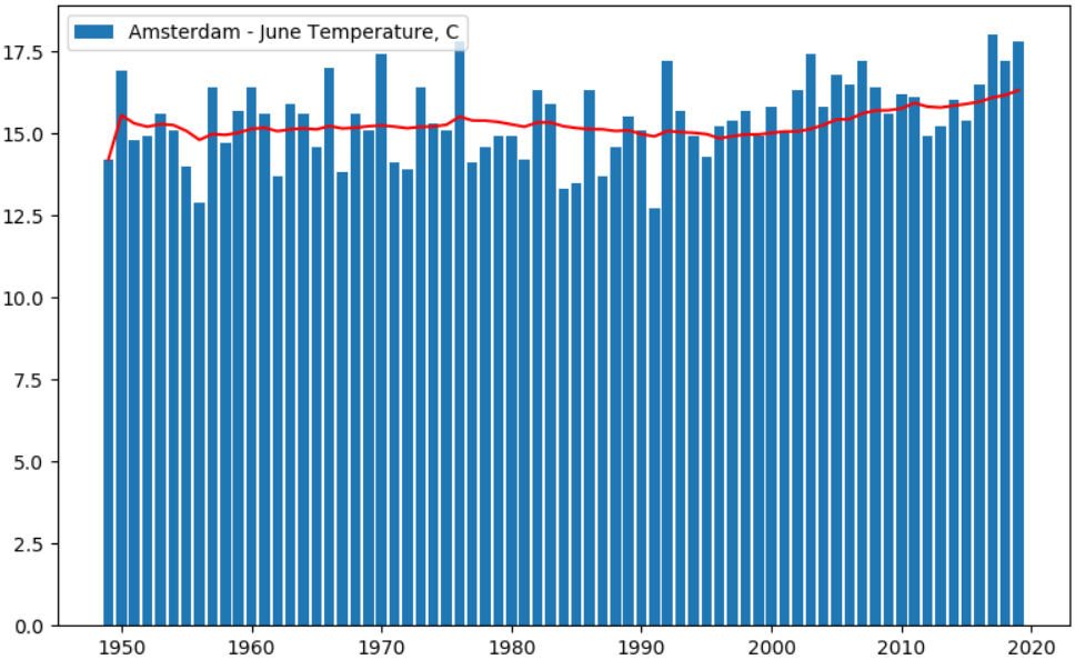
Interestingly, the winters in Amsterdam have not changed as much as in Moscow and St. Petersburg, and the influence of the sea is likely to be affected. For comparison, you can see some continental city, for example Prague :

Interestingly, until the 40s, the temperature grew, then the average values decreased. What has changed, I do not know. Moreover, this is not some local climatic anomaly, the same effect was in Salzburg :
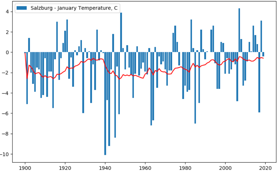
As suggested in the comments, the graphs show interesting peaks of negative temperatures with a period of ~ 20 years. What is it, I do not know.
Actually, I'm not a meteorologist, so there will be no conclusions. Climate change is definitely there, it is impossible to deny it, and average temperatures have indeed risen. It would also be interesting to overlay the data on the graph of CO2 concentration in the atmosphere for these 100 years, or on some other events, for example, on the graph of solar activity. Also quite interesting is the drop in average temperature after 1940 - is it really a war factor (although I'm not sure here), or were there any other events, such as the eruption of large volcanoes.
Those who wish can further experiment on their own.
Only lazy people are not talking about climate change. And by chance finding a good site with historical data, it became interesting to check how the temperature really changed over the years. For the test, we will take data from several cities and analyze them using Pandas and Matplotlib. At the same time, we will find out whether the Chelyabinsk frosts are so severe, and where it is warmer, in Moscow or St. Petersburg.
Also found some more interesting patterns. Who cares to know the details, please, under the cat.
Data collection
I will not provide a link to the site here, just type in Google "weather and climate annals", it will be the first. The data itself is displayed as an HTML table:
It looks beautiful, but for analysis it is not very convenient. We will copy the data to csv, for this I used a free extension for Chrome called Copytables . You can already work with this further, if everything is done correctly, you should get a file of the following form:
Year,Jan,Feb,Mar,Apr,May,Jun,Jul,Aug,Sep,Oct,Nov,Dev,Avg 2003,-7.3,-8.6,-2.7,4.7,15.5,12.8,20.6,16.9,11.3,5.6,1.1,-2.1,5.7 2004,-6.5,-7.0,1.3,4.6,11.4,15.3,19.0,18.4,12.1,5.9,-1.6,-2.9,5.8 2005,-3.0,-8.9,-6.0,7.1,14.8,16.5,19.3,17.6,13.1,6.0,1.4,-4.1,6.2
Now load the data into the Pandas dataframe. We will be looking at the data from 1900.
import pandas as pd import matplotlib.pyplot as plt import matplotlib.dates as mdates from matplotlib.ticker import FormatStrFormatter, LinearLocator, FuncFormatter df = pd.read_csv("moscow.csv", sep=',', encoding='utf-8') df = df[(df['Year'] >= 1900)] plt.rcParams["figure.figsize"] = (8, 5) fig, ax = plt.subplots() def neg_tick(x, pos): return '%.1f' % (-x if x else 0) plt.bar(df['Year'].values, -df['Jan'].values, label=f'{cityname} - January Temperature, C') plt.plot(df['Year'].values, -df['Jan'].rolling(window=20, min_periods=1).mean(), 'r-') ax.yaxis.set_major_formatter(FuncFormatter(neg_tick)) plt.legend(loc='best') plt.tight_layout() plt.show()
There is one peculiarity here - I use the “inverted” graph for negative temperatures, for which I had to use the FuncFormatter class and the neg_tick function.
With the code, everything, as you can see, is nothing complicated. Now let's see what happens. For comparison, I took several cities - Moscow, St. Petersburg and Amsterdam. Those who wish can see for themselves.
Moscow and Petersburg
I display the data on one graph, because at the same time it was interesting to compare Moscow temperatures with St. Petersburg.
For winter temperature, take January. The picture was already on KDPV, but for integrity I will bring it again.
Winter, January:
Summer, June:
In Moscow, the climate is indeed more continental - it is colder in winter and hotter in summer. Another interesting peak, visible on the graph - really cold winters in 1941-1945 - is noticeably below average. Complaints of the Germans about the "general winter" had their own reasons.
Overall, the results are interesting. Average temperatures do change in the positive direction, but winters have become milder somewhere around the 80s, and summers have become warmer somewhere around the 50s. Why dont know.
It is also interesting how selective human memory is. My childhood was in the 80s, and I remember the frosty winters under -20, walking in felt boots and earflaps and all that. It turns out that in the 80s frosts in January were not so much as it seemed to me, but apparently, the coldest days were more remembered.
By the way, it became interesting to check how severe colds in Chelyabinsk correspond to jokes:
Yes, the difference in average temperature is almost 2 times. When in Moscow the average January temperature is -6, in Chelyabinsk -12. If in Moscow the average temperature suddenly drops to -20 ... however, according to statistics, this was the last time in 1942. How much then was unknown in Chelyabinsk, no data.
Now consider European cities.
Amsterdam
In Amsterdam, the climate is quite warm, although the trend as a whole continues. Interesting "outliers" of negative temperatures.
Winter, January:
It's funny that the average January temperature at -7 in 1963m impressed the Dutch so much that it even got into local cinema .
Summer temperatures also change.
Summer, June:
Interestingly, the winters in Amsterdam have not changed as much as in Moscow and St. Petersburg, and the influence of the sea is likely to be affected. For comparison, you can see some continental city, for example Prague :
Interestingly, until the 40s, the temperature grew, then the average values decreased. What has changed, I do not know. Moreover, this is not some local climatic anomaly, the same effect was in Salzburg :
As suggested in the comments, the graphs show interesting peaks of negative temperatures with a period of ~ 20 years. What is it, I do not know.
Conclusion
Actually, I'm not a meteorologist, so there will be no conclusions. Climate change is definitely there, it is impossible to deny it, and average temperatures have indeed risen. It would also be interesting to overlay the data on the graph of CO2 concentration in the atmosphere for these 100 years, or on some other events, for example, on the graph of solar activity. Also quite interesting is the drop in average temperature after 1940 - is it really a war factor (although I'm not sure here), or were there any other events, such as the eruption of large volcanoes.
Those who wish can further experiment on their own.
All Articles