Futuristic user interface of the new Tesla Model 3
Hi, Giktayms! I present to you the translation of the article “ What Tesla’s Model 3 UI Reveals” by Tom Johnson .
If you know a lot about design or just crazy about cars, then this article is for you. It will look at the main features of the elements of the control panel, as well as the user interface of the new Tesla Model 3 - the electric vehicle that has recently entered the market and is available to a wide layer of society, which is equipped with a touch screen. The new user interface design can tell a lot about how Tesla engineers see the future of self-driving cars.
If you are interested in this topic, then check out the Figma-file , which I have prepared especially for you, as well as the link you will find the prototype I made.

From the very beginning, I followed all the events around Tesla Model 3. Last year I finally managed to try the Model S, after which I was pleasantly surprised by how easy it was to drive this car and how sensitively it responds to every movement the driver. Needless to say, I could not help falling in love with Tesla and immediately caught fire with the idea of its “affordable” version, whose characteristics are not inferior to the model I tested. Like many of Tesla's fans, I followed every news on Tesla Model 3 and dug up tons of web pages in search of the smallest details about how even the smallest detail of this car would work.
The ideas of the engineers who were planned to be implemented in this model were really cool, but I could hardly believe that they would completely abandon the traditional dashboard in the new Tesla. Maybe it sounds cool, but not for marketing people and certainly not for buyers. Then I reasonably believed: "Come on, these are just ideas, you never know what can be done."
Well ... it was here that I didn’t guess: a car appeared to the general public, in which the traditional dashboard did not even smell ...
And the gearshift ...
And air conditioning vents ...
And even pens from the glove box ...

Now all these elements are located on the touch screen located exactly in the middle of the car. And most importantly, it didn’t even occur to the engineers to somehow hide this clumsy screen sticking out in the middle of the car, which suggests an average finger pointing straight to the face of the entire automotive world. Thus, all the skeptics of this approach, as well as other car companies that advocated the inviolability of the usual dashboard, got the tasty “F * ck you”. At first, Tesla abandoned the engines as such, but even this was not enough for its engineers and designers, and they decided to continue in the same vein until the entire automotive industry with more than a century of history trembled.
News of the upcoming release of the new Tesla model filled me with reverent horror. However, this time I took the side of skeptics with their many discontented, disparaging and biased cries.
I really wanted to know how Tesla engineers managed to hide all the auto controls behind the glass display panel. So I began to literally study the Internet in search of relevant information about the user interface design of the new model. It is worth admitting that it took me some time, but in the end I was lucky to stumble upon an interesting project presented by designer Andrew Hohlad (Andrew Goodlad). Then I decided that he was able to recreate the user interface of Tesla Model 3, which is about to enter the market, using information posted on the web, as well as exciting YouTube videos on the interface of the new car. This guy created a real prototype of the interface and everything connected with it.
At first, his prototype seemed really cool to me, but after a while a simple set of pictures was not enough for my inquisitive mind and great curiosity. Then I decided to independently analyze every smallest detail of the new Tesla dashboard and understand how it works and why it is so and not otherwise.
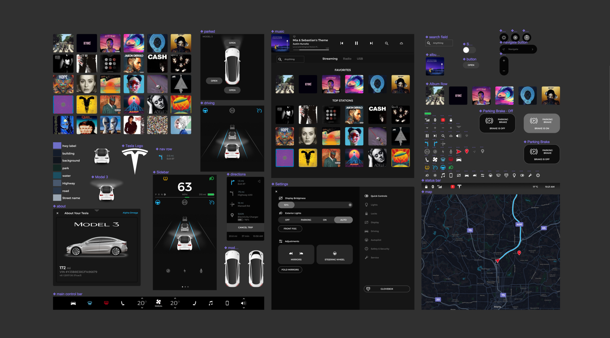
So, I downloaded all sorts of interface images in jpeg format for any screens using CSS Peeper .
Next, I laid them in Figma .
After that, I did not hesitate for a second. I immediately began to recreate the Tesla Model 3 user interface using the images found. I invented the icons of elements on the dashboard, selected colors for them, developed a custom view of the roadmap displayed on the panel, put together all the Figma-elements: switches, buttons, in general, everything that was possible. Such a process was presented to me as a kind of patient therapy: I tracked, step by step, as one or another process of creating each user interface element proceeds. I already experienced something similar when I was a kid and was fond of comics. As my favorite comic book heroes, Snoopy and Bugs Bunny, taught me how to draw, so now I began to understand all the difficulties of working on creating a car user interface design.
Such a process was presented to me as a kind of patient therapy: I tracked, step by step, as one or another process of creating each user interface element proceeds.
I did most of the work with Figma. I already wrote earlier why I chose this particular editor: it is completely web-oriented, so you should not have any difficulties with downloading and using it. In addition, it is so effective that with its help I easily managed to create a prototype of the interface presented below. If you're interested, below you will find a link to the source file:

Prototype:
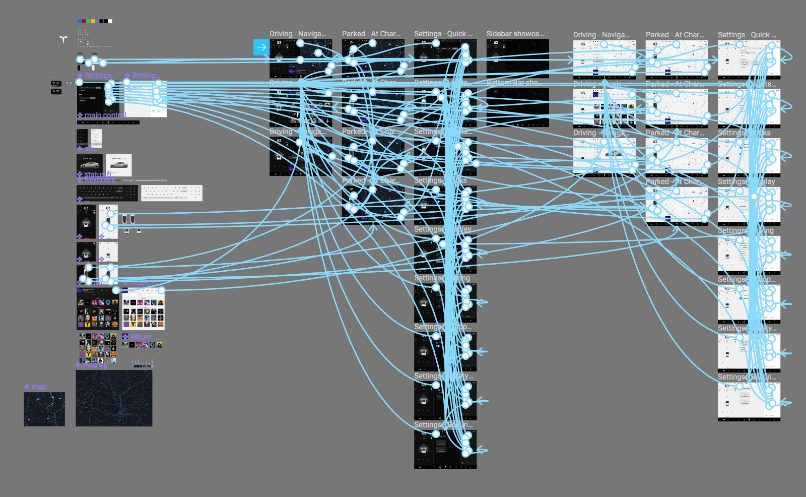
From the author: if you are wondering how to configure the Figma-file, then just write about it in the comments. When I’ve almost finished recreating the prototype I’ve thought of using such a file, I was surprised that using separate components for this purpose greatly accelerated the process of creating a prototype. In fact, this whole process took me about half an hour, and, to admit, I did not expect that everything would go so fast. At first, I just wanted to combine several images displayed on the screen in order to bring it to the end. But now I’m seriously thinking about writing a separate article about this process.
Tesla Model 3 - this is a car, the creators of which least thought about the drivers, and this was done intentionally.
Let's understand ... The car does not have any handles, although it at least has a steering wheel (and thanks for that). In order to turn on the windshield wipers, you need to press a button on the screen (* note from the author: for this purpose, a car still has a lever, but the speed of the windshield wipers is still adjusted using the buttons on the screen). Again, you have to press the buttons on the screen in order to open the glove compartment or to activate the handbrake (* note from the author: the handbrake should be activated automatically, however, it is believed that with the help of the settings you can set the brakes to be activated when pressing buttons). Not very convenient for drivers, is not it? Now while driving, the driver can no longer rely on his reaction and muscle memory, honed over many years.
You might decide that the engineers of the new Tesla made such changes to make the car seem more advanced, dangerous, or not like everyone else ... However, this is not so: just the engineers of the new Tesla decided to prepare people for driving in the foreseeable future without the help of drivers.
As for the user interface, the first thing I noticed is the resolution of the display screen.
As in the case of Models S and X in the new Tesla, a vertical screen could be installed, but instead the ratio of width and height in Model 3 is 8: 5, and the resolution is 1920x1200 pixels. You may ask, and then what? Here's what:
The HDTV provided in the new Tesla hints that the central control screen was created, first of all, to watch something on it, and not for convenient driving. So we can safely say that Model 3 is the messiah of the future, in which cars will drive without the help of drivers. This is not just a car with an unusual control system, it is a real living room on wheels. Perhaps this is a little premature statement - given the gradual development of technology - but it is likely that soon the best place to watch movies will be the salon of your favorite iron horse.
This is not just a car with an unusual control system, it is a real living room on wheels.
No, I am not the right hand of Ilona Mask. All the above statements are just my conjectures and assumptions. So I ask you very much: do not throw stones at me if, suddenly, I am in something wrong.
Below are a few screenshots of the various components of the interface.
As the prototype was developed, the navigation window began to resemble the screen of mobile devices.
It is also worth noting that the dashboard is at arm's length and is located in such a way that it falls within the area of the driver’s peripheral vision. For countries with right-hand traffic, this arrangement can be easily changed: smart engineering is no different.
Note that all external controls are also on the touch screen.
It seems that in Model 3 for any situation has its own special controls. For example, during parking, only items necessary for parking a car are shown on the screen. This approach may seem obvious, but it is really convenient.
The buttons on the steering wheel are still a mystery to me: I have no idea why they are needed.
In this car, you can customize almost anything you want. In addition, there is an opinion that it will also provide the ability to customize shortcuts: elements that are used most often will always be displayed on the control screen. However, there is no reliable information confirming this theory, so far, unfortunately.
By the way, from the front passenger seat, you can reach the controls (roll up / expand) of the music player ...
As I understand it, the screen will display entire albums, and not songs separately. It is also not yet known whether Model 3 provides for the possibility of control through verbal commands.
I recently revised the original iPhone presentation from Steve Jobs and was amazed by the apparent similarity of the iPhone with Model 3.
They both have no buttons.
And that's what occurred to me:

Then Jobs spoke to the audience with a report that for the smart device industry, the presence of physical buttons is a relic of the past. And what we see: if now it occurs to someone to introduce a new device with a full keyboard of buttons, it will simply be raised to laugh.
Then why don't we make corresponding parallels with the auto industry? Why we (or myself), seeing in front of us a single touch screen instead of the usual control panel, do not even want to imagine that this will ever become a generally accepted approach. Didn’t Apple do something similar by abandoning the standard keyboard?
You can argue, they say: it was a telephone, and this is a car - the fields of application are very different.
However, any software, including software for driving, can be updated, improved. Whereas for physical buttons it is unlikely that you can come up with any effective changes: replacing some buttons with others or updating their appearance does not seem to be something useful. So it may well be that replacing buttons and other physical vehicle controls with a full-fledged control screen is not such a crazy idea.
Original Posted by: Tom Johnson .
- # 1 promotion service on reddit .
If you know a lot about design or just crazy about cars, then this article is for you. It will look at the main features of the elements of the control panel, as well as the user interface of the new Tesla Model 3 - the electric vehicle that has recently entered the market and is available to a wide layer of society, which is equipped with a touch screen. The new user interface design can tell a lot about how Tesla engineers see the future of self-driving cars.
If you are interested in this topic, then check out the Figma-file , which I have prepared especially for you, as well as the link you will find the prototype I made.
From the very beginning, I followed all the events around Tesla Model 3. Last year I finally managed to try the Model S, after which I was pleasantly surprised by how easy it was to drive this car and how sensitively it responds to every movement the driver. Needless to say, I could not help falling in love with Tesla and immediately caught fire with the idea of its “affordable” version, whose characteristics are not inferior to the model I tested. Like many of Tesla's fans, I followed every news on Tesla Model 3 and dug up tons of web pages in search of the smallest details about how even the smallest detail of this car would work.
The ideas of the engineers who were planned to be implemented in this model were really cool, but I could hardly believe that they would completely abandon the traditional dashboard in the new Tesla. Maybe it sounds cool, but not for marketing people and certainly not for buyers. Then I reasonably believed: "Come on, these are just ideas, you never know what can be done."
Well ... it was here that I didn’t guess: a car appeared to the general public, in which the traditional dashboard did not even smell ...
And the gearshift ...
And air conditioning vents ...
And even pens from the glove box ...
Now all these elements are located on the touch screen located exactly in the middle of the car. And most importantly, it didn’t even occur to the engineers to somehow hide this clumsy screen sticking out in the middle of the car, which suggests an average finger pointing straight to the face of the entire automotive world. Thus, all the skeptics of this approach, as well as other car companies that advocated the inviolability of the usual dashboard, got the tasty “F * ck you”. At first, Tesla abandoned the engines as such, but even this was not enough for its engineers and designers, and they decided to continue in the same vein until the entire automotive industry with more than a century of history trembled.
Actually it was a little different.
News of the upcoming release of the new Tesla model filled me with reverent horror. However, this time I took the side of skeptics with their many discontented, disparaging and biased cries.
The Model 3 has four wheels, and it looks like a car, but it looks like its usual car ends there.
I really wanted to know how Tesla engineers managed to hide all the auto controls behind the glass display panel. So I began to literally study the Internet in search of relevant information about the user interface design of the new model. It is worth admitting that it took me some time, but in the end I was lucky to stumble upon an interesting project presented by designer Andrew Hohlad (Andrew Goodlad). Then I decided that he was able to recreate the user interface of Tesla Model 3, which is about to enter the market, using information posted on the web, as well as exciting YouTube videos on the interface of the new car. This guy created a real prototype of the interface and everything connected with it.
Why I decided to recreate the user interface myself
At first, his prototype seemed really cool to me, but after a while a simple set of pictures was not enough for my inquisitive mind and great curiosity. Then I decided to independently analyze every smallest detail of the new Tesla dashboard and understand how it works and why it is so and not otherwise.
So, I downloaded all sorts of interface images in jpeg format for any screens using CSS Peeper .
Next, I laid them in Figma .
After that, I did not hesitate for a second. I immediately began to recreate the Tesla Model 3 user interface using the images found. I invented the icons of elements on the dashboard, selected colors for them, developed a custom view of the roadmap displayed on the panel, put together all the Figma-elements: switches, buttons, in general, everything that was possible. Such a process was presented to me as a kind of patient therapy: I tracked, step by step, as one or another process of creating each user interface element proceeds. I already experienced something similar when I was a kid and was fond of comics. As my favorite comic book heroes, Snoopy and Bugs Bunny, taught me how to draw, so now I began to understand all the difficulties of working on creating a car user interface design.
Such a process was presented to me as a kind of patient therapy: I tracked, step by step, as one or another process of creating each user interface element proceeds.
I did most of the work with Figma. I already wrote earlier why I chose this particular editor: it is completely web-oriented, so you should not have any difficulties with downloading and using it. In addition, it is so effective that with its help I easily managed to create a prototype of the interface presented below. If you're interested, below you will find a link to the source file:
Prototype:
From the author: if you are wondering how to configure the Figma-file, then just write about it in the comments. When I’ve almost finished recreating the prototype I’ve thought of using such a file, I was surprised that using separate components for this purpose greatly accelerated the process of creating a prototype. In fact, this whole process took me about half an hour, and, to admit, I did not expect that everything would go so fast. At first, I just wanted to combine several images displayed on the screen in order to bring it to the end. But now I’m seriously thinking about writing a separate article about this process.
What's new, I learned about the design of the user interface Model 3
Tesla Model 3 - this is a car, the creators of which least thought about the drivers, and this was done intentionally.
Let's understand ... The car does not have any handles, although it at least has a steering wheel (and thanks for that). In order to turn on the windshield wipers, you need to press a button on the screen (* note from the author: for this purpose, a car still has a lever, but the speed of the windshield wipers is still adjusted using the buttons on the screen). Again, you have to press the buttons on the screen in order to open the glove compartment or to activate the handbrake (* note from the author: the handbrake should be activated automatically, however, it is believed that with the help of the settings you can set the brakes to be activated when pressing buttons). Not very convenient for drivers, is not it? Now while driving, the driver can no longer rely on his reaction and muscle memory, honed over many years.
You might decide that the engineers of the new Tesla made such changes to make the car seem more advanced, dangerous, or not like everyone else ... However, this is not so: just the engineers of the new Tesla decided to prepare people for driving in the foreseeable future without the help of drivers.
This car was created for easy driving.
As for the user interface, the first thing I noticed is the resolution of the display screen.
As in the case of Models S and X in the new Tesla, a vertical screen could be installed, but instead the ratio of width and height in Model 3 is 8: 5, and the resolution is 1920x1200 pixels. You may ask, and then what? Here's what:
- This is HDTV guys!
- Lower (permanent) controls have a height of 120 pixels.
- 1200–120 = 1080 pixels.
- 1920x1080.
The HDTV provided in the new Tesla hints that the central control screen was created, first of all, to watch something on it, and not for convenient driving. So we can safely say that Model 3 is the messiah of the future, in which cars will drive without the help of drivers. This is not just a car with an unusual control system, it is a real living room on wheels. Perhaps this is a little premature statement - given the gradual development of technology - but it is likely that soon the best place to watch movies will be the salon of your favorite iron horse.
This is not just a car with an unusual control system, it is a real living room on wheels.
No, I am not the right hand of Ilona Mask. All the above statements are just my conjectures and assumptions. So I ask you very much: do not throw stones at me if, suddenly, I am in something wrong.
Separation of interface components
Below are a few screenshots of the various components of the interface.
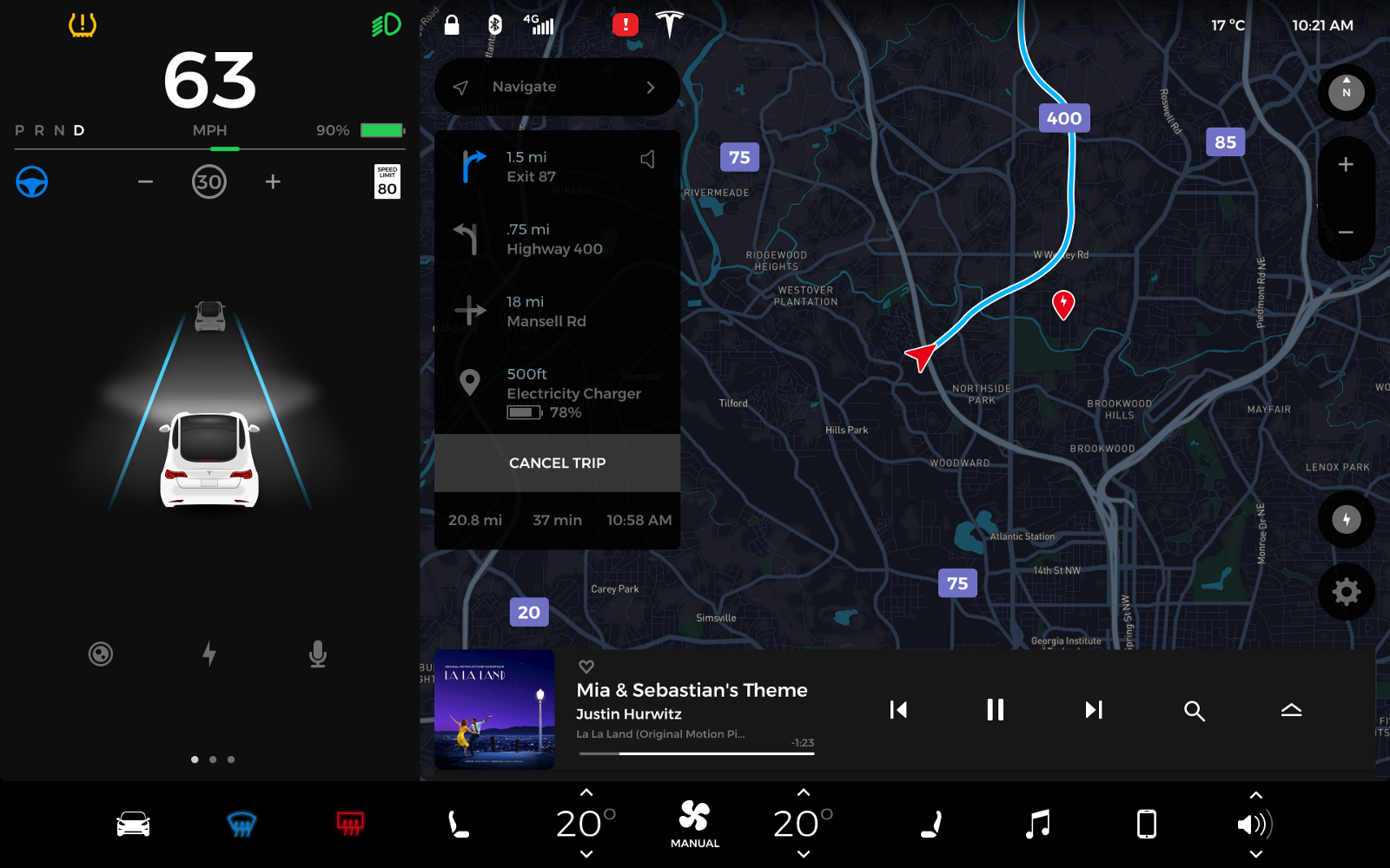
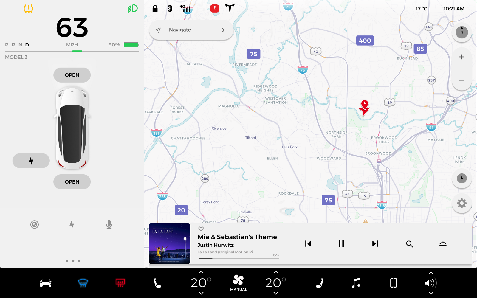
Driving Mode — On the Go
As the prototype was developed, the navigation window began to resemble the screen of mobile devices.
It is also worth noting that the dashboard is at arm's length and is located in such a way that it falls within the area of the driver’s peripheral vision. For countries with right-hand traffic, this arrangement can be easily changed: smart engineering is no different.
Parking mode
Note that all external controls are also on the touch screen.
It seems that in Model 3 for any situation has its own special controls. For example, during parking, only items necessary for parking a car are shown on the screen. This approach may seem obvious, but it is really convenient.
Quick settings
The buttons on the steering wheel are still a mystery to me: I have no idea why they are needed.
In this car, you can customize almost anything you want. In addition, there is an opinion that it will also provide the ability to customize shortcuts: elements that are used most often will always be displayed on the control screen. However, there is no reliable information confirming this theory, so far, unfortunately.
Playing music
By the way, from the front passenger seat, you can reach the controls (roll up / expand) of the music player ...
As I understand it, the screen will display entire albums, and not songs separately. It is also not yet known whether Model 3 provides for the possibility of control through verbal commands.
Conclusion
I recently revised the original iPhone presentation from Steve Jobs and was amazed by the apparent similarity of the iPhone with Model 3.
They both have no buttons.
And that's what occurred to me:
Then Jobs spoke to the audience with a report that for the smart device industry, the presence of physical buttons is a relic of the past. And what we see: if now it occurs to someone to introduce a new device with a full keyboard of buttons, it will simply be raised to laugh.
Then why don't we make corresponding parallels with the auto industry? Why we (or myself), seeing in front of us a single touch screen instead of the usual control panel, do not even want to imagine that this will ever become a generally accepted approach. Didn’t Apple do something similar by abandoning the standard keyboard?
You can argue, they say: it was a telephone, and this is a car - the fields of application are very different.
However, any software, including software for driving, can be updated, improved. Whereas for physical buttons it is unlikely that you can come up with any effective changes: replacing some buttons with others or updating their appearance does not seem to be something useful. So it may well be that replacing buttons and other physical vehicle controls with a full-fledged control screen is not such a crazy idea.
Original Posted by: Tom Johnson .
- # 1 promotion service on reddit .
All Articles